
Table of Contents
It is often said that past decades were better than our own. Evoking nostalgia from earlier times softens the memories. Brands are all too aware of this, which is why they draw on aesthetics from previous eras to awaken a world of feelings in our brains.
In the food and beverage industry, the 70s are all the rage. It was the golden age of rock and pop culture, of the growth of advertising and the emergence of mass media. And packaging is now aping its floral patterns, colourful shapes, typographic illustrations and psychedelic scenes.
We take a look at 10 products that are undergoing a retro renaissance through their packaging.
Retro typefaces with thick lines
In the 1970s, graphic designers moved away from the International Typographic Style to bolder typefaces, with thick lines, decorative elements and double outlines. Today, an example of this trend can be found in the packaging for Nuud, a brand of plastic-free chewing gum that is plant-based and sugar-free. The studio Mother Design is behind this tremendously fun and expressive visual identity. On the front, the brand name appears as a smiling mouth, accompanied by the slogan “Chew plants, not plastic!”.


In 2021, fast-food chain Burger King updated every element of its visual identity with a design they described as “playfully irreverent and proudly true.” The new logo, which pays homage to the logo used by the brand throughout the 70s, 80s and 90s, introduces graphic elements with a retro feel and chunky fonts. It also more clearly emphasises the two halves of the burger bun surrounding the words Burger King.
New York-based Phil’s Finest is a brand producing sausages and ground beef made with vegetables, whose recipes are made in collaboration with award-winning chefs. For the redesign of their packaging, the team at Gander agency wanted to recreate a handmade feel. So they designed bold clear packaging with colour-coded die-cut labels to match the product inside, creating a monochromatic aesthetic which most brands in the industry would avoid entirely.


Paying homage to the hippie movement and the cosmos
Imagery drawing on hippie culture and ancestral healing are other elements of packaging inspired by the 70s. Take That Hippie Co., a range of gummy supplements for men’s health which feature distinctive packaging that explores “the world of a hippie,” in the words of its Australian creators. The visual language of the packaging conveys a feeling of trustworthiness and convenience. The designers have also created a humorous, no-nonsense tone and bold typography, far removed from the language usually associated with these kinds of products.


Illustrations evoking the cosmos and astrology are the hallmark of Dark Matter Coffee’s packaging. The Chicago-based brand likes to experiment with sustainable coffee, even offering barrel-aged coffees. This innovative spirit led them to launch a line of canned cold brew coffees, for which they turned to the originality of the multi-awardwinning team at Zmmr. Most notable in the packaging are the retro-futuristic labels drawing on the cosmos and astrology, with psychedelic illustrations in bright colours created by Mexican artist Raúl Urias.
Disco and psychedelic style
Psychedelic style is also the theme of some of the labels from Spanish brewery Península. “Some” because this company, founded by a father and son who are passionate about beers from America’s West Coast, is constantly expanding their range, always with particular attention to the packaging design.


The visual identity of Sound echoes the brand’s name with its S-shaped waves, but also resembles sound waves and rainbows. The US company sells sparkling water made from natural and sugar-free ingredients in both cans and glass bottles. The intention behind this colourful disco-style design was to attract attention in the refrigerators where their products are sold, but also to convey their fun, innovative and carefree spirit.


Explosion of colours
In 2015, the historic stock cube brand OXO revamped its design with the help of creative agency Coley Porter Bell. The result was packaging in a range of striking colours such as red, yellow, green, purple and pink to represent different flavours, in contrast with a larger, bolder logo. Additionally, the wrapping can be unfolded to read recipes using the stock cubes, and also include slogans such as “Liven up your Lasagne” and “Sprinkle for spectacular stir fry.”
Ginger, passion fruit, raspberry, tangerine or grapefruit. These are just some of the flavours of one of the most popular kombucha brands in Canada: Club Kombucha. Each one is represented through a different chromatic range, again using retro-inspired waves and typography. However, what’s particularly striking is that this non-alcoholic drink, usually promoted as a healthy alternative to beer, is sold in cans, using the typical visual traits of the product it wants to unseat.


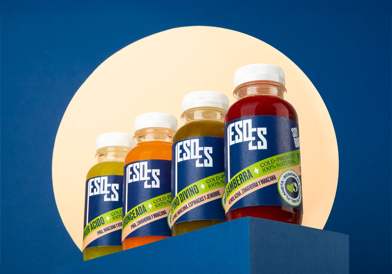
ESOES is another a healthy drink brand, but also fights against food waste. This brand of cold-pressed juices, lemonades and smoothies – made from fruits and vegetables that the industry dismisses as “imperfect” – had its packaging designed by Agencia Jaimito. Inspired by the 70s, the diagonal lines, colour combinations and gradients are the hallmark of this fully biodegradable packaging. Also worth noting is the brand’s play on words: “Eso es!” is Spanish for “That’s it!”, congratulating us for helping the environment, in response to the planet’s cry for help: S-O-S.

It may be through colours or typography. Through an homage to the hippie movement or seeking inspiration in disco or psychedelia. The fact is that the 70s are back in the world of design and packaging, to appeal directly to our consumer brains.