
Table of Contents
Hitting American cinemas on 3 July 1985, Back to the Future was the highest-grossing film in the world that year, raking in $210 million in the US alone. So what is it about Robert Zemeckis’ blockbuster that captured the imagination of millennials – and the generations that came after them?
No one thing makes Back to the Future a classic; rather, it’s a masterful blend of ingredients. There are the two main characters, the go-getting teen Marty McFly and his eccentric scientist friend Doc Brown; there’s the popular sci-fi trope of time travel; and there are the delightful details scattered throughout the trilogy: the strange DeLorean, the mysterious date for the trip to the future, the omnipresent clock tower, the fictitious city of Hill Valley, the famous flux capacitor… and much, much more.
Fans love these touches. Some came about by chance, but others were the result of genius. Like the captivating posters created by celebrated poster designer Drew Struzan.
Today, we’re travelling back in time to see how the Back to the Future film posters were made – and what the “alternative futures” for this art would have looked like. We would also like to pay tribute to the artist Drew Struzan, who recently passed away, whose artistic legacy will be forever linked to this cult film.
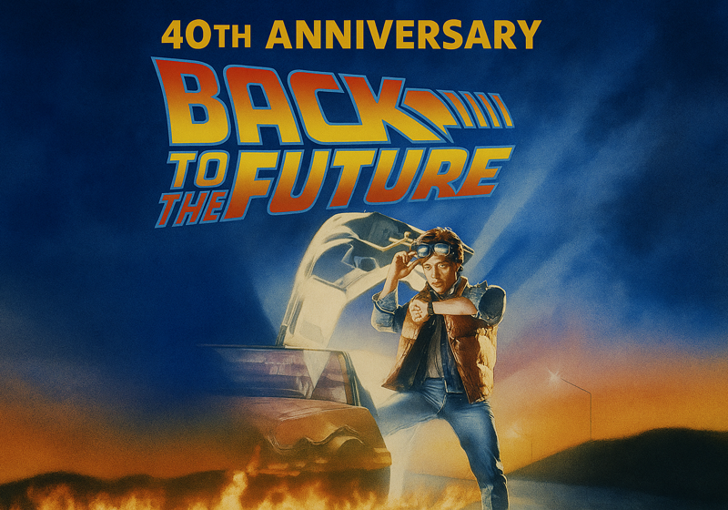
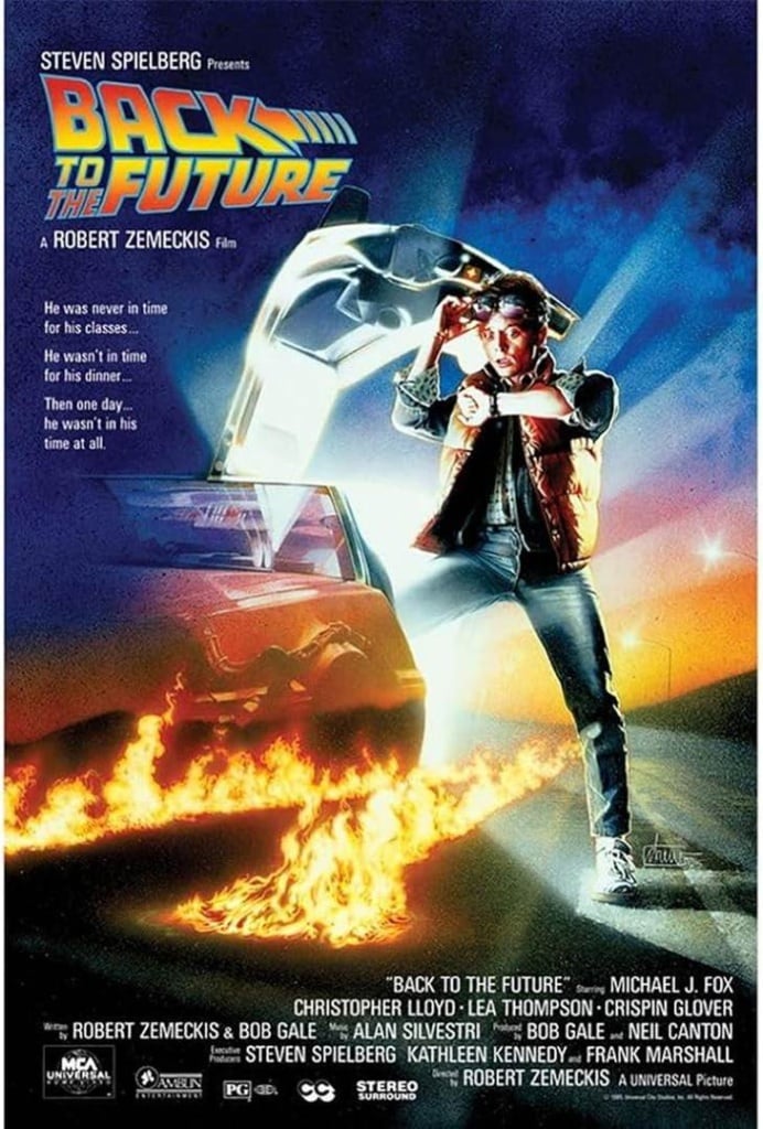
That iconic Back to the Future poster
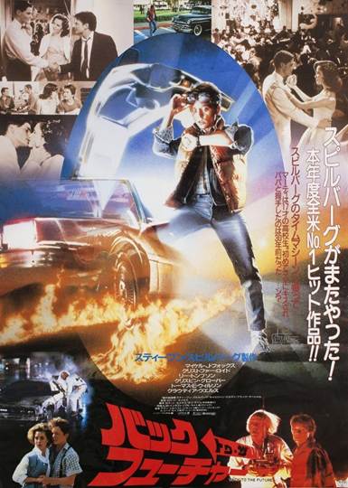
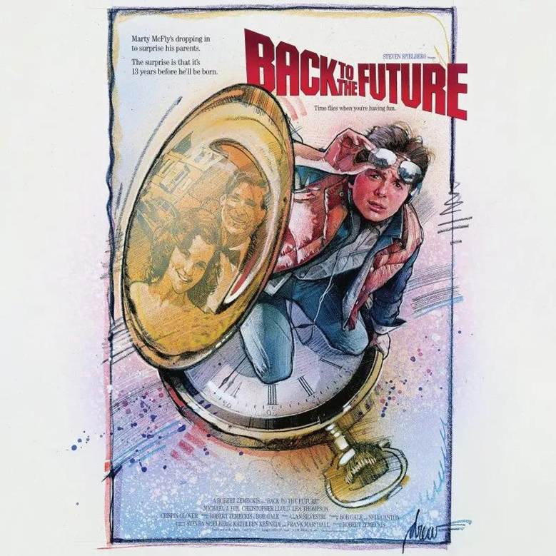
The poster for the first instalment of the Back to the Future trilogy brilliantly builds intrigue and excitement. It shows main character Marty McFly, played by Michael J. Fox, as he embarks on the trip of a lifetime. Next to him is the famous DeLorean, the car that the screenwriters chose for the film’s time machine (did you know that it was originally supposed to be… a fridge?). The DeLorean’s doors are open, the tarmac is ablaze: a thrilling adventure is about to begin.
In the 1980s, illustrator Drew Struzan was Hollywood’s go-to guy for movie posters: before he worked on Back to the Future, his credits already included acclaimed posters for Blade Runner, The Thing, E.T. and the Indiana Jones series [we dig deeper into posters for Indy’s big-screen escapades here].
It was director Robert Zemeckis himself who gave Struzan the call. And in his attempt to get the artist onboard, he used a line worthy of one of his films: “I waited until I made a film good enough to deserve your poster. I think Back to the Future is that film.”
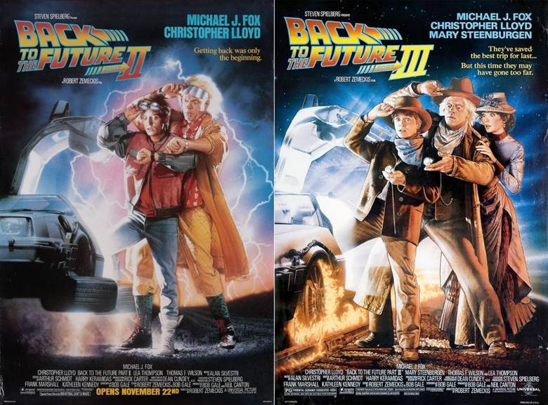
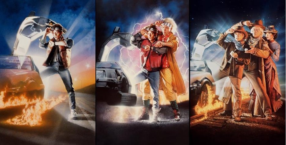
Struzan also designed the posters for parts two and three of the Back to the Future trilogy, released in 1989 and 1990 respectively. For these, he kept the layout identical to the first, but added details hinting at the new temporal settings for the films: the (then future) year 2015 and the Wild West! Struzan added other major characters, too: first Doc Brown (played by Christopher Lloyd) for Part II, who was then joined by Clara Clayton (played by Mary Steenburgen) for Part III.
The story behind the Back to the Future posters
Though highly realistic, the images in Back to the Future posters are not stills from the film, but illustrations – Struzan’s trademark. As the artist explains in this interview, he wasn’t trying to recreate reality, but to get “people to feel the fantasy of the film.”
For example, a detail on the original Back to the Future poster that strikes many as strange is the perspective of the DeLorean: it seems to be shown from two different angles at once.
The creative process behind a Struzan poster was never simple, but it was particularly long and drawn out for Back to the Future. As is often the case, the designer did not see the completed film before he started work – he was only given a few details. Struzan had a few unsatisfactory attempts before Steven Spielberg– a producer on the film – suggested the right idea.
There’s an amusing anecdote behind the first poster for Back to the Future. Michael J. Fox wasn’t available to pose for Struzan’s drawings, and the stills that were sent to the designer didn’t work for the image he had in mind. So Struzan had to improvise: he posed himself and had his wife photograph him.
Which means that the Marty McFly in the poster is mostly Struzan’s body… with Michael J. Fox’s head on top! Fortunately, when it came to producing the posters for parts two and three, a special photo shoot was held with the actors. Legend has it that during the shoot, Michael J. Fox approached the illustrator and asked “Are you THE Drew? I’m your biggest fan!”
The pile of rejected posters for Back to the Future
Struzan’s way of working was by no means fast. First he created black and white sketches, then colour sketches and finally colour paintings – all showing different times, places and situations so that the marketing team could get an idea of how they could showcase the film. And for the final images, Struzan drew the illustration on board, then used an airbrush to fill in colour, plus coloured pencils for detailing.
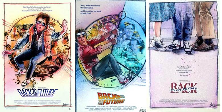
Three posters designed by Drew Struzan for Back to the Future but rejected in the end. Image: facebook.com
Using this painstaking workflow, Struzan produced a slew of alternative artwork for the Back to the Future poster. Many of these drawings were never intended to be shown to the public, but were meant to help the artist and the producers get the result they wanted. And judging by the final poster, it was worth the effort!
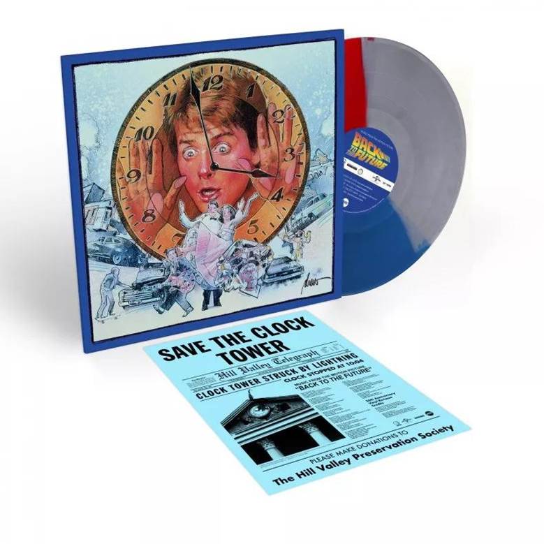
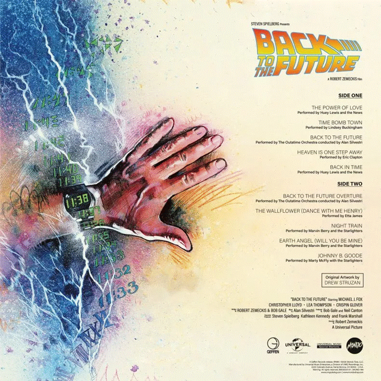
One of the drawings rejected for the Back to the Future poster became the cover for the soundtrack. Image: newsweek.com
Happily, we can still admire some of these posters and imagine an alternative history for the trilogy. Some of this artwork has also been given a new lease of life. One discarded poster was re-used decades later as the cover for the 35th anniversary edition of the soundtrack. And the same image of Marty McFly trapped inside a clock is said to have inspired the poster for another cult film: Groundhog Day, starring Bill Murray.
What do you think about Drew Struzan’s creative process? Could it be a source of inspiration for you? And does the Back to the Future poster bring back any special memories? Share your thoughts!
Disclaimer: All images in this article belong to their rightful owners and are used for informational purposes only, to pay tribute to the great masterpieces of cinema and master illustrators. Readers are invited to give due value to the works mentioned by purchasing them and enjoying them in the ways and forms provided for by law.