
Table of Contents
Picture Hollywood films from the 1950s, where women look after the house and men go to work in smart suits.
Picture suburban homes with immaculate lawns on leafy streets.
This is the world depicted in the magazine we’re flicking through today.
It’s one of the “Seven Sisters”, a set of influential magazines aimed at American housewives. These middle-class women were thought to have little appetite for high culture and more interest in tips for making their homes attractive and welcoming.
In this world, which at best seems quaint and vintage and at worst patriarchal and conformist, over 45 million copies of these magazines were sold every week in the seventies*.
Readership has fallen steeply since, but still represents a sizeable market for American publishers.
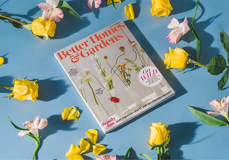
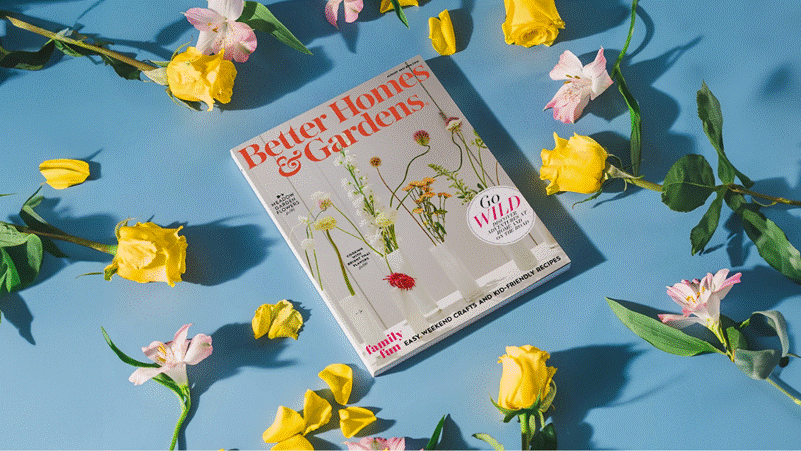
Today, we’re zooming in on perhaps the most iconic of the Seven Sisters, a title that’s still in print: Better Homes & Gardens (BHG). As its name suggests, the magazine is devoted to home improvement, gardening, cooking and interior decoration.
BHG cover 1922. Source: https://www.bhg.com/
Better Homes & Gardens was founded in 1922 in Iowa, in the heart of rural America, a place immortalised a few years later in Grant Wood’s famous painting American Gothic (a title that references the Gothic-style home depicted in the painting, rather than any mysterious and decadent subtext!). Iowa was, and still is, a state that embodies traditional rural values of strong family and hard work.
Wooden houses, ubiquitous in the state, take much time and effort to maintain, as do large gardens: BHG was born out of this need, and soon spread throughout the country, including big cities.
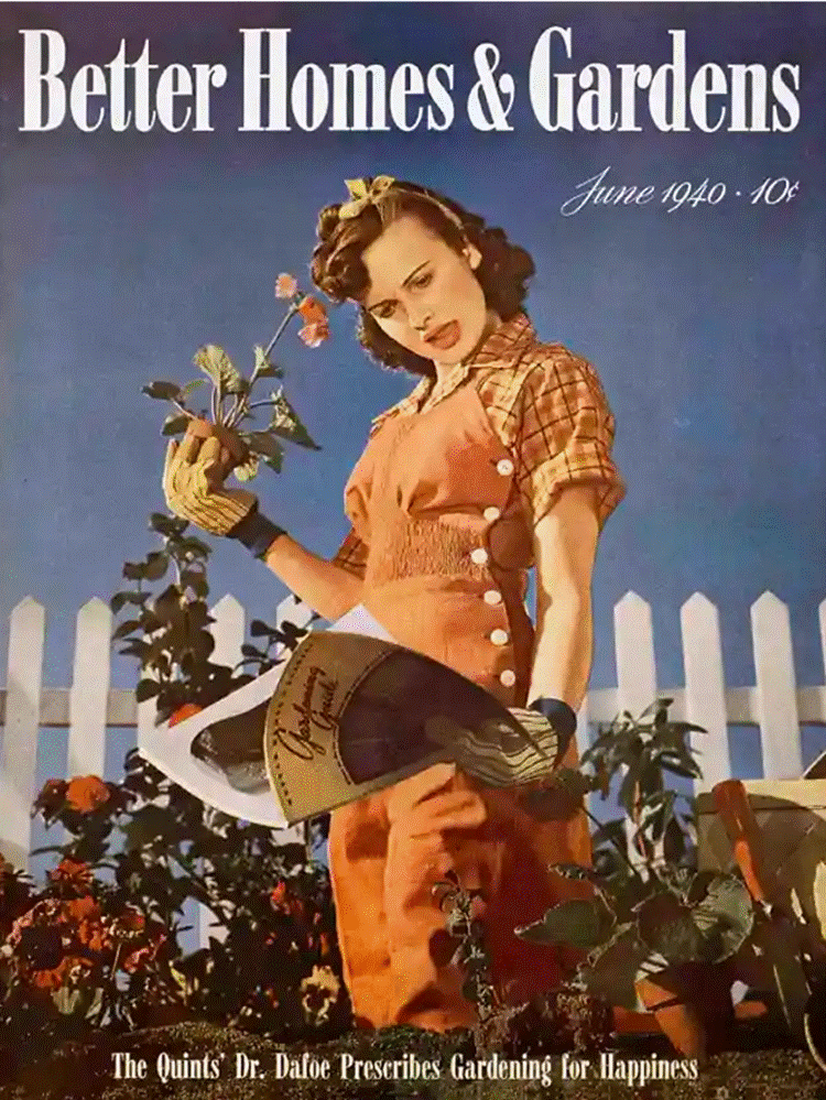
BHG cover 1940. Source: https://www.lippincott.com/work/better-homes-gardens-brand/
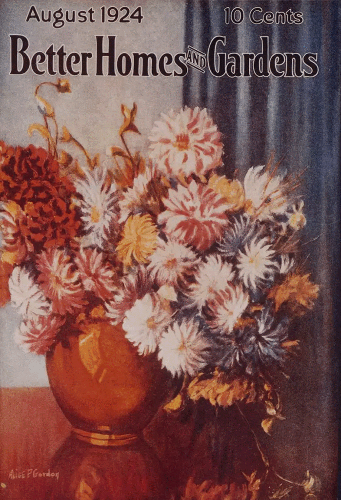
The cover carries illustrations or photographs of gardens and interiors with a masthead in a classic font that resembles Garamond. As early as 1930, the magazine began diversifying its offering, publishing a recipe book entitled Red Plaid Cookbook, which sold some 38 million copies**.
From that day onwards, BHG branched out into a slew of related businesses, publications and investments. It built a media empire out of American homemaking and tradition, and now boasts a much-visited website and long-running TV show, as well as the magazine itself.
BHG ambientata. Source: https://www.lippincott.com/work/better-homes-gardens-brand/
A conventional magazine with traditional graphic design
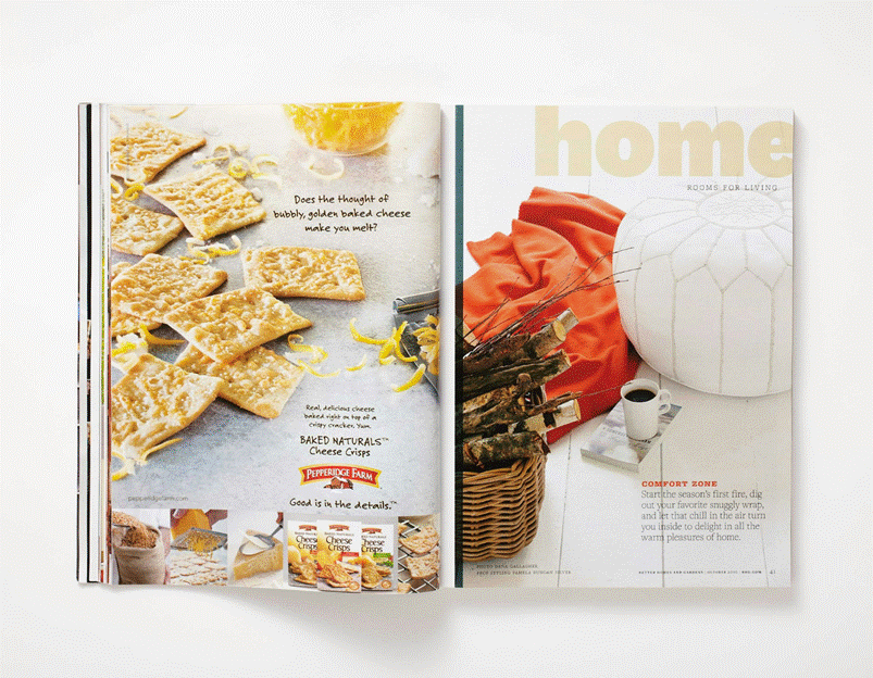
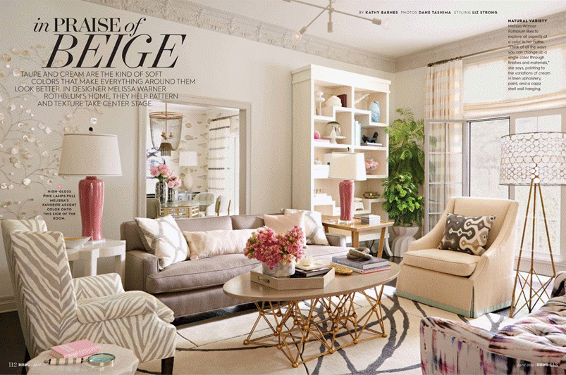
Given the subject matter and target audience, it’s no surprise that BHG’s graphic design is anything but innovative and edgy. It adopts the large format typical of lifestyle magazines, with a layout that is calming and easy to read, plenty of white space, and lots of callouts and coloured boxes.

The fonts used reflect this design philosophy, too: serifs for headlines, sans-serifs for subheads and boxes, and legible serifs like Georgia to ensure the magazine is easy to read.
Script fonts draw attention to specific sections, like tips or tutorials.
The masthead, redesigned in 2017, uses an Austin font that brings out the ampersand linking “Homes” and “Gardens”.
Tradition that endures into the 21st century
In 2010, Pentagram, one of the world’s leading graphic design agencies, was commissioned to give BHG a major makeover.
They found a traditional but elegant magazine full of short sections and brief columns that lent itself to a dynamic re-design.
Pentagram explained that their refresh took this structure into account “by placing an emphasis on the start of each section – opener titles are exaggerated, cropped and rendered in the chunky sans serif font National”.
Nature and naturalness
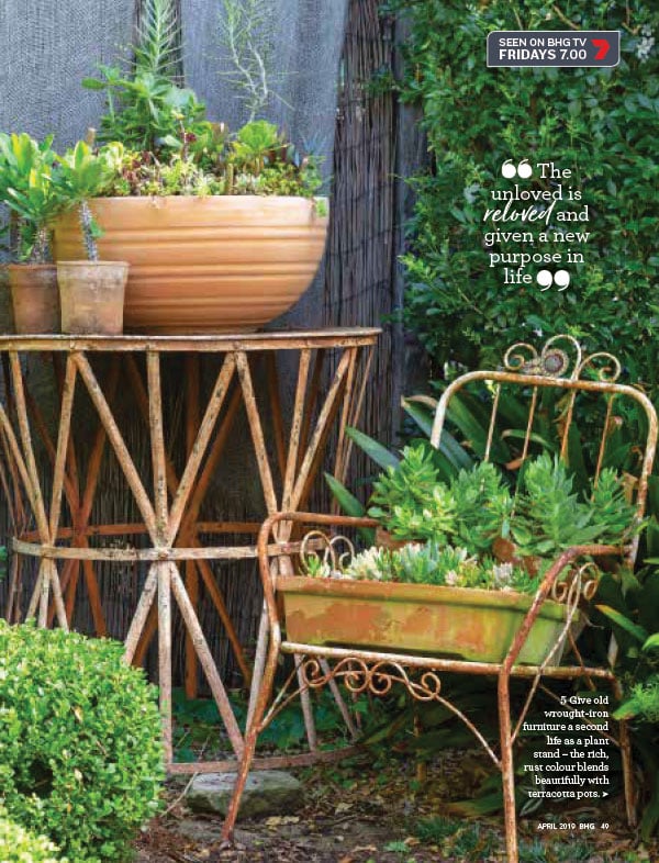
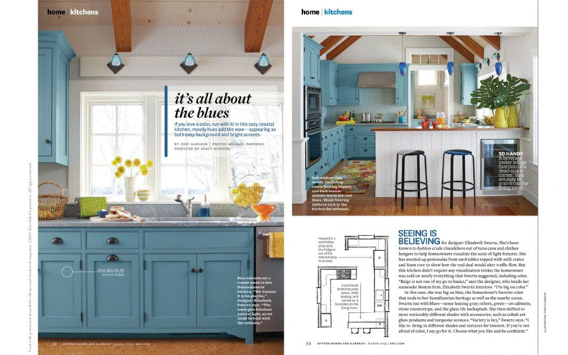
BHG has always been packed with illustrations and photos of interiors and exteriors, of women doing housework and of delicious recipes.
Photos are always well lit and objects and furniture meticulously arranged, almost as if it were an interior design catalogue.
Carefully coordinated colour palettes are pastel or neutral to convey a sense of calm and harmony.
The aim is to create a “domestic dream” effect.
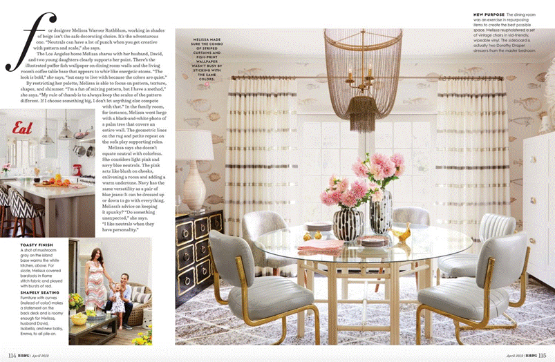
Then there are the pages devoted to gardens. Again, these are painstakingly prepared and photographed, often with complex layouts that incorporate tutorials, tips and storytelling.
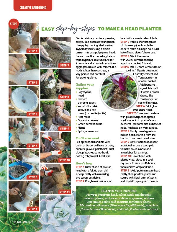
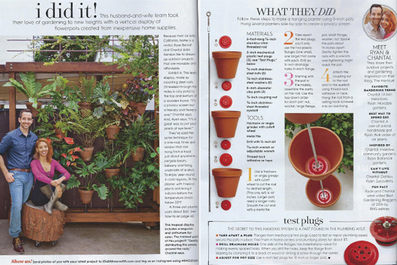
Sections advising on home decoration and renovation adopt a more minimalist and functional design with elements that interact with photos, such as captions, numbers, planting schemes and diagrams.
A well-designed magazine with a positive message
Better Homes and Gardens is a well-designed magazine full of colour and positivity. Although there’s nothing innovative about its design, its pages are always carefully balanced to express the “domestic dream” of an America still rooted in traditions, proud to live in the countryside, far removed from the chaos of its big cities. In this respect, Better Homes and Gardens paints a picture of the old and fading American Dream.
__________
* Data from Wikipedia https://en.wikipedia.org/wiki/Seven_Sisters_%28magazines%29
** Data from: https://www.bhg.com/