
Table of Contents
Minimalism: an increasingly popular trend
It’s the major trend of recent years. Flat design and minimalist style are being emulated everywhere, in every sector. For brands that have been around for decades, it’s often a means of getting back to basics, to simpler things, with no thrills. Updating your logo is also a way to make over your image and to target a younger demographic, a new generation of consumers, a connected generation.
Because these new rules are often associated with the digital age, as it was brands like Facebook, Airbnb, Yahoo, Google and GoDaddy who started the movement 5, 6, even 7, years ago. And when it comes to the automotive sector, BMW wasn’t the first mover. Citroën had changed its logo by flattening the chevrons back in 2016. In the BMW group, MINI had already jumped on the flat design bandwagon in 2017 with a very clean, minimalist version of its logo in black and white. More recently, Volkswagen and Lotus made similar changes to their logos by switching them to 2D. And the most recent example is that of Nissan, which unveiled its new more minimalist, more digital identity last July.
BMW enters a new era
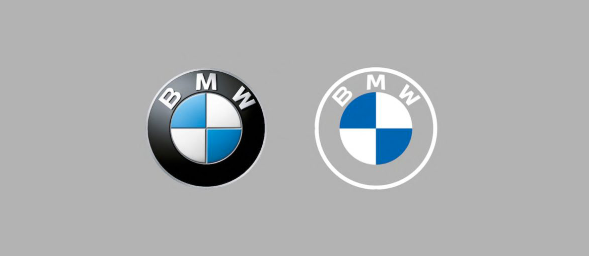
But we digress. The Bavarian car giant, which celebrated its centenary in 2016, had until now only changed its corporate identity five times, which is comparatively little compared to Renault or Volkswagen with 10 and 12 logo versions respectively. This new identity was unveiled at the launch of the new Concept i4. And this new logo marks an enormous change in BMW history. For the first time since the brand was founded, BMW has got rid of the outer black ring and replaced it with a transparent background. Naturally, the logo retains the blue and white check pattern, which is a nod to the colours of the Bavarian flag (and no, the logo doesn’t represent the rotor blades of a helicopter, as many people believe).

A modern logo for big ambitions
For Jens Thiemer, Senior Vice President Customer and Brand: “The new design is an expression of the revised brand identity, which places the customer at the centre of all activities. Pared-down and two-dimensional, it conveys openness and clarity. The additional transparent version of the logo is a more open invitation than ever for customers to join the world of BMW. The change reflects BMW’s transition from centring purely on the automotive world to being about technology and connections. The latest look of the BMW brand is geared towards the challenges and opportunities of digitalisation. The redesigned logotype expresses openness and strength of character to ensure a contemporary, future-proof presence both on- and offline.”

The subtle visuals and graphic flexibility that transparency brings allow the brand to vary its image and easily tailor it to a variety of touch points for different targets. But while this makeover is bold, it arguably has its limitations. Adopting transparency in a logo is risky strategy. It’s clear that, on a dark background or on the radiator grill of the new Concept i4, this new logo works well. But what about a light background?
Perhaps not such a great idea?
BMW hasn’t yet said when this new logo will feature on its production cars, but if it doesn’t adapt the white circle and typography when it appears on light backgrounds (like a white car, an ad with a clear sky or headed paper, for example), the brand risks being reduced to a blue and white spot. The problem with minimalist logos is that, if you simplify too much, you can damage the brand. And in this case, transparency threatens to impede legibility and with it brand recognition.