

Table of Contents
Did you know that, according to data from Kantar Media, only 51% of Brits read at least one book in the past year?
It’s a lot less than many other developed countries, but it’s still a lot of people: around 34 million, in fact. Of these, around 22 million are so-called ‘heavy readers’, reading at least 10 books a year, rather than just a single paperback on the beach.
Why am I telling you this?
Because all these readers need a simple and essential tool to keep track of their reading: a bookmark.
Bookmarks, a brief history
Bookmarks first appeared at the same time as the production of the first handwritten books, and were probably used in the first codices. They emerged in Europe, Africa and Asia, and were predominantly rigid (made of wood, bone or gold or other metals), because at the time books were still unique and precious objects.

It was during the middle ages that the foundations were laid for the bookmark as we know it today, with the use of string, strips of leather and ribbons, followed by the first paper or thin wooden bookmarks, and eventually the development of various unique and ingenious solutions, including rotating bookmarks.

In the nineteenth century the bookmark became the tool we now know and love, printed on paper and often including a hole with a small string tied through it. From then on, with the invention of advertising and increasing literacy rates that made books a mainstream product, the bookmark started to play an important role in promoting businesses.
Why do we need bookmarks?
Bookmarks are objects that are handled and seen many times – indeed they can become a reader’s trusty companion, used over and over again for different books.
As well as being useful, they must also be beautiful, fun and engaging – basically they should inspire people to want to use them.
They are not business cards: in my opinion, people who fill bookmarks with information, special offers and text are making a mistake. Resist the temptation to fill every last square inch!
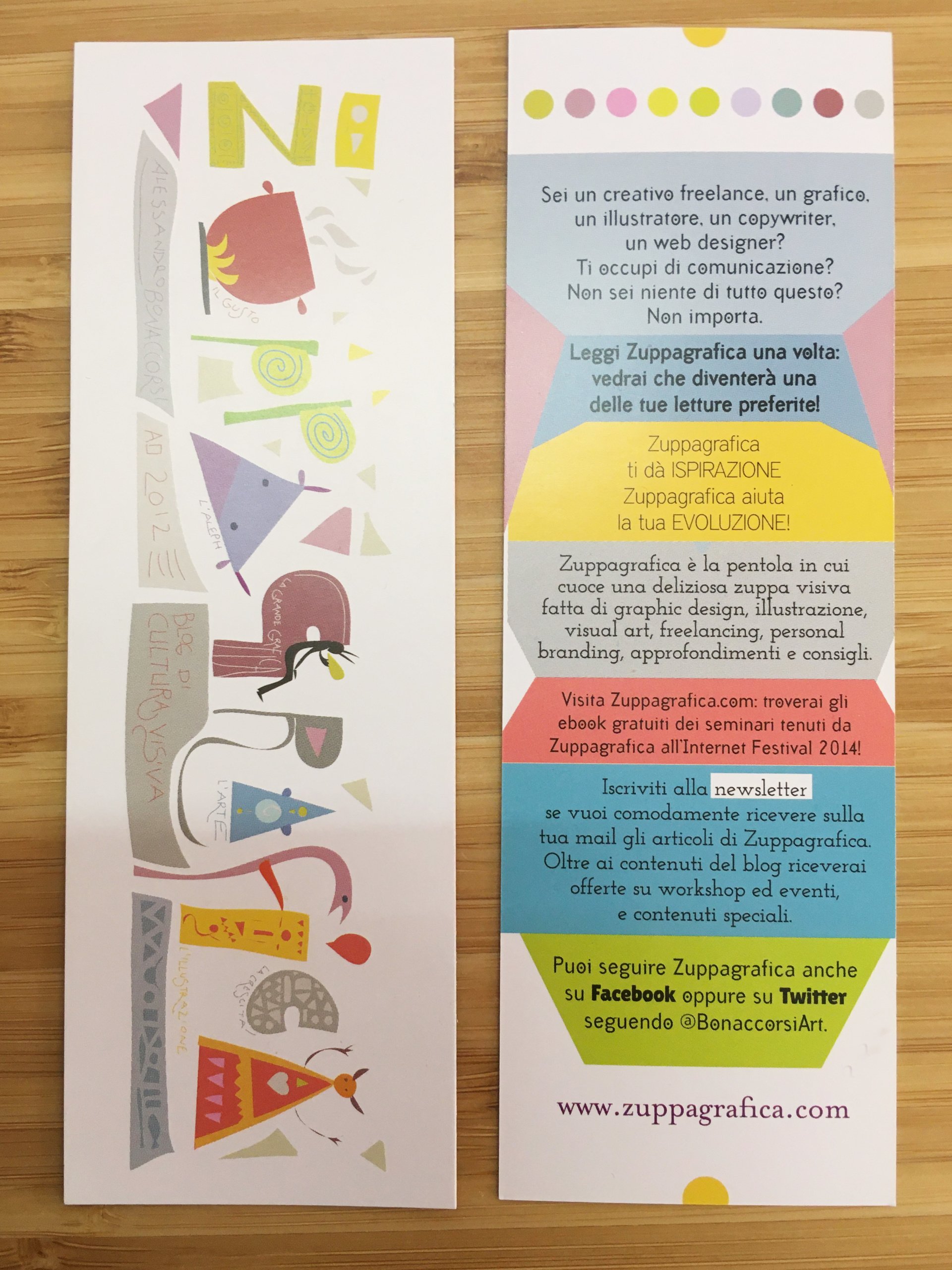
For example, this is a bookmark I made many years ago, where I decided to add a lot – indeed, too much – information to promote the blog I was writing at the time. Everyone saw it as a mini-flyer, a sort of unusual business card, and nobody would have used it between the pages of a book, or at least not intentionally.
How to design a bookmark?
Bookmarks are simple graphic design products, but precisely for this reason it is important to design them well and not make any mistakes.
The first thing to do is to choose the optimum size and paper.
Here are some recommendations:
1.Size
A bookmark should be:
- 5-8 cm wide
- 12-21 cm long
These intervals have been chosen because bookmarks have to fit easily between the pages of a book, and the smallest standard books are around 14-15 cm long.
On our website you can find special deals on the standard 5 x 21 cm format, suited to larger books.
2.Paper
The paper you choose for your bookmark should be quite thick, but not as heavy as card: between 150 and 250 gsm is perfect. The finish is also important – if you opt for recycled or natural paper there’s no need for additional finishes, but coated paper may be even more effective with lamination added.
You may also consider a shaped cut; in this case you need to order our Custom Tags, cut to your chosen shape.
3.The different parts of a bookmark
Bookmarks are divided into two parts: the front and the back. Since the cost of printing remains the same, it’s worth making use of both. Leaving the back blank makes a bookmark look cheap and unprofessional.
The front is the most important part, and must have a striking design (we’ll look at this in more detail in the next paragraph), while the back should contain a brief text, potentially a call to action (but extremely short) and your contact details (name, website, email and potentially your phone number or address).
Once you have established the basic layout, you can create the graphic design. As mentioned above, bookmarks must grab people’s attention, and be fun or loveable in some way – providing a certain extra something that adds value to their function. After all, their function can be performed by any scrap of torn paper, even toilet roll!
You’d think it would be easy to do better than a piece of Andrex, but you’d be surprised: there’s a lot of work involved!
Deciding on a bookmark’s appearence
There are basically two ways of making a bookmark:
- base it on an image
- base it on a piece of text
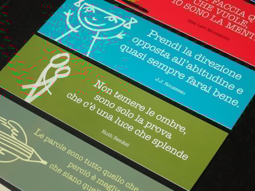
Bookmarks based on text
From a graphic design point of view, bookmarks featuring a piece of text are perhaps more complex: the choice of the colour and the font and its size will have a huge influence on the final result. The best advice I can give is to keep things simple and maintain consistency with the rest of the project.
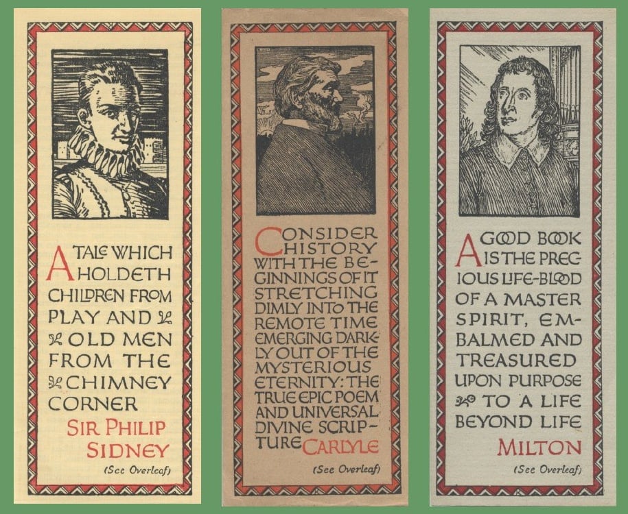

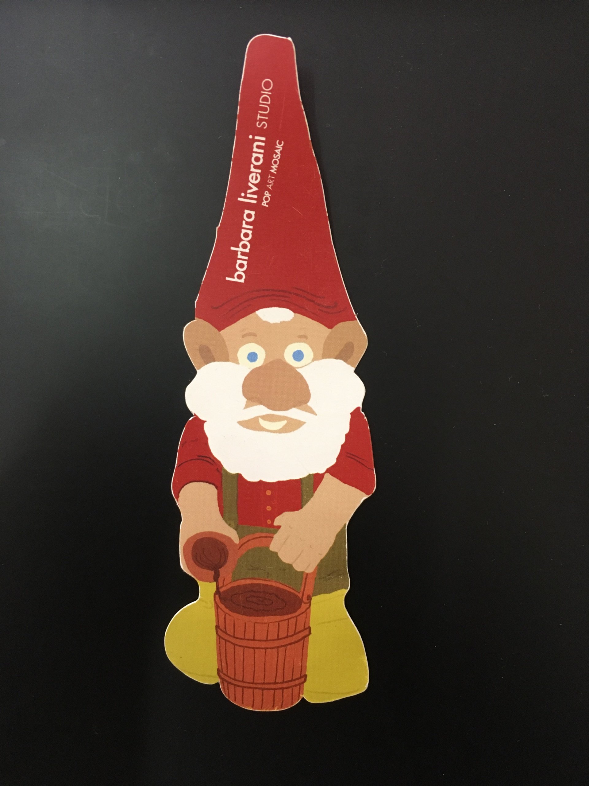
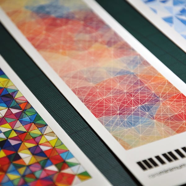
Bookmarks based on an image
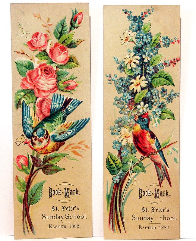
Bookmarks featuring an image are the most common, and therefore are difficult to make original and recognisable. The following are all common:
- bookmarks featuring famous paintings
- bookmarks featuring graphic designs
- bookmarks featuring illustrations and drawings
- bookmarks featuring photos
A similar classification could be done for book covers or postcards, but for bookmarks the image must be designed or cropped in a vertical format, in a narrow strip, making it difficult to find the right image or a successful way to crop it.
The best advice is to try, try and try again, including printing some draft versions, to work out which image or cropping technique works best.
When you’re creating or commissioning the image yourself, you just need to be creative and imaginative: simply adding a logo or a drawing by a good illustrator is not enough to produce a successful bookmark.
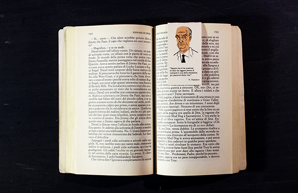
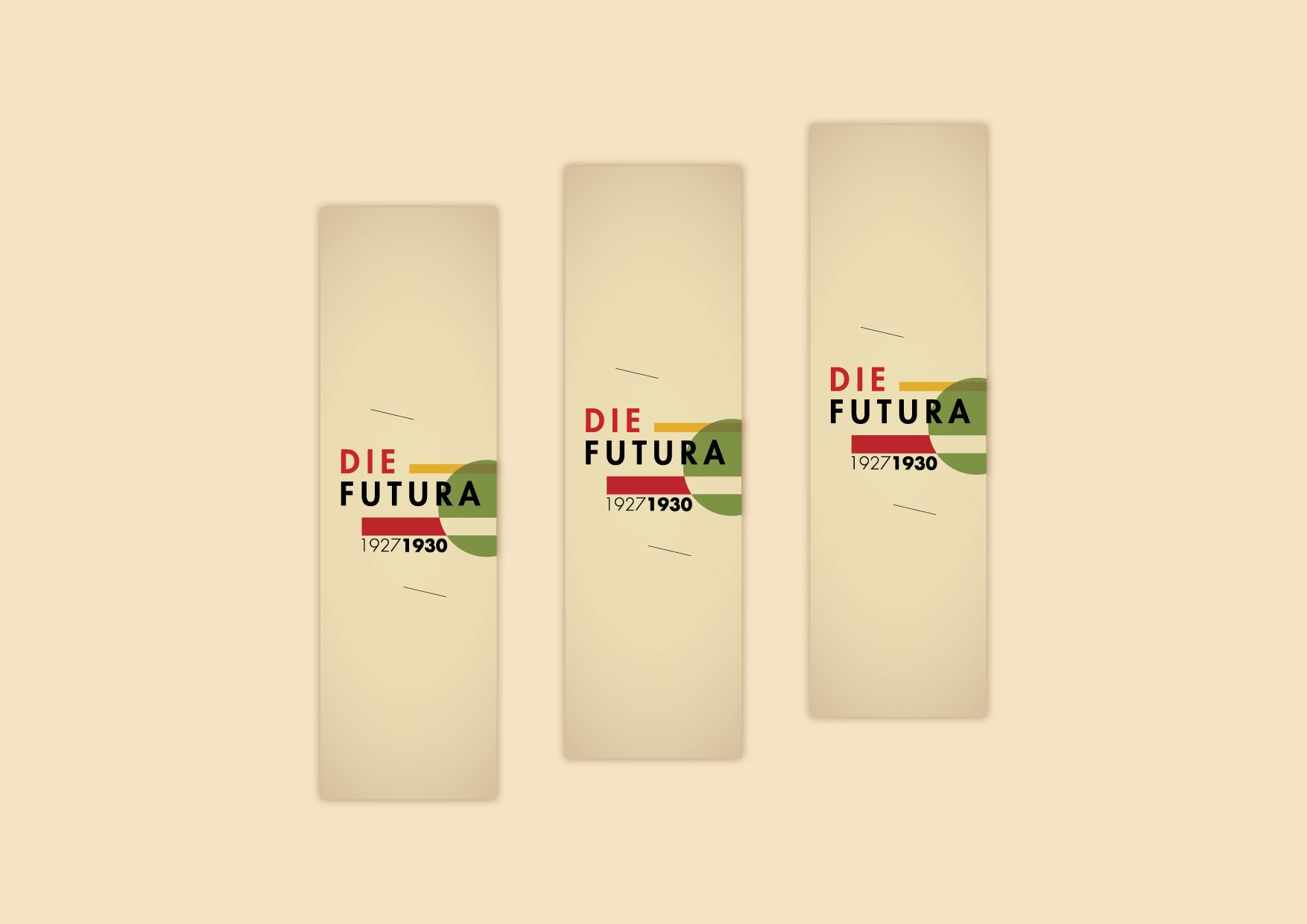
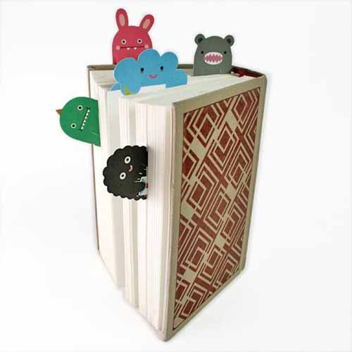
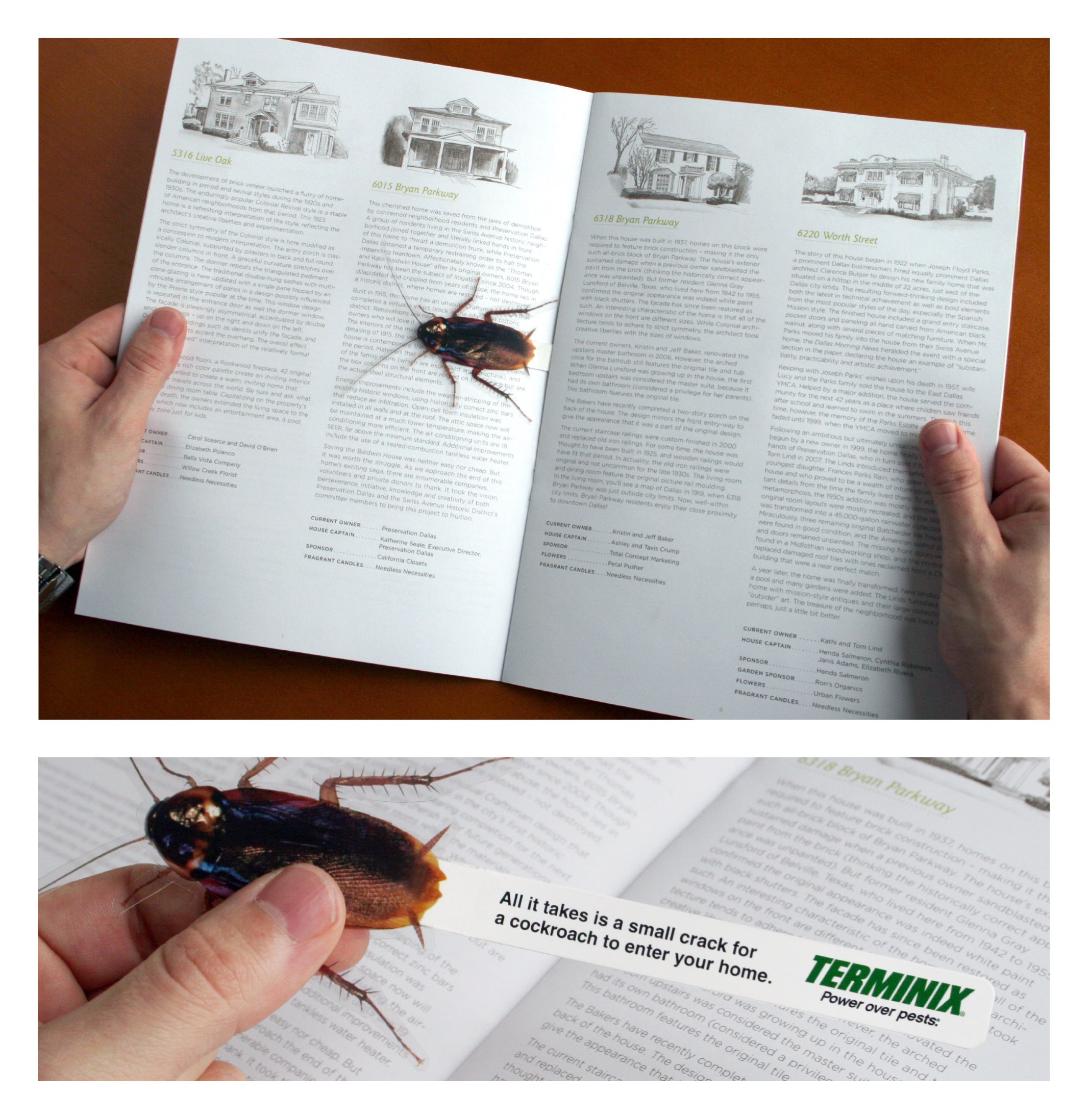
Some examples of creative bookmarks
One thing bookmark designers love doing is playing around with their function, such as their role in the book or their position within the pages, as shown in the examples below.

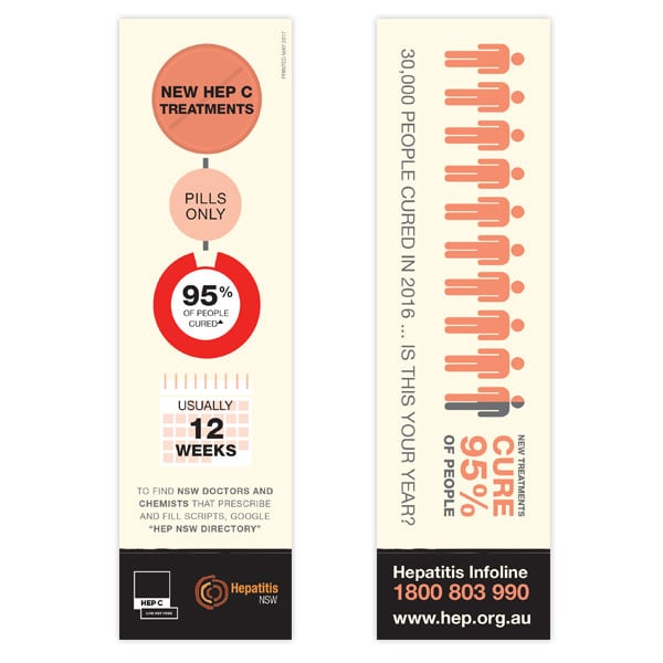
Don’t forget that since bookmarks are cheap and potentially seen by everyone who reads, they can also be perfect for non-commercial uses, such as this Australian non-profit organisation that offers tips on fighting hepatitis C.
The key to a perfect bookmark? Imagination!
In conclusion, bookmarks are objects with enormous scope for playing around with graphics and images. Whether you use them to promote yourself or your clients, to provide information or to raise awareness, to give away or to sell, the important thing is that you make them interesting in some way. Whether fun, intelligent, beautiful or bizarre, they have the potential to be a key marketing tool in many promotional campaigns or to increase your visibility and ensure people remember you.
Marketing Strategies Using Bookmarks
1. Brand Visibility and Recognition
Bookmarks are an excellent canvas for maintaining and enhancing brand visibility. When designed effectively, they can serve as a constant reminder of your brand every time the user opens their book. This is achieved by incorporating your brand’s unique visual identity into the bookmark design.
- Consistent Branding: Ensure that your bookmarks reflect your brand’s color scheme, logo, and font styles. Consistency across all marketing materials helps to reinforce brand recognition.
- Contact Information: Make sure to include essential contact details such as your website, email, and social media handles. This makes it easy for customers to reach out or learn more about your offerings.
2. Customization and Personalization
Customizing bookmarks can significantly enhance their appeal. Personalized bookmarks show that you value your customers, which can foster loyalty and repeat business.
- Customer Names: Adding the recipient’s name to the bookmark can make it feel exclusive and special. This personal touch can increase the likelihood of the bookmark being used and kept.
- Tailored Messages: Craft messages that speak directly to the interests or needs of your customer segments. For example, a bookstore might include recommendations for books based on past purchases.
3. Promotional Offers and Incentives
Bookmarks can double as promotional tools by including special offers or discounts. This not only incentivizes repeat purchases but also tracks the effectiveness of your marketing efforts.
- Coupon Codes: Print unique discount codes on your bookmarks. This encourages customers to make additional purchases and provides a way to track the success of your bookmark campaign.
- Seasonal Offers: Highlight special sales, holiday promotions, or limited-time offers to create a sense of urgency and drive immediate action.
4. Collaborations and Cross-Promotions
Partnering with other businesses, authors, or publishers can extend the reach of your bookmarks. These collaborations can introduce your brand to new audiences and add value to the bookmark.
- Co-Branding: Share the bookmark space with a complementary brand. For instance, a coffee shop and a local bookstore could create a bookmark that promotes both businesses.
- Event Promotions: Use bookmarks to advertise upcoming events such as book signings, launches, or community gatherings. This can increase attendance and create buzz around your brand.
5. Educational Content and Tips
Providing useful content on bookmarks can make them more likely to be retained and used. Educational material not only adds value but also positions your brand as a knowledgeable and helpful resource.
- Reading Tips: Offer advice on improving reading habits, such as setting goals or creating a comfortable reading environment.
- Fun Facts: Include interesting trivia related to your industry or products. This can make the bookmark a conversation starter and more engaging.
6. Eco-Friendly Materials
Using sustainable materials for bookmarks can enhance your brand’s image by showing a commitment to environmental responsibility. This can appeal to eco-conscious consumers and set your brand apart.
- Recycled Paper: Opt for bookmarks made from recycled or sustainably sourced paper. Highlighting this choice can attract customers who value sustainability.
- Soy-Based Inks: Use environmentally friendly printing options, such as soy-based inks, which are less harmful to the environment compared to traditional inks.
7. Interactive Elements
Adding interactive features to your bookmarks can engage users in new and exciting ways. This can enhance the user experience and make your bookmarks memorable.
- QR Codes: Incorporate QR codes that lead to your website, a special offer, or an interactive experience. This not only drives traffic to your online presence but also adds a modern touch to your marketing materials.
- Augmented Reality: Implement augmented reality (AR) elements that come to life when viewed through a smartphone app. This can create a unique and immersive experience that leaves a lasting impression.
8. Distribution Channels
Effectively distributing your bookmarks is crucial to maximizing their impact. Consider various channels to ensure your bookmarks reach your target audience.
- Event Giveaways: Distribute bookmarks at trade shows, book fairs, and community events. This can attract new customers and increase brand awareness.
- In-Store Displays: Place bookmarks near checkout counters or in high-traffic areas within your store. This makes it easy for customers to pick one up during their visit.
- Direct Mail: Include bookmarks in direct mail campaigns. This not only adds value to your mailings but also increases the chances of your promotional materials being kept and used.
By leveraging these strategies, bookmarks can become an effective, low-cost tool for enhancing brand awareness, customer engagement, and promotional efforts. Whether through personalized designs, collaborative efforts, or interactive features, bookmarks can provide a unique and memorable marketing touchpoint for your audience.
Have fun!
If you need more inspiration, there are ten more examples here:
https://www.creativebloq.com/graphic-design/bookmark-design-1131695
Would you like to help us add to or improve the content of this article? Check our guidelines and send us your request via email at: seo@pixartprinting.com.