
Table of Contents
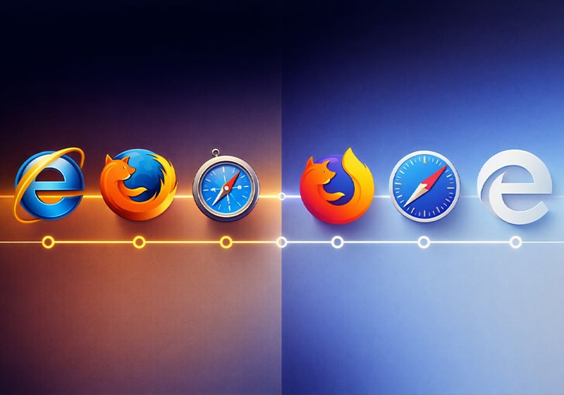
Today we’re talking about internet icons, in the true sense of the word – the logos of the browsers that have accompanied our life on the web since the mid-1990s. And we’re doing it at a pivotal moment, when, more than ever before, the future of browsers hangs in the balance.
First, a quick explainer for those of you who aren’t sure what we’re going on about! Browsers are simply the various apps that allow you to access websites, including popular options like Chrome, Firefox, Safari, Edge and Opera. However, their existence in their current form is now being challenged, as in many areas of life, by the advent of artificial intelligence chatbots. ChatGPT and its ilk have already launched the first AI browsers, which promise to provide all the answers we need and do all our browsing for us. If they keep their promise… will browsers as we know them today still need to exist?
While we wait to find out the answer to this question and to see how the online landscape might shift as a result, we thought we’d indulge in a bit of nostalgia with a dive into the history of some of the most famous browsers.
Our focus will be how browser logos have evolved over the past 30 years!
Netscape: the logo of the 1990s’ most popular browser
In the beginning… there was Netscape.
Ok, perhaps that’s going a bit far. Netscape wasn’t even the first browser: the very first was called WorldWideWeb and was created in 1991 by the internet’s inventor Tim Berners-Lee, but it was mostly a tool for insiders. The first browser designed with the public in mind was Mosaic, which later evolved into Netscape.

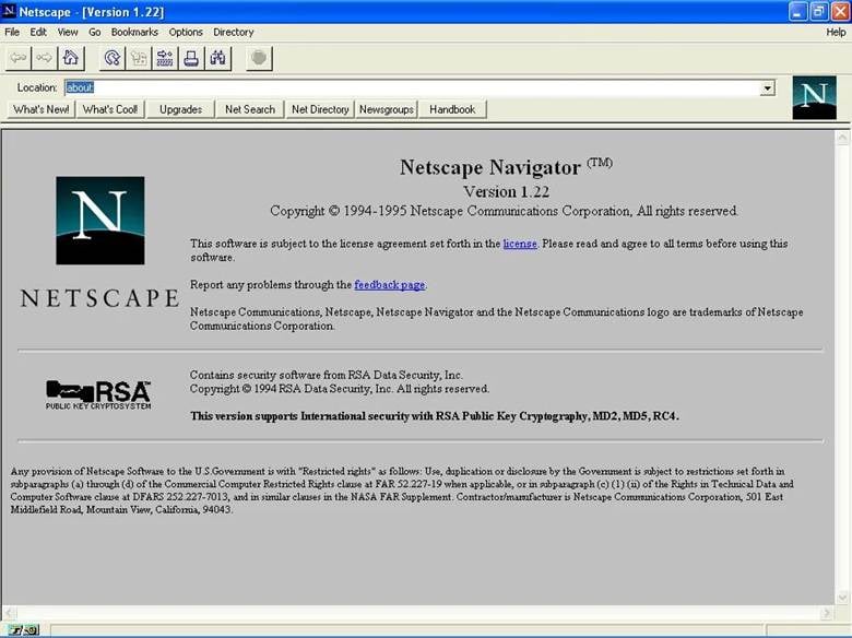
Netscape was undoubtedly the first successful internet browsing software, and it became the 1990s’ most popular browser. Launched in late 1994, it was the first essentially graphical browser, inspiring all the others that followed in its wake. One of the innovations it introduced was progressive page loading, meaning users no longer had to stare at a blank page for several minutes waiting for their slow connection to load the whole thing.
All in all, the way we have browsed the web over the past three decades is mostly down to Netscape. The events that led to its demise are well documented: following its golden age, in the late 1990s it lost the ‘browser war’ with Internet Explorer, in part because the latter had monopolised the market. The Netscape project ended for good in 2007.
Before we move on to some other browsers, a quick recommendation for you: if you’d get a kick from seeing some old pages from the early days of Netscape, take a quick trip around this digital museum!
The much-loved, much-hated and much-derided Internet Explorer, one logo at a time
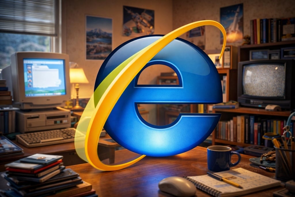
It may now be the source of much resentment – not to mention the star of countless memes and satirical pages poking fun at its now proverbial slowness – but you have to admit: Internet Explorer is the browser that accompanied most of us on our early exploration of the internet.
At its prime, in the early 2000s, Internet Explorer reached a 90% market share, in part because it was integrated by default into the Windows operating system. This move was subsequently ruled illegal and monopolistic, but by that point it was already too late for its main rival Netscape.
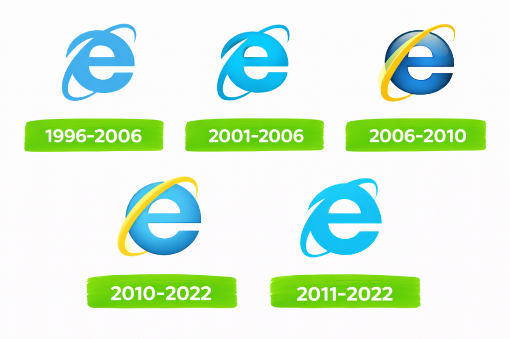
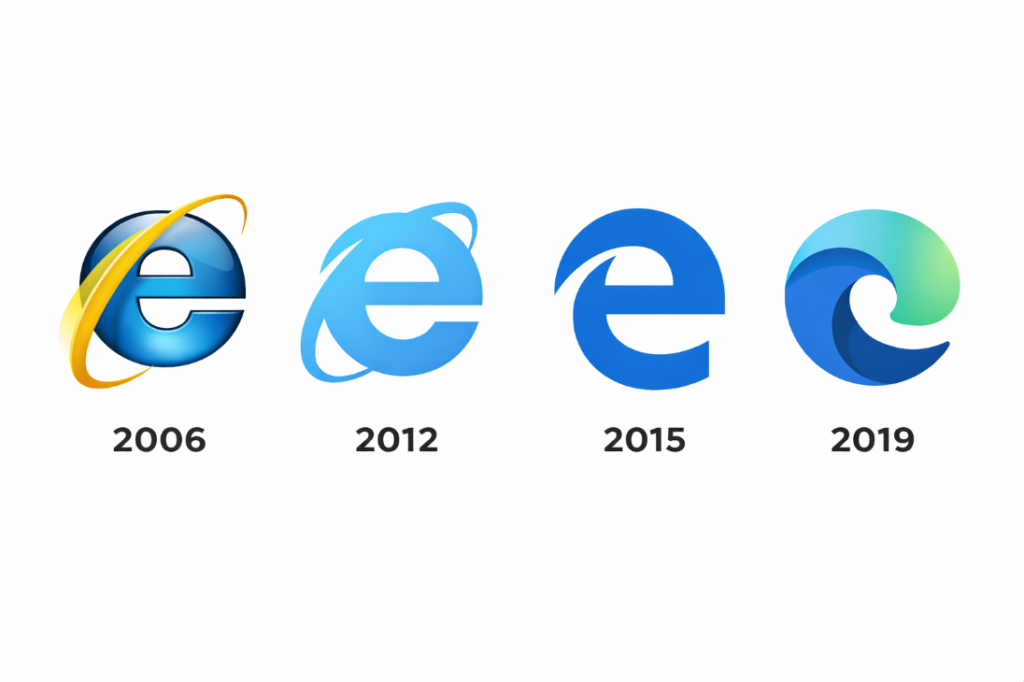
Internet Explorer was therefore the quintessential browser of the 2000s. Microsoft released the first version in 1995, basing it on its forerunner Mosaic. The iconic letter E with an orbital ring, which symbolised dynamism and connection, appeared for the first time in 1996. And this simple yet effective image came to symbolise the internet for at least a decade: the logo’s later redesigns never strayed far from the 1996 original.
Although Internet Explorer won the browser war with its rival Netscape in the late 1990s, a decade later its luck ran out. In the so-called second browser war at the end of the 2000s, Microsoft’s browser came up against new competitors, Mozilla Firefox, Safari and – in the 2010s – Chrome, which shattered Internet Explorer’s monopoly once and for all.
Microsoft retired Internet Explorer in 2022, having launched its successor, Microsoft Edge, in 2015. Although initially the Edge logo maintained the connection with the iconic letter E, its 2019 redesign saw the final end of its association with Internet Explorer. Today, Microsoft’s browser logo looks more like those of its direct competitors Chrome and Firefox.
Opera: The browser logo that popularised tabs
We’ve reached the post-Internet Explorer era of the 2010s. Let’s start by telling the story of the logo of one of the browsers that proudly fought (and lost) a commercial war with their rivals: Opera.
Not many people know that Opera originated in the far north. It started life as a research project run by Norway’s leading telecoms company Telenor, and was officially launched in 1995, making it the longest-lived browser still in existence.
It was one of the first pieces of internet software to make extensive use of tabs, way back in the 2000s: today they remain a common feature of browsers, allowing users to multitask/procrastinate by opening an unlimited number of new windows within the browser.
Interestingly, the browser has enjoyed great success in Africa. It is the fifth most popular browser in the world, but especially in the 2010s it was far and away the best-loved software in a huge number of African countries. The reasons for this success are still debated, but it is probably due to the browser’s ‘mini’ version, which made more effective use of data over slower connections.
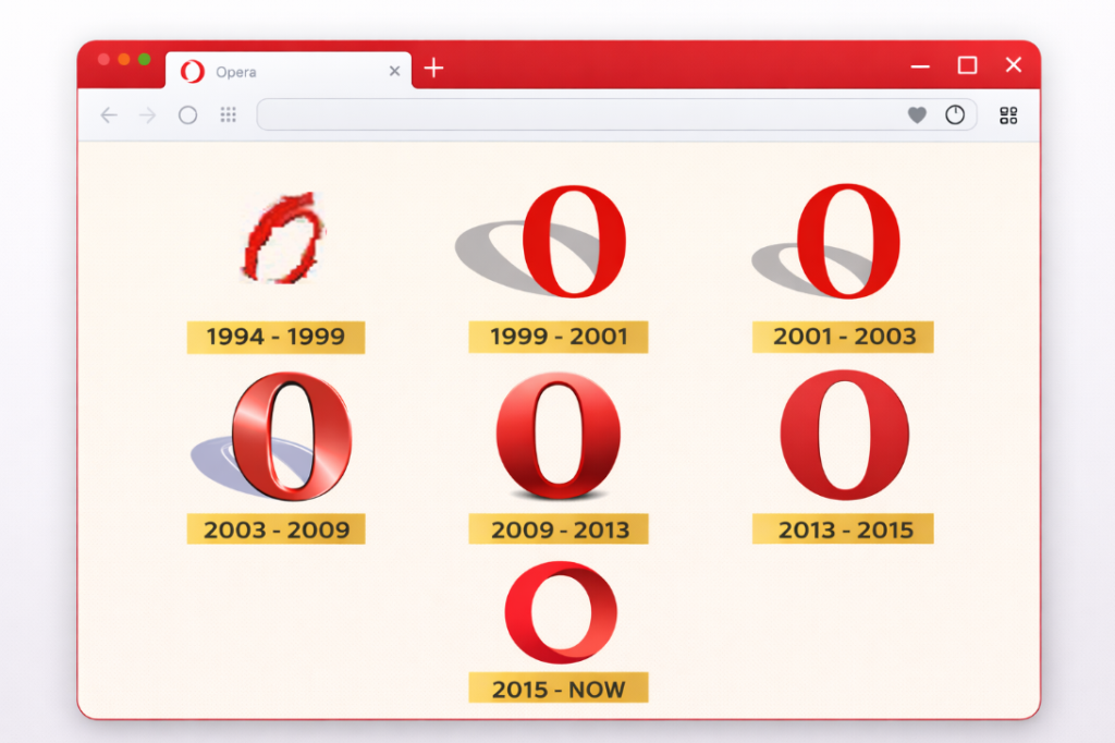
Now let’s take a look at Opera’s logo. The letter O – a fierce rival to the other vowel symbol used by Internet Explorer – appeared back in 1994 and has changed design several times: over the years a shadow and a 3D effect have been added, and then subsequently removed. The red colour has always stayed the same, however, and this remains the browser’s most distinctive feature.
Firefox: the browser logo with a bushy tail
Another worthy competitor in the browser war is Mozilla Firefox, which currently sits in fourth place in the list of the world’s most popular browsers.

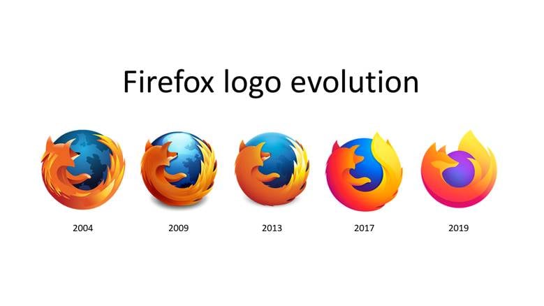
Firefox was created in 2002 by the Mozilla Foundation, and presented itself to the world as Netscape’s spiritual successor. When it was first developed it had a different name and a different symbol: a phoenix. It was only when it was officially launched in 2004 that the now iconic fox was introduced to represent it.
The Firefox logo, which depicts a flaming fox embracing the Earth, has remained relatively similar over time. As with the other browsers’ logos, Firefox’s logo has become gradually more stylised as the years have progressed, from a 3D image with numerous details to a simpler and more modern version.
In the late 2000s, Firefox seemed destined to win the scrap with the other browsers: in 2009 it shook Internet Explorer to the core by taking about a third of the global market share and becoming the world’s most popular browser. Unfortunately for the fox, however, Google Chrome appeared on the horizon a few years later.
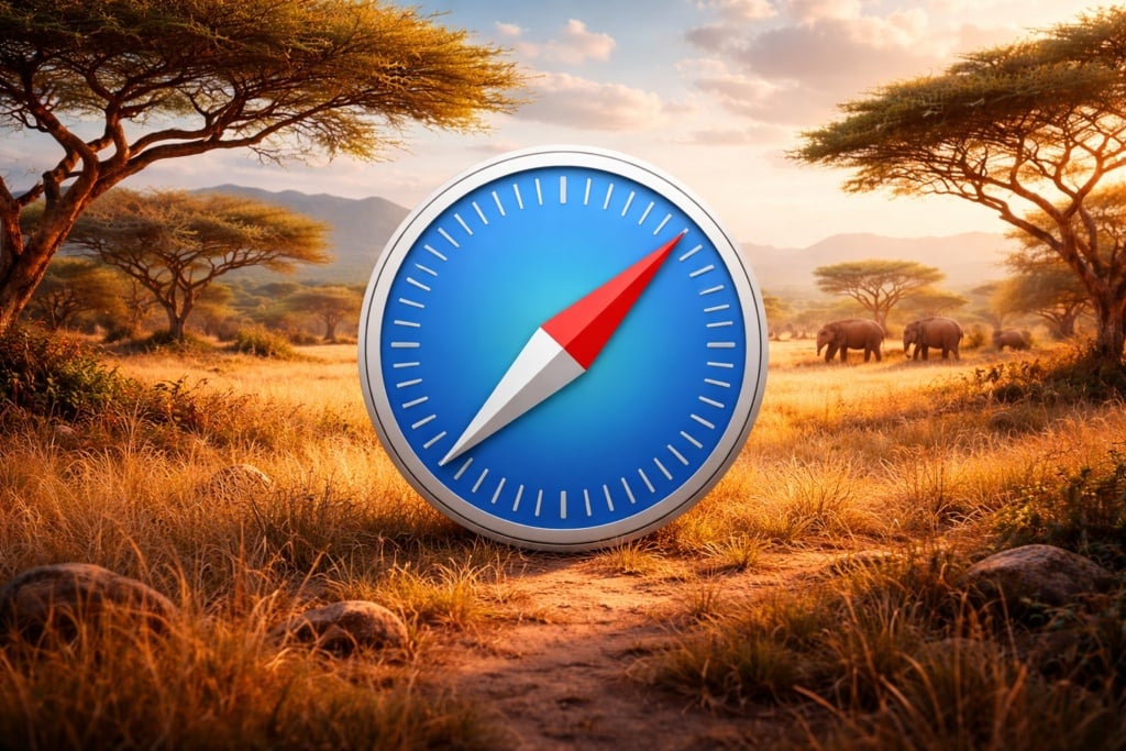
Safari: the logo of Apple’s browser
But before we get to the winner of the browser war, let’s see who had to settle for the silver medal. The world’s second-most popular browser is Safari: the default browser on Apple’s operating systems.
Apple launched Safari in 2003 with the clear aim of denting the extraordinary power held by Internet Explorer at the time, or at least putting up a fight within its proprietary operating systems. From 2007 the browser was also added to the newly launched first generation of iPhones.
Today, largely thanks to its integration into iPhones and iPads, Safari is the world’s second most popular browser, with around 15% of the market share.
Here’s an interesting fact for you: rejected names for the browser included iBrowse and Alexander, in honour of Alexander the Great.
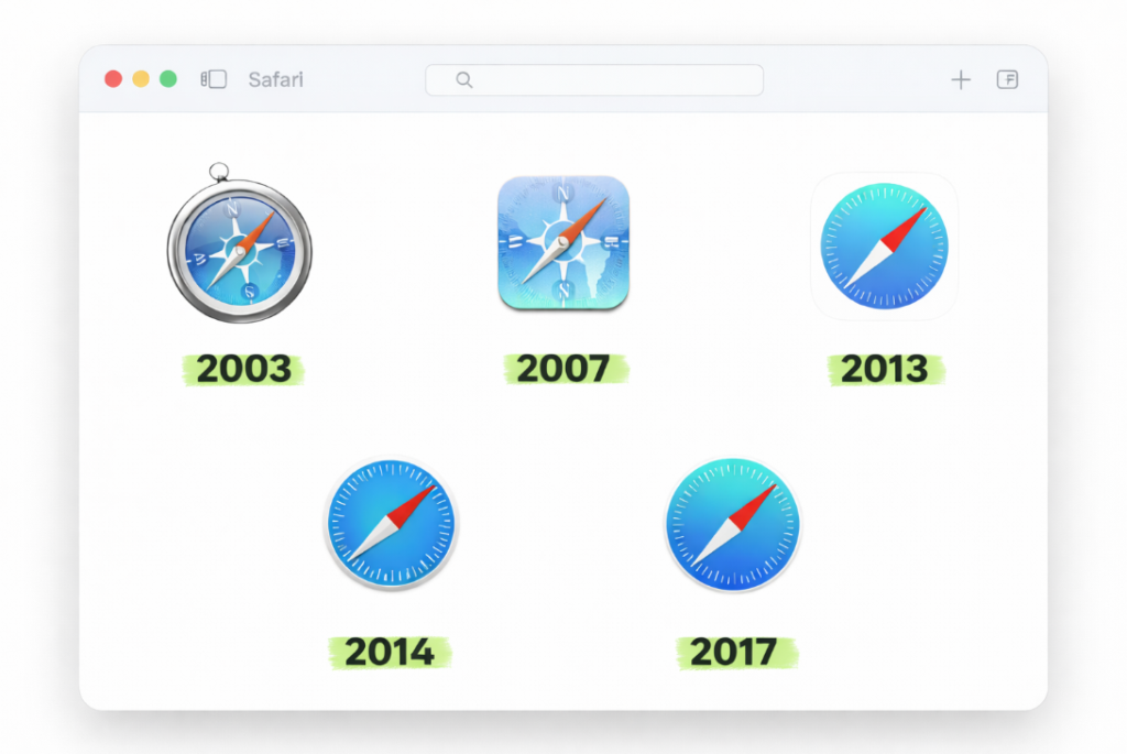
Apple decided to use a compass as the image for its browser, and once again the logo has clearly been simplified over the years. The first version was a highly detailed and sparkling compass, and since then the designs have become increasingly stylised, right through to the latest redesign in 2017.
However, one thing has never changed on the Safari logo: the compass needle has always pointed north-east, instilling the image with dynamism.
Google Chrome: the logo of the most popular browser in the world today
We’ll conclude our round-up with the current victor of the browser war: Google Chrome, the world’s most popular browser (as you can see at a glance from this graph).
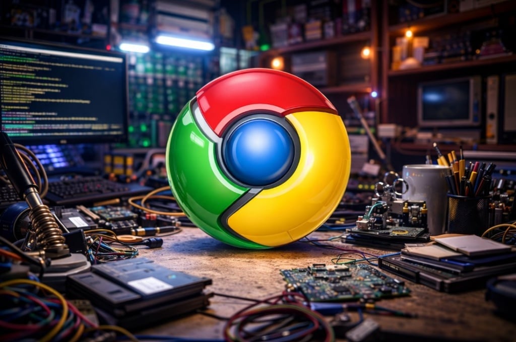
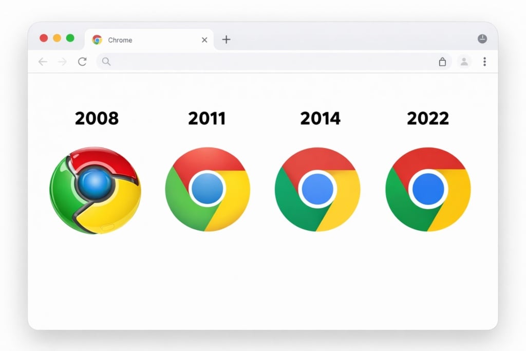
Chrome was launched by the search engine Google on 1 September 2008, and immediately stood out for its minimalist look and its speed. It introduced various innovations that we now take for granted, like the way typing a word in the address bar takes you straight to search engine results.
Although the logo has not changed a great deal since the 2008 version, it has been simplified. The shiny, metallic 3D sphere in the colours of the Google logo (red, yellow, green and blue) has been replaced by a flatter, simpler and more modern version.
But what does the future have in store for browsers? Chrome may have won the browser war, but it certainly cannot afford to rest on its laurels. The emergence of AI is radically changing the internet landscape, and another battle between browsers and their rivals with links to artificial intelligence is looming on the horizon.
Google, with its chatbot Gemini, is one of the biggest investors in the sector. Will it manage to effectively integrate AI into Chrome and challenge a new generation of AI browsers?
Or perhaps – who knows? – we’ll simply end up waving farewell to these pieces of software that have kept us company in our online exploration over the past 30 years.
What do you think? Do you like how browser logos have evolved over the past few decades? And what kinds of images do you think might accompany a new generation of internet browsing tools?