
Table of Contents
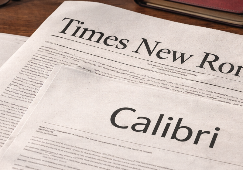
In recent days, an intriguing piece of news has begun to circulate: the US administration may be preparing to phase out Calibri from institutional documents, returning instead to the more traditional Times New Roman. A seemingly marginal, almost trivial decision that has nevertheless sparked a surprisingly wide debate.
Beyond the formal confirmation of a directive applying across federal institutions, the issue itself is entirely legitimate. Because a typeface is never just a typeface. It is a cultural, technical and symbolic choice. And when it concerns official documents, laws and public communication, its significance extends far beyond graphic design.
This episode offers an opportunity to step back and ask why Calibri and Times New Roman have become the focus of a broader confrontation, to revisit their histories and to reflect on what they truly communicate.
Why institutional typefaces are debated
Every institution has a voice. And that voice is also shaped by the form of its letters.
In official contexts, typography is not meant to impress or to stand out; it is meant to convey clarity, reliability and continuity.
Over time, governments and public administrations have adopted precise typographic standards in order to:
- ensure consistency across documents
- improve readability
- avoid ambiguity or misinterpretation
- reinforce an image of authority
The debate between Calibri and Times New Roman emerges precisely from this tension: modernity versus tradition, digital efficiency versus historical memory.
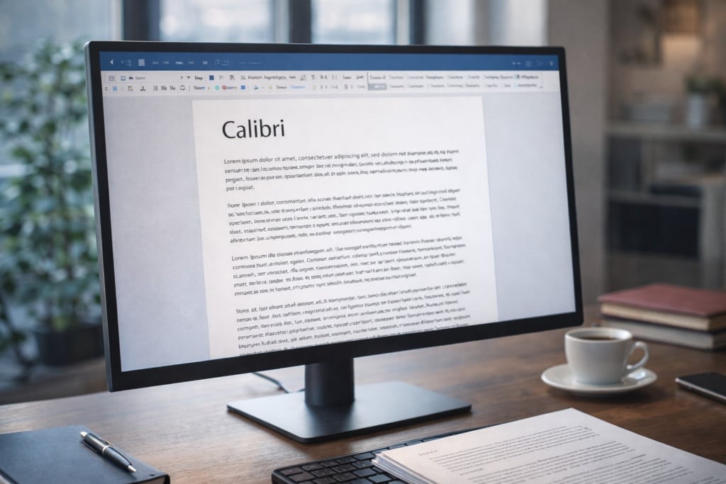
Calibri: the typeface of the digital era
Origins and design
Calibri was developed in the early 2000s within Microsoft as part of the ClearType project. Its purpose was clear: to create a typeface optimised for on-screen reading, designed for LCD monitors and digital documents.
In 2007 it became the default typeface of Microsoft Office, replacing Times New Roman. Within a few years, Calibri had entered millions of administrative documents, emails, reports and official communications.
Typographic characteristics
Calibri is a humanist sans-serif typeface:
- soft, rounded strokes
- open proportions
- generous spacing
- absence of serifs
These features make it:
- highly legible on screen
- efficient for long texts
- visually clean and neutral
Why it was chosen
Calibri embodies the idea of a modern administration:
- digital
- fast
- standardised
- functional
Yet this very neutrality has also attracted criticism. For some, Calibri appears too informal, too closely associated with the corporate and technological world, and insufficiently solemn to represent the State.
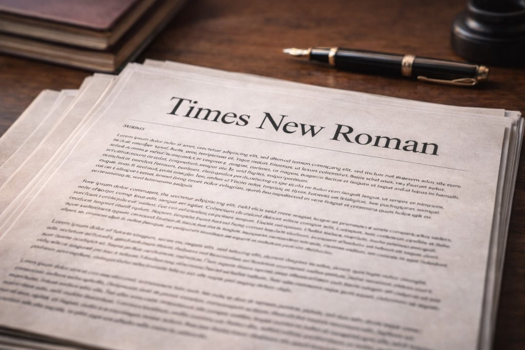
Times New Roman: the voice of tradition
An editorial history
Times New Roman was created in 1931 for The Times of London. It is a serif typeface designed for print, intended to be legible, compact and authoritative on paper.
Throughout the twentieth century it became a global standard: books, newspapers, academic papers and official documents. For decades, it was the typeface of seriousness by definition.
Typographic characteristics
Times New Roman is a classic serif:
- pronounced serifs
- strong contrast between strokes
- high text density
This makes it:
- well suited to print
- immediately recognisable and familiar
- strongly associated with formality
Strengths and limitations today
While it conveys authority and continuity, Times New Roman is often perceived as:
- outdated
- overused
- less suitable for on-screen reading
And yet, it is precisely this sense of age and familiarity that many find reassuring.
Tradition or functionality? A false dilemma
The opposition between Calibri and Times New Roman is not a battle between right and wrong. Rather, it reflects a deeper question:
what image should a public institution project today?
- Historical continuity or technological adaptation?
- Familiarity or efficiency?
- Solemnity or accessibility?
Each typeface responds differently to these demands. And neither can be said to be “better” in absolute terms.
When typography becomes the language of power
The choice of an institutional typeface is a silent yet powerful act.
It does not make headlines like legislation, but it shapes the perception of the State day after day, document after document.
Calibri tells the story of an administration oriented towards digital processes, standardisation and speed.
Times New Roman evokes an institution reconnecting with its history, its forms and its rituals.
To describe this choice is not to take sides, but to acknowledge that letters themselves speak — and that, at times, they say far more than we might expect.