
Table of Contents
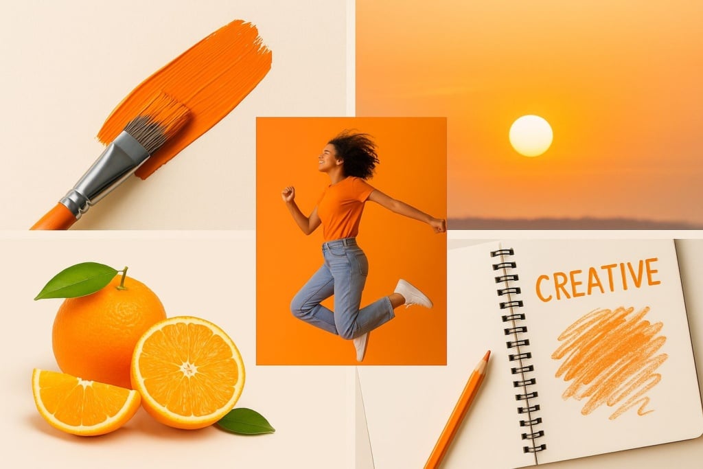
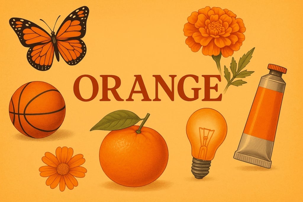
Orange is a secondary colour, created by mixing red and yellow. It’s a warm, energetic hue that radiates vitality, optimism, and creativity. It combines the drive of red with the cheerfulness of yellow, becoming a symbol of enthusiasm and transformation.
It’s not a colour that goes unnoticed. We see it in sunsets that bathe the sky in golden light, in the bright skin of oranges, in autumn leaves as they turn before falling. But orange is also a colour rich in meaning – found in spirituality, art, design, fashion, and marketing. It has accompanied humanity through the ages, changing in form and function, yet never losing its expressive power.
Let’s explore its traits and hidden stories!
What does the colour orange mean?
Orange is a colour that conveys vitality, joy, and movement. In the visible spectrum of light, it falls between 590 and 620 nanometres, and is perceived as one of the warmest colours, along with red and yellow.
Unlike red, which can suggest aggression, or yellow, which can sometimes evoke anxiety or instability, orange strikes a balance between energy and positivity. It’s a colour of strength and approachability. Of drive and playfulness. That’s why it’s often associated with creativity, courage, motivation, and a zest for life.
In many cultures, it’s also a colour of change and transition: it represents the in-between seasons like autumn, and youth as a phase of discovery and personal growth.
Orange is often linked to leadership figures too, as it communicates charisma, dynamism, and the ability to inspire without needing to dominate. It’s a colour that draws people in, energises, and builds emotional connection.
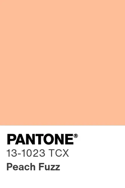
In the Pantone colour system, orange is represented by Pantone 165 C. For 2024, Pantone chose a soft version of orange as its Colour of the Year: “Peach Fuzz”, with the code Pantone 13-1023, a powdery and comforting take on the classic orange.
Where does the word “orange” come from?
It’s fascinating to note that for much of history, the colour orange had no specific name. Ancient cultures referred to it as a tone between red and yellow, or described it using familiar materials like saffron or ochre.
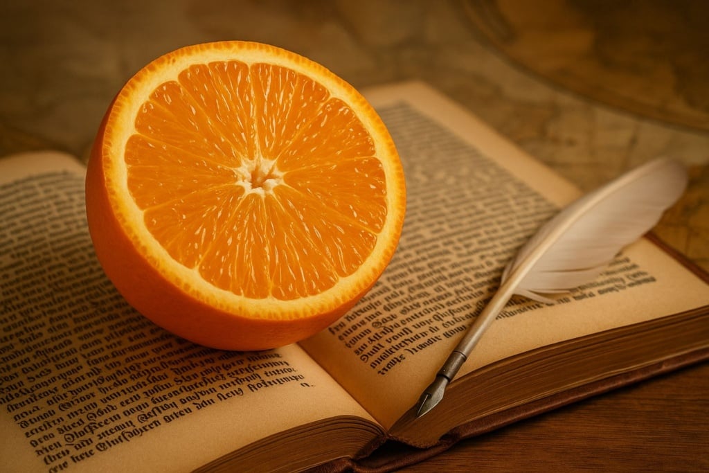
The term “orange” began to spread across Europe in the 16th century, after the arrival of the sweet orange from the Indies – an exotic fruit with a striking hue. In Italian, “arancio” refers to both the fruit and the tree, and from there, the name for the colour evolved.
In English and other Romance languages, the word for the colour also comes directly from the fruit. It’s a clear example of how colour perception is tied to our sensory and cultural experience.
How has orange been used in art?
Orange has had a fascinating journey through visual arts. In ancient times, it was created from natural pigments like red ochre or realgar – a vivid but toxic mineral. It was a difficult colour to produce, often reserved for precious or sacred details.
During the Middle Ages, orange was associated with divine light and golden reflections. It appeared in illuminated manuscripts, in the robes of saints, and in the skies of religious iconography.
In the Renaissance, as pigment quality improved, orange gained new roles: in portraits, landscapes, light effects, hair, and backgrounds meant to warm the scene.
But it was in modern art that orange truly exploded: Van Gogh used it to contrast the deep blues of the sky and interiors, while Fauvist and Expressionist artists embraced it to convey raw emotion. In the 1960s and 70s, with Pop Art, orange took centre stage in posters, packaging, album covers, and advertising – establishing itself as a key colour in contemporary visual language.
What spiritual meaning does orange have?
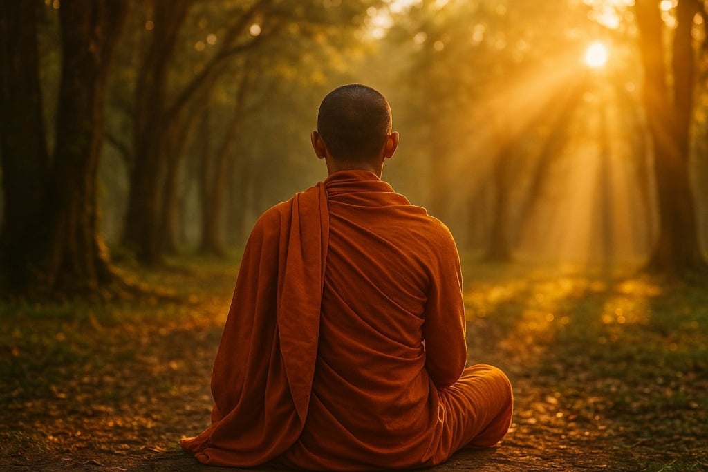
In many spiritual traditions, orange is considered a sacred colour. Its meaning varies across cultures but often revolves around transformation, detachment, and inner energy.
In Buddhism, monks wear saffron-coloured robes to symbolise renunciation of material possessions, inner light, and humility. The colour was chosen because it evokes the earth, the sun, and the flame – all vital, elemental forces.
In Hinduism, orange (or saffron) is one of the most sacred colours, representing devotion, the quest for truth, and spiritual discipline. It’s also the colour worn by holy ascetics known as sannyasins.
In yogic philosophy, orange is linked to the sacral chakra (Svadhisthana), the energy centre associated with emotion, creativity, and sensuality. When balanced, this chakra enhances personal expression, pleasure, and emotional connection.
Where do we find it in pop culture?
From film and music to fashion and graphic design, orange has made a bold and lasting mark on pop culture. It’s a vivid colour, but also an ambiguous one: it can feel joyful or unsettling, familiar or surreal.
In Stanley Kubrick’s “A Clockwork Orange”, the colour takes on a disturbing role: it symbolises a dystopian future where violence and control coexist with an eerie sense of normality.
On the other hand, the series “Orange Is the New Black” uses it to reflect a confined world – the prison – full of energy, rebellion, and humanity.
In design, orange is used to convey creativity, youthfulness, and a non-conventional edge. It dominated the 1970s aesthetic, becoming the colour of social change, cultural experimentation, and liberated self-expression.
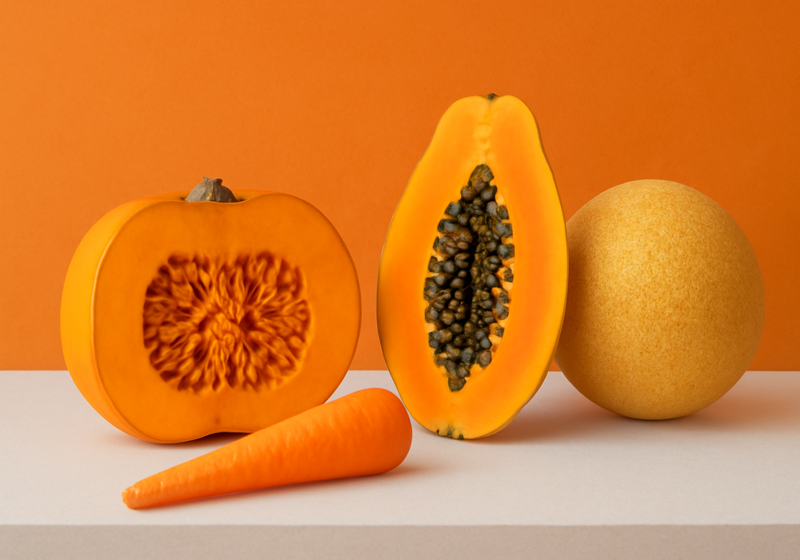
Orange in nature
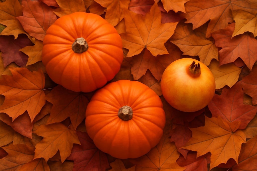
Nature might be the greatest ambassador of orange. From butterflies to pumpkins, from minerals to sunsets, orange appears frequently as a signal of ripeness, energy, or caution.
In the animal kingdom, bright orange often serves as a warning signal. The monarch butterfly, for instance, flaunts its orange and black wings to ward off predators. Some toxic frogs and tropical snakes use similar strategies.
In the plant world, orange is linked to ripening (apricots, persimmons, oranges), blooming (marigolds, zinnias), and autumn foliage – thanks to carotenoids, the plant pigments responsible for yellow-orange hues.

How is orange used in marketing?
Marketers love orange – and it’s easy to see why. It draws attention, encourages action, and communicates positivity without being aggressive. It’s often used by brands targeting young, curious, and energetic audiences.
In web design, orange is one of the most effective colours for call-to-action buttons (“Buy now”, “Find out more”) because it stands out while remaining friendly.
Brands like Fanta, Amazon, Nickelodeon, SoundCloud, and Blogger have used orange to suggest freshness, fun, accessibility, and spontaneity. It’s also a great fit for messages of innovation and enthusiasm.
What colours go well with orange?
Orange is highly versatile when it comes to colour pairing. Its complementary colour is blue, which creates bold and dynamic contrast.
Combined with neutrals like white or light grey, orange becomes the undisputed star of the composition – perfect for minimalist designs with strong character. Paired with brown, it evokes warmth, nature, and earthy tones. With yellow, it forms a sunny, joyful palette ideal for messages of warmth and openness.
In fashion, interior design, or branding, orange is often used as an accent colour – a few strokes are enough to energise a space or layout.
Fun facts about the colour orange
- 🇳🇱 It’s the national colour of the Netherlands, linked to the Dutch royal family (House of Orange).
- 🛑 It’s used in temporary road signage to indicate caution or danger.
- 🍲 In the food industry, it stimulates appetite and is associated with sweetness.
- 🧘 It represents the sacral chakra, the seat of creative energy.
- 🎃 It plays a starring role in celebrations like Halloween and Thanksgiving.
P.S. Why is orange associated with the Dutch royal family?
Because the House of Orange-Nassau originated from the Principality of Orange in southern France. Over time, orange became a national symbol of unity and identity in the Netherlands.
Orange is ready to win you over
Orange is more than just a blend of red and yellow. It’s a visual language of transformation, energy, and human warmth. It has travelled alongside humanity through cultural, spiritual, and aesthetic milestones – symbolising balance between impulse and thought, between body and spirit.
It’s the colour of sunsets, rebirth, and unspoken emotions. A hue that grabs attention… but also warms the heart.
What about you? What’s your relationship with orange? Do you embrace it, or keep it at a distance? Let us know in the comments.