

Table of Contents
Corporate image is one of the secrets to lasting success in the market
Every graphic designer who’s been around the block has heard the expression “corporate image”.
Corporate image encompasses everything about a company that’s visible (visual communication, product advertising etc.) and also strongly influences corporate identity, in which it plays an important part.
A company speaks and communicates through its image and does so predominantly using graphic design.
In this article, we’ll look at five of the most interesting examples of great corporate image design from recent years (and which have yet to make it into graphic design books!).

Mailchimp: the perfect blend of craftsmanship and technology
Mailchimp is one of the biggest email marketing services in the world. How many of us, even just once in our lives, have sent an email with the help of the grinning chimp?
Until a few months ago, the firm’s corporate image was based on a chimp sporting a cap, the colour sky blue and the elegant hand lettered company logo, which was tweaked by graphic-design superstar Jessica Hische in 2013.
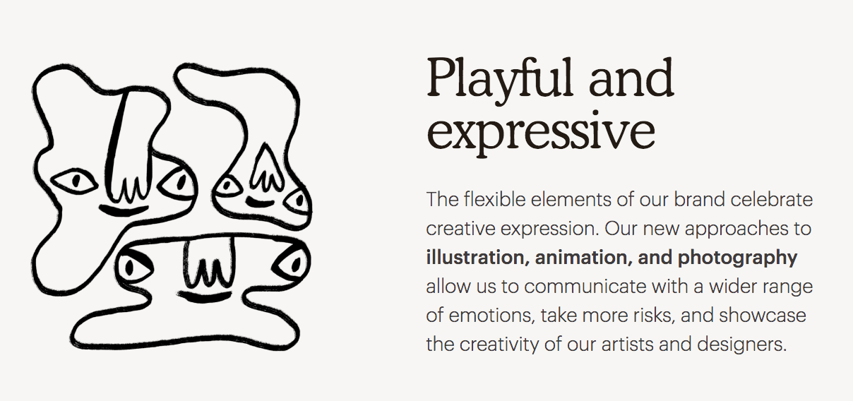
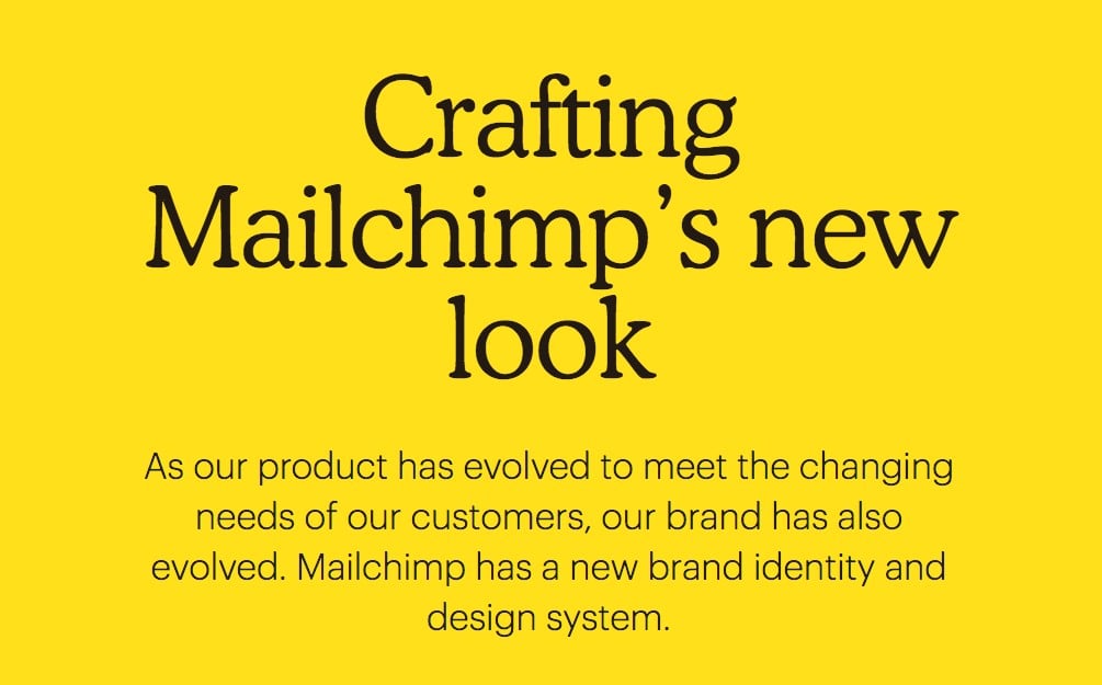
Then the revolution: the chimp stayed, but along came the colour yellow and, most importantly, illustrations that contrast with the bold, geometric and technological aesthetic that reigns in the world of mailing services. In doing so, the company has set a new standard for the future of branding.
Because Mailchimp’s corporate image is principally used online, it uses animations and gifs, in addition to static illustrations.
You can read a more detailed account of Mailchimp’s redesign here: https://mailchimp.com/design/

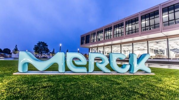
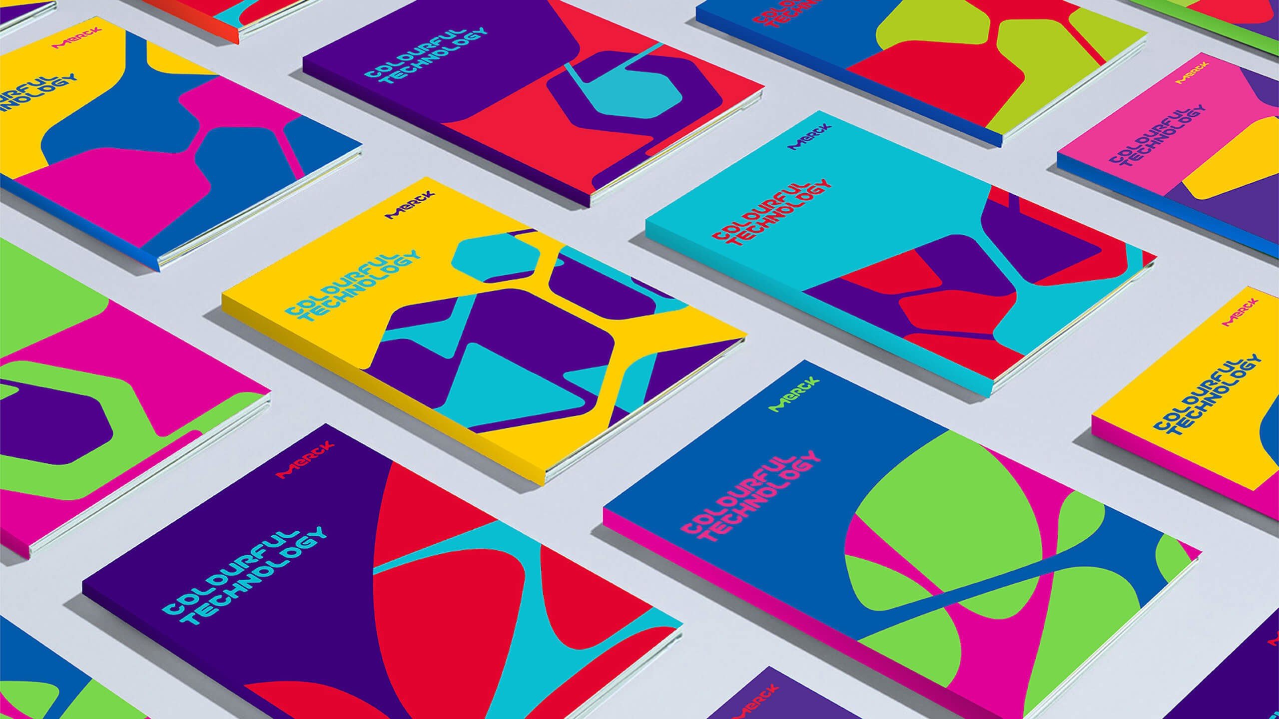
Merck: Big Pharma gets a more human and creative face
A few years ago, German pharmaceutical giant Merck hired the Futurebrand agency to overhaul its brand image. The result was unique and revolutionary in the industry.
Axel Loeber, Merck’s head of branding, explained the rationale behind the new look, which was unveiled at the end of 2014: “Science is such an exciting thing, why does it always look so dull in these gloomy pictures?”.
The colours and lettering of the new logo evoke the cellular world that pharmaceutical research explores and, above all, Merck’s creativity, which makes the firm stand out from its competitors in the sector.
Loeber continues: “When you look at branding in this industry, they all use the same conventions: lab coats with a hi-tech appearance, pharma connotations, producing things in a highly regulated area. You really can’t show the product, so the solution is to by-pass the issue and show the production process, making it difficult for companies like us, companies that are very specialised and don’t dominate the market, to set ourselves apart. We therefore went much further than anyone might have expected with our rebranding.”
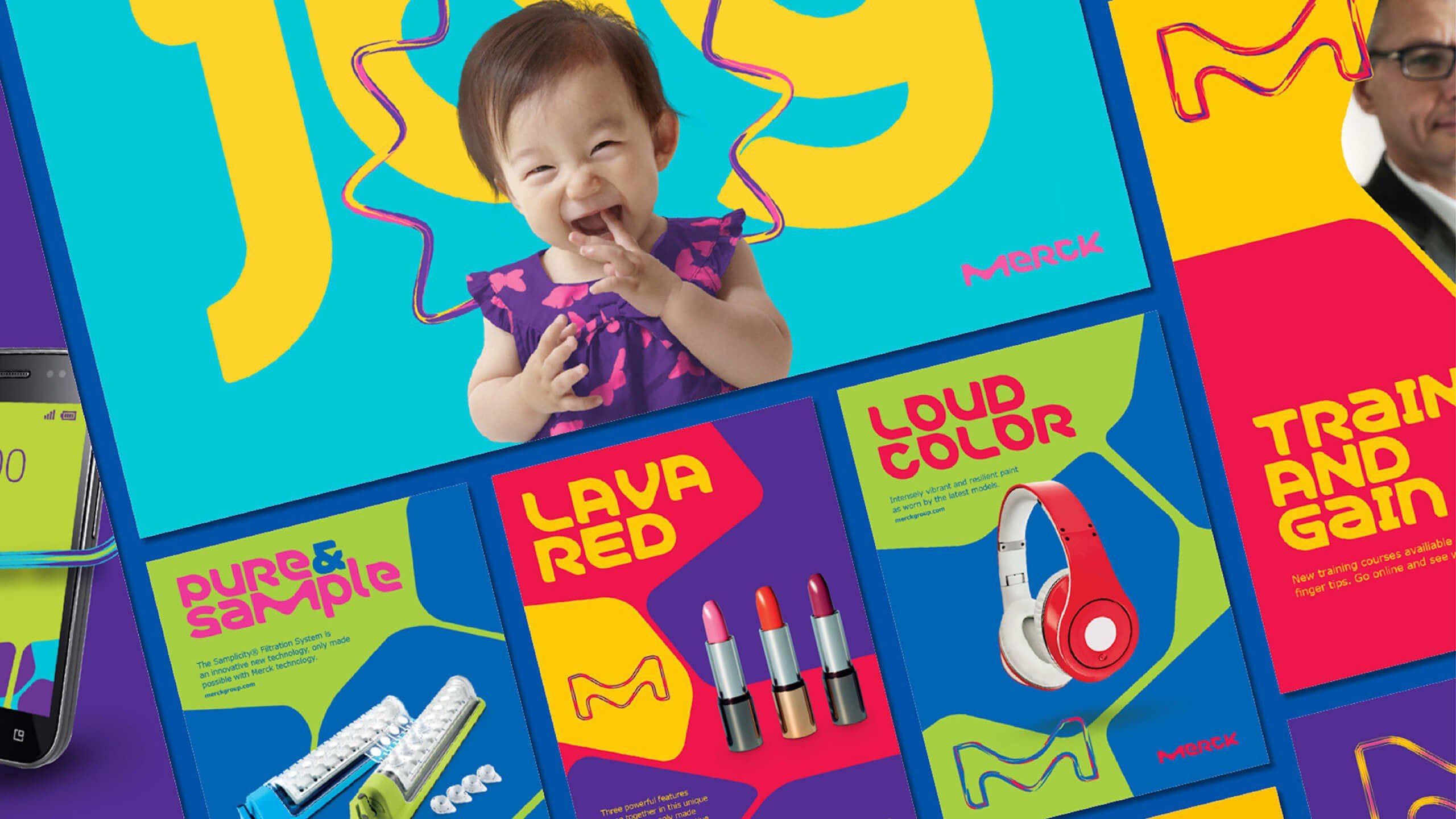
Merck opted for an organic-looking design that uses lots of colours and interchangeable shapes. The result is a corporate image that’s very POP, but also flexible and easily adaptable to various formats, including digital.
It’s an extremely creative corporate image that provides clear guidelines for advertising and product design.
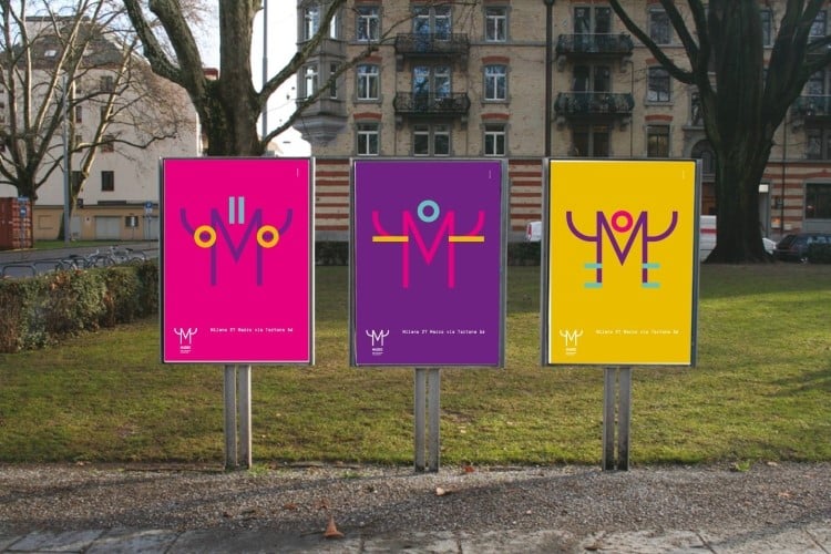
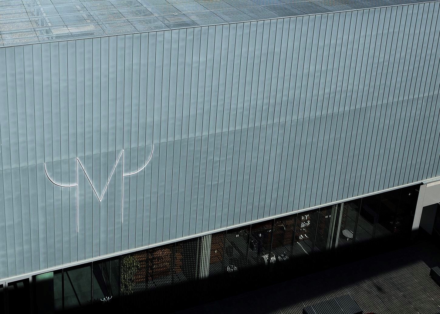
Mudec: a museum for people
Milan’s Mudec, or Museum of Cultures, is a great example of how corporate image is closely tied to an organisation’s environment. Mudec was founded in 2015 and immediately established itself as one of the most important museums in Milan and northern Italy. It is housed in the post-industrial spaces of the former Ansaldo Factory, which have been transformed to create a cutting-edge museum where graphic design and architecture blend together perfectly.
Studio FM have created an unmistakeably Italian corporate image that is modular and, like Merck’s, is not only able to make the museum recognisable, but also to tell its story and promote it.
The idea that corporate image is a living thing, a dynamic and evolving system is a new concept that graphic design took a while to grasp.
The Mudec capital “M” theme – which resembles a sort of ancient mask – offers myriad possible variations and opportunities for visual playfulness.
Just as the font chosen becomes the tool for narrating the exhibitions and permanent collection, the role of the corporate image is not simply to make brochures and leaflets pretty, but to create a more complete experience for those coming into contact with the museum.

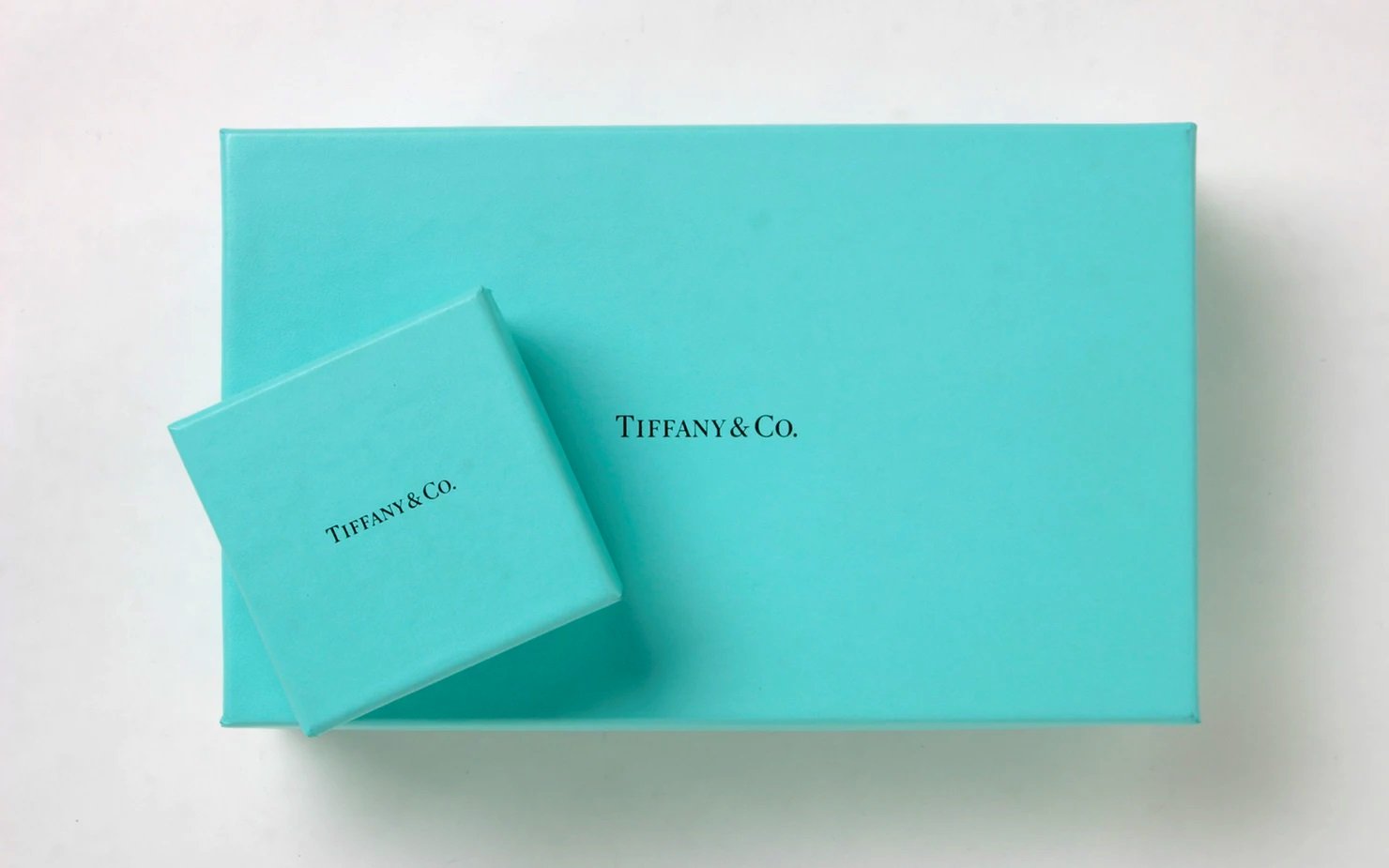
Tiffany & Co.: sophistication in simplicity
One of the world’s most famous brand identities, thanks in no small part to the classic film starring Audrey Hepburn, belongs to New York jewellers Tiffany & Co.
Its signature sea green, refined lettering make it one of the world’s most recognisable brands: the whole corporate identity follows these rules of elegance and minimalism, paying maximum attention to a handful of details.
While Tiffany & Co.’s corporate image was graphically sound, the fierce competition in the luxury market led the firm to bring in Pentagram, arguably the world’s best graphic design agency, to see what could be improved in its image.
The changes Pentagram made are almost imperceptible to the consumer’s eye, but they created a harmony between elements that was previously missing.
For example, they redrew the logotype by hand to make it look like a hot-metal type face. They also subtly made over the packaging, reducing the size of the logo on bags and boxes by 40% and switching from printing to foil stamping.
You can read the full redesign story for this famous brand on the Pentagram website.

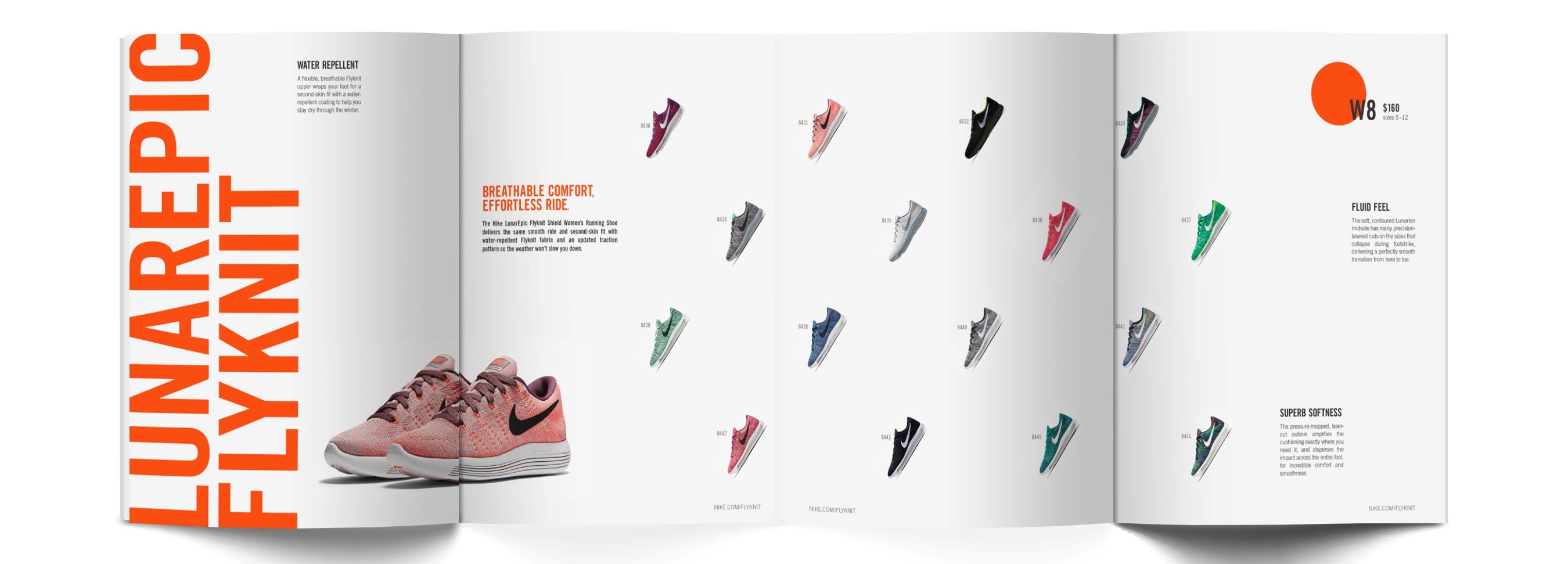
Nike: the quintessential modern brand
Nike is already a classic brand. It pioneered the idea that the logo is more important than the product. As Naomi Klein notes in “No logo”, Nike constantly sells us pieces of its brand image, as if, for every product we buy, we were purchasing a fragment of the Berlin Wall.
Every time we encounter the Nike brand, we come into contact with its idea of sport: an activity for all that goes beyond competition, bringing out the best in each and every one of us when we adhere to the motto “Just do it”.
All this is embodied by the minimalist and enigmatic Swoosh trademark.
The entire Nike corporate image revolves around this mark: the typeface is minimalist and accompanies the Swoosh without stealing the show; initially, the Futura font was used, but it has since been changed to Trade Gothic.
The base colours are black and white, but from time to time, and depending on the design and product, other palettes are used, but always keeping things simple and clear.
Brochures and catalogues maintain this simplicity and clarity too: doing all the talking are product photos and testimonials (another Nike innovation was to base marketing around super-star athletes and their image, like basketball legend Michael Jordan) and the soundbites blown up and written in capitals (as if yelled or carved into rock).
Studied minimalism and simplicity in communication are rules applied across every part of the company throughout the world. Attention to materials, logo proportions and the balance between elements make Nike’s vast graphic system robust and coherent: its simplicity makes it easy to adapt and use for any event or project.
Digital Transformation and Corporate Image
Digital transformation has revolutionized the way companies develop and maintain their corporate image. By leveraging cutting-edge technologies, businesses can create dynamic, engaging, and highly personalized brand experiences. Here’s an in-depth look at how digital transformation impacts corporate image:
Embracing New Technologies
Adopting advanced technologies like Artificial Intelligence (AI), Augmented Reality (AR), and Virtual Reality (VR) enables companies to offer unique and immersive experiences. For example, IKEA’s AR app allows customers to visualize how furniture will look in their homes before making a purchase, enhancing customer engagement and satisfaction. This not only drives sales but also strengthens IKEA’s innovative brand image.
Enhancing Customer Interaction
Digital transformation facilitates seamless customer interaction across multiple platforms. Social media, chatbots, and personalized email campaigns enable companies to engage with customers in real-time, providing instant support and tailored experiences. For instance, Starbucks uses AI to personalize marketing messages and offers based on individual customer preferences and behaviors, fostering a deeper connection with their audience.
Streamlining Operations
Improving operational efficiency through digital tools directly impacts a company’s corporate image. Efficient, transparent, and user-friendly processes contribute to a positive customer experience. Amazon’s use of AI and robotics in its warehouses ensures swift order fulfillment and delivery, reinforcing its image as a reliable and customer-centric company.
Data-Driven Decision Making
Utilizing big data analytics allows companies to make informed decisions that enhance their corporate image. By analyzing customer feedback and behavior, businesses can tailor their products, services, and marketing strategies to meet consumer needs more effectively. Netflix, for example, leverages data to curate personalized content recommendations, ensuring a high level of customer satisfaction and loyalty.
Maintaining Brand Consistency
Digital platforms help maintain brand consistency across all touchpoints. With centralized digital asset management systems, companies can ensure that their brand messaging, visuals, and tone are uniform across websites, social media, and advertising campaigns. Coca-Cola’s consistent use of its iconic logo, color scheme, and messaging across all digital platforms ensures a cohesive brand image worldwide.
Case Studies
Nike
Nike’s digital transformation strategy includes the use of AI and machine learning to personalize customer experiences. The Nike Training Club app offers customized workout plans, while the Nike Run Club app provides personalized coaching. These digital initiatives align with Nike’s brand image of innovation and excellence in sports.
Sephora
Sephora’s Virtual Artist app uses AR to allow customers to try on makeup virtually. This innovative approach not only enhances the shopping experience but also positions Sephora as a tech-savvy and customer-focused brand.
Digital transformation is integral to shaping and maintaining a strong corporate image. By embracing new technologies, enhancing customer interactions, streamlining operations, leveraging data, and maintaining brand consistency, companies can create compelling and engaging brand experiences. These strategies not only improve customer satisfaction and loyalty but also reinforce the company’s reputation as a forward-thinking and innovative leader in their industry.
TAKEAWAYS
Designing a good corporate image is not simple, but simplicity always helps. The more complex a system, the more it must be simplified to keep the corporate image coherent and robust. Take a look around any city, and you’ll see how many companies don’t have a handle on their visual identity: year after year, they make detrimental changes and alterations that weaken their corporate identity, making it less recognisable and leaving it out of step with their objectives.
Every designer, in their own small way, must try to make clients understand the importance of their corporate image because the public’s perception of a firm (or individual) is in large part down to how they present themselves.
Corporate image is akin to the face of a company.
So it needs looking after!