
Table of Contents
Why green holds such a central place in our visual imagination
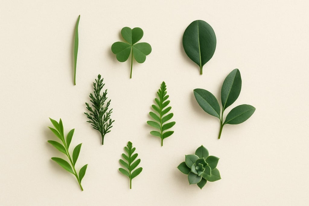
Green is one of the most familiar colours in our everyday lives. It evokes nature, vitality, renewal and balance. In graphic design, branding and visual communication, green is much more than a shade — it’s a rich system of meanings.
From nature-inspired palettes to sustainable brands, eco-conscious packaging and digital interfaces, green has become one of the most versatile and sought-after colours in contemporary design.
This article explores its history, symbolism, psychological impact, how to use green effectively in design and print, and which colour combinations enhance it best.
Origins and history of the colour green
The word green derives from the Old English grene, meaning “growing”, “fresh” or “alive”, closely connected to the plant world.
Historically, green pigments were difficult to produce. Egyptians used malachite, while Romans combined minerals and botanical extracts, often unstable.
During the Middle Ages, green acquired layered meanings: from courtly love to the unpredictable or magical.
In the Renaissance, new pigments enabled artists to depict green with greater realism — seen in Flemish landscapes or Leonardo da Vinci’s naturalistic settings.
By the 19th century, synthetic pigments made green widely accessible in fashion, decoration and industry, cementing its influence in modern design.
The meaning of green: what it communicates and why
Green is one of the most symbolically rich colours, capable of evoking deep and immediate sensations:
- Nature and life
- Balance and harmony
- Renewal and growth
- Freshness and health
Its cultural meanings expand into themes such as:
- Hope and optimism
- Stability and calm
- Environmental awareness and sustainability
Some meanings are more ambiguous:
- certain historic green pigments were linked to poison or superstition
- “being green” can imply inexperience
This diversity makes green an exceptionally flexible colour for visual communication.
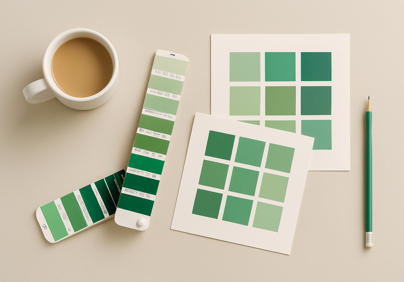
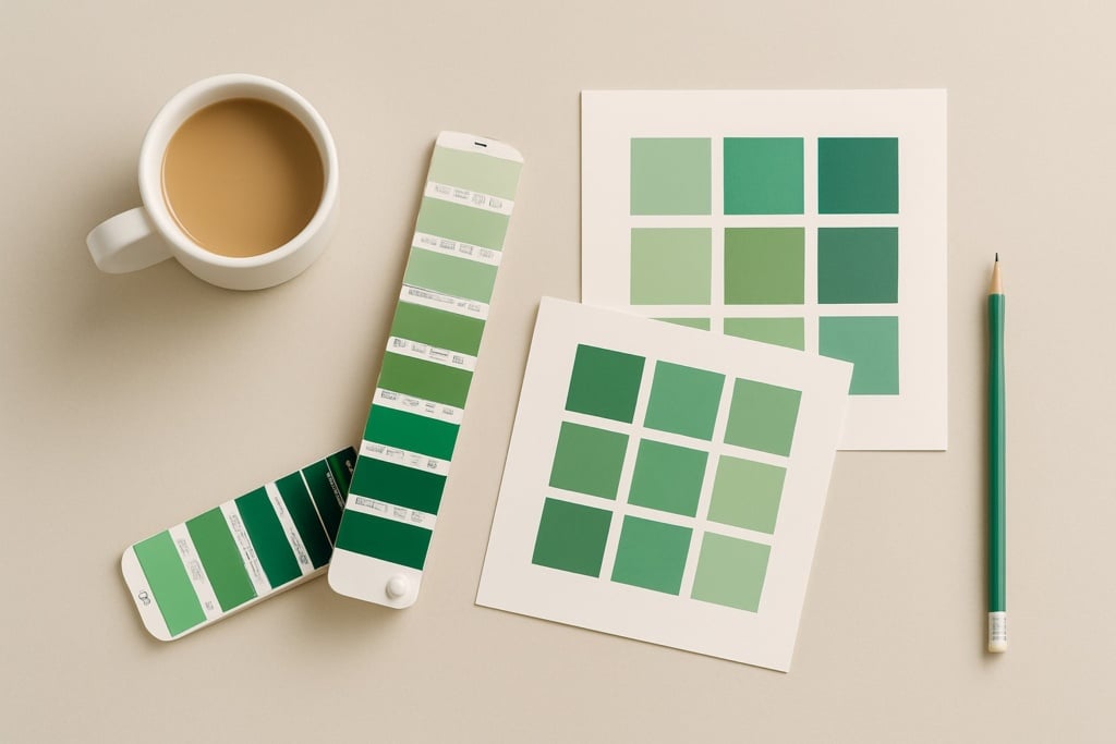
Colour characteristics of green: definition and variants
Understanding how green behaves across colour models is essential, especially when working between digital and print.
Technically:
- in RGB, green comes from activating the green channel with red or blue
- in CMYK, it is created by mixing cyan and yellow
Its position between yellow and blue enables countless tonal variations:
- warm greens → yellowish, bright and energetic
- cool greens → bluish, elegant and calm
Classic green colour codes:
- HEX: #008000
- RGB: 0, 128, 0
- CMYK: 100, 0, 100, 50
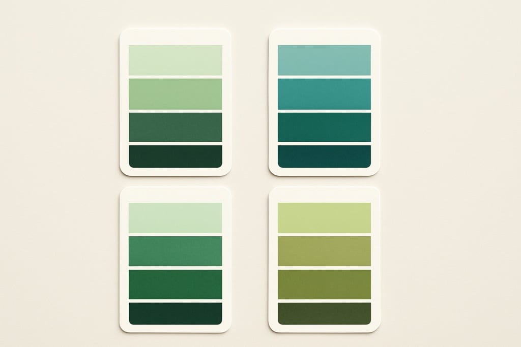
Notable green tones include:
- Mint green
- Olive green
- Aqua green
- Emerald
- Bottle green
- Lime green
- Forest green
How to use green in design and visual communication
Green adapts easily to different contexts — from wellness to innovation — depending on the tone selected.
First, consider where green works best:
- eco-focused brands
- food, beauty and wellness
- clean tech and renewable energy
- editorial projects and outdoor communication
- healthcare and wellbeing
Next, choose the right tone for your message:
- Dark green: prestige, tradition, elegance
- Bright green: energy, freshness, innovation
- Pastel green: softness, minimalism, natural calm
- Blue-green: reliability and sophistication
- Yellow-green: vibrancy and dynamism
Green finds its place in many design disciplines:
- brand identity
- UI and digital design
- illustration and editorial graphics
- packaging and consumer goods
How to combine green: effective palettes
Green transforms significantly depending on the colours paired with it.
For bold contrasts, explore complementaries:
- Reds and corals, modern and eye-catching
For softer moods, opt for analogous shades:
- Yellows and lime tones, fresh and lively
- Blues, balanced and calming
For a refined, premium feel:
- Green + gold
- Green + cream
For contemporary or expressive aesthetics:
- Green + violet
- Green + magenta
Avoid:
- mixing too many unrelated greens
- dark green on dark backgrounds
- yellowish greens in very formal contexts
Green in print: reproduction and practical advice
Green behaves differently in print than on screen. In RGB it appears luminous, while in CMYK it often shifts or dulls.
Key differences include:
- shifts towards blue
- loss of saturation
- dull appearance on absorbent papers
For optimal print quality:
- use coated papers for rich greens
- use uncoated or kraft papers for natural looks
- consider Pantone or special inks
- run colour tests for extreme greens
Green is highly effective in packaging for:
- food
- natural cosmetics
- wellness
- eco-friendly products
Especially when paired with recycled materials.
Curiosities about the colour green
Green carries fascinating stories:
- green screen technology in film
- toxic arsenic green pigments from the 19th century
- surgical scrubs chosen to reduce eye strain
- the rise of greenwashing
A vibrant, versatile and timeless colour
Green is one of the most meaningful and multifaceted colours in today’s design landscape. It conveys nature, balance and freshness, but also elegance or modernity depending on the tone.
In graphic design and print it unlocks countless creative options — from soft palettes to bold contrasts, from eco-conscious projects to high-end branding.
How will you use green in your next projects?
FAQ — Frequently Asked Questions about the Colour Green
What is the meaning of the colour green?
It symbolises nature, harmony, renewal and wellbeing.
What emotions does green evoke?
Calmness, hope, vitality, freshness and stability.
What are the best colour combinations with green?
Complementaries (red/coral), analogous (yellow/blue), elegant (gold/cream) and contemporary (violet/magenta).
How should I use green in design?
Choose a tone that aligns with your message: dark for elegance, pastels for softness, bright for innovation.
What types of green exist?
Mint, olive, aqua, emerald, bottle green, lime, forest green and many more.