Table of Contents
If you need to turn “indigestible” content into more appetising chunks, you might want to present the information as an infographic. Graphical representation will help you highlight the content and make it easier to use and share.
In this article, we explain how to make effective and eye-catching infographics, we’ll show you examples of infographics we’ve found online and liked, and we’ll recommend some tools for creating infographics without having to bother your graphic designer.
What is an infographic?
An infographic is a visual representation of any type of information using images and text. Its purpose is to simplify a concept so that it can be immediately understood. As well as aiding and speeding up understanding, an infographic helps people to memorise content because it appeals to visual memory.
Infographics are everywhere: they are used in company presentations and meetings; you’ll find them in magazines and newspapers; we post and share them on LinkedIn, Pinterest and Tumblr; we use them in blog posts to illustrate complicated ideas and keep the reader interested. If you look at corporate social media accounts, you’ll see that infographics are frequently used as a marketing tool, for example, to present a customer case study in a compelling way that catches people’s eyes. People who, if the case study were simply presented in text form, may not even bother reading it.
How to create effective and eye-catching infographics
How do you create infographics that communicate content effectively? Good question! We have put together some tips to help you do just that.
First of all, clarify what your business objective is and the audience you are after. This should be the starting point for any project, not just an infographic. Once you’ve clarified your objectives and targets, it will be easier to choose the information to add to your infographic.
Order and organise the information. Once you’ve decided on the data or sections to use, chose only those that are essential for achieving your objective. Remember that an overly elaborate infographic loses its effectiveness and that, on average, a reader will spend no more than 2-3 minutes looking at it.
In terms of graphics, organise information into clear thematic groups. Use bold fonts or bright colours to highlight the most important facts.
Too many images can confuse and make content harder to understand. Images should be easy to grasp, attractive and, of course, explanatory rather than decorative.
Don’t limit yourself to presenting data – tell a story too. This way, your infographic will immediately become more interesting. Remember that the title is the first thing that people read, so it must grab their attention and pique their interest.
Last tip: it’s good practice to cite the sources of the data used in the infographic, and it will lend greater credibility to your work.
Inspiring infographic examples
We’ve trawled the web for great infographics. Those that you see below have accomplished at least part of their mission: capturing the public’s attention, or at least ours. We found two examples of infographics that are really easy to read on the Visual.ly site. The first was created by Visually for the Clorox company.

The second was created by Visually for Nationwide Insurance.

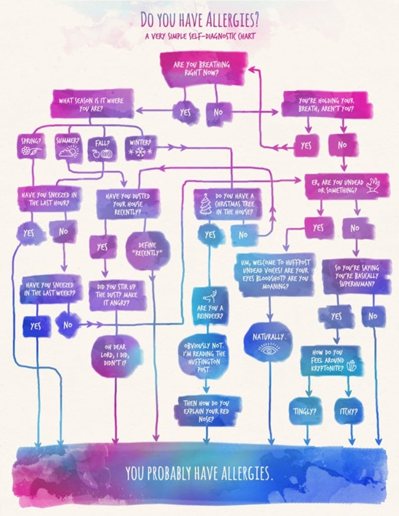
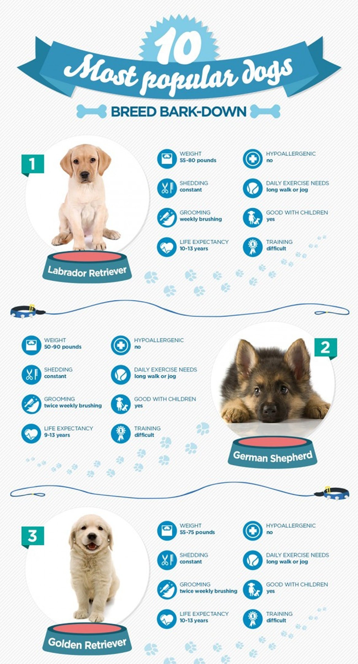
Then we headed over to Pinterest – we told you that infographics are all over social media! – where we found an entire universe of infographics. These four we particularly liked!


Creating infographics online: the tools that help you
The graphic design that you choose for your infographic will largely determine its success. There’s one thing we can all agree on: nobody stops to look at something unless it catches their eye. There are tools that can help you create stunning infographics easily with no experience necessary. Here’s a selection.
Canva
We’ve already talked about Canva, the free software that helps you create any type of graphic design project – including infographics – without breaking a sweat. You can start from scratch and use the tools provided, or you can use a template that can be customised with elements from the library (icons, illustrations, photographs) or that you upload yourself.
Infogram
Infogram is a tool for creating any type of graphics, including interactive ones, and will give you good results without having to employ the services of a designer. It’s free and very intuitive: you start from templates that can be customised with a drag-and-drop editor. You can change colours and styles; add icons, photos, illustrations or GIFs (there are over a million of them); and highlight the most important data points.
Piktochart
Piktochart works like Infogram. It’s a design tool for creating graphics, reports, infographics, interactive maps, posters and flyers. It also uses an easy-to-use drag-and-drop editor that, starting from a template, lets you customise infographics with icons and images (the library contains thousands). What’s more, infographics created with Piktochart are SEO oriented, in other words, their content can be read by search engines, making it easily discoverable by others.
As you’ll see, the tools are very similar to one another. Try them out and find the best one for your next infographic project!

