Table of Contents
Simplification is a sign of intelligence,
says an ancient Chinese proverb:
what cannot be said in a few words
cannot be said in a lot of words either.Bruno Munari
Many designers, and many clients too, are convinced that graphic design should be restricted to the bare minimum. They believe that ‘less is more’ and that minimalism is nothing short of a religion.
While it is true that there are historical, design-related and practical reasons for choosing this approach, and while empty space certainly has its place in graphic design, it is important to recognise that it isn’t enough on its own.

Don’t trust people who, under the pretext of following the ‘Japanese style’ or ‘Swiss school’, create bare, straightforward and soulless products. The extreme minimalism pursued by some designers may have made graphic design more refined, conceptual and functional, but it has also created an easy, quick and repetitive approach that people see as a shortcut to a winning design.
To understand the use of empty space, we first need to consider the history of graphic design and briefly go back through various key stages in its evolution, to see why a certain type of design continues to reap success among professionals.
The twentieth century: graphic design embraces technology
It probably all started in the early twentieth century, when graphic design changed from something limited to typography and craftsmanship to a more complex industrial process; the amount of work completed by hand reduced considerably, in favour of mechanical and more rational production.
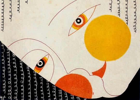
This was the 1920s, the era of the Bauhaus in Weimar, El Lissitsky and Russian constructivism, and Japanese minimalism: graphic design became informative and functional, rebelling against naturalism and embracing abstract art and the new century of technology.
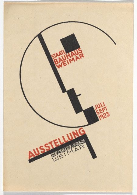
Empty space was needed to balance or bring out the geometric shapes, strong colours and illustrations formed mainly of typeface.
Large blocks of solid colour were added to pages and posters to demonstrate the new capabilities of modern printing technology.
And overly ‘full’ designs became synonymous with folklore and naturalism, and were seen as reflecting a naïvety that was shunned by those who saw it as their mission to use graphic design to speak to a new world and bring about revolution.
In the end, however, every ‘regime’ brought graphic design back to a simple and rhetorical folkloric, almost infantile vision, while true graphic design remained confined to industry and certain cultural and publishing environments. Empty space became almost an elite choice, austere and containing little emotion.
Industrial design and modernism
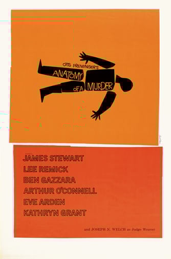
Empty space did not go away: Swiss design, Massimo Vignello, the explosion in industrial product design, and brave design studios and maverick creative individuals like Bruno Munari adapted it for countless different contexts and managed to exploit its full potential.
Graphic design suffered as a result, however, and often lost its lightness, became too dry, and ended up being tied to the use of the font Helvetica and restrictive palettes of primary colours, abandoning the desire for experimentation and risk that other designers across the world continued to cultivate with abandon. Many companies loved this type of graphic design because it seemed to reflect modernism, design and technological innovation, far away from nature and the nineteenth-century world.
Empty space as a cliche: minimalism becomes fashionable
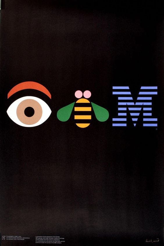
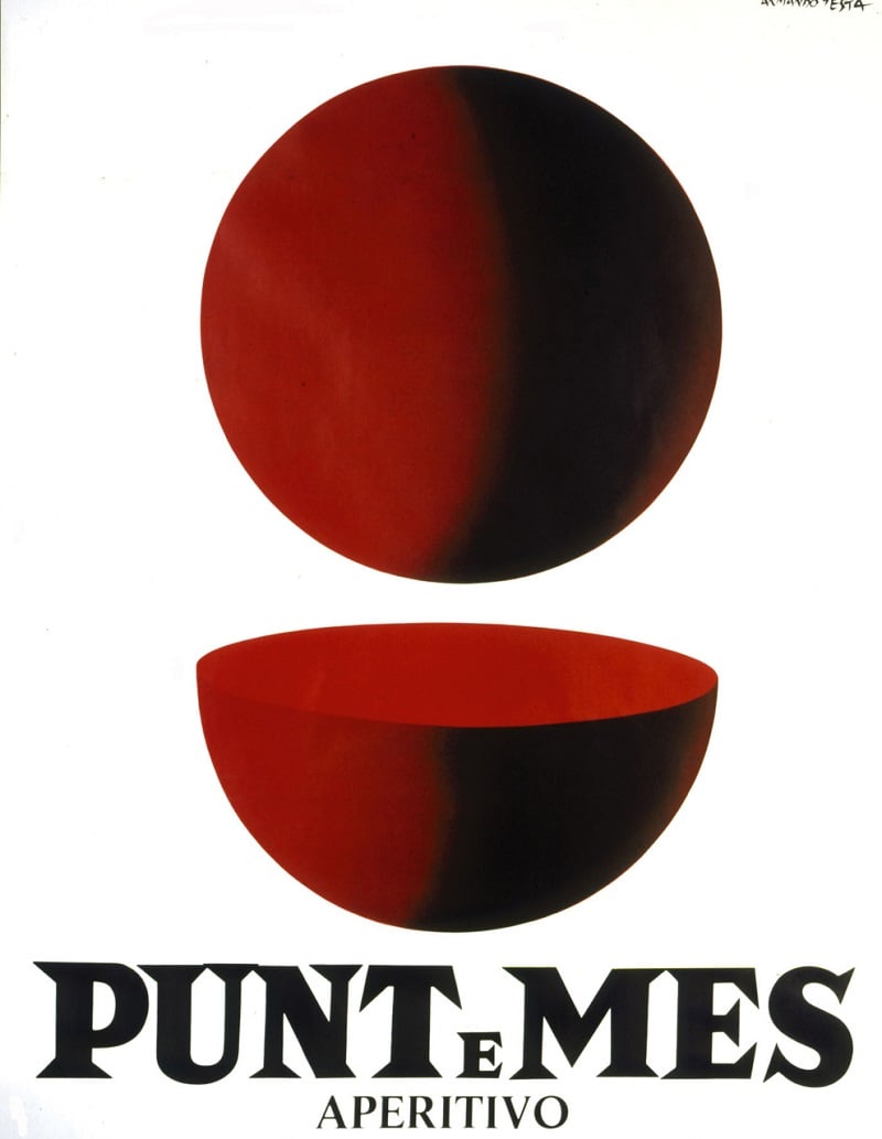
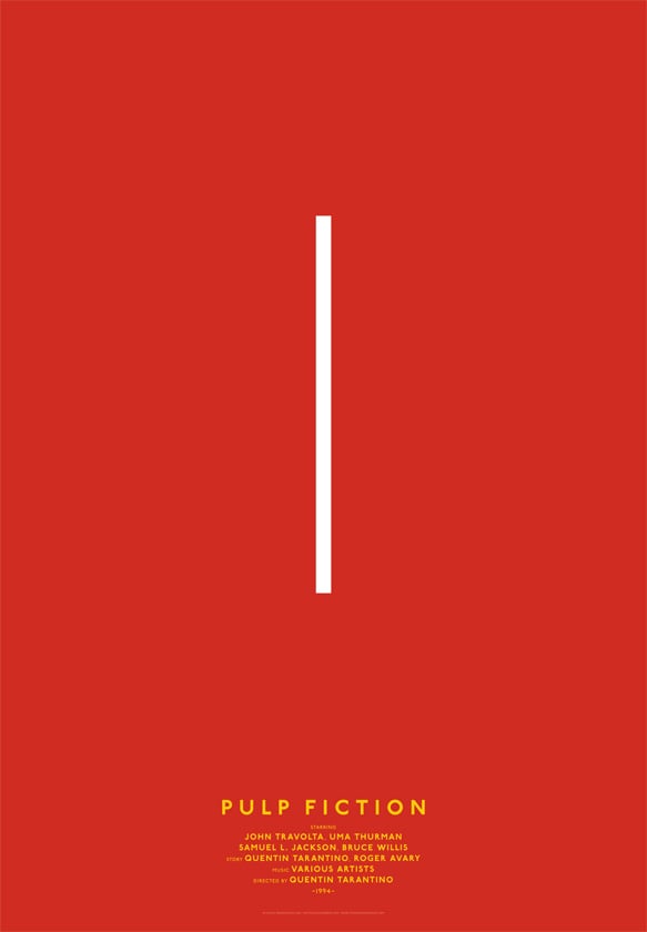
Over time the situation was turned on its head, and the once revolutionary graphic design based on empty space became an oft-repeated cliche, an approach to graphic design that was easy to duplicate and suitable for all occasions, taught in schools and copied to death, squashing any creative impulse with functionality. It also became the pretext for countless graphic design games to share online based on an extreme concept of minimalism, where the aim is to say everything in a single element, challenging people to recognise the most cryptic references to a particular subject (film, book, philosophical doctrine, etc.)
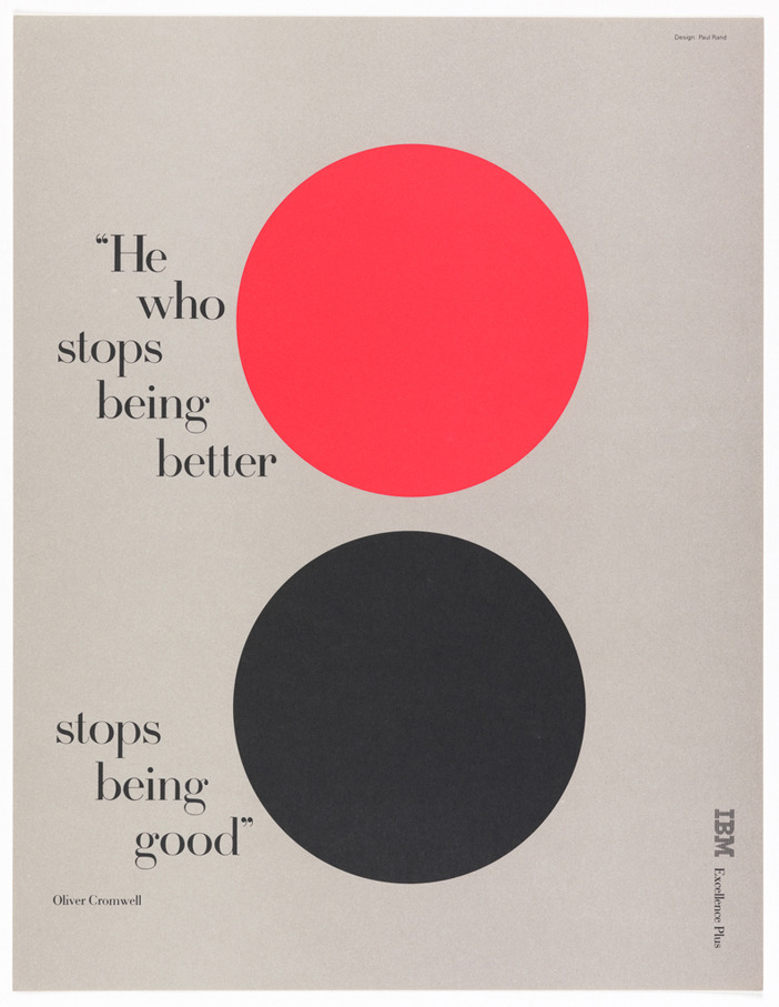
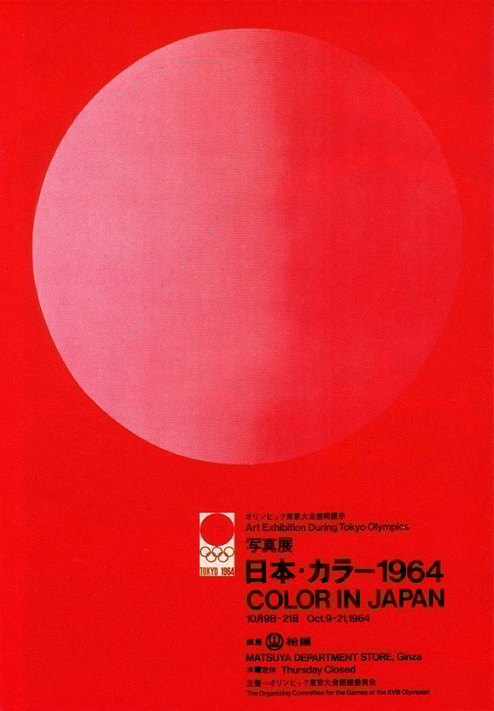
Conscious use of ’empty space’ for composure and clarity
Away from these cliches, designers continued to use empty space to aid communication, as shown by the wide variety of different styles and cross-pollination in contemporary graphic design (I recommend reading the free ebook Geographies of Graphic Design to acquaint yourself with the different styles) in which emptiness is used for countless different purposes: for clarity and functionality or for elegance; for austerity or for playfulness; to highlight a few elements or to create a sense of alienation.
You could say that empty space in graphic design and other forms of visual communication is as popular as ever, due to its ability to calm the eyes, relax the mind and offer clarity. In a hyper-connected world, where you can learn and share anything and everything, empty space in graphic design helps to get back the viewer’s attention, to speak clearly when providing information, to confidently inspire customers to make a purchase, and to make yourself understood through as little information as possible.
The advice coming from many designers in recent years is to do little, but well, or indeed very well: take care of every detail, and create just one item of interest for each product. It may be that contemporary graphic design, even when it is over-the-top, pop-inspired and full of different elements, has learned the lesson of the precision and simplicity of empty space, and when it is well designed it can retain a natural feeling without being naturalistic.
Otherwise you risk making viewers feel like they have just entered the soulless 3D computer model of an empty room…