
Table of Contents
What makes a good typeface? What are the qualities and characteristics? How to assess if our choice will serve the intended purpose? In this post, you can find out the basic answers that will help you choose the lettershapes that will be an added value to the project instead of causing you a ton of trouble.
The first thing to be mentioned is that the design itself is purely subjective and the amount of available (correct) solutions is so vast that it is virtually impossible to say that the one typeface is the right choice. This is why we will focus on the technical elements that are necessary for the typeface to be useful.
1. Clear purpose
First you need to know what you need to use the typeface for. The basic classification at this point is whether you need a display font or a text face. The rules of designing the two are really different. A display project has a more expressive purpose. Usually it is used for logos, titles or purely as graphical shapes. There is no need for ultra legibility in small sizes or from a distance, there is no need for testing if the design is more tiring to read in a long chunk of text. It has to reflect the idea behind the design.
A text face is a completely different story. Adrian Frutiger once said “If you remember the shape of your spoon at lunch, it has to be the wrong shape. The spoon and the letter are tools; one to take food from the bowl, the other to take information off the page… When it is a good design, the reader has to feel comfortable because the letter is both banal and beautiful”. In that case the choice is really subtle. It all comes down to your own preferences and mostly whether you need a sans or serif typeface and if it needs to be more towards classical design or modern vibe. Of course – it still has a degree of expression but it is shifted towards another plain of reception in comparison to display faces.

2. Consistent design and what it means
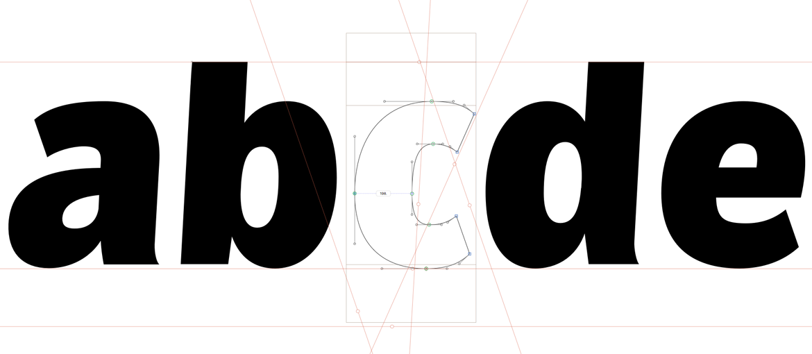
Type design is a meticulous practice that requires hours and hours of adjusting the design pixel by pixel and point by point. The first thing that type designers get familiar with is that consistent design DOES NOT mean equal widths and heights throughout the project. The more unified the project is, the more inconvenient it becomes to read in a longer text. Human eye requires distinctive details in shapes to recognize them quickly and it is more tiring for us to read the shapes that are too much alike. The second reason is that different kinds of lettershapes need to have different widths and heights to appear to be the same. It is most visible between straight lines and arcs. But even when you look at vertical and horizontal lines you will notice that the same ones of matching directions will appear to be of different thickness. Due to this fact arcs need to be thickened compared to straight lines, horizontal ones need to be slightly thinner than verticals. Besides that triangular and round endings of the letters need to exceed the baseline and cap line for the amount of 3-5% so they appear to land on the same track as straight lines. This is called optical compensation and it requires years of training for the type designer to be certain of their decisions.
Even at the earliest stage of the project letters need to properly spaced. In the early days, before the digital era of type design, a type had a rectangular shape and spacing was a physical, intrinsic property of each glyph. It is not much different today, as each letter has a bounding box that reflects the face of the type and the top of its body. Only properly spacing the glyphs allows to look at the design as it will be viewed by the readers – the final goal and aim is to achieve equal gray level when you look at the block of text. That ensures harmonized design and is not tiring for the reader.
3. Kerning
This is the production stage of making fonts. Despite having properly spaced the glyphs some pairs of letters will still look odd. A standard example is the “AV” pair. The diagonal directions act differently next to different lettershapes. With regular spacing a big gap shows up between the mentioned pair. In order to achieve unified spacing the font needs instruction to space this exact pair slightly differently. This process has to be repeated for almost any pair of glyphs – it is very repetetive and time consuming, but ensures that the final product will have high quality. Luckily modern software helps the designers and allows to create kerning groups. For instance left and right side of “v” will be kerned the same way as “w” etc.
4. Hinting
This is the final major production step. Hinting is a set of instructions for your computer on how to rasterize the typeface on the screen at certain size in relation to the pixel size of your display. It is most relevant for small sizes as in those cases there is the lowest amount of pixels that have to shape the form of the glyph. Without hinting letters might appear jumpy or a bit rattled, the apertures might close and eyes might be too dark. As nowadays the pixel density becomes higher (retina display has 144 dpi instead of regular 72) hinting starts to be less relevant. However, if the typeface is meant to be viewed on screens of lower resolution, it has to be taken under consideration.

5. Language coverage and diacritics
It is fairly simple to find well designed typefaces for english text. If you are familiar with foreign languages (for instance French) you might know so called diacritics – the letters with extra accents that change the pronunciation. For type designers it means some extra work (and extra know how!) – to design the accents and place them properly on the extra glyphs. The less popular the diacritics are (some are used in multiple languages) the thinner is the chance to find them in the desired font. In my case it is Polish language, which is based on the accents that are not popular. According to the google fonts 50% of their type resources contain Polish diacritics. The second level of verification is to assess whether or not the diacritic design was done properly (there is a great research study on the central european diacritics: https://theinsectsproject.eu/. Whenever you choose a typeface – look at those accents too!
6. Ready to go!
All rules mentioned above are just guidelines that address the prerequisites of the high quality products. Knowing what you need the typeface for specifically, and how its design will affect the reader is the first step. Then you have to check for the product quality – consistent design, kerning, hinting and language coverage. In the end you will have to decide between the aesthetics and functionality.