Table of Contents
The Facebook logo has not undergone any eye-catching changes since it was first designed: the colours have remained similar, and so has the simple sans-serif font. However, it has been tweaked here and there. Let’s review the various refinements made to the logo, throwing in a few bits of trivia along the way.
The colour: why blue?
Blue expresses reliability, productivity and stability, which is why it is often used in the IT world. But there is also a story, or perhaps a legend, behind Facebook’s choice of blue, which we think is well worth recounting. Apparently, Mark Zuckerberg suffers from deuteranopia, a form of colour-blindness that prevents him from seeing the colour green but instead allows him to perceive various shades of blue that most people cannot detect. Some people believe it was this special optical perception that made the Facebook founder opt for blue. We can’t be certain, or course, but in marketing terms, the colour undoubtedly turned out to be consistent with what the company wanted to communicate.
How the logo has evolved: from 2003 to today
Some people say Facebook’s story began in 2003 with a stunt at Harvard, while others think it all started in 2004, with the launch of the ‘thefacebook’ platform. We’ll begin our story with the now infamous stunt.
2003: a student stunt
You probably already know that when Mark Zuckerberg was a young student at Harvard, he created a website featuring students’ faces to allow them to get to know each other, a bit like a dating app. The website was called Facemash, but this won’t mean anything to most people, as the project was very short-lived. To get access to the photos of all the faces, Mark Zuckerberg had to hack into the university’ internal network: the executives at Harvard forced him to close everything down, and he was on the verge of being expelled.
The Facemash logo was simply the name of the website in Arial Bold font, written in white capital letters against a red background.

Although, according to its creator, Facemash had nothing to do with the subsequent development of Facebook, is likely that the young Zuckerberg took inspiration for his new platform from this stunt.
2004: thefacebook is launched
In 2004, he founded a new website: thefacebook The logo was very simple: the name in a sans-serif font framed between two square brackets, with no spaces, written in light blue against a dark blue background.

2005, now just Facebook
The following year the logo was honed a little: the word ‘the’ and the brackets were removed, the font size was increased and the letters became white against a blue background, all aiming to simplify it and so make it easier to read.

2015, just a few minor adjustments
Look closely at the typeface: the edges of some of the letters have been made more rounded. The redesigned ‘a’ and ‘b’ are the most noticeable, but on closer inspection you can see the other letters have been altered slightly too. The font was also generally thinned down to make the logo easier to read on mobile devices.

2019 changes
In 2019, both the company logo and the app logo were redesigned. Surprisingly, the brand decided to expand the palette of colours used for the corporate logo, helping to distinguish between the various apps in the Facebook family and so create a stronger connection between the parent company and its numerous products.

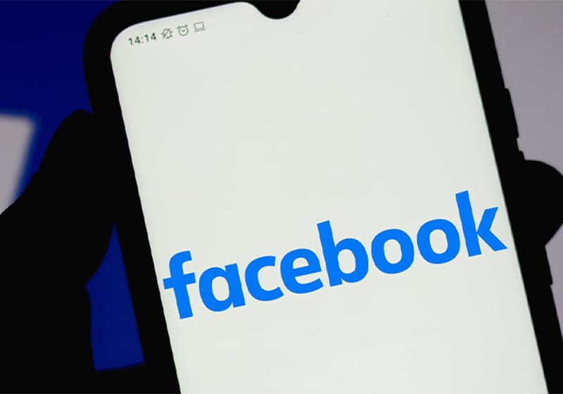
But what about the app logo? Its identity did not change enormously: the font was made even slimmer so it could be read easily on very small screens, and the colours were inverted, becoming blue text on a white background. This is the logo that is still used on the app today.

The article could stop here, but that would omit the final chapter in the story.
Meta, a new name and new logo
Time for a quick aside to avoid any confusion: in 2021, the company changed its name to Meta, while the name of the application (Facebook) remained unchanged, keeping the logo designed in 2019. The company’s new name describes a new digital age, where social media platforms meet virtual and augmented reality (Meta takes its name from the word ‘metaverse’).

Now let’s look at the logo: it looks like the infinity symbol, but also – in a nod to the gaming world – the outline of a joystick. Two flattened circles together form the letter ‘M’. The colour, however, is the same one we have come to know and recognise over the years: blue.
That’s all for now. We await the next chapter with baited breath!

