Table of Contents
It’s not long until Halloween… so what better time than to rediscover some horror classics?
In our own inimitable way, of course! We’ve picked five masterpieces of the genre that have entered the collective imagination, not just for their chilling scenes, but also for their innovative use of fonts and lettering, whether on the official poster or in the title sequence.
We’ll look at the expressionist lettering of the first, unforgettable Nosferatu, the eighties font from John Carpenter’s cult hit Halloween, and anecdote about Stanley Kubrick and the Shining… but that’s enough spoilers! Like in all good horror films, there’s no harm in a bit of suspense.
John Carpenter’s Halloween
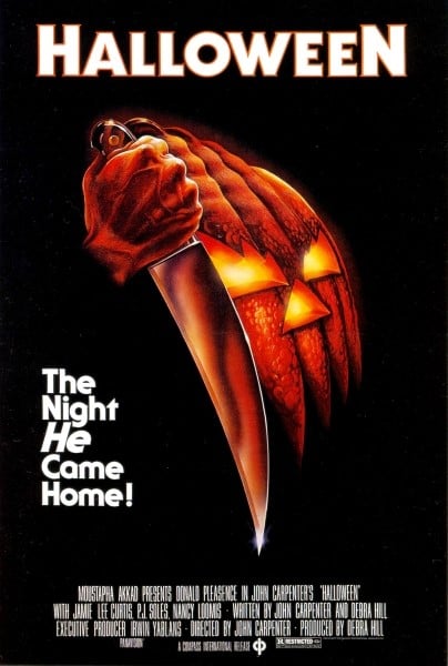
The year 1978 saw the release of a horror film that would immediately become a cult hit and lay the foundations for an entire genre. That film was Halloween by John Carpenter.
Accompanying the release of the first slasher film was a poster that would live long in the memory. It’s all there: a knife wielded by an unknown hand, a menacing and glowing pumpkin, a shudder-inducing tag line and – at the top – the film’s title, Halloween.
The title is white with an orange border on a black background: it’s oppressive, gothic, but at the same time modern. It’s undoubtedly creepy and that’s perhaps why it has become indelibly associated with the eighties: the same font would be used for many other horror films in the decade.
The font used for Carpenter’s Halloween is ITC Serif Gothic Heavy, created by American designer Herb Lubalin and Italian Tony DeSpigna in 1972. It’s a hybrid typeface that combines gothic simplicity with the elegance of Roman characters. The standard version of the same font has also been used in less spine-tingling films like the come latest episodes of the Star Wars franchise, The Last Jedi and The Force Awakens.
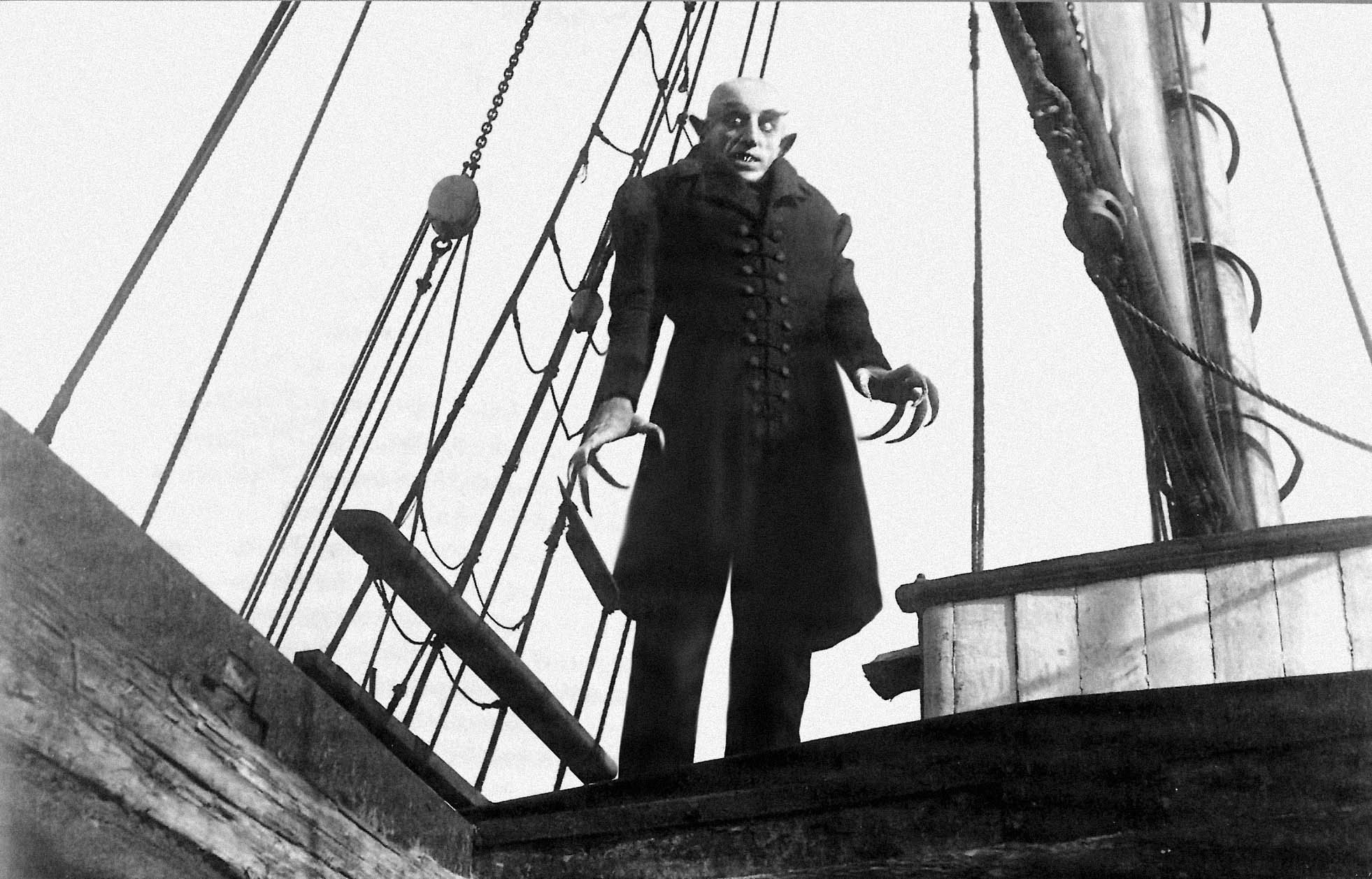
Friedrich Wilhelm Murnau’s Nosferatu

The long shadow of the vampire Nosferatu cast against the wall as he climbs the stairs to attack his victim… despite being almost a century old, the horror classic Nosferatu still sends shivers down the spine today.
Much of the film’s appeal lies in its aesthetics informed by the major artistic movements of the era: German expressionism, art nouveau and art deco. Dark and disturbing framing, cold architecture, sharp contrasts… the film’s murky is capped magnificently by the font used for the title!
The typeface used is Berthold Herold Reklameschrift BQ, designed in 1901 by German Heinz Hoffmann, who at the time worked for the Berthold AG type foundry in Berlin. It’s a font which has art nouveau features and uses gothic characters that were very popular in Germany at the time. But when translated, the font’s name immediately loses its dark mystique : it simply means “advertising font”!
Here you can find a digital version of Berthold Herold Reklameschrift BQ.
Stanley Kubrick’s The Shining
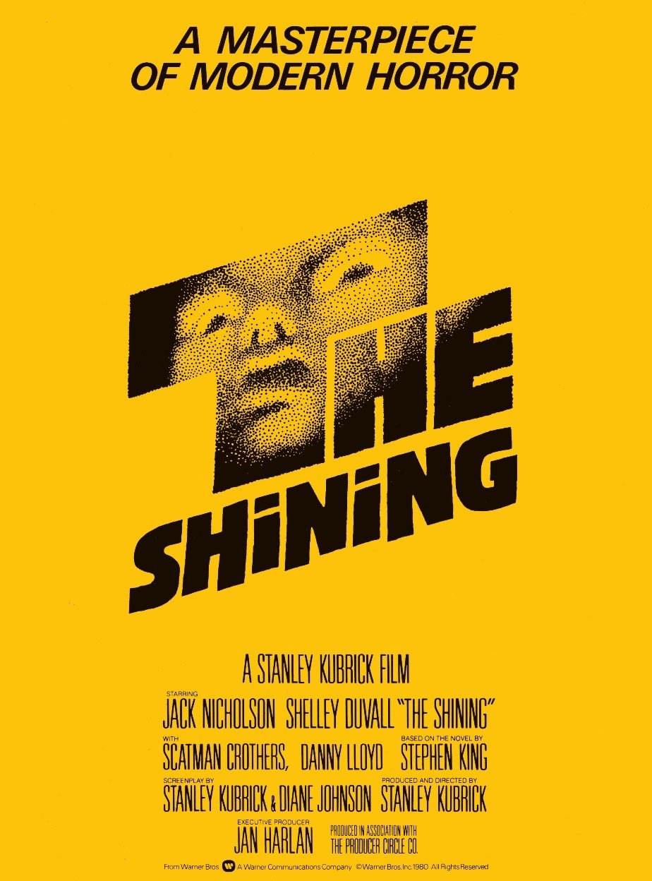
That Stanley Kubrick was an extremely fussy perfectionist is well known. But less well known is that his exacting requirements also extended to the lettering and posters for his films, as the following anecdote from his psychological thrillerThe Shining reveals.
The film adaptation of the Stephen King novel arrived in cinemas in 1980. If you think back to the opening scene, it’s hard not to feel a sense of deep foreboding: a long shot follows the family’s car as it winds across a remote and mountainous landscape, the score heightening the anxiety. But the final touch is the font. A neutral Helvetica that contrasts with everything else while also containing its own disturbing element: the colour. Here’s the whole opening sequence.
However, the typeface used for the title on the poster was specially designed by Saul Bass and that’s who our anecdote is about. Saul Bass was the master of posters (we talk about him here): he designed the poster for Alfred Hitchcock’s Vertigo as well as other masterpieces. But this would not make him immune to Kuckrick’s meticulousness.
Saul Bass proudly and confidently submitted some five designs for the poster for The Shining, but none of these would satisfy the director, who said the lettering was: “hard to read” and “not compact enough”. You’ll find the full story here.
William Friedkin’s The Exorcist

Released in 1973, The Exorcist terrorised whole generations. But what about the font it used? It’s serious, almost ecumenical, in a blood red which foretells the unspeakable to the audience. The poster is enough to put the viewer in the right state of mind for the film: fear.
The lettering was specially created by the designer Dan Perri, using the Weiss Titling font. And it would bring its creator great success. The Exorcist was the first blockbuster on which Dan Perri worked and, with this film in his portfolio, he went on to work on more big movies. In 1976, he designed the lettering and titles for Martin Scorsese’s Taxi Driver and, in 1977, created the iconic titles for Star Wars.
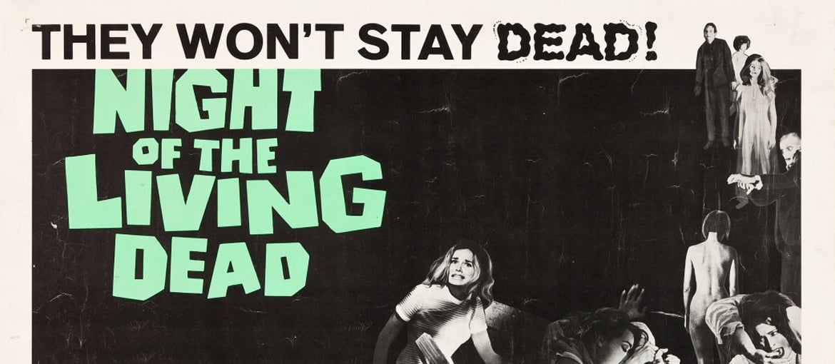
George A. Romero’s Night of the Living Dead
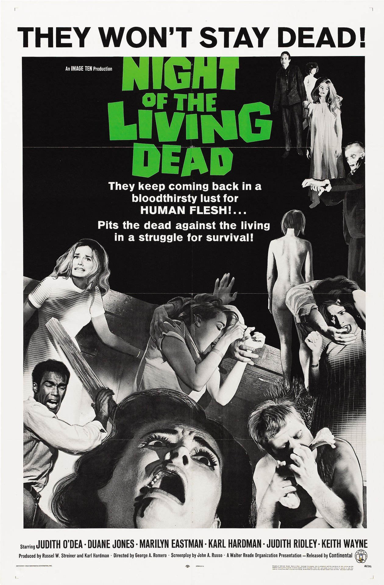
This cult zombie film was George A. Romero’s directorial debut. Not only did it give birth to a new genre in American cinema, the typeface used for the poster and titles spawned many imitations in the years that followed.
If you want to use it for your projects, the closest font you can get is Deanna, created by Chris Hansen and based on the film’s original lettering.
In fact, the film’s original lettering also had a cameo role in the lawsuit that George Romero brought against The Return of the Living Dead – the 1985 film by Dan O’Bannon – which according to Romero presented itself as the (unauthorised) sequel to his 1968 masterpiece. Among the evidence considered by the court was the font: the one used by The Return of the Living Dead was the same as that used in Romero’s film!
Influence on Modern Horror Films
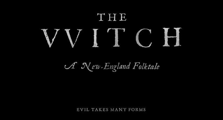
Modern horror films have taken a nuanced approach to typography, blending elements of classic horror fonts with contemporary minimalist aesthetics. This fusion can be seen in films like “Hereditary” and “The Witch,” where the choice of typeface plays a crucial role in setting the tone and enhancing the film’s psychological impact.
Hereditary: The marketing and title sequences of “Hereditary” utilize a serif font that is clean and unembellished, yet it exudes an unsettling quality. The stark simplicity of the font contrasts with the film’s complex and disturbing themes, creating a sense of unease from the very first visual cue. This minimalist approach allows the horror elements to be more pronounced, as there are no decorative distractions to dilute the impact.
The Witch: Similarly, “The Witch” employs a historically inspired typeface that evokes the 17th-century setting of the film. The font’s antiquated style not only grounds the film in its historical context but also adds an eerie, otherworldly feel that complements the film’s supernatural elements. The careful selection of this typeface enhances the film’s authenticity and immerses the audience in its dark, puritanical world.
Evolution and Homage
While modern horror films embrace new design trends, they often pay homage to the fonts of past horror classics. This blend of old and new creates a bridge between generations of horror fans, invoking a sense of nostalgia while delivering fresh visual experiences. The use of retro-inspired fonts in contemporary settings highlights the timeless nature of these designs and their enduring power to evoke fear.
Psychological Impact
The psychological impact of typography in horror films cannot be overstated. A well-chosen font can subconsciously influence the audience’s emotional state, heightening feelings of anxiety and anticipation. Modern horror films leverage this by carefully curating their typefaces to align with the film’s thematic elements. The fonts become a silent storyteller, guiding the audience’s emotions and enhancing the overall atmosphere of the film.
Case Study: A24 Films
A24, a studio known for its innovative horror films, consistently utilizes distinctive typography in its marketing. Films like “Midsommar” and “The Lighthouse” feature typefaces that are integral to their branding. “Midsommar” uses a delicate, almost whimsical font that contrasts sharply with its horrific content, creating a jarring yet effective visual tension. “The Lighthouse” employs a rugged, bold typeface that mirrors the film’s harsh, maritime setting, contributing to the film’s claustrophobic and intense mood.
In conclusion, the evolution of horror film typography reflects broader trends in design while maintaining a strong connection to its roots. Modern horror films use fonts not just as a decorative element but as a vital part of their storytelling arsenal, enhancing the psychological and emotional impact of the visual narrative. By blending classic influences with contemporary aesthetics, these films continue to push the boundaries of how typography can be used to evoke fear and tension.
What do you reckon? Fancy rewatching one of these masterpieces this Halloween?

