
Table of Contents
“Give a child a sheet of paper, some colors, and ask them to draw a car, and they will surely make it red,” said Enzo Ferrari, the man who founded Scuderia Ferrari in Modena.
Since then, the prancing horse has been a symbol of a legend, a myth. Brand Finance has ranked Ferrari as the world’s strongest brand for two consecutive years (2019, 2020): “The prancing horse on a yellow background is immediately recognizable worldwide, even where there are no roads yet. In its homeland and among its many admirers worldwide, Ferrari inspires much more than brand loyalty, more than a cult. It’s an almost religious devotion.”
Let’s now delve into the history, meaning, and evolution of the Ferrari logo.
The History of the Ferrari Prancing Horse and Its Meaning
The first time the prancing horse was associated with the color red and speed dates back to 1692: we can observe it in the emblem of the Royal Piedmont Cavalry Regiment, founded by Vittorio Amedeo II of Savoy – one of the most important cavalry units in European history.
The same symbol – a silver horse, later turned black, on a red field – also appeared on the fuselage of Francesco Baracca’s fighter plane (known as “Asso” in the Italian military aviation), a heroic aviator who served in the Second Royal Piedmont Cavalry Regiment.
In 1923, the prancing horse met Scuderia Ferrari: Enzo Ferrari, after winning a race in Ravenna, met Enrico Baracca, Francesco’s father, and then Countess Paolina Biancoli, Francesco’s mother. She suggested using the prancing horse logo on his cars:
“It was she who told me: ‘Ferrari, put the prancing horse of my son on your cars. It will bring you luck’ […] The horse was and remained black; I added the canary yellow background, which is the color of Modena’s Gonfalon.”
From that moment, the horse became Ferrari’s symbol, albeit slightly modified: the tail points upward, the background turns yellow (in homage to the Modena city flag), and a tricolor stripe is added.
Since 1932, it has appeared in the form of a shield with the initials S. F. on the bodies of two Alfa Romeo 8C 2300 Mille Miglia Zagato Spiders fielded by the Scuderia at the 24 Hours of Spa in Belgium. In 1947, the first Ferrari-branded car (the 125 Sport) also arrived, winning the 1951 Grand Prix and the 1952 World Championship. From this moment, Ferrari’s history, its cars, and its races became legendary.
Did you know there isn’t just one Ferrari logo?
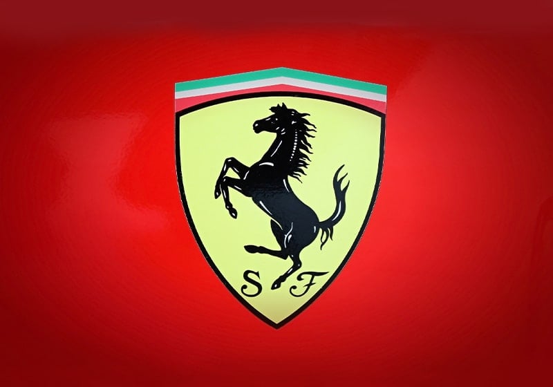
There are two: the rectangular Ferrari logo and the shield-shaped one. The first is the commercial brand and refers to the automotive company, so it appears on cars built in Maranello. The shield-shaped logo, featuring the letters “S” and “F,” represents the Scuderia Ferrari and is used during races.
The Ferrari Logo Over the Years: From 1929 to Today
Over time, the logo has never undergone a drastic change: its elements (prancing horse and flag) and colors (yellow background and black horse) have remained unchanged. Nevertheless, there have been some minor tweaks towards greater simplicity. Here, we review them in the main stages.
1929, the first Ferrari logo
Power. From the very first logo, it conveyed what the company wanted: the horse is restless, muscular, and massive, ready to burst into a frenzied race. Next to the prancing horse are the initials of Scuderia Ferrari, in black on a yellow background.
1931, the Italian flag is introduced
The Ferrari logo is revised: sharpen your eyes, these are indeed small yet decisive details. The thick black border disappears, and the colors of the Italian flag are introduced at the top of the shield. The new logo first appears in 1932 on cars participating in the Spa Grand Prix.
1947, redesign of the Ferrari logo
In 1947, Ferrari entered the automotive industry. A new logo was needed for the cars, one that was more modern and capable of ushering the company into a new chapter of its history. The prancing horse was redesigned: now it is less massive, more elegant, and agile. Below the logo, the name “Ferrari” appears in full, with that gracefully spaced typeface that would become iconic. The yellow color remains but becomes brighter, and the thick black border returns.
2002, the current logo
2002 marked the fourth consecutive Formula One World Championship for the company. It was one of the most prosperous periods for the company. It was also the year of the logo’s new restyling: small, almost imperceptible tweaks that would lead to the version of the logo we can still appreciate today. The restyling was entrusted to the Seidlcluss agency, which adjusted the shape of the prancing horse, the intensity of the yellow color, and removed the black line that separated the flag’s colors.
This is the logo that still defines Ferrari’s visual identity today, an image that is part of our country’s history. A logo that, with just one look, ignites the passions and stirs the hearts of countless enthusiasts.
Would you like to help us add to or improve the content of this article? Check our guidelines and send us your request via email at: seo@pixartprinting.com.