
Table of Contents
Few people know that Alfred Hitchcock, the master of suspense, one of the greatest directors of all time, began his career in cinema as a title-card designer. So it’s no surprise that many of the title sequences for his films are considered masterpieces, in no small part due to his frequent collaboration with legendary designer Saul Bass, who also worked with Stanley Kubrick, Billy Wilder and Martin Scorsese, to name just a few.
From the iconic Psycho to North by Northwest, The Birds, Dial M for Murder and Vertigo, we’ve picked out a handful of Alfred Hitchcock films that perfectly illustrate how he used typography in the opening sequence to set the right tone for the rest of the film.
Dial M for Murder
Released in 1954, Dial M for Murder is based on Frederick Knott’s play – which was already a hit with audiences – and was shot entirely in a London flat. It was Hitchcock’s first and only 3D film, the director having agreed to use this seemingly promising technology that in reality was not yet ready for the big screen.
Perhaps the only moment when Hitchcock fully embraced 3D was in the opening credits: here he chose an oblique and uneven yellow font (that looked as if it had been carved by a knife) with a black shadow presumably chosen to make the letters pop in the 3D version.

In the centre of the screen is the red M of a telephone dial, foreshadowing the phone call on which the entire plot hinges. For this and subsequent scenes, Hitchcock didn’t use a normal telephone, but had one specially made that was over a metre tall.
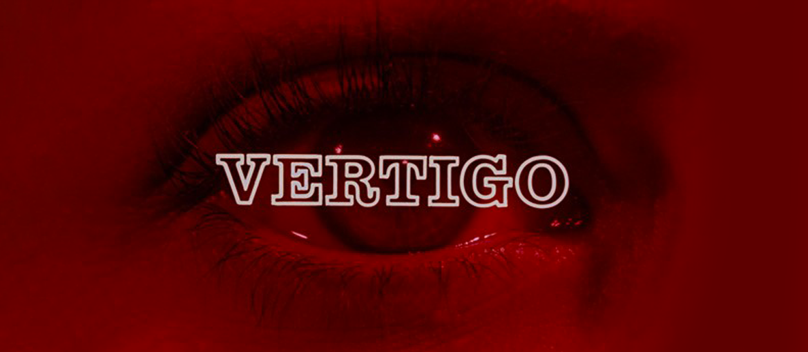
Vertigo
Vertigo came out in 1958 and is the first of three films in which Hitchcock collaborated with designer Saul Bass in creating the opening sequences. Each of these was like “a mini-film within a film”, according to Martin Scorsese, and would continue to influence the thriller aesthetic for years to come.

The soundtrack, changes in colour and tense close-ups help to create an unsettling and intriguing atmosphere that sets the tone for the rest of the film. The mesmerising geometric curves (so-called Lissajous figures) that appear during the title sequence were created by computer art pioneer John Whitney, and are considered by some to be the first example of computer graphics used in the cinema.
Two fonts are used: News Gothic, which we also see in Psycho, and Clarendon, which is adopted for the main title. Clarendon is what’s known as an Egyptian, a typeface with very squared serifs that was in vogue in the 19th century. It was created by Robert Besley in 1845 and is famously the first typeface to be patented. It was so successful that many type foundries copied it after the patent expired.
North by Northwest
North by Northwest) was released in 1959 and the spy thriller masterpiece was one of Hitchcock’s most successful films.
Once again, the opening credits were designed by Saul Bass and were the first in cinema history to use kinetic typography, an animation technique that blends movement and text using video animation. The words slide on and off the screen following a set of grid lines that eventually fade into the facade of a Manhattan skyscraper (David Fincher pays homage to this sequence in his 2002 film Panic Room).

The intersections between lines and the movement of the text foreshadow the series of plot twists and turns that await the viewer in the film, while the credits end in shots of the streets of New York teeming with people, among whom we catch a glimpse of Alfred Hitchcock trying (unsuccessfully) to board a bus.
Psycho
Psycho, released in 1960, is widely considered to be one of Hitchcock’s best films and was his most successful at the box office. The shower murder scene is now etched into the collective memory and is a masterful piece of directing that raised the bar for the level of violence audiences were prepared to accept on the big screen.
Even the opening credits, created by Saul Bass with the help of lettering artist Harold Adler, were boldly innovative for the era: the uppercase text – in the sans serif Venus Bold Extended and News Gothic Bold fonts – are fragmented by vertical and horizontal lines, making them hard to read and hinting at the distressing atmosphere to come.

Creating this effect, as Adler explained, was a painstakingly handmade affair. The bars that we see in the credits were pieces of plywood painted white and moved by hand; each movement had to be precisely timed, and very often the bars would veer off course, meaning the whole scene would have to be reshot. For the lettering, the text was photocopied and split into three parts, each moved individually in one direction and carefully filmed.
The Birds
The Birds is the 1963 movie that followed Psycho: Alfred Hitchcock was by now universally recognised as the master of suspense.
Yet again, the opening credits foreshadow the sense of total derangement which the viewer will only find well into the film and that contrasts markedly with the calm opening scenes. In fact, an initial version of the credits, later discarded by Hitchcock, showed delicate Chinese prints of birds, and was far more in keeping with the calm mood of the film’s beginning.

The credits eventually chosen, designed by James S. Pollak with the help of Harold Adler for the lettering, instead show a cold, almost unnatural text in cyan against a background of silhouetted birds fluttering menacingly. Each piece of text disintegrates before leaving screen, as if pecked to pieces by the birds. Curiously, however, there are no closing credits; it’s almost as if Hitchcock didn’t want to bring an end to the terror he created in the film.
So we’ve seen how the opening credits are a crucial detail in the film-making of Alfred Hitchcock. Many of them are films within films that experimented with innovative techniques and set new standards for the years to come.
Hitchcock’s title sequences hint at the emotions that audiences will feel during the film, but without spoiling the plot. How do they do this? More than just picking fonts, Hitchcock and his collaborators play with text transformation and movement, as well as compositional aspects such as typefaces, colours and other graphical and audio elements. All to stunning effect.