
Table of Contents
“You can do a good ad without good typography, but you can’t do a great ad without good typography”.
Herb Lubalin, type designer
The world’s greatest graphic designers, particularly those from previous generations, had a penchant for a handful of fonts they were familiar with, prioritising reliability and stability over variety in their designs.
They focused on asceticism of form and clarity of information.
What’s more, there being yet no computers for working on graphic design projects, grids and layouts were far more restrictive, forcing designers to adopt a conservative approach that eschewed the more elaborate fonts.
“Typography is two-dimensional architecture, based on experience and imagination, and guided by rules and readability”.
Hermann Zapf, type designer
In our exploration of the favourite fonts of graphic design greats, contrary to what many might expect, we’re not going to start with the iconic Helvetica.
We’ll begin instead with its “father”, superbly designed in the late 1800s and still looking fresh and modern 150 years on.
Akzidenz Grotesk
Although designed in 1896, Akzidenz Grotesk only reached the height of its popularity in the 1950s. It is the father of two extremely famous fonts: Helvetica and Univers.
Using it is a declaration of love for minimalist graphic design and a rationalist and ascetic aesthetic.
Baskerville
A classic and one of the most beautiful fonts ever created: its oldest version dates to the mid-eighteenth century, before it was redesigned as New Baskerville.
It’s classical, elegant and highly legible. Times New Roman pales in comparison with such a striking, well-designed font.
It works equally well in large points and capitals for titles as it does in smaller sizes for long texts: for example, Italian publishing house Adelphi has used it for years to lend “character” to its catalogue.
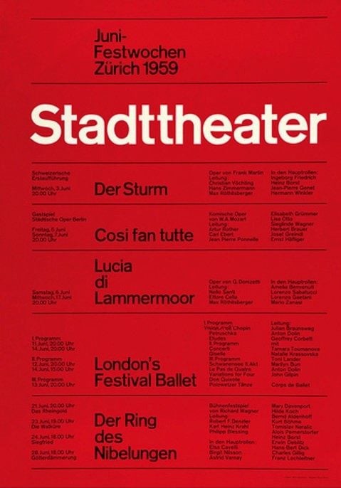
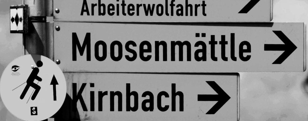
DIN 1451
DIN 1451 is a popular choice when the graphic design needs to be modern and the font linear but functional.
DIN evolved out of a typeface for Prussian railway stations and became a standard in Germany in 1936, used in all sorts of settings (like signage and building numbers); you can see straight away that behind it lie the revolutionary ideas of the Bauhaus and not the regime that was rising to power at the time.
Every designer has used it at some point in their career.
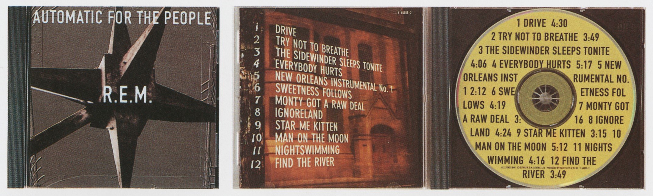
Here’s a famous example from REM’s classic album “Automatic for the People”.
The font works so well that in many European countries it’s the standard for road signs.
But you’ll also find it on lots of packaging, especially products that have to give off an industrial vibe, like paints.
Sabon
This is a masterpiece from the great graphic designer Jan Tschichold. He was commissioned to develop the typeface in 1966, basing it on the legendary Garamond (which we’ll come on to shortly), managing to strike a stunning balance between elegance, originality and legibility.
Designed to work best with book text, it is also used for the following famous logos.
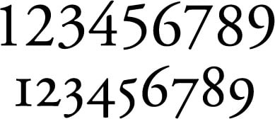
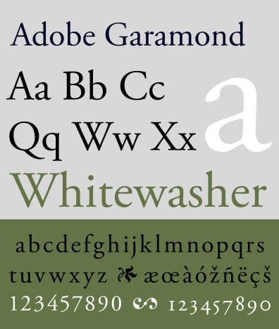
Garamond
No graphic designer worth their salt can do without a classical, functional font like Garamond, in any of its many versions developed the world over.
In Italy, it’s a byword for culture , so much so that most publishing houses use it, from Einaudi to Bompiani, from Rizzoli to Guanda and many more.
One of the most famous versions is that used by Apple.
But it’s a versatile typeface that you’ll find in all sorts of places: one of the most storied serif fonts, it was created way back in the 1500s and has since evolved and changed shape on several occasions.
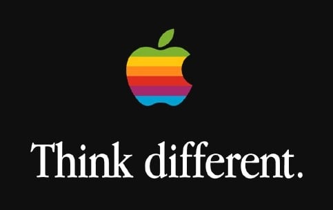
It is superior to the controversial Times New Roman and, in some versions, its numbers and italics are of incomparable elegance.
This may seem like a brief list, but that’s all a good designer needs, said Massimo Vignelli, the famous Italian graphic designer and adopted New Yorker (and the man behind the graphics for the New York subway) in an interview a few years ago (source:https://bigthink.com/)
“Even being very generous, there aren’t more than a dozen truly good typefaces around these days. Actually, I haven’t used more than three or four in my whole life.”