
Table of Contents
Italy’s second-best-selling newspaper does not deal with news or politics, but with sport. La Gazzetta dello Sport is Europe’s oldest sports newspaper and is so popular it even has a nickname, La Rosea (the pink one), due to one of its most recognisable characteristics: its pink paper.
Founded in 1896, the Gazzetta has survived over a century of Italian history, adapting to technological and social changes and searing itself into the country’s memory though the most epic sporting feats.
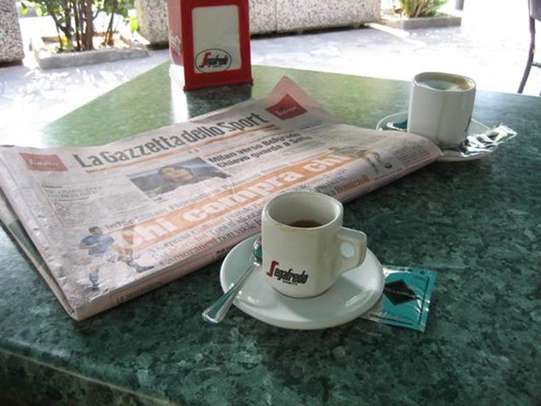
It is the quintessential Monday paper, full of commentary and analysis on the Serie A football games from the day before, and Italians like to read it in the cafe while sipping a cup of espresso and munching a croissant.
Let’s take a look at its history and its graphic design.
Over a century of sport
La Gazzetta dello Sport was born following a wave of interest in sport in Milan in the 1880s, when people started to follow cycling, horse racing and running with great enthusiasm. The newspaper’s launch stemmed from competition between two papers: Corriere della Sera and Raffaele Sonzogno’s Il Secolo. In 1893, Sonzogno launched a weekly publication named Il Ciclo, printed on pink paper.
The decision to create a a newspaper dedicated to all sports, inspired by French experiments like Le Vélo and Paris–Vélo, was a key moment in the history of Italian sports publishing. Eliso Rivera and Eugenio Camillo Costamagna were put in charge of the new publication.
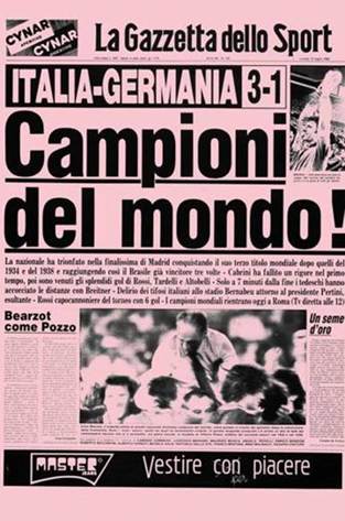
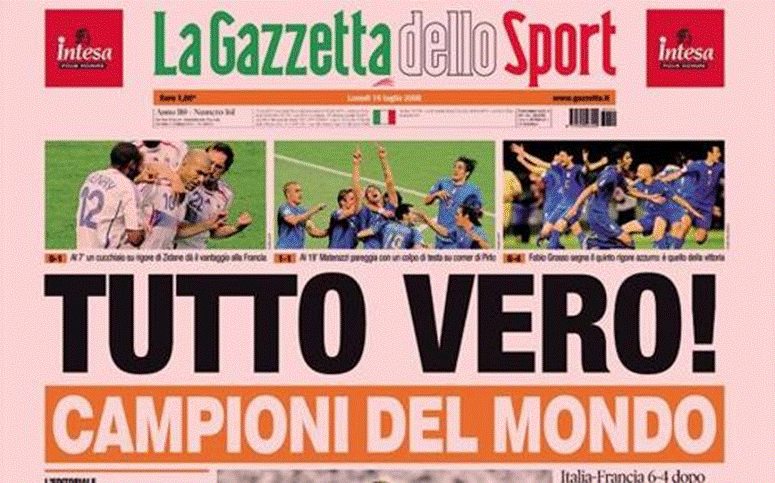
In 1908, following the announcement of the launch of the Giro d’Italia cycle race, the newspaper’s circulation reached 100,000 (at the time it was published three times a week), and at its peak in the 1920s this figure reached 500,000. The record, however, came on 12 July 1982, the day after Italy’s history-making World Cup final victory in Spain, when a whopping 1,469,043 – almost 1.5 million! – copies were printed, using all the production lines the company could get their hands on and finding its way into almost every Italian home.
The front page bore the headline ‘Campioni del mondo!‘ (World champions) in large letters.
Striking graphics and typography, designed for quick reading
La Gazzetta dello Sport‘s evolution reflects the changes that have occurred in the Italian publishing sector over the last century.
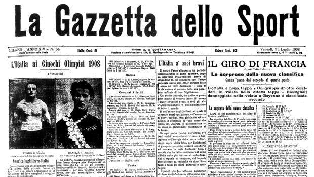
In 1930 the newspaper was split into seven columns, which later became eight, within a classic, large, broadsheet format. It was only in 2008, during the most radical redesign in the newspaper’s history, that the Gazzetta did the same as many other titles and abandoned its traditional broadsheet format in favour of a smaller tabloid format (275 x 404 mm). The smaller size also meant the number of columns had to be reduced to six.
Wenceslau News Design entrusted the redesign to the Barcelona-based studio Cases i Associats, which worked on the design of the entire newspaper and its digital extensions. Particularly noteworthy was the choice of the Font Bureau font Titling Gothic – a very bold sans-serif – as the main font.
The goal of the redesign was to improve the readability of the pages by making the titles and colour boxes more logical and creating simple yet impactful graphics.
However, a few years later, the publishers decided to switch to a new font in the Tablet Gothic family, designed by TypeTogether. According to the design manager, the choice was approved immediately for various technical and aesthetic reasons: the readability needed to be improved – for example the serif capital ‘I’ was often confused with a lowercase ‘l’ – and the font’s 84 different stylistic variants offered a wide range of possible combinations.
The font proved particularly effective for this kind of newspaper, which needs to be read quickly; a strong visual impact is vital to grab readers’ attention.
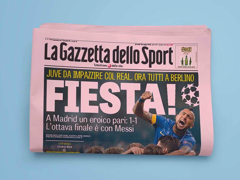
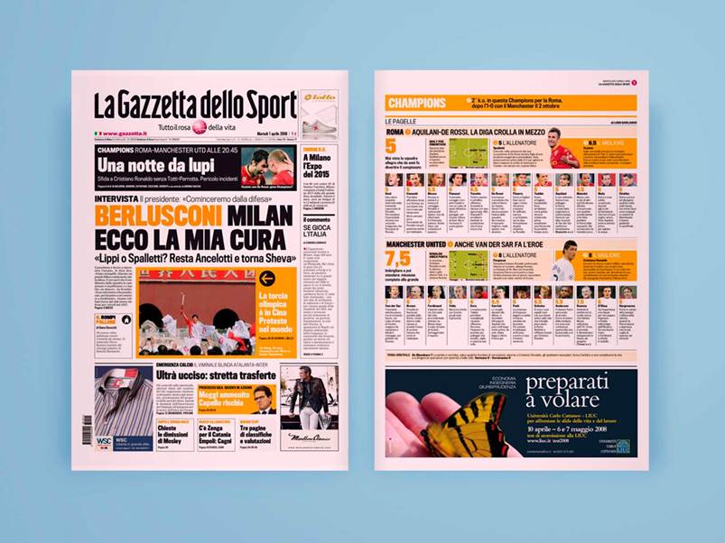
La Gazzetta’s graphic design is masterfully crafted to engage the reader; the bold and colourful headlines, for example, have the feel of a jubilant crowd of football supporters, stimulating a participatory emotional response. The pages – which are always full of news, facts and statistics – have to be well balanced and follow a strict hierarchy, so the many different elements (attention-grabbing headlines, photographs, boxes, tables of key results, ratings and schedules) do not create confusion and make the paper hard to read.
The careful use of colour, the tables, the inside covers featuring large photos and quotes or superimposed headlines, and the use of cross-references, balloons, small boxes and other graphic design elements make the modern Gazzetta attractive, captivating and easy to browse.
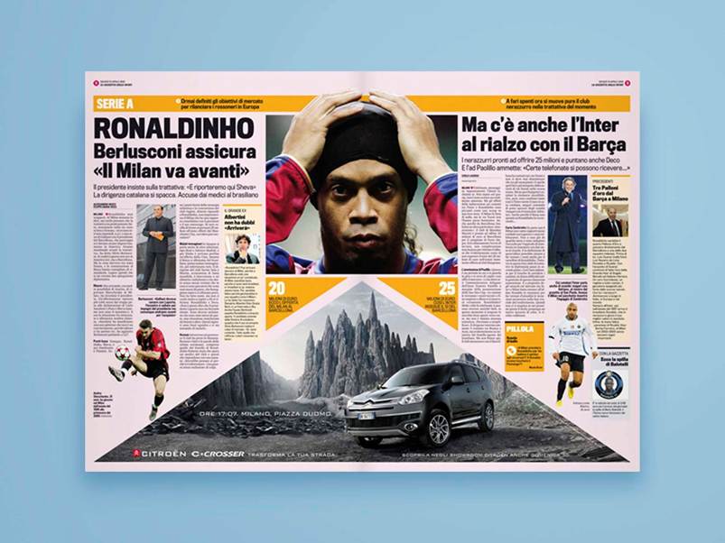
The Gazzetta has followed the recent trends seen in most newspapers and magazines: there is colour everywhere, the headlines jump out from the page and the graphic layout has become even more daring. While these choices may detract from the layout’s elegance, they are essential for grabbing the reader’s attention in a market that is mercilessly dictated by the laws of the attention economy.
Exhilirating infographics and memorable photos
A newspaper like the Gazzetta needs to be spectacular and epic almost every day. Images play a vital role in creating rich storytelling and producing new myths.
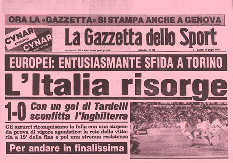
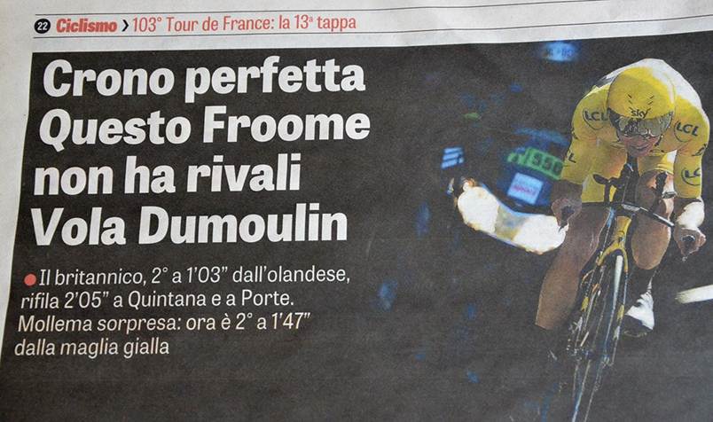
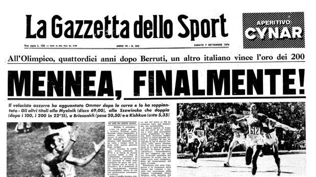
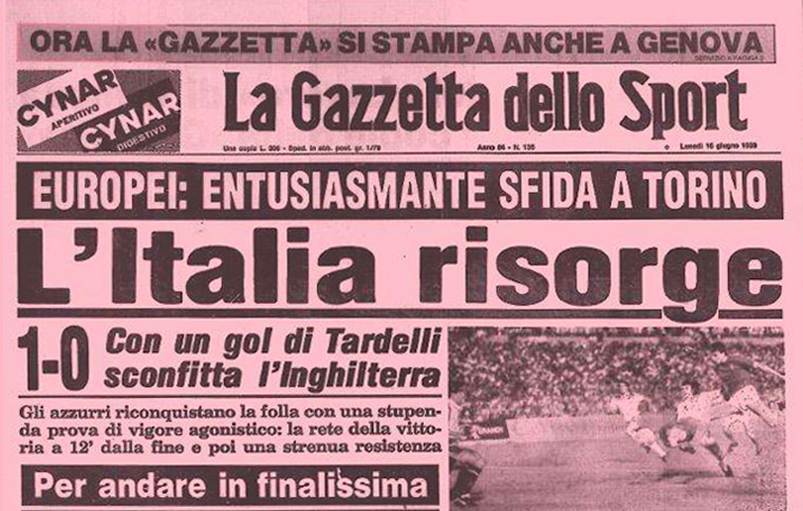
Large photos appear not only on the cover, but also to introduce the various sections inside. Many of the cover images have become part of Italy’s national history – Pietro Mennea’s victories in the 200 metres, or Dino Zoff lifting the World Cup in 1982, for example – but there have been plenty of other memorable images through the decades. The editors tend to choose photos of triumphant moments (celebrations, award ceremonies, cups and trophies raised high in the air) or epic moments (like Usain Bolt crossing the line to claim the 100m world record).
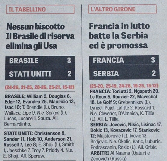
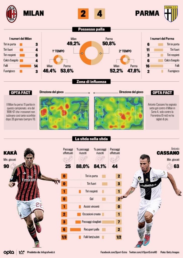
The infographics perform a similar function: they are used to praise teams’ or players’ results, analyse their performance statistics, compare how the different teams fared and, last but not least, summarise stories and biographies.
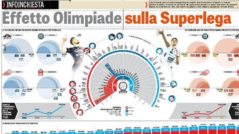
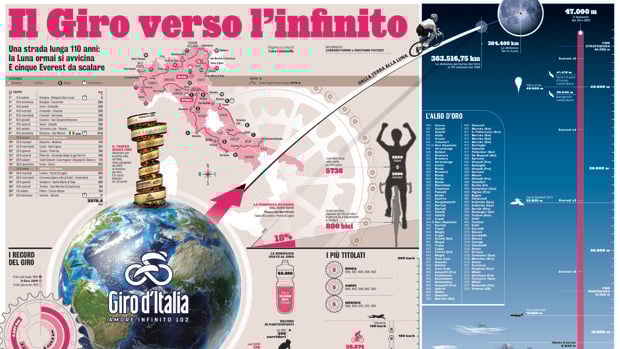
Infographics are also used almost scientifically, providing an objective view of a sporting event and helping to fuel discussions between readers.
One example of this is the classic post-match analysis of the Serie A games, which can sometimes take up an entire page.
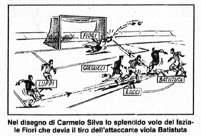
Although the widespread use of infographics is relatively recent, the Gazzetta has always used drawings and informative graphics to help it explain how people’s sporting heroes performed.
Take the famous moviole – or ‘slow-mos’ – of the Serie A goals, which until the 1990s were drawn by Carmelo Silva, showing how the action progressed through images of the players and arrows representing passes, assists and movements. For twenty years, people compared Silva’s moviole with those of his colleague Paolo Samarelli in the weekly magazine the Guerin Sportivo, which could print them in colour. In an era where TV highlights only showed one angle, the hand-drawn moviole were a fantastic descriptive and technical analysis tool.
‘Our job was to recreate the goal action on paper, one detail after another, perhaps reviewing it multiple times on the video recorder.’**
A historic newspaper that embodies Italy’s love for sport
La Gazzetta dello Sport is an entirely Italian phenomenon. It’s the country’s second-biggest-selling daily newspaper, peaking at over 150,000 copies sold on Mondays, when it includes commentary on the Serie A matches. It’s a staple of the Italian coffee bar, and is capable of rousing fans and praising (or criticising) leading sporting figures, as well as capturing the nation’s pride following important victories or sporting feats.
Unlike its better-selling French cousin L’Équipe (which we’ll discuss in another article), in recent times its journalism hasn’t been particularly literary; it has focused on a simple, immediate language, full of metaphors and highly effective nicknames. But in the 1950s, under the editorship of Gianni Brera, it was a different story altogether. The articles successfully created miniature legends, drawing on bold and effective wordplay and metaphors. In the 1970s La Gazzetta embraced a different writing style, where the journalists did not pontificate or give too many personal opinions, but instead tried to stay at the same level as the readership, while explaining technical aspects of the sports they were describing. They also took more interest in what happened before and after events and combed through mountains of gossip and trivia, while also interviewing the biggest stars.
In conclusion, La Gazzetta dello Sport is the newspaper that – more than any other – epitomises Italy, its language and its way of thinking. It represents the most animated and spirited component of its population: the fans and supporters who enjoy discussing football (other sports, with the exception of cycling, are always given many fewer column inches) and saying what they would have done differently the day after a big match. The newspaper has adapted over the years to the way its readers think about and experience sport and life in general. By retracing its story over the decades, you can see the journey La Rosea has taken, and how society has changed with it.
*
https://www.figc.it/it/tifosi/uno-storico-europeo/italia-inghilterra-1980/la-gazzetta-dello-sport
**
From an interview with Stefano Impedovo, an artist at the Guerin Sportivo