
Table of Contents
When, in the summer of 1997, a handful of copies of a new children’s book appeared on the shelves of London bookshops, hardly anyone batted an eyelid. But within those pages lay a universe that would enthral millions of readers and thrill generations of fans, young and old.
That book was Harry Potter and the Philosopher’s Stone, the first volume in the immensely popular saga created by British author Joanne Rowling – from that moment on better known under her pseudonym, J. K. Rowling.
Translated into more than 80 languages – including Latin and Ancient Greek – the Harry Potter saga was a publishing smash-hit: the first book sold over 120 million copies alone, while the series as a whole has sold more than 600 million. In this article, we take a closer look at the seven books that make up the saga and their great many graphic guises.
From the very first cover, designed by an enthusiastic young illustrator, to the Chinese cover chosen through a contest; from the American covers with different titles to the subtle Japanese covers designed by a former marathon runner: here’s our selection of the most interesting Harry Potter covers.
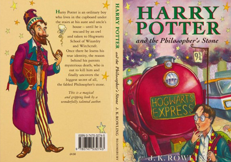
The first cover, designed by a rookie illustrator
We begin with the first appearance of Harry Potter in bookshops: on 26 June 1997, Bloomsburypublished Harry Potter and the Philosopher’s Stone in the UK.

The first print run was tiny at around 500 copies, which may explain why the commission for the cover art was given to a young rookie illustrator called Thomas Taylor. The Harry Potter cover was 23-year-old Taylor’s first official job as an illustrator: his main job at the time was as a sales assistant in a children’s bookshop. As he explains on his website, for his first gig Taylor bought some new pencils and a bottle of Belgian beer to celebrate. The first draft was ready two days later: it was a pencil sketch coloured in with watercolours and then outlined with black watercolour pencil.
This simple cover was also used for the first editions in Canada, Australia and India.

Sadly for Thomas Taylor, for subsequent instalments of the saga Bloomsbury opted for more experienced illustrators (Cliff Wright, Giles Greenfield and Jason Cockcroft) as the book was now an international best seller.
But Taylor, who is now himself a successful children’s author, only has one regret: that he didn’t buy a copy of the first edition, which would today fetch about £40,000.
The first American edition, with a different title
In 1998, the first American edition hit the shelves, published by Scholastic. As you’ll notice immediately,the title was changed to Harry Potter and the Sorcerer’s Stone. The book’s US editor, Arthur Levine, thought that the term “philosopher” sounded too archaic for an American audience.
The cover art for all seven books in the series was designed by American artist Mary Grand Pré. Considered instant classics, with some remaining in print for almost 20 years, these covers are synonymous with Harry Potter for an entire generation of Americans.

Indeed, it was Grand Pré who devised the Harry Potter “logo”, giving the “P” of “Potter” the distinctive lightning bolt, amongst other things. Designing lettering wasn’t actually part of the commission, but was something Mary Grand Pré did off her own bat, as she wasa huge typography enthusiast.
It turned out to be an inspired idea: the Harry Potter lettering with the lightning bolt was adopted as the logo for the film, as well as many other foreign-language editions, including Finnish and Indonesian, and was even transliterated into Cyrillic!
Harry Potter covers “for adults”
Harry Potter’s runaway success swept up not just kids and teenagers, but adults too. Which is why, in the UK, publisher Bloomsbury decided to publish a version with covers explicitly designed for adults.

Challenging the axiom “never judge a book by its cover”, the only thing the publisher changed between the version for children and the version for adults was the cover.
While the photographs on the first adult edition were nothing to write home about, in 2013 Bloomsbury published another version featuring incredible engravings by Andrew Davidson, a renowned British artist specialising in woodcutting.
Linocut collector’s editions
Another series of covers to use an artistic printing technique is Scottish artist Clare Melinsky’s special-edition of the Harry Potter saga, which was published in the UK in 2010.

These covers were created using linocut, a type of relief printing which, as the name suggests, uses a thin block of linoleum.
Ensconced in her cottage in south-west Scotland, Clare Melinsky produced a series of elegant and colourful illustrations that allude to key plot developments in the story.
The mysterious Italian cover… with a giant rat
The Italian translation of the first book came out in 1998. It was published by Salani, who commissioned illustrations for the cover from Serena Riglietti.
This cover has long perplexed J. K. Rowling: the young magician is depicted wearing a bizarre rat-shaped hat while hunched over a game of chess with a giant rat at his side.

None of these elements appears in the story, leading the author to wonder muse on social media: “I’ve always loved that cover because it’s so odd. Why the rat head? Why the giant rat in the headscarf? I never met the illustrator, so I still don’t know.”
The answer came in an interview with the illustrator: as is the case with many other controversial covers, Serena Riglietti had not read the book when she got the commission. All she had to go on was a brief synopsis of the book from the publisher, which included the line “Harry Potter is a kid at a magic school where pupils can take a rat or an owl into class with them”. Which explains the rodent’s appearance on this cover.
Despite these details, the Italian edition was a bestseller, and the cover would be indelibly etched into the memories of millions of young readers. The same illustrator would also design the cover art for all the subsequent instalments of the saga published by Salani until 2007.
The Chinese cover chosen by competition
Some of the most unusual covers in the Harry Potter saga were released in China as part of a special collector’s edition.
These intriguing illustrations were the result of collaborations with artists who won a design competition held by the publishing house. Although disliked by some fans because of a spoiler, they contrast markedly with many other international editions of the Harry Potter saga.

The elegant covers of the Japanese edition, with illustrations by Dan Schlesinger
Some interesting anecdotes lie behind the covers for the first Japanese edition of the Harry Potter saga, which feature illustrations by American artist Dan Schlesinger.

Schlesinger – whose long and varied career included stints as an elite marathon runner and Harvard-educated lawyer – has a long-standing connection with Japan. He was in the country learning traditional engraving techniques when he was approached by an obscure publishing house looking for new material to publish.
At the time, Schlesinger’s son was reading a recently published book little known outside of the English-speaking world. And the title? You guessed it: Harry Potter and the Philosopher’s Stone. This is how, after recommending the book to the publisher, Dan Schlesinger came to design the Japanese covers for the saga using subtle and atmospheric pastel and pencil drawings.

Who knows what wonderful work will next adorn the covers of J. K. Rowling’s classic series? And what about you? Which are your favourite Harry Potter covers?