
Table of Contents
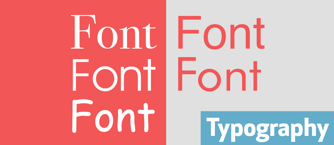
Language has a physical presence and this is expressed through fonts. Carefully choosing which font to use is less about personal taste than it is about following the typographical rules that are the hallmarks of a professional job.
In this article, we reveal fascinating facts about some famous fonts, from those most loved by designers to the most reviled one of all time (we bet you’ve already guessed which it is). Knowing their history will help you use them better.
Bodoni: the first modern typeface
Let’s start in the company of Giambattista Bodoni (1740-1813), one of the most important figures in the history of Italian typography. Giambattista was a printer, typographer and director of the Tipografia Reale di Parma. In 1788, he published his most important work, Il Manuale Tipografico, which listed the four qualities of a good font: regularity, clarity (legibility), good taste (simplicity) and beauty. Virtues that can be found in the typeface he created, Bodoni. In its design, he used geometric rules to give letters the characteristics he desired.

Bodoni is considered the first modern typeface because it’s fine, austere and elegant, with clear contrast between the strokes (some thin, others thicker) and serifs that are perpendicular to the stroke, rather than curved like those typical of the Renaissance.
Avant Garde: the typeface designed for a magazine
One of the most important figures in international design was Herb Lubalin (1918-1981), art director of Avant Garde magazine. Herb Lubalin designed the Avant Garde font together with type designer Tom Carnase. The history of this typeface is intertwined with that of the eponymous magazine: in fact, the font was created for the publication’s logo.
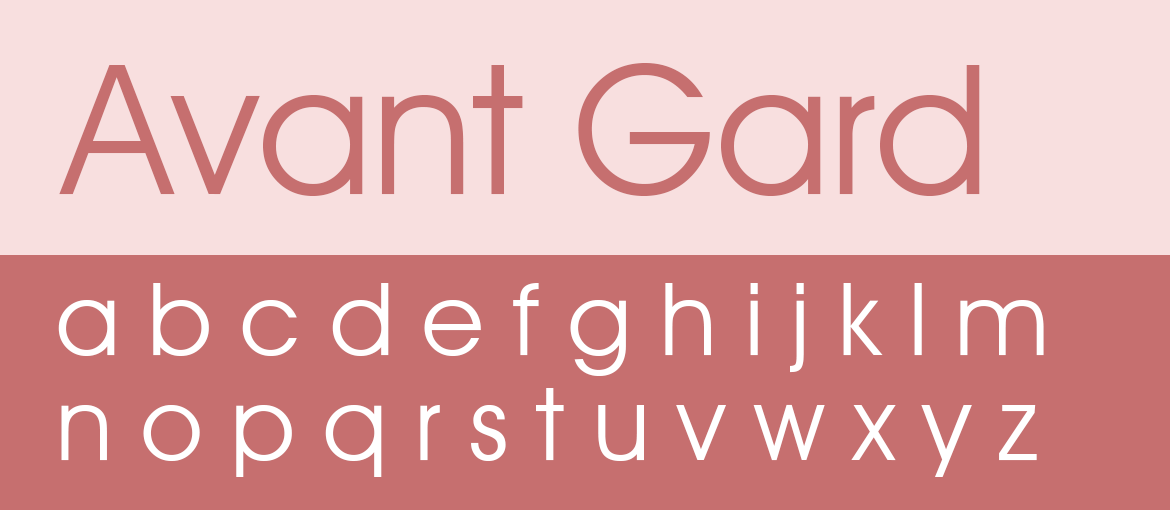
So, what are the features of this sans serif font? If you had to associate this typeface with a geometric shape, it would undoubtedly be the circle. And it is, in fact, the circle from which the simple, linear forms of the letters are derived, resulting in a clear and easy-to-read font. As well as having more than one version of the same letter, the typeface also includes a series of ligatures – two or more letters joined together to make a single character – that hark back to the monumental texts of the 14th and 15th centuries. Because of its retro feel, Avant Garde is often used in vintage graphics.
Futura: the first font on the moon
In Germany, in 1927, Paul Renner created a new typeface: Futura. The font fully encapsulated the spirit of the time, when the rationalism and functionalism of the Bauhaus school reigned supreme. Futura, a sans serif font, has a precise geometry and its characters are derived from simple shapes like the circle, square and triangle. The result is a minimalist, elegant and modern design.
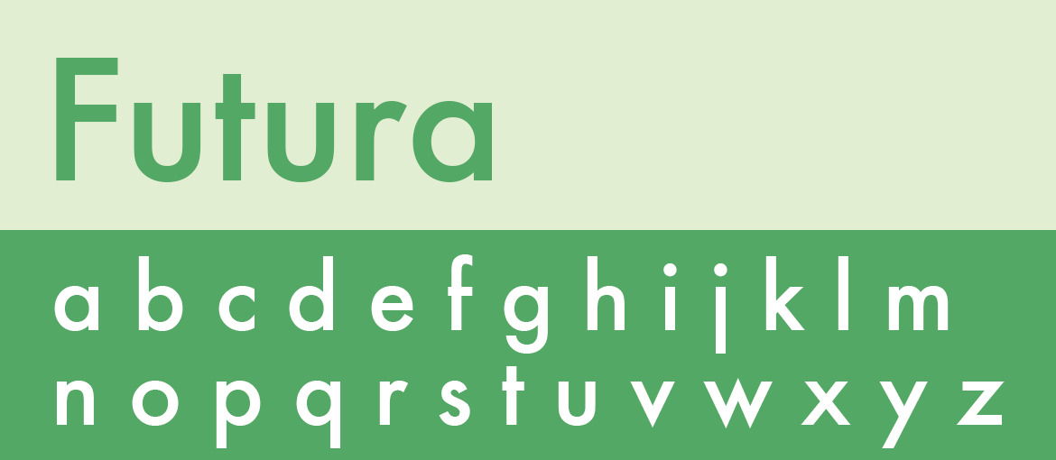
The Fifties were the golden age of Futura, with many advertising agencies adopting the font for campaigns and headlines. You’ll see the font in the logos of brands like Volkswagen and Ikea (which later switched to Verdana), and on posters for famous films, including “2001: A Space Odyssey” and “American Beauty”. But undoubtedly the greatest achievement of Futura was landing on the moon: it was the font used to engrave the aluminium plaque left behind in 1969 during the Apollo 11 mission. With its modern name and design, Futura foretold the conquests to come.
Helvetica: the 100% Swiss font
Helvetica is a typeface commissioned by Eduard Hoffmann and designed by type designer Max Miedinger in 1957. Eduard Hoffmann, president of the Haas Type Foundry, asked Max Miedinger to design a new sans serif font to compete with the popular Akzidenz Grotesk, a typeface created in 1896 by German type foundry H. Berthold AG. And so Neue Haas Grotesk was born, and was subsequently rechristened Helvetica, to emphasise its place of birth: Switzerland. The name Helvetica derives from the Latin word for Switzerland, “Helvetia”.
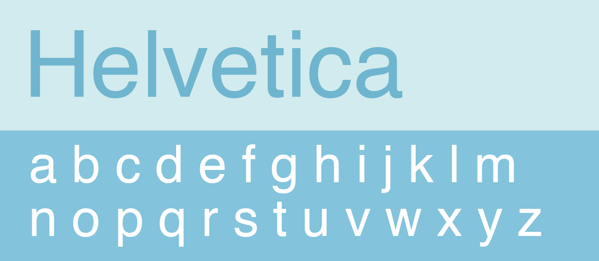
Helvetica is a technical, minimalistic and highly legible font. It was widely used in the Seventies and can be found in many logos and advertising campaigns from the era. It’s still going strong today, largely thanks to Apple, which in 1984 included the font in its operating system, thus ensuring its success. Helvetica was the font chosen by Unimark for the New York subway’s signage, and is also used in the logos of Toyota, Lufthansa, Panasonic, Mattel, Jeep, The North Face and American Airlines.
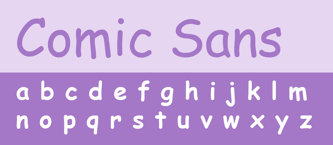
Comic Sans: the most reviled font
We’ve reached the most reviled of all fonts: Comic Sans, developed by Microsoft and designed by type designer Vincent Connare in 1994. In 1995, it was included in the Windows operating system, and quickly became one of the most popular fonts. Comic Sans is a simple sans serif typeface, silly and childish, inspired by the speech bubbles used in comics, hence the name.
Why do so many people have it in for this font? Beyond purely aesthetic considerations, the problem with Comic Sans is that it’s often used inappropriately. The most egregious example of misuse comes from the world of science. The crime against typography was committed by CERN in Geneva, which presented one of the most important scientific breakthroughs in history, the discovery of the Higgs boson, with a slide using this frivolous and informal font. The “God particle”, as it is also known, surely deserved a more reverent typeface.
We hope you’ll keep these fascinating facts in mind when you next use one of these fonts for one of your future communication projects.