
Table of Contents
Think of a piece of Tiffany jewellery. Finished? We bet at least two images popped into your head: an elegant Audrey Hepburn eating breakfast in front of the Tiffany shop window and a precious little turquoise box. Were we right?
This just goes to show how powerful this now legendary brand is. Although the cult 1960s film Breakfast at Tiffany’s made the New York-based jewellery firm the epitome of luxury, the brand has also been accompanied by a specific colour throughout its almost 200-year history: Tiffany Blue.
We’re currently exploring the world of iconic colours, and this colour, which more than any other is identified with luxury and elegance, simply had to be included! Today, we’d like to tell you the story – through a series of anecdotes and some smart business strategy – of how Tiffany & Co. not only exploited the distinctive nature of its turquoise blue, but – almost uniquely – managed to own it outright.
What is Tiffany Blue?
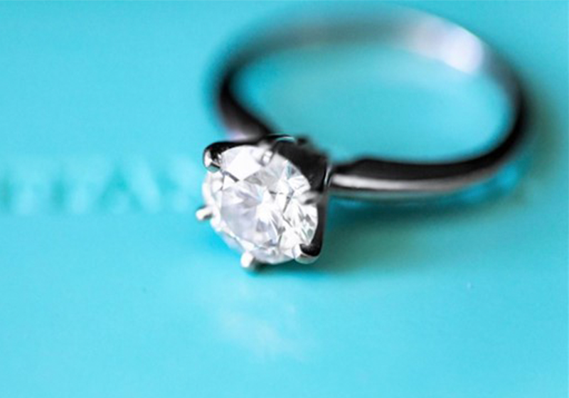
Also known as robin’s egg blue (for reasons that will soon become apparent), Tiffany Blue is a hue slightly darker than turquoise.
Sophisticated, stylish and unforgettable, it has its own Pantone code: 1837 Blue. The number 1837 is no random series of digits; it’s the date the famous new York jewellery firm was founded.

Laurie Pressman, vice-president of The Pantone Color Institute, defines Tiffany Blue as a “cool and fresh aquatic blue shade, a colour that speaks to vibrancy and escape, you are immediately transported into a world filled with luxury and delight”.
Isn’t that exactly how you feel when you look at an iconic Tiffany Blue box?
It all stems from a robin’s egg
Did you know that the closest thing to Tiffany Blue in the natural world is the egg of a specific bird: the American robin?

The robin’s egg colour was first used by Tiffany in 1845, when it was chosen for the cover of the brand’s Blue Book, an annual publication used to present its jewellery. Later the same turquoise shade was used on some packaging, and it was then that it began to acquire legendary status.
Nobody really knows why Charles Lewis Tiffany chose this particular colour, but there are a few theories out there. For example, turquoise was already very fashionable in the Victorian era for special dove-shaped jewellery that brides often gave to their bridesmaids.

In any case, it was certainly not the reason it was chosen that gave the colour its iconic status, but rather the clever way it was used, protected and nurtured by the brand, increasingly fostering its association with the name.
Turning a colour into an icon: from packaging to pop art!
Way back in the early twentieth century, the iconic Tiffany boxes were protected by a strict rule that still applies to this day: no box could leave the factory without a piece of Tiffany jewellery inside. This strategy increased the value of the turquoise boxes, which became a symbol of luxury themselves.
Over the decades, the link between Tiffany Blue and the American company became ever stronger. Advertising campaigns made bold use of the colour – like in 2018, when the taxis in New York were painted Tiffany Blue – while collaborations were forged between Tiffany and other firms based exclusively on the use of the colour, as with the Nike trainers.
Another revealing anecdote concerning Tiffany Blue concerns a painting by American artist Jean-Michel Basquiat, a leading exponent of graffiti and Pop Art in the 1980s.

The work Equals Pi, created by the New York-based artist in 1982, stands out for its Tiffany Blue background. At the time, the colour had not yet been trademarked by the jewellery firm, but Tiffany’s managers did not let the opportunity pass them by. Not only did the buy the painting to put up in the firm’s headquarters, they also used it in a 2021 marketing campaign starring Beyoncé and Jay-Z, with the aim of attracting a new generation of customers.
This led to a fierce row: Tiffany’s comms managers suggested the blue used by Basquiat was a homage to the company, while the artist’s team were horrified, and stressed his anti-establishment message.
From a colour to a trademark, and an attempt to “steal” it
These stories all confirm one thing: the robin’s egg blue is now inextricably linked to Tiffany & Co. and its concept of luxury and sophistication.
In 1998 the company succeeded in trademarking the colour, giving it a certain degree of ownership over it. A few years later it was standardised by Pantone. Its formula – which is also protected by the fact that it is a particularly difficult hue to obtain – remains secret, known only by the Tiffany & Co. marketing department, which can share it with its most trusted partners.
In 2021, London-based artist Stuart Semple – the self-proclaimed Robin Hood of colours – attempted to free the blue from Tiffany’s clutches, creating and marketing his own Tiff Blue in protest at Tiffany’s actions. Did he succeed in his mission? Or perhaps he merely reinforced the status quo, confirming that turquoise now belongs to Tiffany.