
Table of Contents
Founded in February 2005 by Chad Hurley, Steve Chen, and Jawed Karim, YouTube quickly revolutionized the digital media landscape. It became the world’s leading platform for video sharing and consumption. Over the years, its logo has undergone several changes—each one reflecting the brand’s growth and the evolving trends in modern design.
Twenty Years of YouTube in Our Lives
YouTube has profoundly transformed how we consume video content, establishing itself as a global cultural phenomenon. It has amplified the voices of millions of creators, reshaped the traditional media landscape, and reinvented the way we experience entertainment and communication. The platform has given rise to new digital professions like YouTubers and influencers, redefined advertising models, and opened up new channels for learning, creativity, and information. Today, YouTube is embedded in our daily lives, influencing cultural tastes, social behavior, and even political discourse.
YouTube’s Visual Identity: Why the Logo Matters
YouTube’s logo is more than just a graphic—it’s a globally recognized icon. In a digital world driven by visual content, a consistent and instantly recognizable logo builds trust and brand awareness. With its unmistakable red play button, YouTube has turned a simple design into a cultural reference. Whether seen on a smartphone, smart TV, or embedded on a third-party website, the logo instantly evokes a familiar and shared user experience.
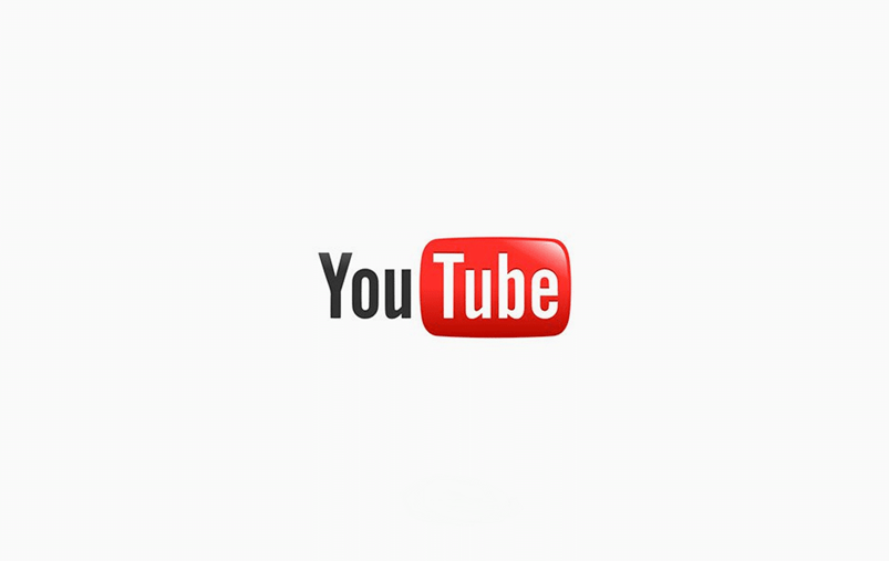
The Original Logo (2005): Simplicity and Clarity
The very first YouTube logo, launched in 2005, emphasized simplicity and communication. The word “You” appeared in black, while “Tube” was enclosed in a rounded red rectangle, symbolizing a television screen. The design clearly communicated the platform’s early mission: to allow users to broadcast themselves freely to the world.
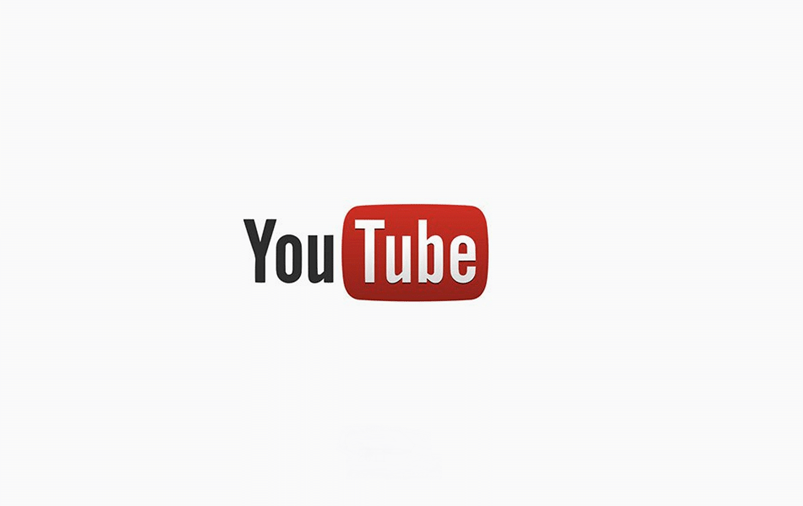
2011: Moving Toward Modernity
In 2011, YouTube introduced a minor update to its logo. While maintaining the original structure, the red color became brighter and the typography was refined for a more contemporary and legible look. This visual upgrade reflected the platform’s adaptation to the rapidly evolving digital landscape.
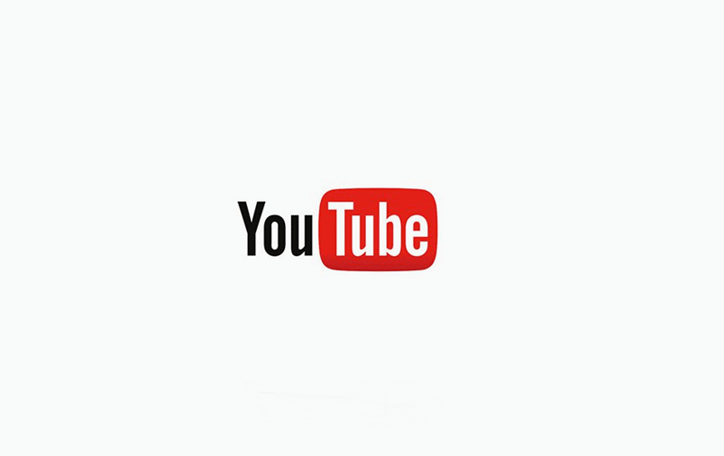
2013: Fine-Tuning for Versatility
In 2013, the logo saw subtle but significant refinements in its typography and color. These adjustments were aimed at improving its adaptability on smaller screens, especially smartphones and tablets, which were becoming dominant platforms for video consumption.
2017: A Revolutionary Redesign
The 2017 redesign marked a turning point for YouTube’s brand identity. The red rectangle was detached from the text and transformed into the iconic play button, placed to the left of the wordmark. This shift emphasized the core function of the platform: video playback. The font was also updated with lighter, sleeker lines, improving legibility and visual appeal across all screen sizes.
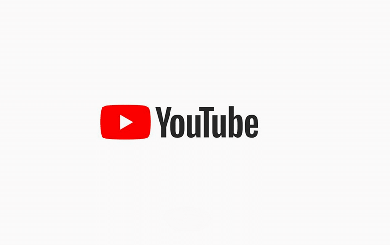
The Current Logo: Minimalism and Iconicity
YouTube’s current logo, first introduced in 2017, features a minimalist design that centers around the red play button. This version is clean, modern, and highly scalable, making it instantly recognizable on any device or platform.
Evolution of the Logo and Brand Growth
The evolution of YouTube’s logo closely mirrors the platform’s global growth. Each redesign has coincided with major strategic milestones: the 2011 update aligned with user growth, the 2013 tweaks preempted the mobile-first era, and the 2017 overhaul signaled the platform’s transition into a robust ecosystem of apps and services. These changes weren’t purely aesthetic—they reflected a broader strategy to position YouTube as a dynamic, user-focused platform that continually adapts to the digital age. As new features like YouTube Premium, YouTube Music, and Shorts launched, the logo evolved in tandem to support this diversification.
Color and Typography: A Visual Language
The color red plays a central role in YouTube’s brand identity—it conveys urgency, energy, and attention. It’s a color that demands a click, making it perfect for a platform driven by engagement. The typography has also evolved: from a bold and blocky typeface to a modern, sleek font that enhances clarity and accessibility. These refinements support YouTube’s branding across all user interfaces and content environments.
The Symbolism of the Play Button
With its introduction in 2017, the standalone play button became the emblem of YouTube’s visual identity. This simple triangle on a red background is now one of the most recognizable symbols on the internet. It perfectly encapsulates what YouTube is about—instant video access—and reflects the brand’s intuitive user experience.
Comparing YouTube’s Logo with Other Platforms
Compared to other social media giants like Facebook (Meta), Instagram, or TikTok, YouTube has maintained a consistent visual identity. While others have opted for frequent and sometimes drastic rebrands, YouTube has chosen a path of thoughtful, incremental updates. This consistency has helped reinforce its emotional connection with users and solidify its long-standing position in the digital space.
The Logo in UX and App Design
The YouTube logo exists in multiple versions across platforms: as a favicon, app icon, smart TV button, and more. Its adaptability and simplicity ensure that it remains recognizable even in its most minimal form. This scalability is a testament to its intelligent and user-centered design.

Public Reactions to Logo Changes
Every redesign has generated public response. The 2017 update in particular sparked debate: some praised its modernity, while others found it too plain. Over time, however, the new logo gained wide acceptance, proving its effectiveness and alignment with the platform’s evolution.
The Future of the YouTube Logo
Looking ahead, YouTube’s logo may continue to evolve alongside emerging technologies like AI, augmented reality, and the metaverse. Still, the core identity—the red play button and clean typography—is likely to remain intact, given its strong recognition and emotional value.
Official Resources and Visual Guidelines
For those interested in using official versions of the logo or studying its design evolution, YouTube provides a public brand resource portal: Brand Resources. Additional reference sites include Wikimedia Commons and Logopedia, which offer historical and visual documentation of logo changes.
Conclusion: The Logo as a Reflection of Brand Evolution
The story of the YouTube logo is one of strategic adaptation. Each visual update has reflected not only design trends but also the platform’s direction and ambition. YouTube’s ability to evolve while staying true to its core identity is a model of effective branding.