

Table of Contents
A flyer may seem like a “simple” communication tool at first glance, but in reality it has a demanding task: within seconds it must grab attention, be understood, and drive action (visit a shop, make a booking, call, visit a website, redeem an offer).
That is why flyers still work today, even in a world dominated by digital marketing. They are physical, immediate, local, and capable of reaching people at exactly the right moment. The difference lies in the planning. A confusing flyer ends up in the bin; a clear, well-printed one can generate surprisingly strong results.
In this guide, you’ll find everything you need to create a truly effective flyer.
Specifically, we’ll cover:
• Defining your objective
• Flyer structure
• Writing persuasive copy
• Design principles
• Choosing the right format
• Paper types and finishes
• Preparing your print file
• Ordering online
• Distribution strategies
1) What Is a Flyer and When Should You Use One?
A flyer is a printed marketing piece designed to communicate one main message quickly and convincingly. Unlike brochures or catalogues, which go into depth and tell a broader story, a flyer focuses on:
• Announcing (an event, a grand opening, sales, a special menu)
• Promoting (a limited offer, a new service, a product launch)
• Informing (opening hours, relocation, local initiatives)
• Converting (discount vouchers, QR codes, clear calls to action)
Flyers are particularly effective when:
• You’re targeting a local audience (neighbourhood, town, business district)
• You want to reach people offline (in the street, in shops, through letterboxes)
• You need fast communication with competitive cost per contact
2) First Rule: Define Your Objective and Audience (Before Designing)
Before opening Canva or creating an Illustrator file, take a step back and clarify your strategy. This is the step many people skip — and it’s the one that has the biggest impact on results.
Objective (Choose One Main Goal)
• Drive footfall to a physical shop
• Generate bookings (phone / WhatsApp / website)
• Launch a new product or service
• Promote an event
• Direct traffic to a website via QR code
Audience
• Who are they? (age, interests, habits)
• Where will you reach them? (town centre, offices, schools, gyms, trade fairs)
• What problem do they have — and what promise are you making?
A useful sentence framework:
“This flyer is for ___ who want ___ and I will convince them by ___.”
When the objective is clear, the design naturally becomes clearer too. You know what to highlight, what to remove, and what tone to use.
3) Flyer Formats: Which to Choose (and Why)
The most common flyer sizes are based on ISO standards (the A-series). Many print providers display tables with exact millimetre measurements to help you decide.
Most Popular Flyer Sizes
• A6 (105 × 148 mm): pocket-sized, perfect for vouchers, invitations and quick promotions.
• A5 (148 × 210 mm): the most balanced option; ideal for offers and clear messaging.
• A4 (210 × 297 mm): more space and visual impact; suitable for price lists, menus and programmes.
• DL (approx. 99 × 210 mm): long and narrow; ideal for vertical promotions or envelope inserts.
How to Choose the Right Format
• Hand distribution: A6 or A5 (easy to hand out and keep).
• Window display / noticeboards: A4 (easier to read from a distance).
• Lots of content: choose A4 or print double-sided (cleaner than overcrowding one side).
• Budget considerations: smaller formats often reduce costs — but never at the expense of readability.
Many professional guides recommend choosing format and layout based on objective and context — not simply personal preference.
4) Structure That Works: What a Flyer Must Include
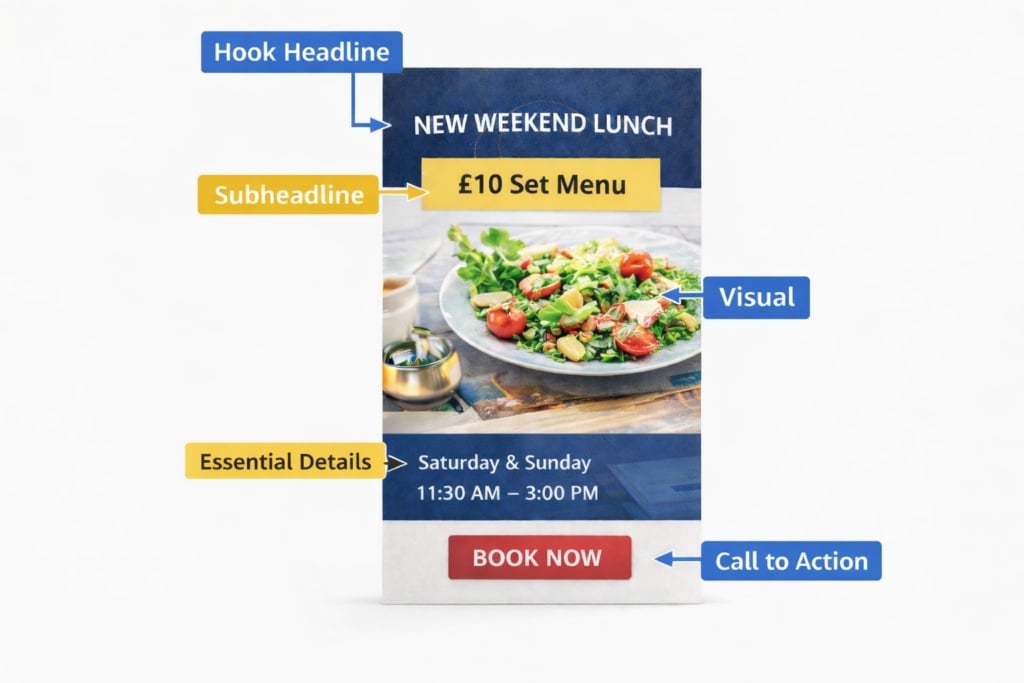
An effective flyer is almost always built around a clear information hierarchy. You can think of it as a visual journey structured into five key blocks.
1) The Hook Headline
Your headline must immediately state what you are offering and who it is for. It should be short, concrete, and instantly readable.
Examples:
• “Grand Opening: 20% Off Everything Until Sunday”
• “Evening English Course: Enrolments Now Open”
• “New Lunch Menu: £10 Set Menu”
2) The Promise / Benefit (Subheadline)
A single line that clarifies the main advantage:
• “Book in 30 Seconds via WhatsApp”
• “Genuine Discounts on Selected Products”
• “Limited Places Available – Confirm Your Spot”
3) Visual (Image or Graphic Element)
Clean, relevant imagery helps communicate your message at a glance. Professional flyer design consistently emphasises visual coherence, balance between elements, and strong readability.
4) Essential Details
Include only what is necessary for action:
• Dates and times
• Location
• Price or key conditions (if relevant)
• What the offer includes
5) Call to Action (CTA) + Contact Details
Your CTA must be visible and specific:
• “Scan to Book”
• “Present This Flyer at Checkout”
• “Call Now”
5) Copywriting: How to Write a Clear and Persuasive Flyer
A flyer is not a mini-article. It is closer to a landing page: short sentences, concrete language, action-driven verbs.
Golden Rule: One Core Idea
If you try to communicate ten messages, your reader will remember none.
Keep the Language Simple, Direct and Specific
Better:
• “Men’s T-Shirts £15”
than
• “Unmissable Offers and Exclusive Benefits”
Better:
• “Friday and Saturday Only”
than
• “For a Limited Time”
Recommended Micro-Structure
• Problem / Desire: “Short on time?”
• Solution: “Express service in 24 hours”
• Proof / Credibility: “Rated 4.8/5 by customers” (if true)
• Action: “Book Now”
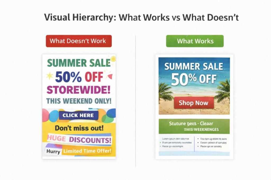
6) Design: Visual Hierarchy, Fonts, Colours and Layout
This is where much of your flyer’s effectiveness is decided. Even without professional design training, you can follow some practical rules widely recommended in print and layout guides.
Visual Hierarchy (Reading Order)
- Headline
- Visual
- Offer / Benefit
- Details
- CTA + Contact
If your flyer does not follow a clear reading order, the viewer’s eye will wander — and the message will weaken.
Fonts: Maximum Two Families
• One font for headings (with personality and impact)
• One font for body text (clear and highly legible)
Avoid overly thin fonts or decorative typefaces for longer text blocks.
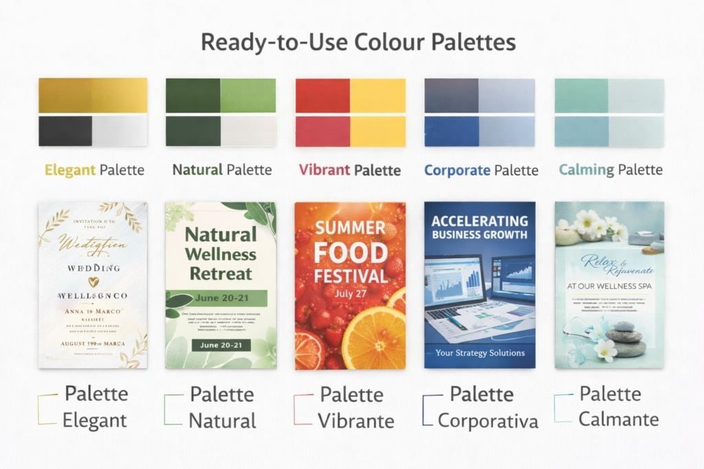
Colours: Contrast First
• Dark text on a light background (or the reverse) ensures readability.
• Avoid using too many colours. Choose a palette consistent with your brand identity.
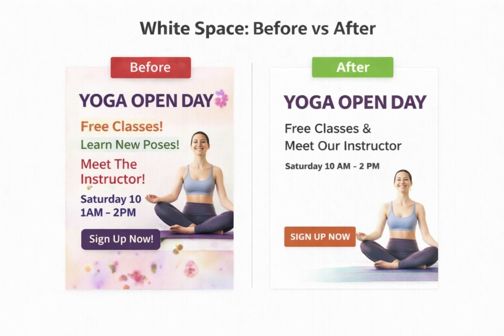
White Space: It’s Not Empty — It’s Breathing Room
White space (or negative space) makes your layout feel structured and professional. If it feels slightly “too empty,” it is often a sign that your design is clean and balanced.
7) Tools to Create a Flyer (Even from Scratch)
If you don’t have an in-house designer, you can start with ready-made, customisable templates. These are often the quickest way to achieve a balanced, professional layout.
Alternatively, tools such as Canva offer guided workflows and pre-designed templates for flyers with already optimised visual structure.
For those looking for broader comparisons of online tools and software, there are dedicated guides available — but here we focus on the main practical options.
Which Approach Should You Choose?
• Templates (recommended in most cases): fast, clean, and reduces the risk of layout errors.
• Professional design software (Illustrator / InDesign): maximum control; ideal if you have a structured brand identity.
• Professional designer: advisable for major campaigns where visual impact and brand perception are critical.
8) Preparing the File for Print (The Step That Prevents Costly Mistakes)
A flyer can be perfectly designed from a strategic and aesthetic perspective — but if the file is not properly prepared for print, the final result can undermine all your effort.
Dull colours, badly trimmed edges, pixelated images, and text placed too close to the margins are extremely common issues — and almost always avoidable with the right preparation.
Here are the key technical aspects to check before uploading your file for printing.
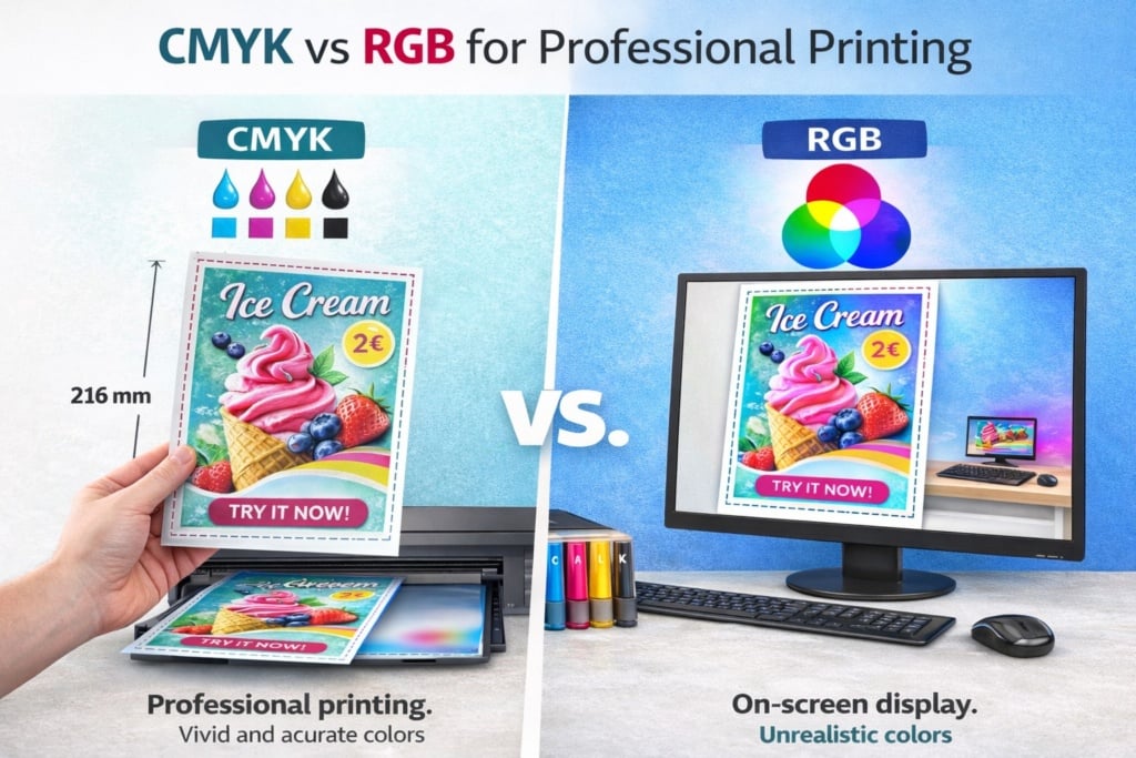
🎨Colour: Why You Must Use CMYK (Not RGB)
Screens (computers, smartphones, tablets) use RGB colour mode (Red, Green, Blue), which is based on light.
Professional printing uses CMYK (Cyan, Magenta, Yellow, Black), which is based on ink.
If a file designed in RGB is printed without correct conversion:
• Colours may appear duller than expected
• Bright tones (such as neon greens or intense blues) may shift significantly
• Overall contrast can decrease
👉 What to do: Set your document to CMYK from the beginning, or export a properly converted print-ready PDF. This helps maintain colour consistency and reduces unpleasant surprises.
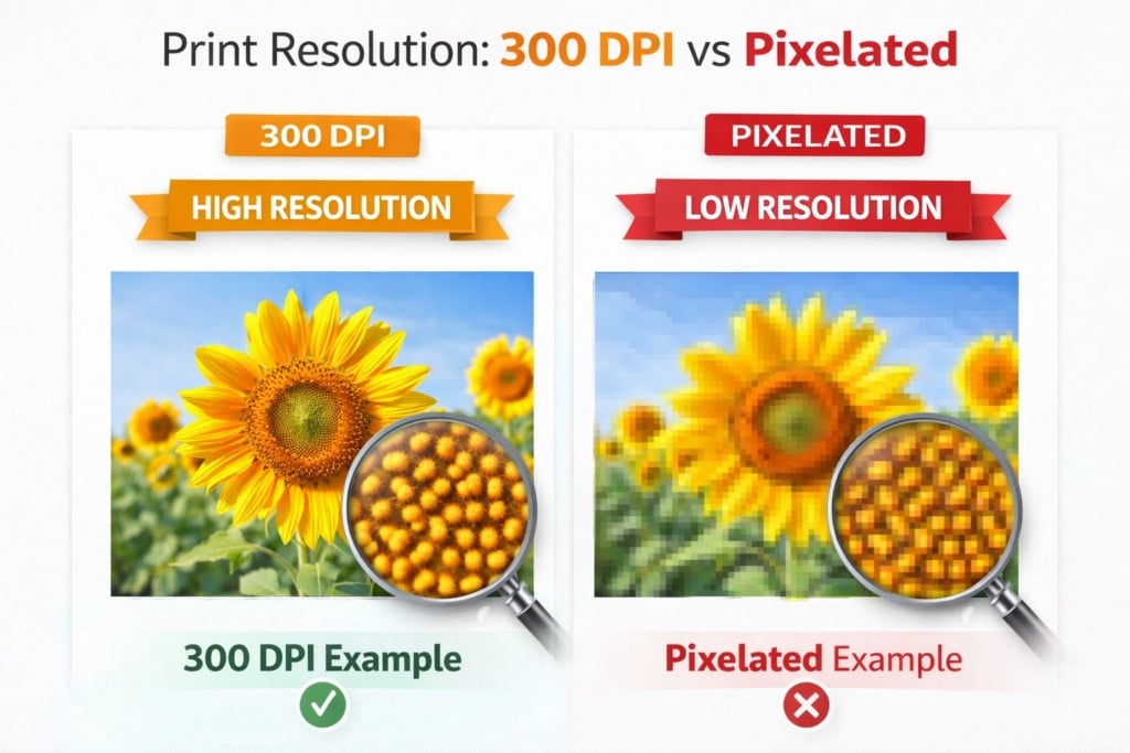
🖼Image Resolution: Why 300 dpi Matters
An image that looks sharp on screen may appear pixelated in print if the resolution is insufficient.
For professional printing:
• Recommended resolution is 300 dpi (dots per inch)
• Images should not be enlarged beyond their original size
• Avoid low-resolution images downloaded from the internet
If you enlarge a small image to fill an A4 layout, it will appear blurry or pixelated in print. Always start with high-quality source images.
✂️Bleed: What It Is and Why It’s Essential
When flyers are printed, large sheets are mechanically trimmed to their final size. Even with precision equipment, there can be a slight tolerance of a few millimetres during cutting.
If your background colour or image stops exactly at the final trim edge, you risk ending up with an unwanted thin white border after cutting.
To prevent this, printers use what is known as bleed.
What Is Bleed?
Bleed is an extra margin — typically 3 mm on each side — added beyond the final finished size of the flyer.
Practical example:
• Final A5 size: 148 × 210 mm
• File with bleed included: 154 × 216 mm
• The extra 3 mm on each side will be trimmed away after printing
All background colours, images, or graphic elements that need to reach the edge must extend into the bleed area.
📐Trim Size: What “Finished Size” Really Means
The trim size (also called finished size) is the final dimension of the printed product after cutting.
In our example:
• 148 × 210 mm = trim size (finished format)
• 154 × 216 mm = file size including bleed
It is essential to distinguish between:
• File size including bleed
• Final trim size
If you design your file at the trim size without adding bleed, you increase the risk of visible cutting imperfections.
🛡Safe Area: Protecting Text and Important Elements
In addition to bleed, there is another critical area to consider: the safe area.
This is an inner margin (usually 3–5 mm inside the trim edge) where important elements must remain:
• Text
• Logos
• Phone numbers
• Key graphic details
Why Is It Important?
Even with precise trimming, minor shifts can occur. If text is positioned too close to the edge, it may appear visually cramped — or worse, partially cut off.
Practical Rule:
• Bleed: outside the trim size → ensures full-bleed backgrounds
• Safe area: inside the trim size → protects important content
⚫Black Text and Small Fonts: Paying Attention to Print Quality
Another common issue involves the use of black in print.
There are two main types of black:
• Standard black (100% K only)
• Rich black (a combination of CMYK values)
For small or thin text, it is advisable to use standard black (100% K only) because:
• It ensures sharper edges
• It avoids registration issues (slight misalignment between ink layers)
• It improves readability
Rich black is better suited for large background areas.
📄Exporting the Correct Print PDF
Before uploading your file:
• Export as a print-ready PDF
• Embed fonts or convert them to outlines
• Make sure bleed is enabled
• Check the file at 100% zoom
• Ensure no essential elements sit outside the safe area
A few minutes of technical checking can prevent costly reprints.
In Summary: Technical Checklist Before Ordering
Before placing your order online, make sure:
• The file is in CMYK
• Images are 300 dpi
• Bleed is correctly set
• Important content remains within the safe area
• The PDF is exported in high-quality print settings
Proper file preparation is not a minor technical detail — it is what separates an “acceptable” flyer from a professional, clean and brand-consistent result.
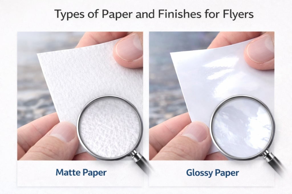
9) Paper and Finishes: Choosing Based on Your Objective
Here you’re playing an important card — quite literally. The perception of your flyer depends heavily on the paper you choose. That’s why selecting the right stock is crucial.
When choosing paper for your flyer, consider the following factors:
Weight (GSM)
• Lighter weight = economical and practical for large quantities
• Heavier weight = premium feel, greater rigidity, stronger perceived value
Matt vs Gloss
• Matt: elegant, easier to read, minimal reflections (excellent for text-heavy designs)
• Gloss: brighter colours, stronger visual impact (ideal for image-focused promotions)
Lamination and Special Finishes
• Lamination increases durability and improves tactile quality (useful if the flyer will be handled frequently)
• Special finishes should be used when perceived value is central (e.g. high-end branding)
10) How to Print and Order Your Flyer Online
Once your file is ready, the operational phase begins: choosing format, quantity, paper type and delivery timeframe.
Online print platforms allow you to configure the main options (format, paper stock, weight, single or double-sided printing) and view delivery times and pricing in real time.
A Practical Campaign Tip
If you are distributing flyers to generate new customers, it often works extremely well to pair them with a contact tool that people will keep — such as business cards.
Flyer = captures attention and explains the offer.
Business card = provides immediate contact details (name, phone, QR code, social media) and reinforces credibility.
The combination increases the likelihood that the contact will not be lost after the flyer has served its purpose.
11) Distribution: Where, How and How Much (Without Wasting Budget)
Even the perfect flyer fails if it is distributed randomly.
Here are some strategic suggestions to maximise effectiveness.
Choose Locations That Match Your Audience
• Gyms, schools, offices, markets, trade fairs, local events
• Partner businesses (cafés, hairdressers, bookshops, etc.)
• Letterboxes (where permitted and in compliance with local regulations)
Relevance between location and audience significantly improves results.
Quantity: Targeted Beats Massive
Before printing 50,000 copies, run a controlled test:
• 500–2,000 flyers in selected areas
• Measure at least one metric (promo code, tracked QR link, “present this flyer” request)
Testing first allows you to validate the message before scaling up.
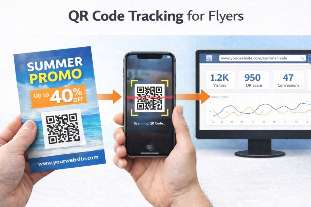
Simple (But Powerful) Tracking
• QR code with UTM parameters (to measure visits)
• Dedicated discount code (e.g. FLYER10)
• Specific WhatsApp number or dedicated landing page
Tracking turns distribution from a blind expense into a measurable marketing action.

12) Common Mistakes to Avoid (The Ones That Ruin Everything)
There are some critical errors that must be avoided in flyer design.
Here they are summarised:
- Too much text: if it looks like an information sheet, it will be ignored.
- Generic headline: “Incredible Offers” says nothing specific.
- Invisible CTA: if you don’t tell people what to do, they won’t do it.
- Poor-quality images: they damage credibility.
- Confused hierarchy: if everything looks equally important, nothing stands out.
- Improper print setup: badly cut edges, dull colours, pixelated images.
Avoiding these mistakes already puts you ahead of many printed materials in circulation.
13) FAQ: Frequently Asked Questions About Creating a Flyer
What Is the Best Format?
It depends on usage: A6/A5 for hand distribution, A4 for display or when more information is required.
Single-Sided or Double-Sided?
If you have more than one key message (offer + details + map + conditions), double-sided printing often results in a cleaner, more readable layout.
How Do I Know If the Flyer Is Working?
Use at least one tracking method: QR code, promo code, dedicated landing page, or in-store request to present the flyer.
Can I Create a Flyer Without Design Experience?
Yes. Starting with templates and guided tools is often the fastest and safest approach to achieving a balanced and professional layout.
Final Checklist Before Printing
Before sending your flyer to print, double-check:
• Clear objective (one main action)
• Strong, specific headline
• Essential message + clear benefit
• Visible CTA + contact details
• Format chosen based on context
• File properly prepared for print (CMYK, 300 dpi, bleed and safe area)
• Paper and finish aligned with brand and budget
• Distribution planned + tracking system in place
When strategy, design and print preparation work together, a flyer becomes far more than a simple sheet of paper — it becomes a powerful local marketing tool.
Good planning — and successful printing.