
Table of Contents
The importance of covers in book marketing: what they are, how to create them and where to find inspiration.
“Never judge a book by its cover”, goes the proverb.Yet, no matter how open minded we may be, all of us do it to some degree.
Every book has a cover. We might not be able to judge its content from its outward appearance, but the outside of a book can definitely tell us a lot about what we’ll find inside So, one function of a cover is to give us an idea of what a book’s about. But there’s another function – one that we’ll look at in this article – which is to get readers to buy it.
People shopping for books, whether from a bookshop or an online marketplace, will base their purchase decision on a number of factors, including the cover: together with the title and summary information (blurb on physical books, as well as descriptions in digital marketplaces), the cover will help readers decide whether or not to buy the book.
Cover marketing
A key tool for marketing a book is its cover: along with the title, it helps people to remember the book – all the more so if it carries an image. Over the last 100 years, a book’s packaging – its cover – has become ever more important, while retaining notable differences from country to country, market to market. A cover must catch the eye. It used to be said that a cover should be like a poster seen from afar, so that it will stand out on the crowded shelves of a bookshop.
That holds true today: We buy books because we’ve heard about them, we’ve read reviews about them, they’ve been recommended to us by someone or simply because they’ve caught our eye.
And this happens whether we’re shopping in bookshops or online.
The most iconic covers of all time
Some book covers have changed the course of publishing history, while other have captured the zeitgeist better than any other medium.
Book covers as we know them today are a relatively recent invention, born out of the spread of literacy and the rise of major publishing houses. For example, the success of pocket-sized books can be attributed to the first affordable novels published by Penguin Books in 1935, even though the format first appeared three hundred years earlier. Their cheap yet iconic covers are instructive: the same graphic design was used for every book; all that had to be changed were the title and author. They became known as paperbacks because of their soft cover, which enabled them to be carried in a handbag or coat pocket for reading anywhere.

In Italy, it was Rizzoli who first introduced this format in 1949 with its BUR (Biblioteca Universale Rizzoli) series of great literary classics.The paperback format quickly spread across Europe, with publishers beginning to offer these affordable but less durable soft cover books alongside traditional but more expensive hardbacks. Books were no longer precious sources of knowledge to be kept safely locked away under the watchful eyes of librarians; they were now products for the masses. And this paved the way for a new, more modern type of graphic design that used the latest printing technologies.
In Italy, the year 1965 saw the launch of the Oscar Mondadori series, which were also sold on news-stands to great success. Then came the more upmarket Gli Struzzi series from Einaudi in 1970. Meanwhile, across the Alps in France, Gallimard paperbacks hit the shelves.

Penguin’s paperback revolution also started a trend in book cover design that can still be seen today: a uniform visual identity for all books from a given publisher or series. Interestingly, this was quite the opposite to what was happening with album covers in the music world at the time.
Cover design
Penguin covers were designed by Jan Tschichold, who set out a number of rules to ensure a consistent visual identity. Standardisation was especially important given that graphic design and typesetting was done by hand at the time. Talking about his work for Penguin, Tschichold famously said: “We do not need pretentious books for the wealthy, we need more really well-made ordinary books.”

The idea that books should be accessible also informed cover art. Designs tended to be simple and abstract, in keeping with art trends at the time, which also helped make printing easier and cheaper.
In Italy, Bruno Munari created some of the most memorable abstract cover art. Perhaps the best examples are his designs for the “Uno al mese” series from Bompiani in the fifties, and his black and white covers for the Satelliti series for the same publisher in the seventies.

Further innovation came in the Anglophone world in 1970 with the publication the Fontana Modern Masters series of pocket guides on thinkers and philosophers: the cover of each title in the series could be arranged to create a larger piece of art. The covers were inspired by optical art and the work of Hungarian artist Victor Vasarely in particular.

Fuente: https://www.fontanamodernmasters.org/
Modern Masters’ use of colour was unusual at the time, with black-and-white still dominating, a prime example being the iconic covers for the Folio series from French publisher Gallimard, which featured designs by artists of the calibre of Saul Steinberg and Jean Dubuffet.

Source.
Little changed until the start of the nineties, when new digital printing technology emerged and innovative art directors like David Carson came along. Carson and his peers began breaking all the rules in publishing, blazing a trail for iconoclastic book cover designers like Chip Kidd.

Unlike many other book markets, English-language publishing now tended to approach each book as a one-off design. A whole gamut of artistic techniques were being used to create standalone cover artwork, not just images (photos or illustrations), but bold lettering, visual puzzles, conceptual art, collages and more.

Source: https://npr.brightspotcdn.com/
Book covers in today’s digital world
We saw how book covers have evolved over the last 100 years. Now we’re going to turn our attention to what’s been happening since the arrival of digital marketplaces and the explosion of self-publishing.
At the end of the article, we’ll give you six tips on how to design and print an eye-catching cover, as well as a selection of seasoned book-cover designers to look to for inspiration.
Book covers in the Kindle era
With books now being sold in electronic format online, covers need to adapt to this new environment. And, despite predictions of their imminent demise, they are just as important as ever. eBooks don’t need spines, dust covers or fancy paper: what they need is bold and distinctive artwork. A book is no longer tactile experience, but a visual one.
One of the first book covers to be specially designed for sale online was Poke the Box by marketing guru Seth Godin. There is no title or text, just an illustration of a little man in evening dress jumping in the air set against an orange background. Drawn in the style of a fifties cartoon, it exudes energy and enthusiasm. It was 2014 and Seth Godin had thrown the rule book for cover marketing out the window. His theory was simple and practical: online, a title is just a search string; it doesn’t need to be on the cover, which can instead feature a completely unconnected image that also works well at smaller sizes.

In the eight years since Poke the Box came out, however, traditional covers have remained the norm, used more or less interchangeably for paper and digital versions. But thanks to Godin, some are beginning to realise that the cover isn’t the only marketing tool for a book, and that this can be combined with a webpage (or even a website), a video (book trailer or similar), music and so on.
Furthermore, the semantic structure of search engine results continues to prioritise the title (so it helps to be meaningful) and the cover (ideally an image inextricably linked to the title): together, they are the key to finding the book on the web.
Designing your own cover for a self-published book
The internet democratised the publishing market: it removed barriers to entry for authors looking to self-publish their work and publishing projects with limited audiences (niche magazines, for example). This parallel market spawned a new cottage industry in bookmaking, aided by the wide availability of cheap or free graphic design software, which has enabled independent publications to compete not only in terms of content, but design production values too.
The self-published market is particularly vibrant in the United States. Notable examples of self-released best-sellers include “50 Shades of Grey” and the “Eragon” saga, both produced and financed by the authors themselves.
A well-designed cover is crucial for self-published work because, like it or not, people do judge books by their covers, and may decide a title is no good if its appearance doesn’t look how it should in their mind. Buyers expect every last detail of a book to be carefully crafted; they look at not just the story inside, but how that story is packaged.
A book’s cover is like a magic portal into the story told inside: it has a power that can’t be overlooked.
If you don’t think you’re up to designing a simple cover using an easy-to-use tool like Canva, you can turn to a professional. These days, there are lots of digital platforms out there where you can find a freelance graphic designer to create a cover for you. Once you’ve found your designer, agreed a price and delivery date, you’ll need to put together a design brief, including any visual ideas of your own, and other useful information, like a synopsis of the book. This brief will serve as a guide to the designer as they create your cover.

6 Tips for a memorable cover
It’s time to take look at the characteristics of a well-designed cover, one that thrills readers when they open it and sticks in their mind.
1.Coherence
The outward appearance should reflect what’s inside. It should convey the atmosphere and emotions that that readers will experience when reading that story.
2.Evocation
A cover works best when it’s evocative rather than descriptive. It doesn’t have to reveal all by showing the characters, the setting or solving the mystery. A cover should cast a spell on people that makes them want to read the book.
3.Balance
Even strange or provocative covers have to be balanced: there mustn’t be conflicts or incoherence between elements.

4.Font
The choice of typeface can make all the difference, as any self-respecting graphic designer knows. Again, the font used should be coherent with the content.
5.Image
The key to an effective cover is an image, or lack of one. It’s the first thing that people set eyes on before, a fraction of a second later, moving to the title. Some covers are designed to generate dissonance between the image and the title, which creates a sort of riddle or distancing effect that piques readers’ interest and encourages them to open (and, hopefully, buy) the book. But it’s a fine line: pushed too far, that spark of curiosity won’t catch light and interest will vanish in an instant.
6.Inspiration
Looking around you, going to bookshops and visiting publishers’ websites is important for getting an idea of current trends and where opportunities lie. It’s up to you whether to keep things conventional or to try something new: both approaches can bring success
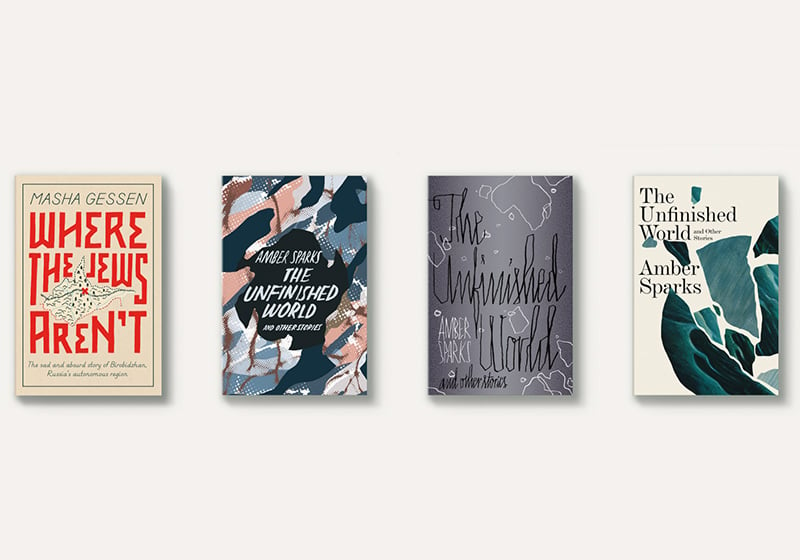
Below is a selection of book-cover designers who’ve made a name for themselves in recent years. There’s no definitive style: one trend follows another at bewildering speed. Some become classics, others go out of fashion, never to return.
The only rule is there are no rules.
Holly Ovenden
https://www.instagram.com/hollydrawsinink/?hl=en
Will Staehle
https://unusualco.work/
Rodrigo Corral
http://www.rodrigocorral.com/
Chip Kidd
http://chipkidd.com/home/
Robin Billardello
https://robinbilardello.tumblr.com/
Lauren PC
http://www.laurenpc.com/
Jack Nicolella
https://www.jakenicolella.com/
Isabel Urbina Pena
http://www.isabelurbinapena.com/
Cardon Webb
https://www.cardonwebb.com/
Happy designing!