
Table of Contents
Images are part of everyday life.
They depict the world that we see and they are all around us: on screens, walls, catalogues and packaging. But images are also “mental images”. They are ideas, concepts and representations that we find in photography, painting, illustration and cinema.
Images are highly effective communication tools, whether they are of real objects, people or places, or more abstract. We attribute images with greater communicative power than we do other elements: as the saying goes, “an image is worth a thousand words”. In graphic design, images help create a connection with the text and can clarify the information presented in a layout by adding meaning and evoking associations.
An image on its own, however, is not enough to be meaningful[1].
Its meaning changes depending on its context and position, in other words, the way it’s used. In the right context, even an abstract image like a yellow circle can bring to mind the sun. In the wrong one, a photo of real people can confuse the public.
Different types of image
There are different types of images:
- Photographs
- Illustrations
- Drawings
- Graphics
Graphics are images which, using just a few elements, try to convey a concept, as seen in icons and brands. Unlike illustrations, graphics are simplified to the point where often all that’s left are shapes and symbols that describe the subject.

The choice of image type exerts a significant influence on graphic communication and composition. One type of image might be better suited to conveying a particular message than another, as graphic design guru Timothy Samara explains:
Photographs are associated with documentation or assumed to represent reality. They are concrete, pure, environmental and reliable.
Illustrations are perceived as “created” and personal, readily showing their method of creation; they evoke fantasy, display impossible or ideal situations, and portray their content in a subjective way – even if they are naturalistic.
Icons, symbols, and translations distil and simplify complicated, abstract ideas; they are most often associated with diagrams, navigation, and identification.[2]
Images can also be typographic, in the sense that a typeface can be manipulated to become an image that conveys a certain message.

Creating a dialogue between images and text: juxtaposition
The goal of the designer is to judiciously blend different styles of image – drawing on the specific qualities of each – to convey a message in the right way. While a single image can provide sufficient information, combining two images (juxtaposition) increases communicative power. By juxtaposing two images, we can create a narrative and, in some cases, change the meaning that a single image would have had on its own.
Images and text influence one another: the case of memes
In the same way, we can play around with meaning by combining images and text. The right text can change the meaning of an image and vice versa. Internet memes are a great example of how the meaning of images can be changed by text, or by the juxtaposition of another image.
One example is the Facebook page Se i quadri potessero parlare (If paintings could talk), in which witty captions are added to pictures, thereby totally changing our perception of these images by giving them new meanings.
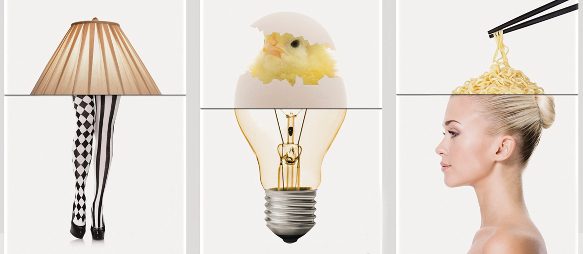
Pairing images: creating new meanings
If I use a close-up photo of a woman covering her face with her hand, it will take on different meanings depending on the text that accompanies it. If I add a second image next to this, for example, of an alarm clock, it will take on yet another meaning.

In some cases, pairing two images can even create new images, like in this design by Lokesh Padmashali for Opium (an eyewear brand).


Stock images: handle with care!
Graphic design combines text and images to convey a message. We’ve already seen how text positioning can orient the message in one direction rather than another.
How an image is used, and its context, can give diametrically opposed meanings. This is the case with stock photos, those images that can be bought (often for just a few pounds) from many the many image banks online. Stock photos are easy to get hold of, cost little and, although seeing increasing use by private individuals, are mainly bought by firms for commercial use. Stock photos are used, unaltered or retouched, in communications by many firms as part of their visual strategies.
To show you just how important it is to be judicious in your choice of stock image for your communication campaigns, here’s a recent example.
Fertility Day: the importance of choosing the right photo for a media campaign
A few years ago, the Italian Ministry of Health sent out a booklet raising awareness about how lifestyle choices affect fertility. The booklet’s cover juxtaposed two stock images. One showed what seemed to be two young white couples having fun at the beach: attractive, smiling and cheerful, they were rendered in bright and natural colours, and represented a “good example”. The other image depicted a racially mixed and less polished group of young people smoking and cigarettes and cannabis, which was rendered in more faded tones to emphasise the idea of a “bad example”.
The message that this juxtaposition sent was not exactly what the Ministry has in mind, focusing attention on the differences between the two images and on the ethnicity of the people in the two photos.

These two stock images, available for anyone to purchase, had been bought and used by other organisations and companies in quite different contexts and conveying quite different meanings: travel, freedom, integration, work, fun. The effect of the two images juxtaposed in the Ministry of Health’s booklet, however, ended up overshadowing the intended message (that adopting healthy lifestyles protects fertility) and instead sparking controversy about racial stereotyping. So, in this case, the consequences of carelessly combining stock images cancelled out the booklet intended message, making it (in)famous not so much for its content, but for its form.
Stock images: the pitfalls to avoid
When presented with a stock image, we often get the impression of something fake. A brochure or a website full of stock images, plucked as they are from an image bank, does not inspire confidence. So, it’s important to avoid images in which people are shown in conventional places and settings, which is often what happens in images related to the business world.
It’s better to use images where the poses are more natural and which haven’t been around for ages. To help with this last issue, there is Tiny Eye, a site that monitors and shows how many times and image has been used, and where. When choosing a photo, you should also have a clear idea of the message that you want to give, so that image is complements the content and is not just filler
How to use images
Stock images, created to satisfy various needs and be sold to as many customers as possible, can, however, help a graphic design to pack a punch. Especially if you manage to make them original. Cropping, enlarging, distorting, adding elements and generally playing with these images is a great way of creating a striking graphic design.
A while back, an article in Creative Bloq listed five tips for using images more effectively in editorial design.
The first tip was to channel the content’s message.
The type of content and its tone of voice can guide you in your image choice, whether it’s a photograph or an illustration. Photography is more effective in representing a specific subject that the text refers to and controlling tone and humour (like in the photo below).
Illustration is more effective at communicating more abstract concepts[3], as well as adding personality and colour to a design. In the graphic design of Alexey Brodovitch (art director of Harper’s Bazaar from 1934 to 1958), images were always perfectly in keeping with the content, both visually and in terms of meaning. It’s an approach that continues to influence graphic design today, especially in magazines.


To produce a good graphic design, you need to arrange all the elements in a way that brings them into dialogue with one another. The elements that we layout on the page are mostly text and images. Just as it’s important to understand fonts to get the most out of them, it’s also important to understand images. It’s therefore important to understand what the right type of image is (photo, illustration, drawing, graphic) for your graphic design, how it combines with the content and how it affects the message. To do so, you always need to consider the context in which the image will be used and make it relate to the other visual elements around it.
[1] Riccardo Falcinelli, Nuove iconologie e visual design, Progetto Grafico 23, AIAP, 2013
[2] Timothy Samara, Design Elements: A Graphic Style Manual, Rockport Publishers, 2007
[3] Illustration, for example, is widely used by digital firms who offer digital services that are difficult to represent with photographs