

Table of Contents
A monumental novel; a contemporary novel; an American novel. David Foster Wallace’s Infinite Jest is all this and more. In its thousand-plus pages of ironic and inventive prose, hundreds of which are dedicated to endnotes (and footnotes to the endnotes), readers will meet a host of weird characters (including a junkie who looks like a dinosaur) all living in a near future where years are sponsored by private companies and the United States, Mexico and Canada have become one country known by an innuendo-laden acronym.
That’s right, today we’re talking about a book like no other. First released to much hype in the US, Infinite Jest became an instant literary bestseller with over 40 thousand copies sold the year it was published. But the challenges of translating such an idiosyncratic novel meant that for years it remained largely unknown outside the Anglosphere. Meanwhile, Foster Wallace acquired a superstar status in the English-speaking literature world. And ten years after publication, the novel had sold over a million copies in the English language.

In this #CoverStory, we’ll be looking at Foster Wallace’s complex contemporary novel through the lens of its best known and most interesting covers: we’ll start with the very first – hated by Foster Wallace – with its blue sky and white clouds, then move on to tennis-themed versions, before taking in more creative works featuring skulls, creepy smiles and video tapes.
The first Infinite Jest cover, hated by Foster Wallace
Book covers are often a source of friction between authors and publishers. And the cover for Infinite Jest is part of this long tradition of… disagreements. Foster Wallace publicly shared his dislike for the first cover, describing it uncharitably to one interviewer as looking like a safety booklet for an American Airlines flight.

The cover is pretty simple. The title and author’s name take up most of the space and are set in block capitals against a background image of a blue sky with fluffy white clouds. It’s fairly forgettable stuff.
In his memoir Although of Course You End Up Becoming Yourself: A Road Trip with David Foster Wallace, David Lipsky reveals that the author had a series of ideas for the Infinite Jest cover, all of which were rejected his by editor and publisher. One was to use a photo shot on the set of Metropolis, Fritz Lang’s masterpiece of expressionist cinema released in 1927.
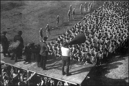
The strange image that Foster Wallace had in mind shows director Fritz Lang atop a platform where he’s using an enormous megaphone to address hundreds of shaven-headed extras lined up row after row below. The author said there was no particular metaphor behind this image: he just “thought it was cool”. The thumbs down came from his editor, Michael Pietsch – the same man who cut over 600 pages from the original manuscript for Infinite Jest. Apparently, Pietsch said that “it required too much brain work on the part of the audience”. What do you think?
More Infinite Jest covers… and more sky and clouds!
Many have pondered this choice: what have sky and clouds got to do with the novel?
In the book, fluffy clouds in a blue sky appear just once in an obscure passage describing the wallpaper in a dentist’s waiting room. Some argue that the cover creates a sense of disorientation – the same feeling that readers get from the story inside.
Whatever the reasons for this choice, the first Infinite Jest cover will be forever associated with the book by millions Anglophone readers. Which is perhaps why so many international editions use the same sky-and-clouds imagery on the cover – despite what the author thought of it!

Released in 1997, the first paper back edition of the novel also had clouds on the cover. But the lettering was more playful, probably a nod to the “jest” in the title, which itself is a reference to Shakespeare’s Hamlet…
Clouds also feature on the cover to the French paperback edition of Infinite Jest published by Points. Foster Wallace’s novel didn’t arrive in France until 2015.

The first translation of Infinite Jest was Italian: the book landed in Italy in 2000. Published by Fandango, the cover for the first Italian edition of Infinite Jest keeps the original motif of blue sky and white clouds, as does the later edition published by Einaudi.

Even one of the many 20th-anniversary editions published in 2016 – this one from Back Bay – still features the (in)famous white clouds and blue sky on the front.

Tennis-themed Infinite Jest covers
While there are next to no blue skies with white clouds in Infinite Jest, there is plenty of tennis. A key setting is Enfield Tennis Academy, a school for young prodigies. And then there’s the absurd game of eschaton, a cross between tennis and an apocalyptic role-playing game, which is played on six tennis courts at the same time.
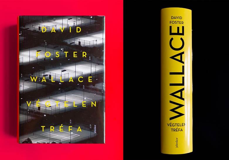
The tennis courts on the cover of the Hungarian edition of Infinite Jest, released in 2009, seem to be a reference to eschaton.
Foster Wallace was a decent tennis player in his youth, though he claimed he was held back by his tendency to… overthink things. It’s no surprise, then, that the cover for the first French paperback edition of Infinite Jest, published in 1997 by Éditions de l’Olivier, has a smiling – and slightly creepy – tennis ball on the front.

Infinite Jest covers showing a VHS cassette
The plot device that drives Infinite Jest forwards is the hunt for an old VHS cassette of an avant-garde film said to send viewers into a stat of hypnotic ecstasy. It’s this device – the book’s MacGuffin – that inspired many designers to put images of TVs and video tapes on the cover.
In 2016, for example, the 20th-anniversary edition of Infinite Jest from the novel’s original publisher, Little Brown and Company, had a “divine” video cassette on the cover. The design was chosen through a competition run by the publisher.

Also featuring analogue TVs and VHS tapes is the beautiful cover for the Polish edition of Infinite Jest published in 2022.

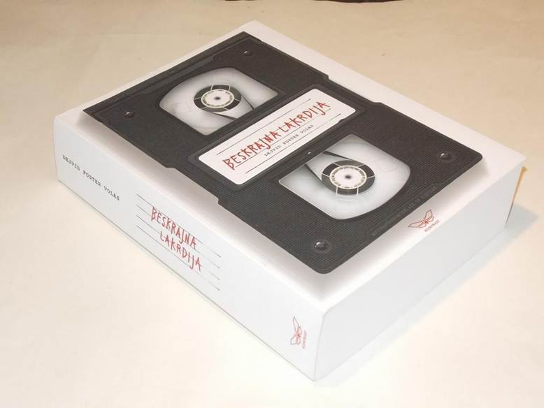
Another original take on the VHS theme is this Serbian edition of Infinite Jest, also released in 2022.
A VHS cassette and the obligatory background of blue sky and white clouds appear on this cover for a Spanish edition of Infinite Jest from 2007.

This Portuguese edition of Infinite Jest puts an old TV front and centre of the cover.

Though less explicit, this famous cover for the UK edition of Infinite Jest appears to be an allusion to the lines that worn VHS cassettes create on the screen.

Other curious Infinite Jest covers
It’s no surprise that a novel as complex and mind-bending as Infinite Jest has inspired some weird and wonderful covers. While there are relatively few foreign-language editions (due to the challenges of translation), the covers for the translations that do exist are remarkably rich and varied. Here are our favourites.
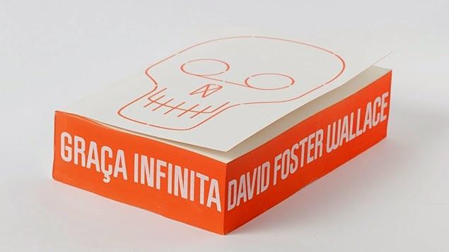
We start with the now famous Brazilian Infinite Jest cover, which simply features a rudimentary drawing of a skull on the front. As for the title and author, they are printed on the outside edge of the book block.
In contrast, the long-awaited Chinese edition of Infinite Jest, published in 2023, depicts a strange fluid on the cover.

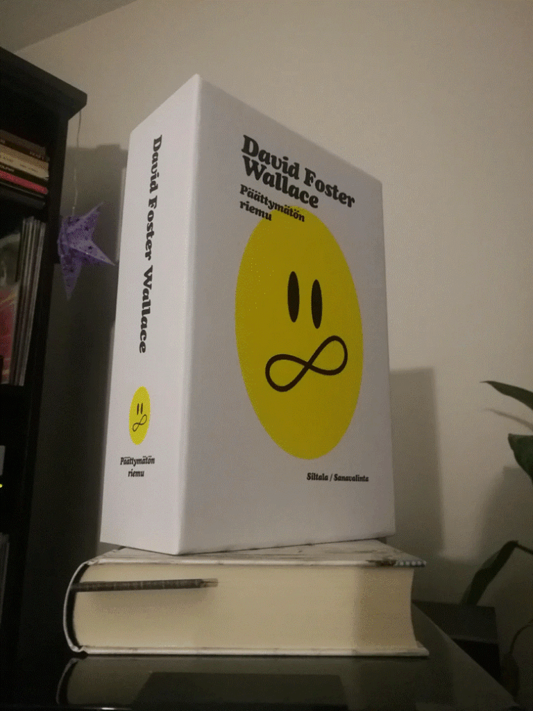
A yellow smiley was chosen for the Finnish edition of Infinite Jest that came out in 2020. The smiley is a recurring image in Foster Wallace’s novel, but the author subverts its typically positive meaning by making it the symbol of a terrorist group.
A smiley yet unsettling image is used on the cover to this Spanish edition of Infinite Jest published by Debolsillo.

We wrap up our selection of Infinite Jest covers with an example that goes against the grain: this German edition, released in 2009, opts for a type-only cover.

Infinite Jest turns 30 in 2026. And we’re sure this anniversary will bring with it more incredible covers.
What do you think about these Infinite Jest covers? Do you share Foster Wallace’s dislike for the very first? And has this article inspired you to create your own mind-altering work?