
Table of Contents
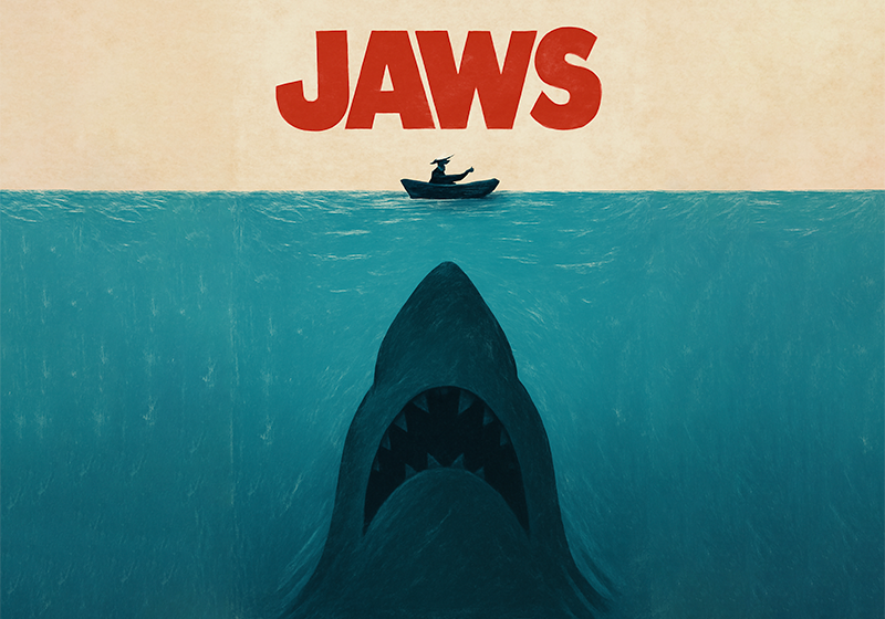
The poster for Jaws is perhaps the most famous of all the Hollywood movie posters – a true icon of American popular culture. It condenses the essence of Steven Spielberg’s masterpiece into a single image, depicting the terror that comes from the depths of the ocean and the unease of the human victim. And although it describes what happens in the film, the poster also leaves plenty of room for the imagination.
When it came out in 1975, Jaws – directed by a still very youthful Steven Spielberg – was an instant box-office hit. But it was much more than that: it was the first summer blockbuster, kickstarting a genre that has made our summers much more terrifying. And it launched the director’s career – in the space of a few years he would produce other major success stories including Jurassic Park, E.T. and Indiana Jones.
The brilliant poster for Jaws was a central part of the enormous marketing campaign in the lead-up to the film’s American release on 20 June 1975. And it worked: Jaws became the most-watched film in history, only surpassed two years later by Star Wars.
However, not everyone knows that this powerful film poster has is roots in a paperback book cover…
The Jaws poster came from a book cover
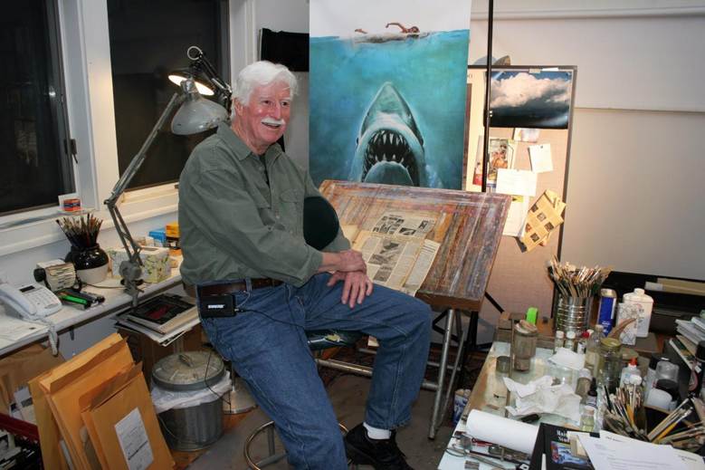
The iconic Jaws poster was the work of Roger Kastel, an American artist who would also later design the poster for The Empire Strikes Back, the second Star Wars film. When he was commissioned by the film’s producers, Kastel was working in publishing, and notably had worked on the cover for the paperback version of Jaws the book.
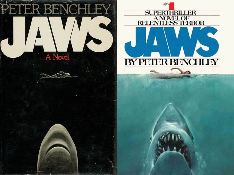
Jaws the film was based on the bestselling book of the same name by Peter Benchley, published in 1974. if you look at the cover of the first edition of the book, you will notice that the artwork is surprisingly similar to the famous poster for the film. The minimalist cover by graphic designer Paul Bacon has several key elements from the famous movie poster: the blissfully unaware swimmer and the terrifying shark arriving vertically and threateningly beneath her.
However, the publishers of the novel’s first edition were not particularly fond of the cover: it was not realistic enough, and the shark wasn’t very threatening. This was where Roger Kastel came in.

After completing a few sketches, Roger Kastel decided the original cover was not entirely worthless. Far from it: the elements and their composition were spot on. So the artist took Paul Bacon’s cover and made it more realistic and incredibly disturbing.
Kastel went to photograph a great white shark at the natural history museum in New York. Then he took advantage of a photo shoot for the historic lifestyle magazine Good Housekeeping to ask the model to lie on her stomach on a chair and pretend to swim front crawl.
What makes the poster for Jaws unique?
As Roger Kastel himself explained, the producers at Universal tested out various solutions for the poster. Ultimately, however, they decided to use Kastel’s book cover, although with a few differences!
First of all, they obscured the girl’s chest with foam from the sea – Kastel’s original book cover design had actually been censored in a few states. And they changed the colour of the lettering from blue to red.
It was the right move: the colour palette that oscillates between the cold water of the sea and the blood-red title creates just the right amount of tension. Roger Kastel’s hand drawing perfectly recreated the summer atmosphere on Amity Island – the fictional island where the film is set – while his meticulously honed study of the swimmer’s position communicates a subtle and vague sense of danger.
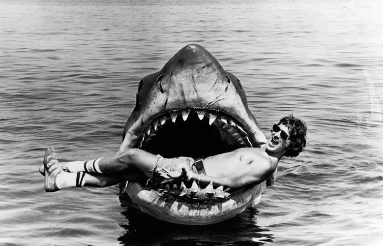
And then there is the film’s most important element: the shark. Before Steven Spielberg began filming the movie, he was not sure how to go about reproducing the animal, and initially considered training a real shark! Fortunately, this idea was abandoned, and some spectacular mechanical models of great white sharks were built instead. Roger Kastel took a similar approach in the poster: the drawing is fairly realistic, but a few fantasy touches make the ocean creature even more terrifying!
These, therefore, are the key ingredients in what is probably the best film poster of all time.
Why the Jaws poster was so important
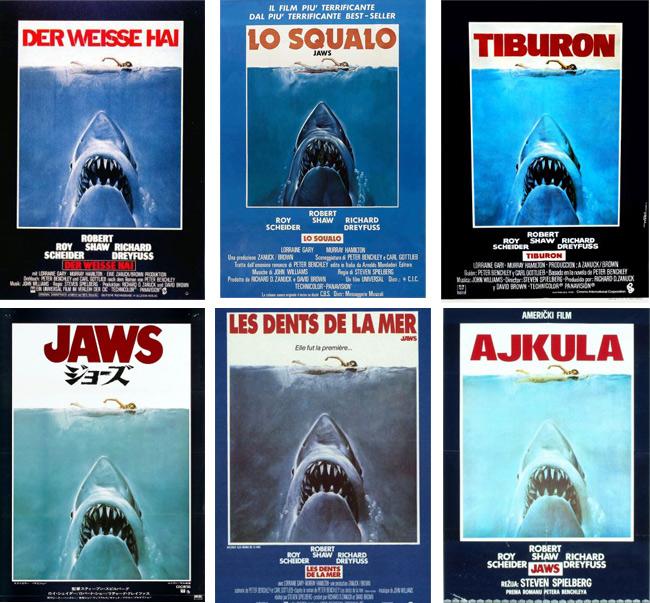
The design for this poster is so perfect, it was used practically all over the world to accompany Jaws‘ international release.
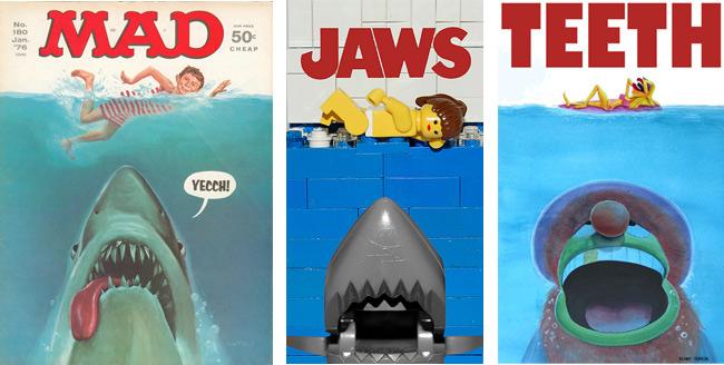
The image was reproduced thousands of times, and many people have noted that the poster had a major influence on future cinema posters. Its simplicity, its use of colours and the way the film is introduced inspired many blockbuster posters over the coming decades.
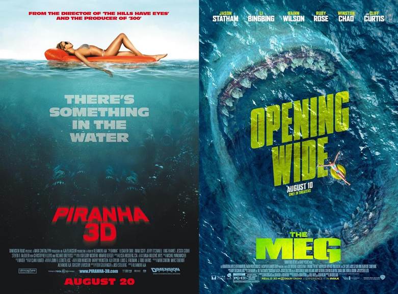
And, of course, the Jaws poster is also one of the most parodied: that’s the price you pay for creating a winning design!
A final, mysterious piece of trivia on the Jaws poster
To finish off, we’ve got one more interesting fact on the Jaws poster for you – one of those Hollywood anecdotes that add an air of mystery to proceedings. Roger Kastel’s original design – a painting measuring roughly 50 x 70 cm – vanished into thin air!
Kastel himself – who died in 2023 at the age of 92 – recounted the bizarre tale. The painting was on display at the Society of Illustrators in New York, before being sent to Hollywood for the film. Kastel expected to get it back, but it disappeared without a trace. Still today, nobody knows if it was stolen and hung in a house somewhere in Los Angeles, or whether it got lost in Universal’s store rooms and will turn up again one day.
They say that things like this only ever happen in Hollywood. The artist Drew Struzan, who designed the legendary Indiana Jones posters [which we described here], told Kastel he would be waiting years before he got any of his original drawings back!
How about you? Might you take inspiration from the perfect design of the Jaws poster? Or are you considering hanging a copy on the wall of your summer cottage?