
Table of Contents
Everyone has heard of the Tour de France, one of the most important events in European sport. But few people know that its history has close links to France’s most famous sports periodical, L’Équipe.
Le Tour was founded in 1903 following an initiative from the newspaper L’Auto (a very similar story to the founding of the Giro d’Italia, as we described in our article dedicated to La Gazzetta dello Sport).
L’Équipe rose from the ashes of L’Auto in 1946 – the brainchild of Jacques Goddet, with a name inspired by the concept of teamwork. It went on to play a highly significant role in Europe’s sporting history: as well as creating the Tour de France, it came up with the idea for the Champions League, invented the Ballon d’Or, and founded Paris Football Club, which would later become Paris Saint Germain (PSG).
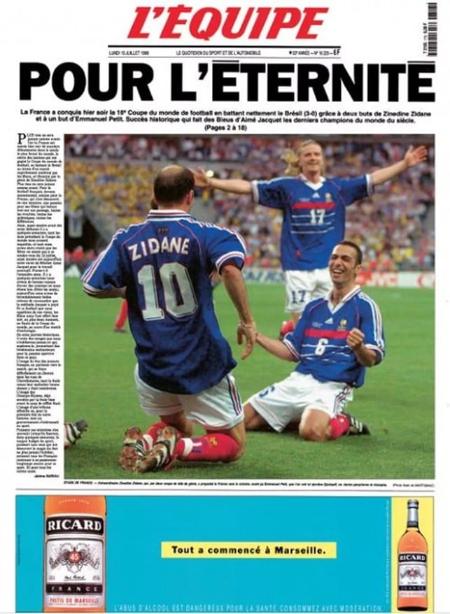
The newspaper typically sells over 200,000 copies every day: its circulation peaked at over 400,000 in the early 2000s, and achieved a record of almost 2 million sales when France won the football world cup in 1998.
But enough waffle! Let’s get to work exploring the graphic design of one of the world’s most famous and authoritative sports newspapers.
Eyecatching graphics
As we saw in our deep-dive into La Gazzetta dello Sport, sports newspapers typically use very eye-catching graphics, often oversized and with exaggerated contrasts, and frequently give more space to photos and particularly headlines at the expense of textual content.
The headline’s job is to arouse the passions of readers by catapulting them inside the event being described.
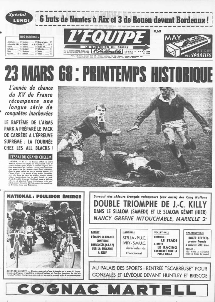
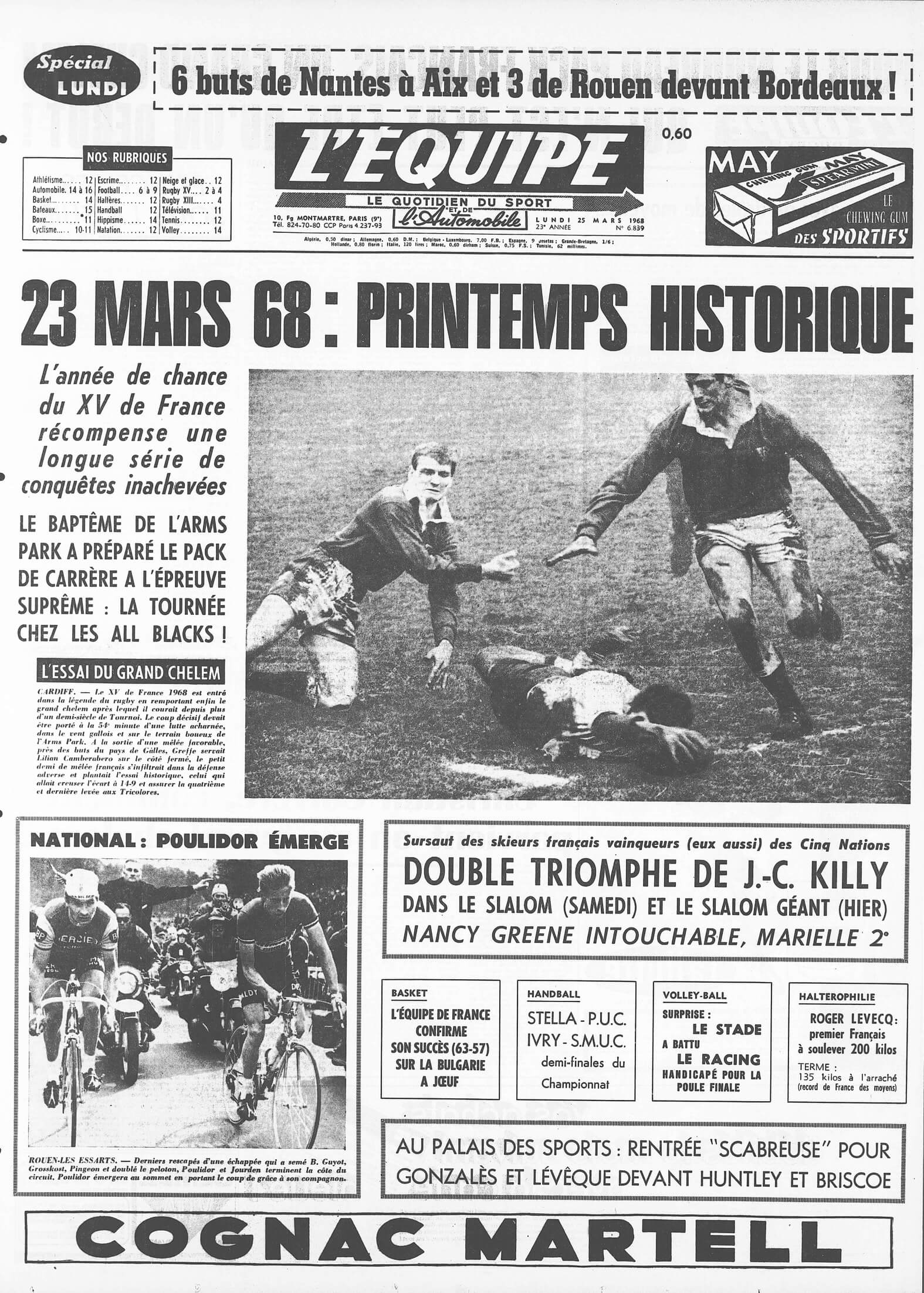
L’Équipe has always had large photographs and headlines and a much more ‘mass-appeal’ graphic design than the Italian La Gazzetta, which retained a certain degree of stylistic elegance until the 2000s.
There were three major revolutions in the history of L’Équipe‘s graphic design.
The first was the introduction of colour printing in 1998. The newspaper was well ahead of its time compared to other European newspapers: we now take it for granted that newspapers are in colour, but they were printed in black and white for almost all of their centuries-old history. In the UK, the Times, for example, did not print in colour until 2008.
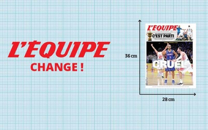
The second related to the newspaper’s size, which, after 70 years, changed in 2015 from a giant broadsheet format to tabloid. The aim, shared by all other newspapers that did the same thing, was to improve the reading experience, particularly on Sundays, when the newspaper had over 50 pages and so was rather challenging to handle.
At the presentation event for the new format, journalists were given a ruler and two figurines to see the difference in how Zlatan Ibrahimovich and Cristiano Ronaldo appeared in the old and new version. It was almost half the size!
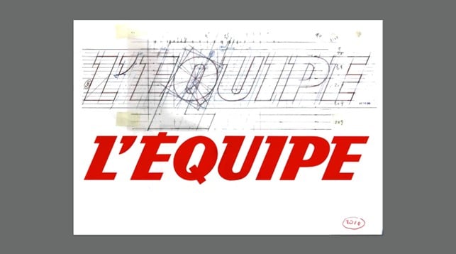
The third and final change involved the paper’s design, which gradually evolved from 2015 onwards, following the resizing. The work was entrusted to Étienne Robial, one of France’s most famous graphic designers, famed for his rigorous and mathematical approach.
The masthead’s iconic slanted red logo was made more compact, modern and impactful.
The inside content was rebalanced, with more space given over to infographics, boxes, clipped photos and icons.
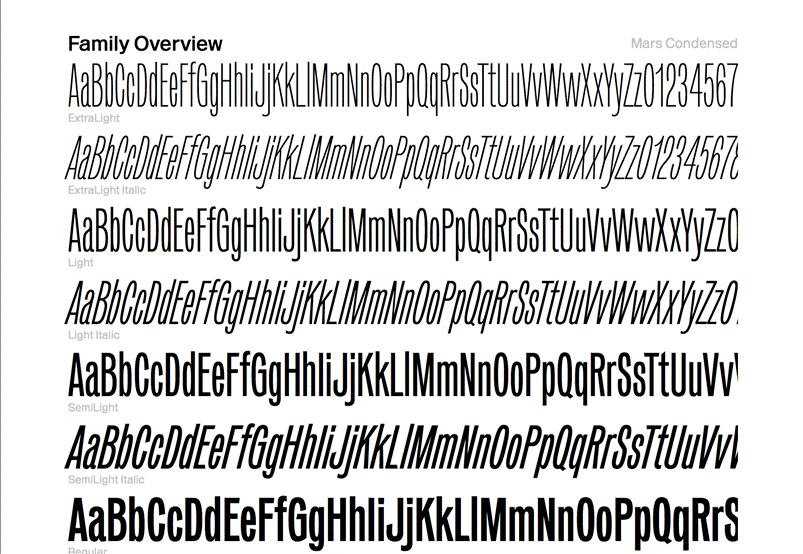
The sans-serif font Mars, designed in 2016 by Alaric Garnier, was chosen for the headlines, while ITC Cheltenham – a classic serif font with a British flavour – was used for the body text.
An orderly, well-organised layout
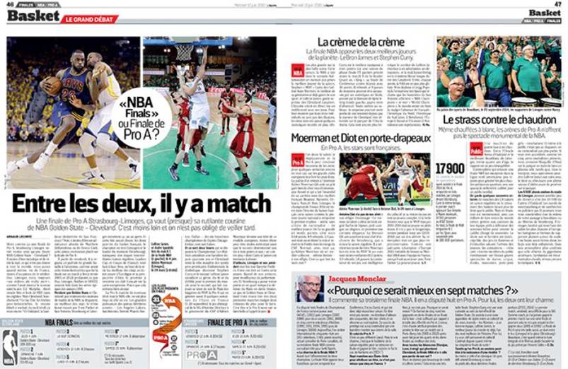
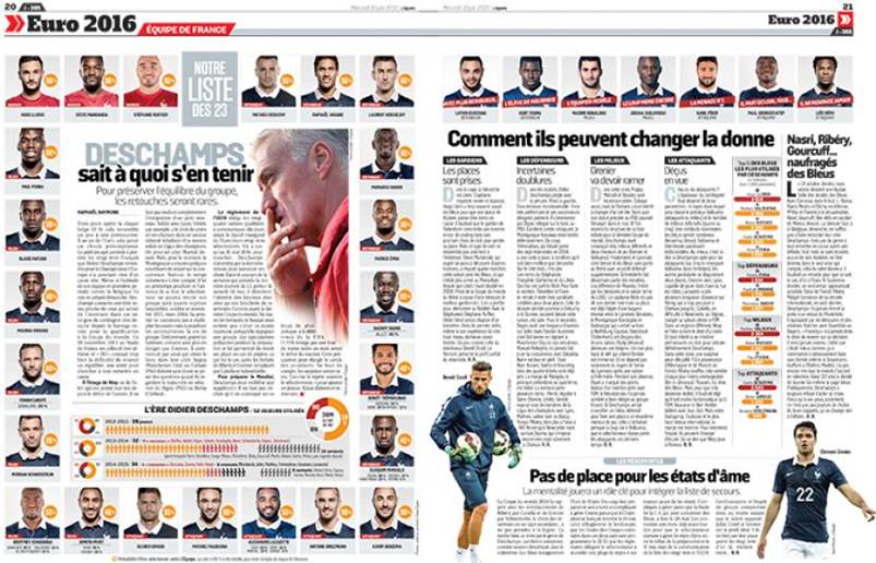
L’Équipe‘s inside pages have always had a meticulous, very European, design: one that never gets carried away, and never falls into disorder, as happens to many publications as time passes following a redesign or change in style guidelines. There are a maximum of six columns, with the option of inserts, columns providing background information, and boxes. The headings and subheads follow a well-defined hierarchy, and coloured boxes help readers decipher how the information is structured and ordered.
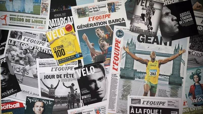
The newspaper does not make heavy use of illustrations or infographics, preferring to concentrate on photo journalism. Indeed, L’Équipe‘s use of photos is seen as its main design strength, as can be seen from its covers.
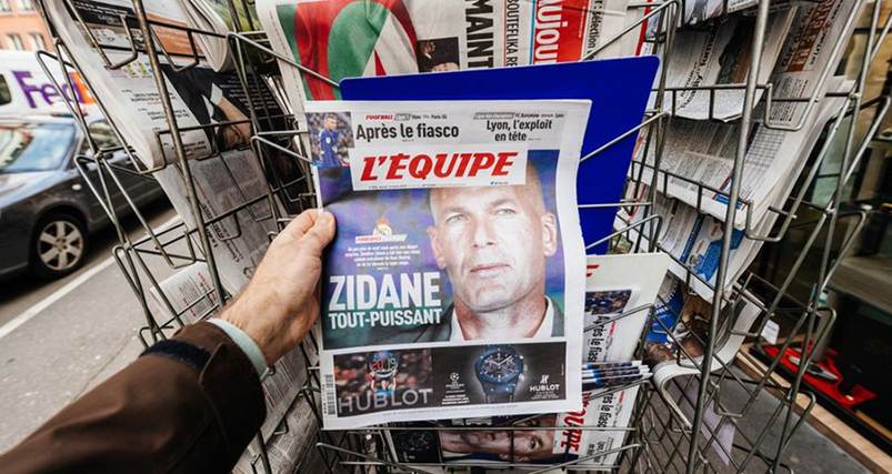
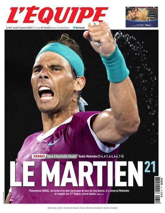
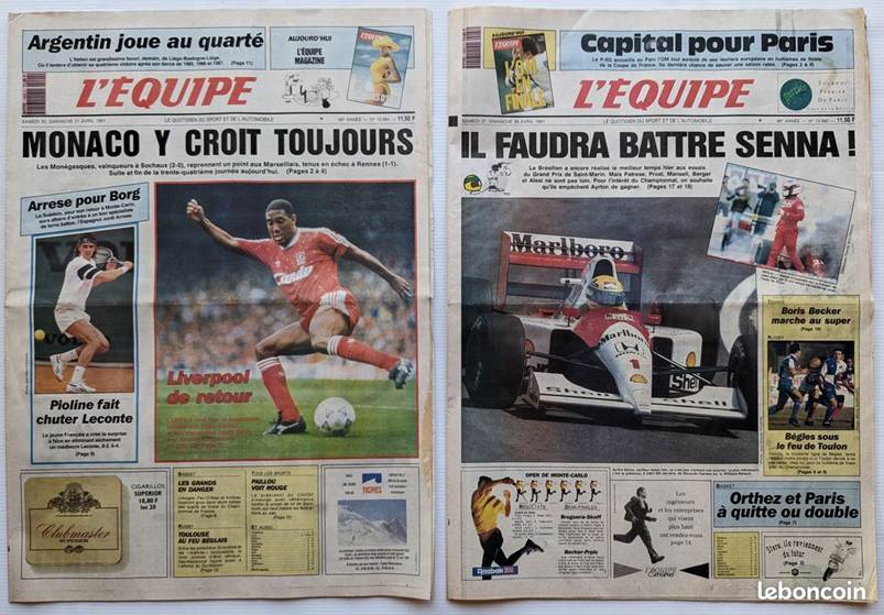
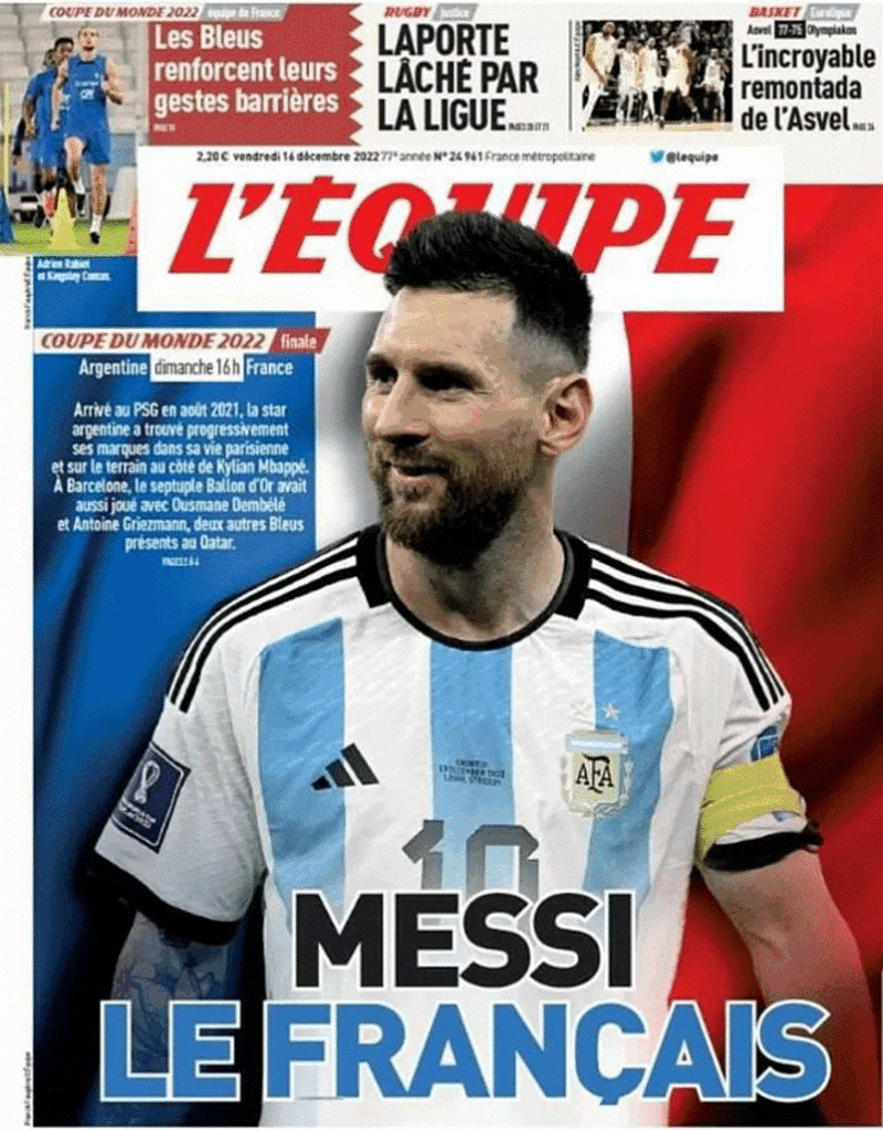
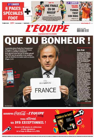
Cover heroes
We’ve often used the word ‘iconic’ to describe the covers of the newspapers and magazines we’ve analysed. L’Équipe takes things to a whole other level, however: the front page celebrates (or even creates) a hero, putting them at the heart of an epic story to make it more memorable for readers. The daily paper’s stories are then condensed and refined for the Saturday magazine, L’Équipe Mag, as it is known to fans, which over the years has become increasingly important and well known (to the extent that La Gazzetta dello Sport ended up creating a similar magazine to go with the newspaper).
Top-level sports reporting
L’Équipe remains a leading example of sports reporting to this day, and it is also not afraid to innovate in the publishing sector. For example, its publishing group uses artificial intelligence to work out how many copies to send to the various regions of France, thus reducing the number of unsold copies (by up to 2 million copies per year!**).
Another trademark characteristic is the way it gives space to many sports, and not just football, covering all the major and most popular events.
L’Équipe has cemented its reputation as one of the world’s leading publications by combining its paper edition with a website and digital communication that reaches millions of readers.
Before we end, it is worth noting that L’Équipe‘s graphic design has changed remarkably little over the years, which probably stems from the sense of teamwork felt by the journalists who founded it under occupation at the end of the Second World War. The best newspapers don’t need sweeping changes to engage their readers; great content and effective graphic design are all it takes!
*Data taken from https://en.wikipedia.org/wiki/L%27%C3%89quipe
** Article describing how AI has been used to optimise sales