

Table of Contents
San Francisco’s cult destination for typography fans
The Letterform Archive is a multifaceted non-profit hub dedicated to advertising graphics, lettering and fonts – with superb online resources
We’re in the Dogpatch, one of the hippest neighbourhoods in San Francisco (and among the 50 coolest neighbourhoods in the world according to Time Out magazine). Once upon a time, this land belonged to the Ramaytush Ohlone, the Native Americans who lived on the San Francisco peninsula before the Spanish arrived; today, among the converted warehouses and loft apartments, a plethora of art galleries, independent shops, restaurants and wine bars have sprung up.
It’s on these vibrant streets that typography and design enthusiasts will find a unique place that some call the city’s “design mecca”: the Letterform Archive.
From typefaces to concert tickets: a vast, immersive and multifarious archive
Founded in 2015, the Letterform Archive has a carefully curated collection of over 85,000 works and objects from the world of lettering, typography, calligraphy and advertising design; on a visit to the premises, you will find a bit of everything, from books to periodicals, from posters to sketches and artworks alongside ephemera, typographic specimens and even a 4000-year-old archaeological find. All this is supported by a non-profit foundation run by teachers, curators and volunteers who organise exhibitions and courses, both online and offline.
A special mention goes to Rob Saunders, the American collector who founded Letterform Archive. A designer, teacher and publisher – among other things – Saunders has collected and catalogued graphic design and typefaces for over 40 years. Today, he’s the Executive Director and Curator of the Letterform Archive.
The collections
The most incredible thing about the Letterform Archive is the variety of objects, prints, artworks, typefaces and other content in its various collections: in them you’ll find a bit of everything.
The curators offer different ways of exploring this archive, from digital content to temporary exhibitions.
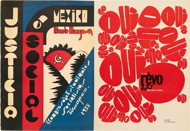
The latest in-person show, for example, is dedicated to the typography of protest – with signs, T-shirts, posters, pin badges and flyers used in protest movements from the 19th century to today (from the abolitionist movement to Black Lives Matter).
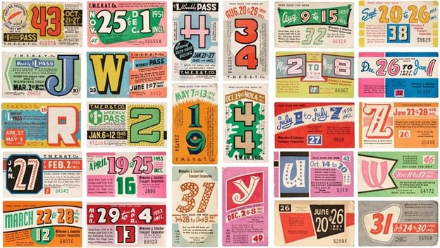
Editorial content explores things like the fonts most used by the Bauhaus, the art and design school that operated in Germany at the turn of the 20th century, while articles and videos provide introductions to Bollywood film posters and the many colourful transport tickets held in the archive.
You won’t get bored at the Letterform Archive. The oldest item in the archive is a cuneiform tablet dating to 2000 BC. It takes its place alongside Coca-Cola style guides and a 19th-century family tree written in stunning Kanji – the ideograms used in Japanese writing.
And there’s more: a concert ticket from 1960 in typical psychedelic lettering, a rare copy of Ver Sacrum, the art magazine founded by Gustav Klimt in 1898, and the entire back catalogue of Emigre, the cult magazine founded in the mid-eighties that pioneered the use of computers in graphic design.
A closer look at some selected works
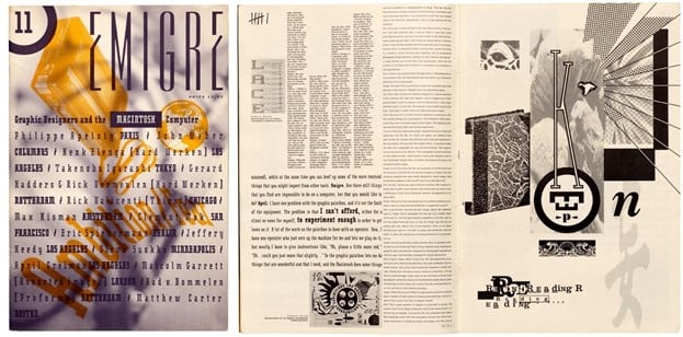
Above are a number of pages from issue 11 of Emigre magazine, published in 1989. Emigre was the first independent type foundry to focus explicitly on personal computer technology. The magazine was first published in 1984.
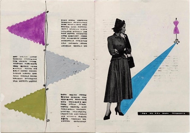
Below are sketches by Mila Kavalla that provide a fascinating peek into the world of mid-century fashion advertising and illustration. Kavalla was an Austrian illustrator and graphic designer born in 1924. She founded the Viennese design agency “Hellmann-Kavalla”.
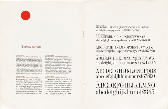
A significant part of the collection is given over to typeface specimens. Here, for example, we can see details and information about Torino, a font inspired by Italian classical proportions and designed in Canada in 1955 by Nickolas Storto.
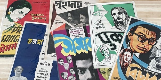
Shown below are a series of Indian film posters from the archive, which is accompanied by an interesting analysis of the lettering.
A stunning page take from an 18th-century calligraphy manual by Dutch master Boers Bastiaan.
A host of online resources and courses
If San Francisco is a bit far from home, don’t worry: the Letterform Archive offers a rich array of online resources (although the curators emphasise the value of visiting the collection in person, if possible):
- Online archive. This is undoubtedly the Letterform Archive’s most valuable digital offering: it gives you access to a significant chunk of the collections in high-resolution images.
Indeed, the Letterform Archive is in a constant process of digitisation – you can take a look behind the scenes at how this is happening. The online archive lets you search for pieces by country of origin, decade, format and discipline, amongst other things. You can access it here. - Remote courses and lectures. Education is one of the pillars of the Letterform Archive, and this can be accessed online too. For example, Type West is a postgraduate course in type design that can be taken online. Lectures and workshops on the history of typography and graphic design are available in digital format – check out the calendar here.
- Social media. Lastly, the Letterfom Archive is very active on social media. Take a look at their profiles on Instagram or Twitter. Here are some of its greatest hits!
Were you thrilled to discover this magical place for typographic art? We certainly were!