
Table of Contents
With graphic designers, it is almost always the case that most people will have seen (or even purchased) one of the items they designed, rather than having heard their name or seen their face. And Jonathan Barnbrook, the man behind works most of you will undoubtedly have seen, like the covers of David Bowie‘s last two albums, is no exception. As you may recall, the final one – ★ (Black Star), released two days before Bowie’s death – contained only a black star and some graphic symbols referencing the rock star’s namer.
His beginnings creating lettering for bands
Jonathan Barnbrook was born in Luton (UK) in 1966, and studied at Saint Martins College of Art and Design and the Royal College of Art. He did his first graphic design at the age of sixteen, drawn to record sleeves and the shapes of the letters used for the names of bands. As Barnbrook points out, you can understand the entire ideology and philosophy of a band from the lettering alone. When an album cover works, something magical happens, and somehow you end up loving the music you’re listening to even more[1]. He immediately began designing individual characters, followed by entire type families. He was relatively well known even before he finished college, with works published in various European, American and Japanese design magazines[2]. In 1990, on finishing his studies, he set up his own studio, Barnbrook Design, and a few years later, in 1997, his own type foundry, Virus Studio.
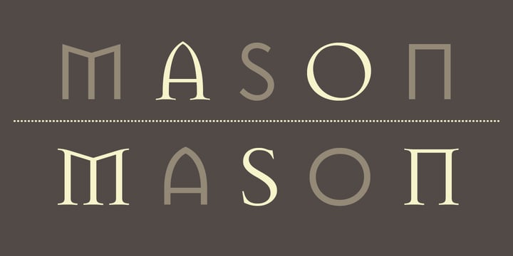
In 1992 the American type foundry Emigre added two of his fonts, Exocet and Mason, to its catalogue. Mason was originally called Manson, but the name was changed following numerous complaints about its connection to the surname of the infamous Californian serial killer Charles Manson. In 2011, Mason was added to the permanent collection of the MoMA in New York.
Graphic design and politics
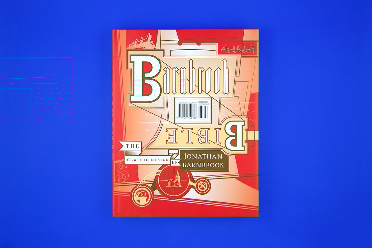
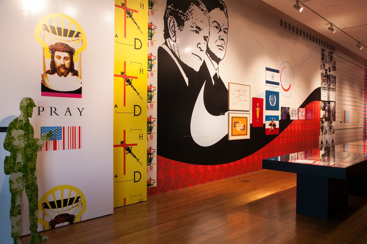
Barnbrook has always used the language of graphic design not only to produce objects, but also to communicate his ideas, which are frequently political in nature, as he believes that graphic design should not solely be used for the benefit of multinationals, generating profit and encouraging consumerism[3]. His profile on the Design Museum website, which dedicated a retrospective to him in 2007, describes him as “pioneering the notion of graphic design with a social conscience”. The exhibition, entitled Friendly Fire, reflected his more political work and his wish to look critically at his profession and at society as a whole. Barnbrook designed the layout of the exhibition himself, and of course also created the catalogue that accompanied it, Barnbrook Bible.
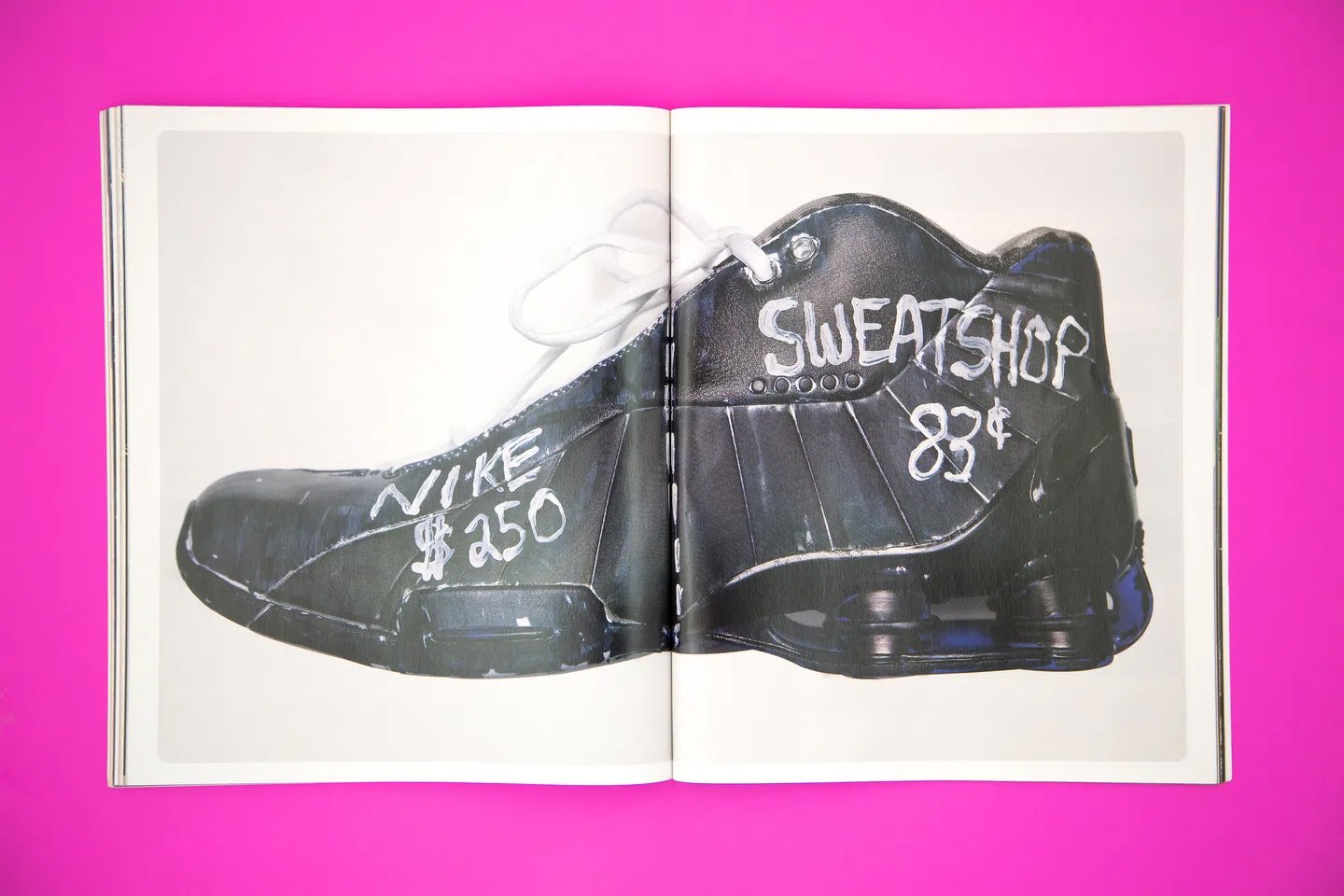
Barnbook believes his political work provides the opportunity to give design back the meaning it often lacks. When one thinks about political graphic design and propaganda, one tends to think about totalitarian regimes, while commercial graphic design is often considered a politics-free space. For Barnbrook, however, just being a commercial graphic designer is in itself a very strong political idea. “To ignore the issues around sweatshops, to ignore the fact that you’re consenting to relentlessly push a market economy is a political decision”[4], he said.
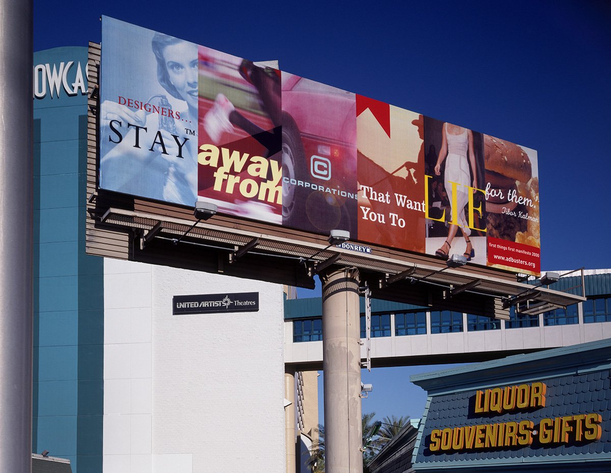
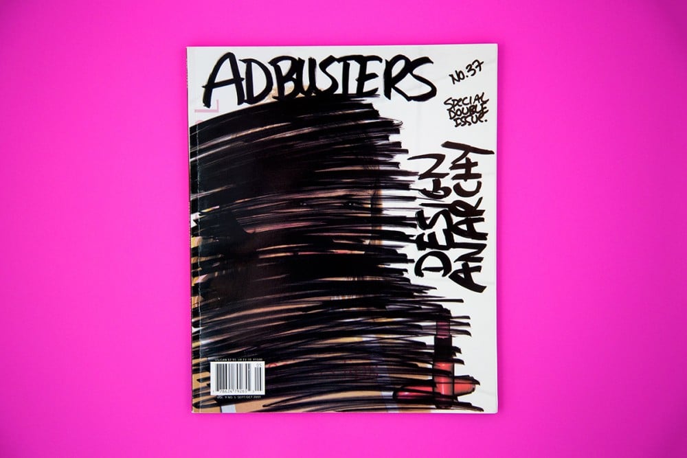
In 2001 he worked as art director for the magazine Adbusters, produced by a non-profit Canadian environmental and ‘anti-advertising’ organisation. Around the same time he produced a large billboard featuring a quotation from Tibor Kalman: “Designers, stay away from corporations that want you to lie for them”, which was shown for the first time during a conference of the members of the American Institute of Graphic Arts (AIGA) in Las Vegas.
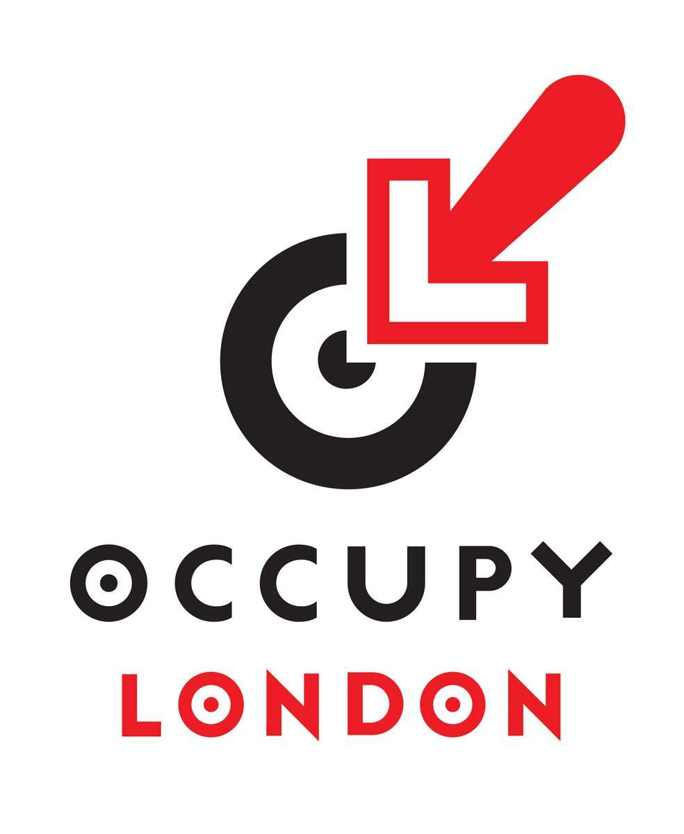
In 2011, he worked with the Occupy London movement, including creating their logo.
Collaboration with Damien Hirst
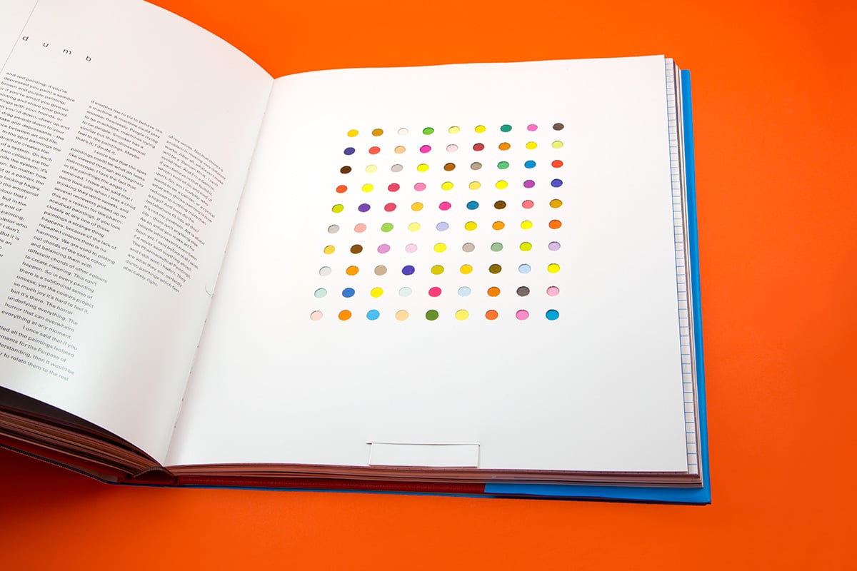
In 1997, Barnbrook collaborated with Damien Hirst, then a rising star, and now one of the world’s best-known contemporary artists, working with him and on his behalf to create the artist’s book I Want to Spend… Each work in the book is treated differently, including ‘gimmicks’ like pop-ups and stickers, and with Hirst’s name presented as if it were a medicine. This book, which went on to receive numerous design awards, was the starting point for another partnership between Hirst and Barnbrook, the furnishing of Pharmacy, a restaurant/cafe in Notting Hill.

David Bowie’s album covers
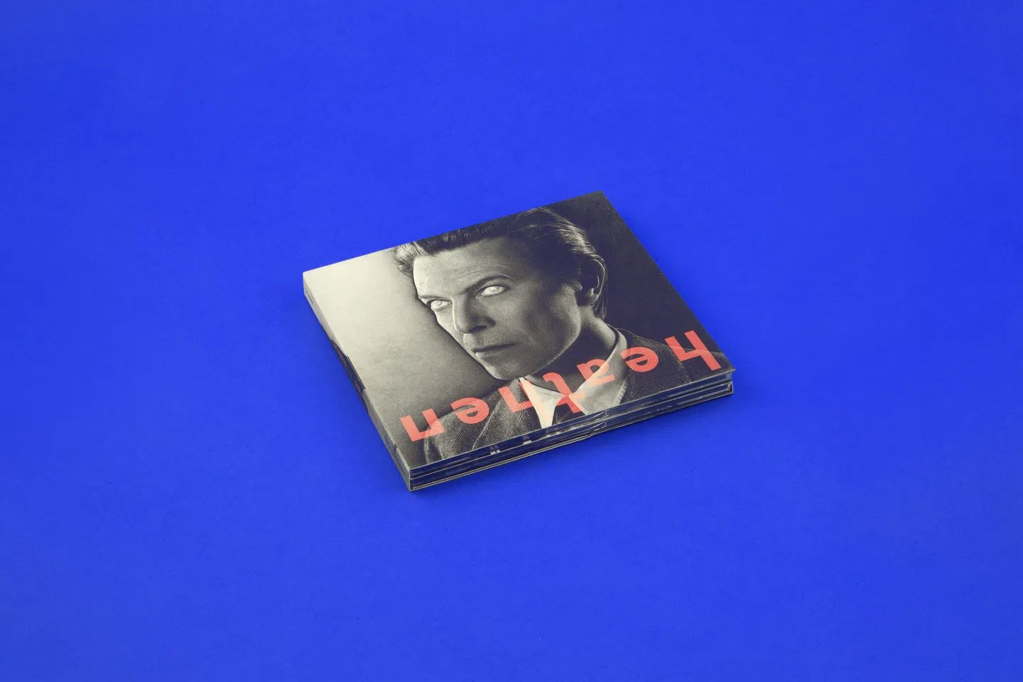
Barnbrook’s best-known collaboration is definitely his work with David Bowie, beginning with the cover of the album Heathen in 2002 and continuing with Bowie’s final two albums, The Next Day and ★ (Black Star). The latter even won a Grammy in the Best Recording Package category.
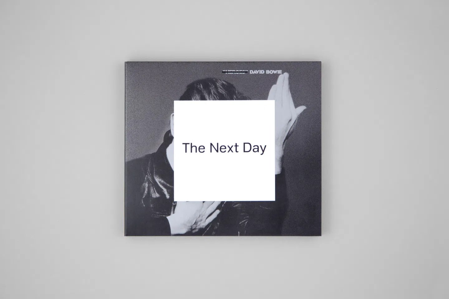
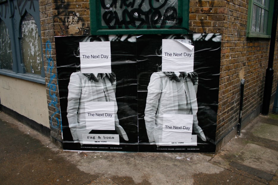
Barnbrook designed special fonts for all three albums. For The Next Day he create a faux-modernist font, Doctrine (also used for the studio’s website). The image on the sleeve is the cover of an old Bowie album (Heroes) with a white rectangle on top, like a poster with another poster stuck on top. For Black Star he created a font comprising graphic symbols linked to stars. The font is open source and can be downloaded from bowieblackstar.net.

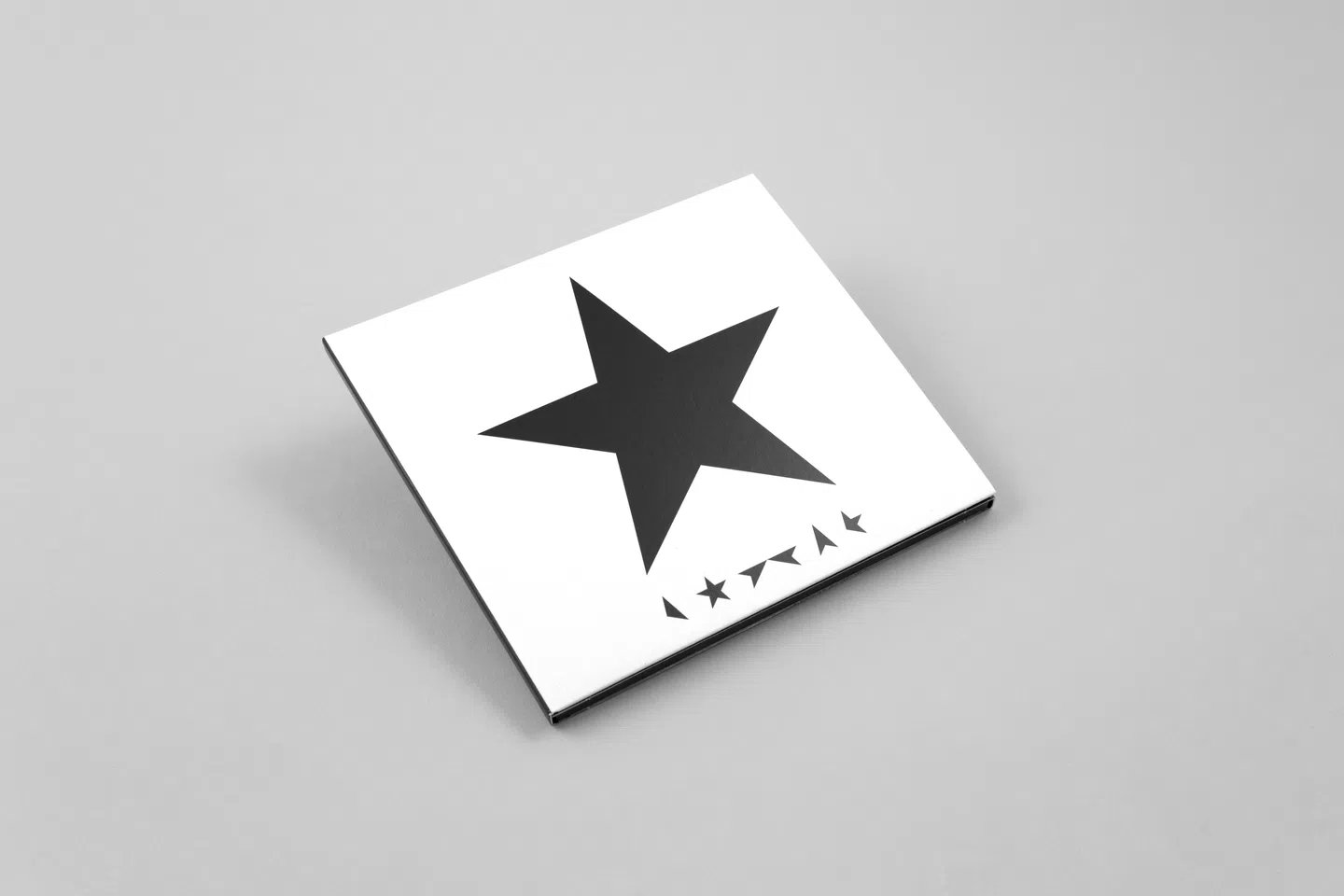
In an interview with Creative Review, Barnbrook said the idea for Black Star came from numerous discussions with Bowie, inspired by the designer meeting the writer William Burroughs 25 years previously. During this encounter they talked about typography, and Burroughs told him that the shapes of letters would one day return to being hieroglyphs, similar to those used by the ancient Egyptians[5].
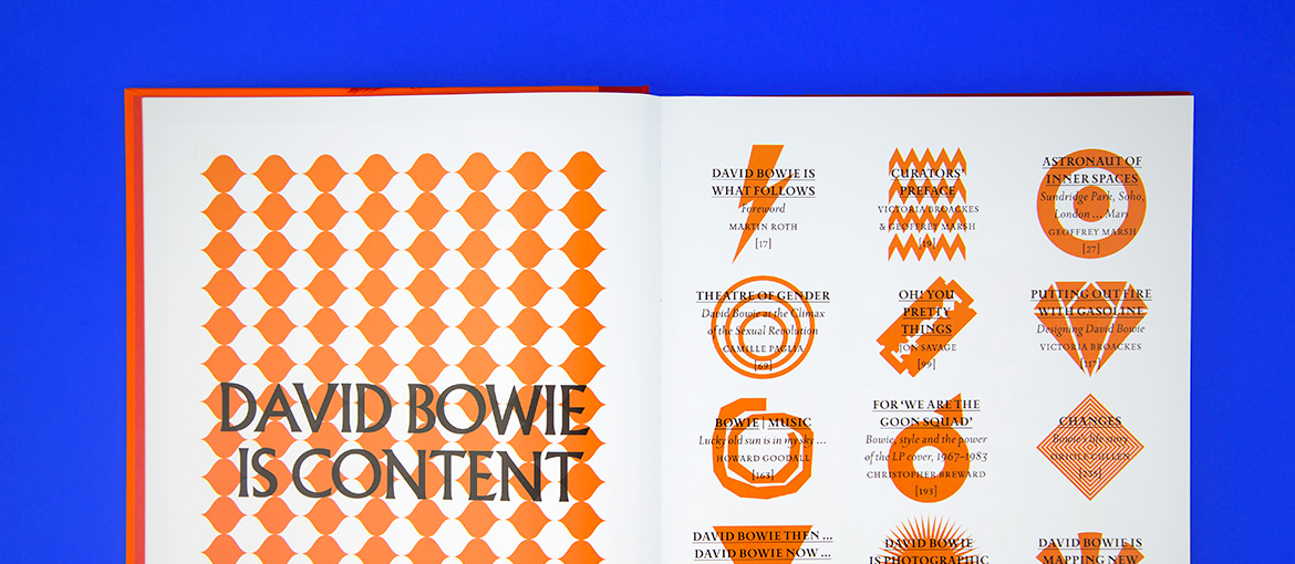
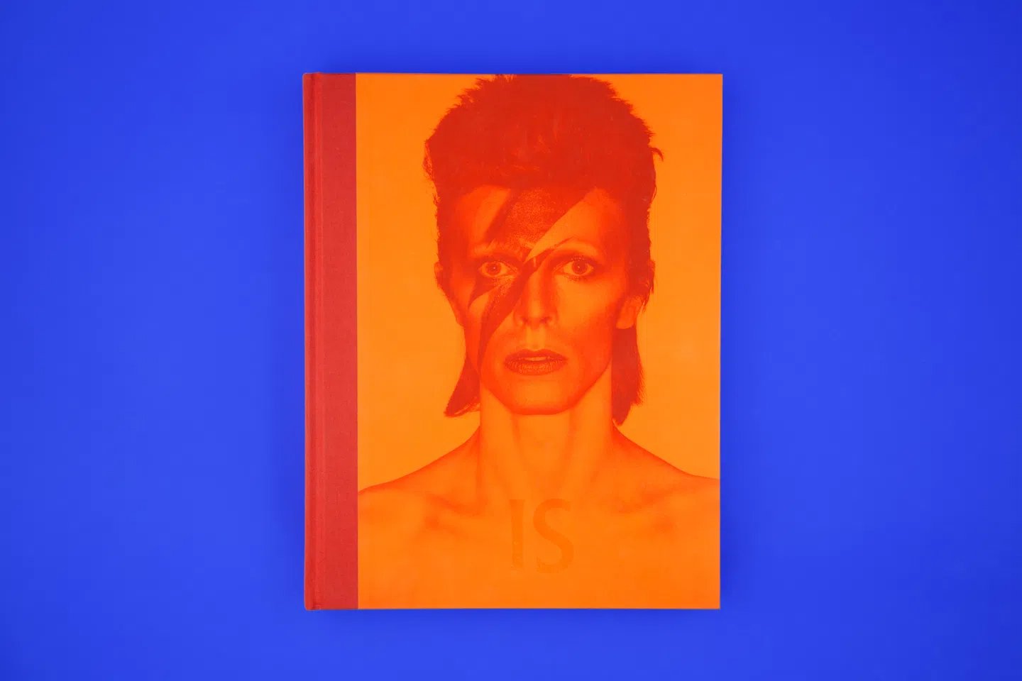
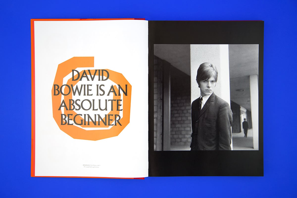
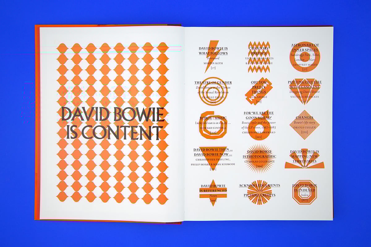
In 2013, the Victoria and Albert Museum in London dedicated an exhibition to David Bowie, entitled David Bowie Is. Barnbrook designed the catalogue, and the first pages contain a series of graphical symbols, each inspired by a key moment in David Bowie’s career.
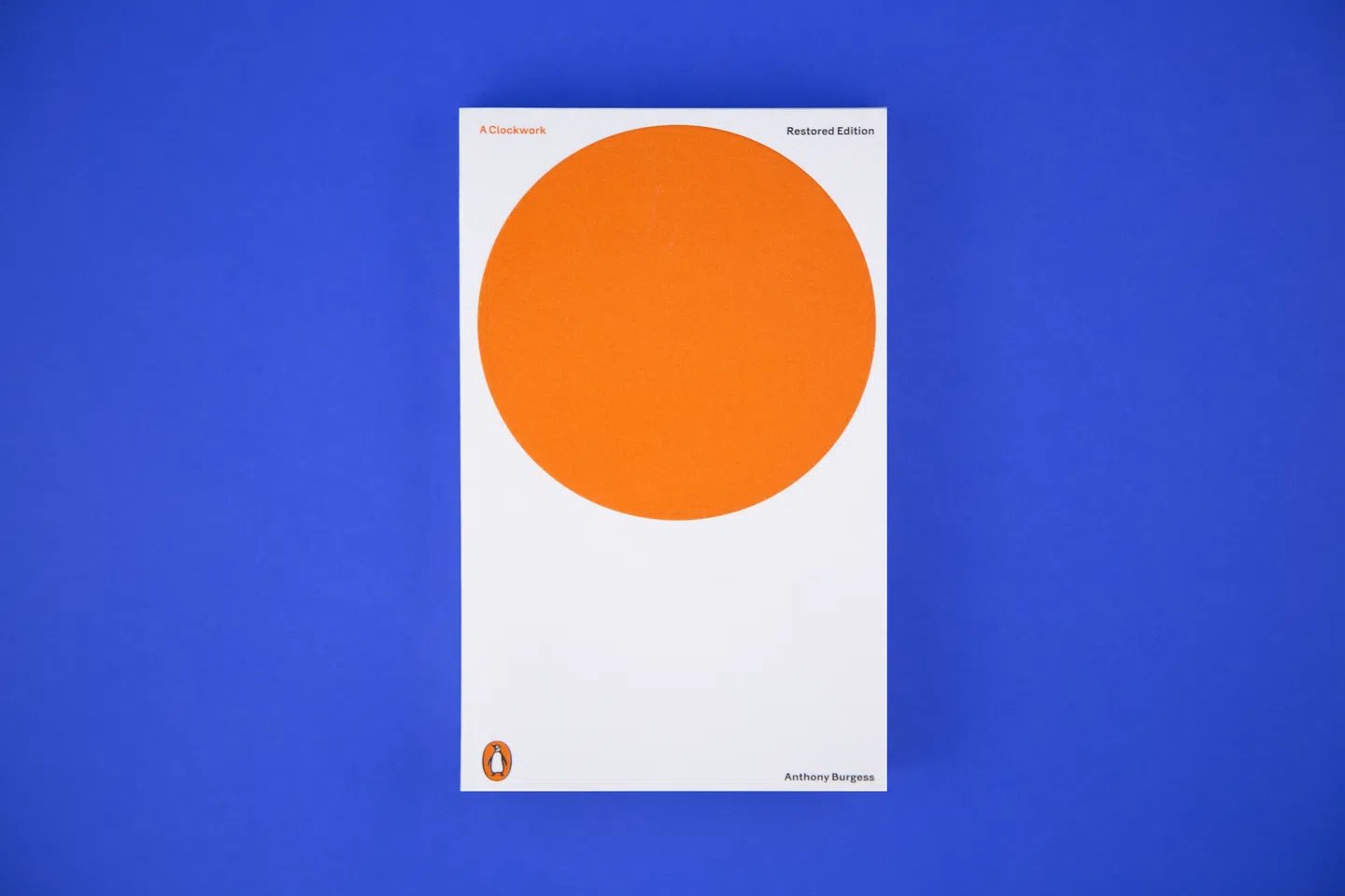
The cover of A Clockwork Orange
In 2014, to celebrate 50 years since the book’s first edition, the British publishing house Penguin asked Barnbrook to design the cover of A Clockwork Orange. In Barnbrook’s hands the title on the cover was left incomplete, with an orange circle providing the final word.
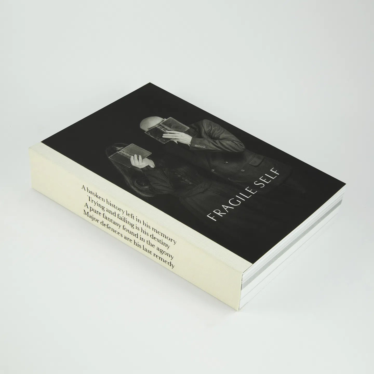
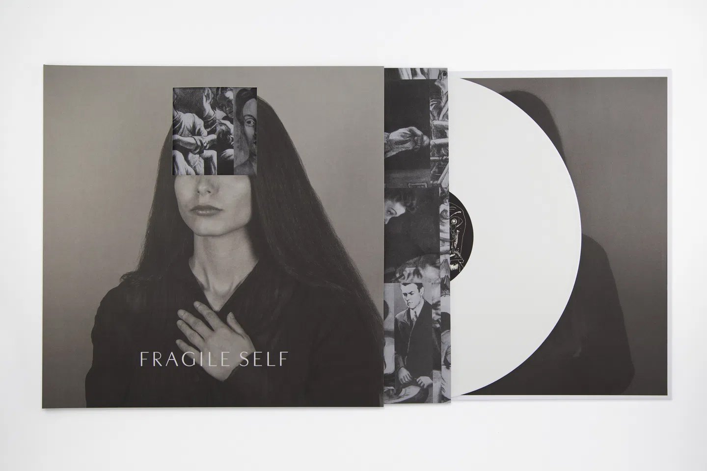
Electronic music with Fragile Self
In recent years, Barnbrook and his wife Anil Aykan have been working on an electronic music project called Fragile Self. The duo pays as much attention to images as to music – the album took several years to make, and includes a 480-page tome displaying the poetic details of each song[6].
Designing for a large audience
In an interview with the magazine It’s Nice That, Barnbrook revealed he is fascinated by very large projects, like the Olympics or the World Cup, which are visible everywhere and by everyone. He is not seeking to satisfy his ego – he is simply interested in the incredible power of graphic design to communicate to so many people. And when a graphic design project, as well as being large in scope, is also done well, it feels like nobody designed it at all. As Milton Glaser said in an interview some time ago, talking about his renowned ‘I♥ NY[7]‘ design:
There’s something strange about that logo: it’s like no one designed it […] It feels like a strange historical artefact. It doesn’t give the idea of being something that was designed. It seems so… I don’t know, inevitable. Probably all the best things one does seem inevitable.
[1] From an interview on YouTube, Design Duo 2017
[2] Rick Poynor, Reputations: Jon Barnbrook, Virus, Eye Magazine, 1994
[3] Lucy Bourton, Graphic design is political: Jonathan Barnbrook on how we can build a better industry, It’s Nice That, 2020
[4] Katrina Schollenberger, In conversation with Jonathan Barnbrook, Artefact Magazine, 2015
[5] Mark Sinclair, Bowie, Barnbrook and the Blackstar artwork, Creative Review, 2015
[6] Lucy Bourton, Graphic design is political: Jonathan Barnbrook on how we can build a better industry, It’s Nice That, 2020
[7] Ciro Esposito, Un’intervista a Milton Glaser, Dispenser.Design, 2020