
Table of Contents
It’s May 1968 in Paris. Young people are out on the streets in force, manning barricades, brandishing placards and chanting slogans in the biggest social uprising Europe has seen in modern history.
But while France’s capital and other cities are gripped by youth-led turmoil, the Bayard publishing group is launching “Notre Temps”, a magazine whose raison d’être is to give a voice to the older generation – initially pensioners – in an era when the elderly feel ignored and stigmatised: back then, retirement was associated with a sort of “social death”. The founding of Notre Temps was therefore a pioneering move that swam against the tide, but one that responded to a genuine gap in the market: at the time, there was no French news outlet that aimed squarely at seniors. Notre Temps filled this hole. It provided useful and reassuring information to readers who were switched on, interested in the world around them and still active in society, redefining the meaning of the third age along the way.
Despite being a seemingly niche publication, by the end of the nineties Notre Temps was selling over a million copies a month* thanks to its age-appropriate approach to traditional lifestyle themes, such as health, pensions, cooking, travel, culture and technology.
The publication could now (rightly) claim to be France’s best-selling monthly magazine, a mantle it still holds today. The secret to its success? Simplicity.
Simple graphic design
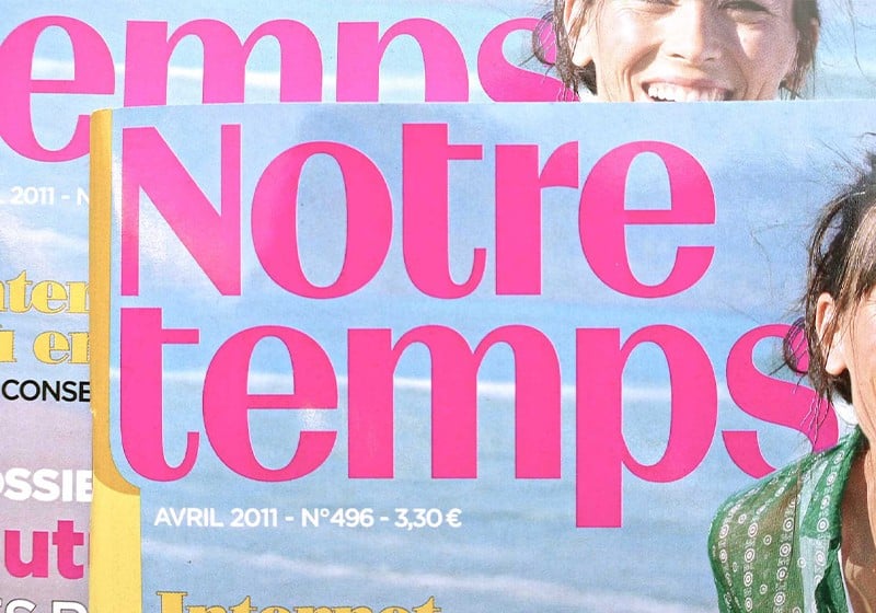
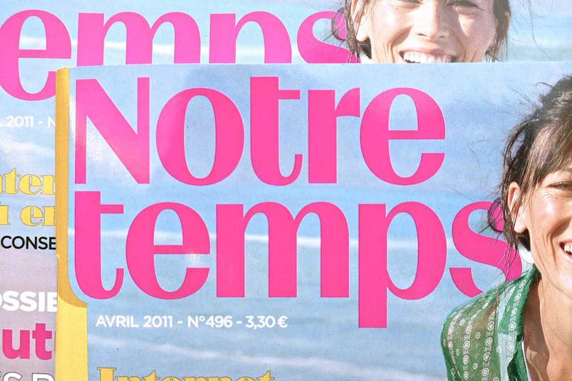
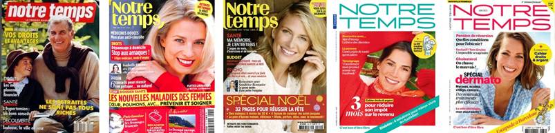
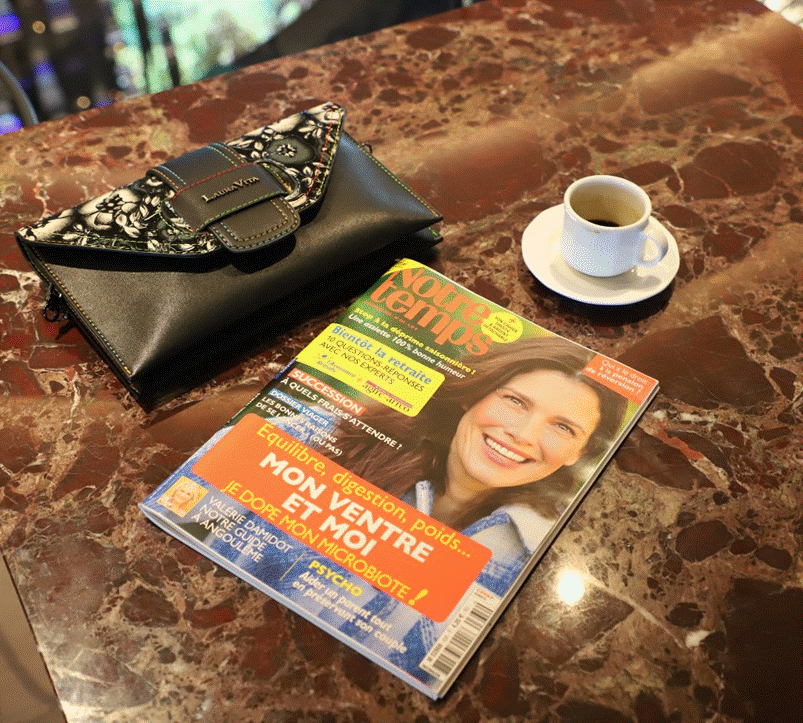
The graphic design of Notre Temps may have evolved over the years (undergoing its latest facelift in 2024), but its hallmark has always been the same: simplicity. And from the 2000s onwards, colour has been a key feature, too, with the magazine using pastels for headlines as well as large-format colour photos.
The aim is to speak to “elderly” readers without making them feel as such.
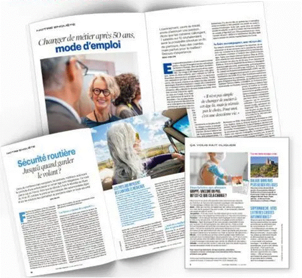
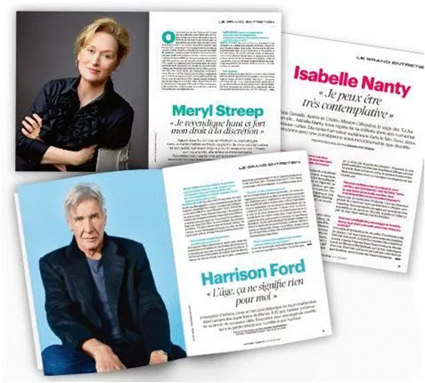
The publication uses a traditional lifestyle magazine format (21 × 27.5 cm), which is slightly squatter than A4. Inside, there’s a simple two- or three-column layout with colourful, easy-to-ready headlines and large photos for its 148 pages.
El objetivo siempre ha sido hablar a los lectores «mayores» sin hacerles sentir que lo son, hablando de su tiempo libre y de cómo utilizarlo activamente.
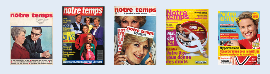
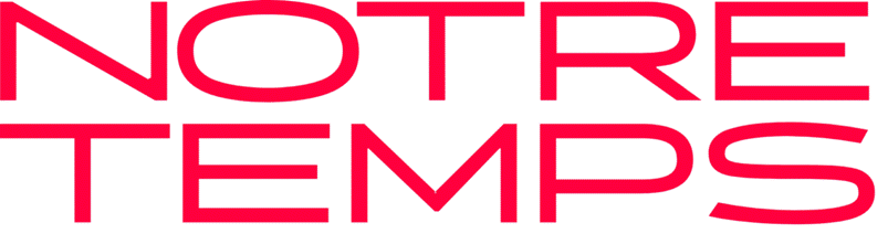
The masthead has had frequent overhauls down the decades: the first saw it switch to a white italic Helvetica on a red background, the next a capped down Helvetica bold. But the biggest change came in 2011, when French type foundry Zecraft created a custom grotesque font that was a better fit for the market. And in the latest redesign in 2024, Notre Temps adopted a light, elegant and contemporary sans-serif typeface perfectly suited for digital media.
The logo now sits inside a coral circle (a decidedly on-trend hue and recent Pantone colour of the year), which is perhaps a nod to a more female readership.
What’s interesting about graphic design at Notre Temps is that it doesn’t slavishly follow fads and chase younger readers: it focuses on an established audience who seek consistency and clarity.
Images and infographics
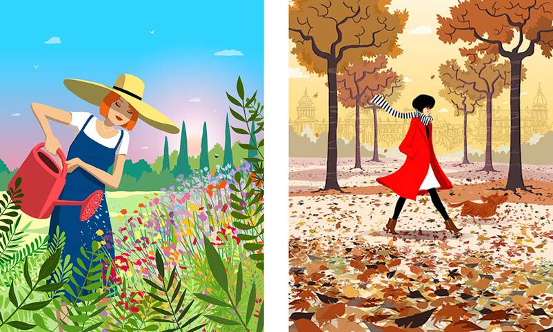
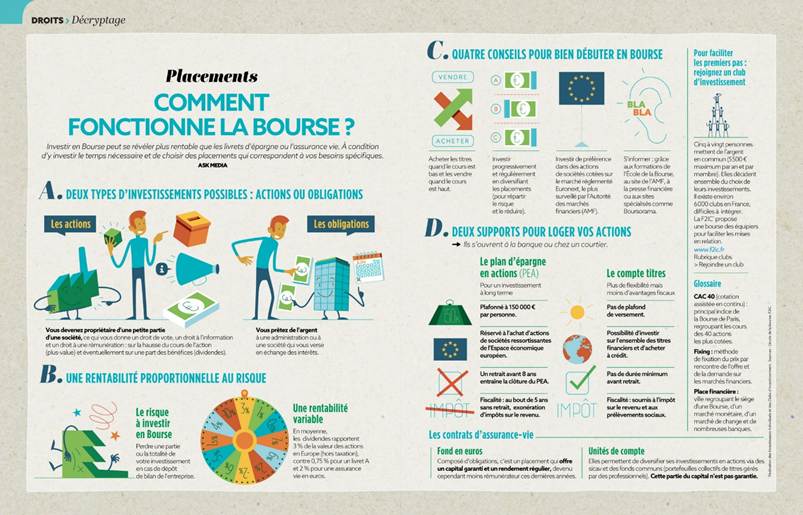
While staying focused on its core readership, lately Notre Temps has embraced modern trends in magazine design, particularly the use of infographics. It has also experimented with comics and visual storytelling, including a 2024 collaboration with celebrated graphic novelist Riad Sattouf.
Our times have changed
Since Notre Temps first hit news-stands in the late sixties, times have well and truly changed. Its target readership of retirees has totally different needs and interests than they did half a century ago: today’s pensioners are healthier and wealthier, allowing them to lead more active and fulfilling lives, to travel, play sport or volunteer in the community. The magazine has adapted accordingly, while maintaining its distinctive offering, which make it one-of-a-kind in the world.
In 2024, incoming editor-in-chief Isabelle Duriez stressed that Notre Temps did not want to “remind readers how old they are, but offer content that helps them in their actual lives”. It’s a rare example of a media outlet eschewing clichés and offering a more vital and respectful vision of old age. And suggests that the magazine will strive to keep up with its ever more active readership, with without losing sight of its founding principles.
Source for data: https://en.wikipedia.org/wiki/Notre_Temps