

Table of Contents
Entertaining and harrowing, carnal, political, realist but also wildly imaginative. Gabriel Garcia Marquez’s One Hundred Years of Solitude has something about it that’s hard to describe: a sort of special flame that has lit up imaginations for over 50 years.
The idea for this intergenerational epic struck the author out of the blue one day as he was driving to the beach. A few days afterwards, he shut himself in his house and didn’t leave again until 18 months and 30,000 cigarettes later, when he finished the manuscript for this masterpiece.
Today, One Hundred Years of Solitude is a modern classic, but when it was first published Gabriel García Márquez was not convinced that his complex novel would find success. And with good reason: the book was unlike anything seen before.
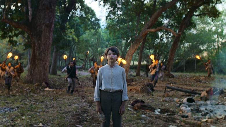
One Hundred Years of Solitude is a literary maelstrom that has swirled in readers’ minds for decades, without ever crystallising into a single image. One factor, no doubt, was Garcia Marquez’s famous reluctance to allow his work to be adapted for the screen – something that only happened 10 years after his death, with the Netflix series released in 2024.
So it’s no surprise that the myriad covers for One Hundred Years of Solitude present a kaleidoscope of different images. It’s rare to see such variety, even for best-selling novels translated and sold around the globe. And it’s even inspired someone to collect 100 covers for One Hundred Years of Solitude.
In this article, we’ve picked out the most inventive and meaningful covers to One Hundred Years of Solitude – ones that explore interesting aspects of the book or have fascinating stories behind them. Let’s kick things off with an anecdote about the first cover…
The first cover for One Hundred Years of Solitude
The first edition of One Hundred Years of Solitude arrived in bookshops on 30 May 1967 to no fanfare: nobody had any inkling that the book would become an international bestseller.
The novel was first published not in García Márquez’s native Colombia, but in Argentina by Buenos Aires-based publishing house Editorial Sudamericana. The cover has a white galleon at its centre with three yellow geometric palm trees below: it’s a reference to the moment when José Arcadio Buendía – the patriarch of the family whose fortunes we follow in the novel – stumbles across a Spanish galleon in the middle of the jungle. But García Márquez never signed off this artwork, and he told the publisher to change it immediately. So how did this unapproved illustration end up on the cover?
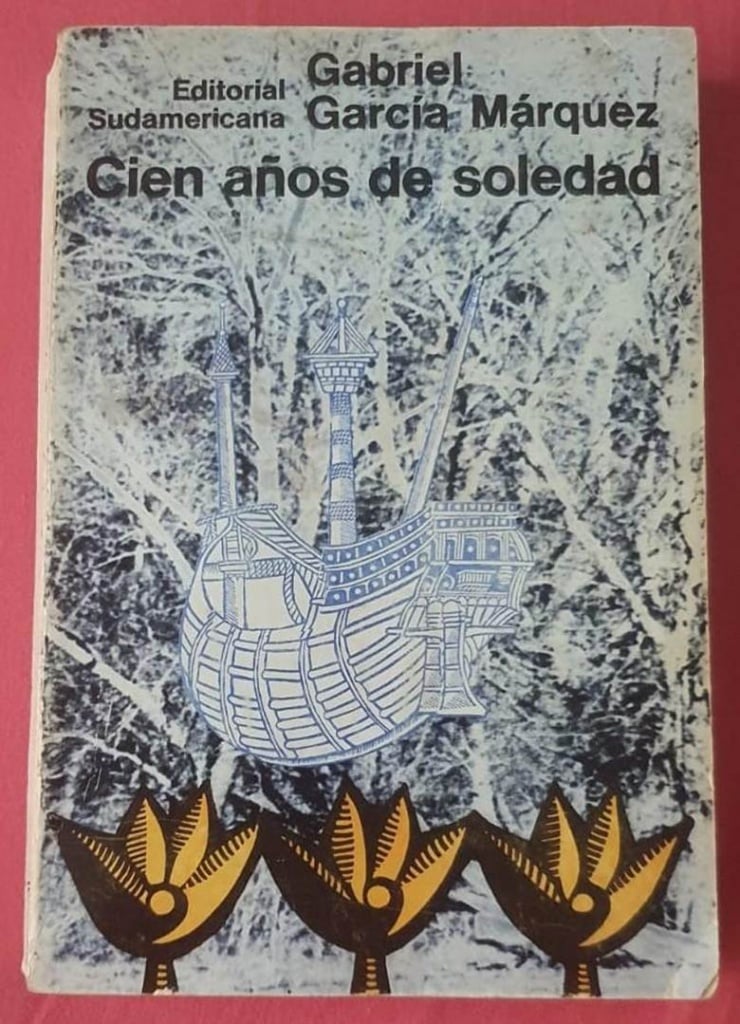
In fact, in agreement with García Márquez, the publisher had originally commissioned a cover from Mexican painter and friend of the author Vicente Rojo. But the artwork arrived in Buenos Aires too late. The painter claimed to have sent it in good time and in one interview joked: “I always imagined that on its journey from Mexico to Argentina it stopped in Macondo to seek the blessing of the townsfolk”.
Caught in a bind, the publisher asked their in-house designer, Iris Pagano, to hastily improvise a cover. And that’s how we got the first cover to One Hundred Years of Solitude – a collector’s item today!
Vicente Rojjo’s cover for One Hundred Years of Solitude
The first 8000 copies of One Hundred Years of Solitude flew off the shelves in a week. The book was immediately reprinted with the right cover: the one designed by Vicente Rojo.

Gabo (as García Márquez was affectionately known) loved this enigmatic cover so much that he had himself immortalised in a portrait while wearing the book… as a hat! Readers loved the cover too, intrigued by the mysterious symbols framed by blue borders on the front and back of the cover.
The painter wanted to bring a popular touch to the cover with this playfulness, which extended to the lettering, too. “I designed the letters as if they’d been done by a local signwriter for any old stationer’s or garage,” explained Rojo.One Hundred Years of Solitude was initially published in paperback: the first hardback editions didn’t come out until 1970.

But there’s one detail that sparked all sorts of far-fetched theories about its meaning: the strange back-to-front “E” in the word “soledad” (solitude) in the title. Why did Rojo write it like this? His explanation was simple: “I turned the ‘E’ around to stress the humbleness of the painter who did the sign and made a mistake. [In my imagination] it was a local painter, not a master signwriter…”
The covers for the first translations
With reprint after reprint, One Hundred Years of Solitude soon sold a million copies: an extraordinary achievement for a South-American author in that era. Today, García Márquez’s novel has been translated into 37 languages and sold more than 50 million copies worldwide.
The first translation of this unforgettable piece of fiction was enjoyed by readers in Italy, a country that at the time was forging a special bond with Latin American authors. Just a year after the book came out in Buenos Aires, One Hundred Years of Solitude hit Italian bookshops in 1968.
While the first Italian cover is a hard-back type-only affair, the subsequent paperback edition uses the same Spanish galleon motif found on the very first edition of the novel. It’s an image that hints at a mysterious place where strange things happen, but some say it suffers from a major flaw: it’s too… exotic! Both the cover to the first edition and the first Italian translation have fantastical, tropical auras about them, likely designed to pique readers’ curiosity. But this atmosphere does not exactly reflect the realism portrayed by García Márquez inside.
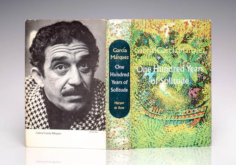
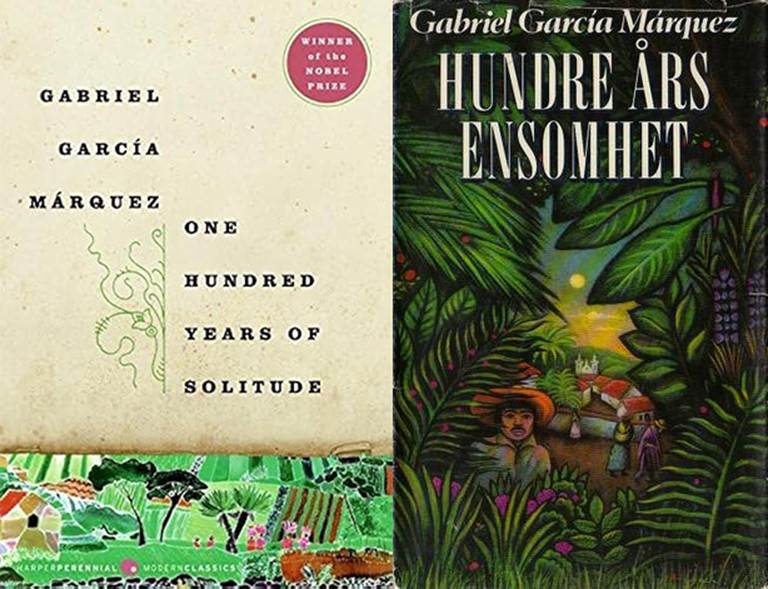
In 1970, the first American edition of One Hundred Years of Solitude was published in New York by Harper & Row. This, too, sports a colourful and dreamlike cover with lush vegetation and the outline of a mysterious galleon in the middle.
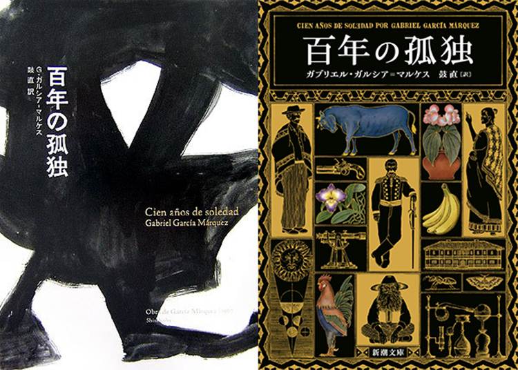
One Hundred Years of Solitude arrived in the far east relatively quickly: the first Japanese edition appeared in 1972. But the novel never enjoyed the success it found elsewhere. This all changed in 2024, when the Netflix series made the Japanese finally fall in love with the book.
Covers for One Hundred Years of Solitude with the city of Macondo
Among García Márquez’s most celebrated creations is undoubtedly the city of Macondo. It is in this town deep in the forest that most of One Hundred Years of Solitude is set.
Right from those famous opening lines, Macondo catches our imagination. García Márquez found the inspiration for this fictional town in the city where he was born Aracataca. It was here that he saw the word Macondo printed on a sign for a banana plantation and began to imagine a place that is both real and magical at the same time.
So it’s only natural that many covers for One Hundred Years of Solitude depict Macondo and do so in all manner of styles.
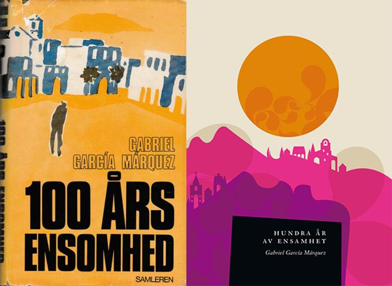
Here’s how cover artists from two Nordic countries, Norway and Sweden, see the town of Macondo. Left: a Norwegian edition from 1969; right: a more modern Swedish cover from 2014.
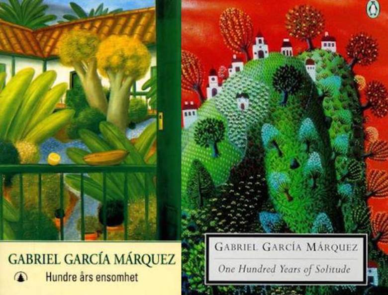
Macondo also features on this American cover for One Hundred Years of Solitude from the 2000s (left), published by Harper Perennial. And we get a glimpse of the city through the forest on this Norwegian cover from 1983 (right).
We are treated to more visions of Macondo with a British cover from Penguin (left) and another, more metaphysical one from Norway published in the nineties (right).
But our favourite image of Macondo is this delicate depiction from a 2017 Lithuanian edition which shows the city floating on the leaves of the Amazon rainforest.

Covers for One Hundred Years of Solitude with the Buendia family
Through García Márquez’s linguistic inventiveness, space and time intertwine in One Hundred Years of Solitude. Space is Macondo and time is the fate of the Buendia family. Indeed, Macondo was founded by José Arcadio Buendía, the first member of the family that the novel follows over some seven generations.
Here’s our pick of One Hundred Years of Solitude covers showing members of the family at the heart of the novel.
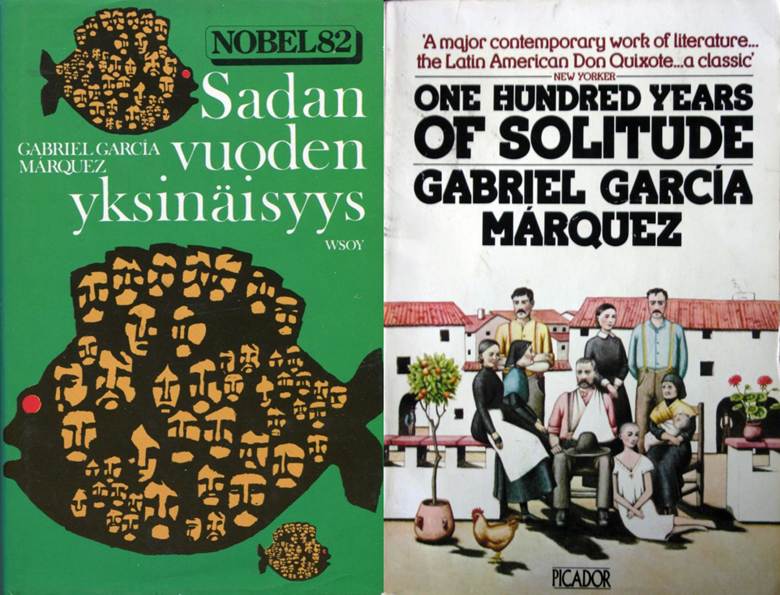
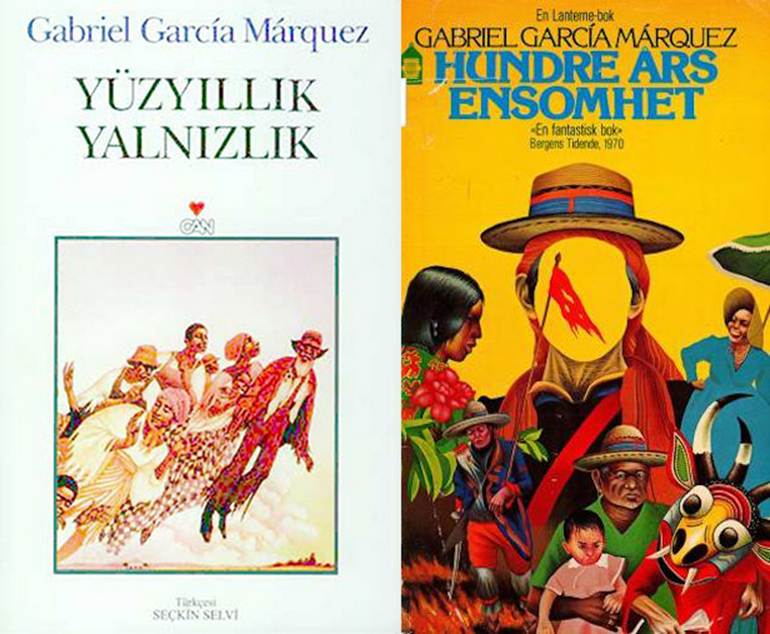
How many Buendias are there? A Finnish cover (left) presents the faces of generations and generations of the clan being ferried somewhere aboard a strange fish: it makes us think how the destinies of individuals are bound together in one story with a capital S. In contrast, the British cover from 1978 (right) is decidedly more conventional.
Here are two more portraits of the Buendia family in two quite different styles: the cover on the left hails from Turkey, while the one on the right is from Norway.
Seven generations is a lot, and with time not moving linearly in the novel, it’s notoriously hard to keep up with who’s who in the Buendia tribe. So why not stick a family tree on the cover? That’s what they did for these two versions of One Hundred Years of Solitude: one Italian, the other Korean.

More weird One Hundred Years of Solitude covers
There’s nothing ordinary about One Hundred Years of Solitude. Not the language, nor the time, the plot, the people or the places. His ironic and tragic narrative inventions may have won Garcia Marquez the Nobel for Literature in 1982, but the author pulled off an even greater achievement: he gave us a new way of imagining the world.
Some covers for One Hundred Years of Solitude seem to be trying to outdo the originality of the book inside – for better or for worse. For instance, two mysterious and metaphysical covers show us the strange way that time passes in the novel: time that’s forever foreshadowing events in the future and jumping back into the past. Right: a Russian edition from 2002; left: the cover for a Bulgarian edition from the seventies.

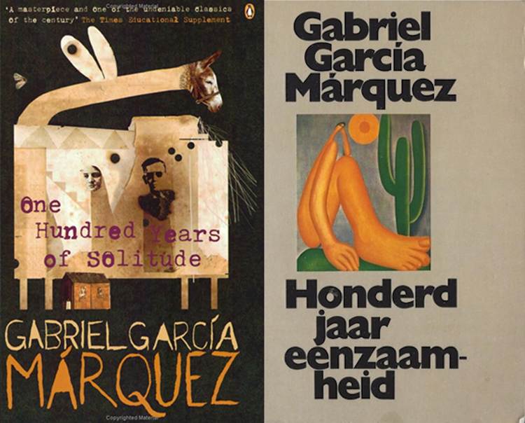
We can’t find words to describe these two One Hundred Years of Solitude covers from 1972. On the left is a British edition published by Penguin and on the right is a cover for a Dutch version.
Images: lithub.com
We wrap up our selection with this baffling cover for an Italian edition of One Hundred Years of Solitude published by Mondadori in 1995. What do you think inspired this art?

Did these One Hundred Years of Solitude covers make you want to read (or re-read) García Márquez’s magical masterpiece? Or did they give you ideas for your next graphic design project? Share your thoughts!