
Table of Contents
We continue our exploration of the illustration world and the places, products and situations where it’s used. In the last article, we saw how illustration is used in shops and stores, so now it’s time to look at the products sold there. We’ll see how illustration can be central to a product’s graphic design, and the clincher when it comes to making a sale.
Illustration is perceived as lending artistry and exclusivity to a product; it can be used to appeal to a young audience, or it can be designed to show a product’s authenticity and simplicity, which is why it’s frequently used for craft and organic products. From a technical standpoint, illustration is most often applied to paper packaging and labels, but thanks to modern printing techniques, which have been around for a few decades now, complex illustrations with lots of colours can also be printed on aluminium, plastic and cardboard.
Are you illustrating the product or generating interest?
An important question to ask is: does illustration really generate interest? In a complex marketing strategy, illustrations can help position a product on the market and make it stand out. Inside a store, it can catch the eye of potential customers, something that can be hard to achieve in supermarkets and mass-market retail, where consumers are often loyal to brands and shop based on price. And in discount retailers, illustrated packaging is rare, because people tend to perceive such products as being more expensive so leave them on the shelves.
Creativity for food
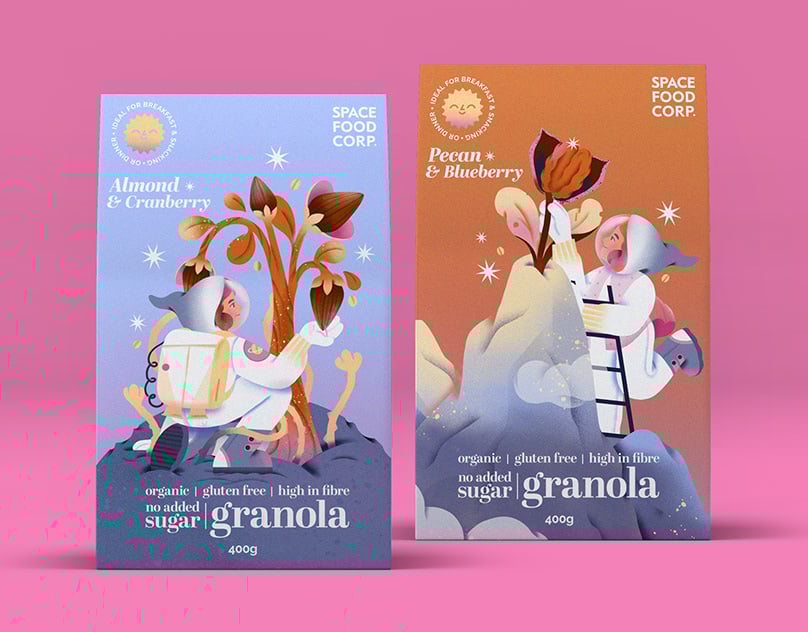
We’ll start our overview with the food sector, where we’ll see that illustration can be ideal for making certain products recognisable and conveying their qualities to consumers.
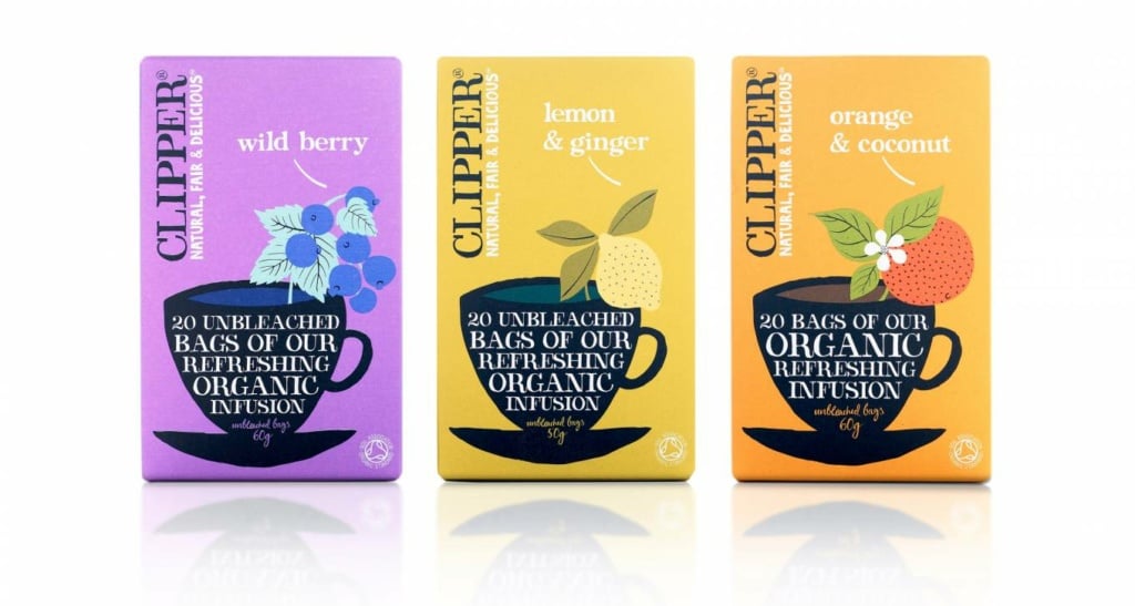
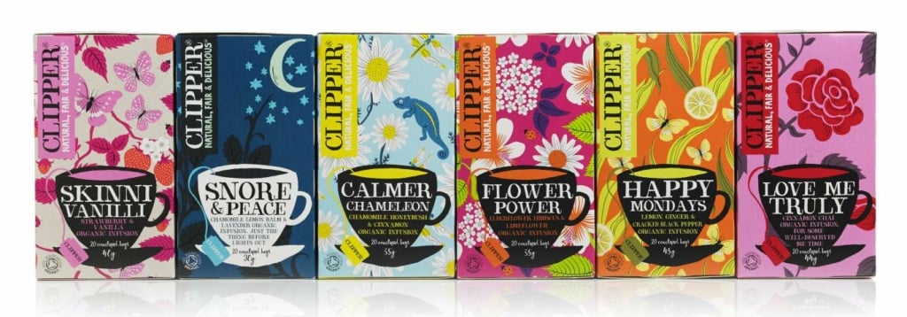
A great example of a blend of drawing and graphic design was the makeover given to the Clipper Tea line by British marketing agency Big Fish in 2008. It kicked off a trend for iconic and recognisable packaging and marked a turning point for packaging design.
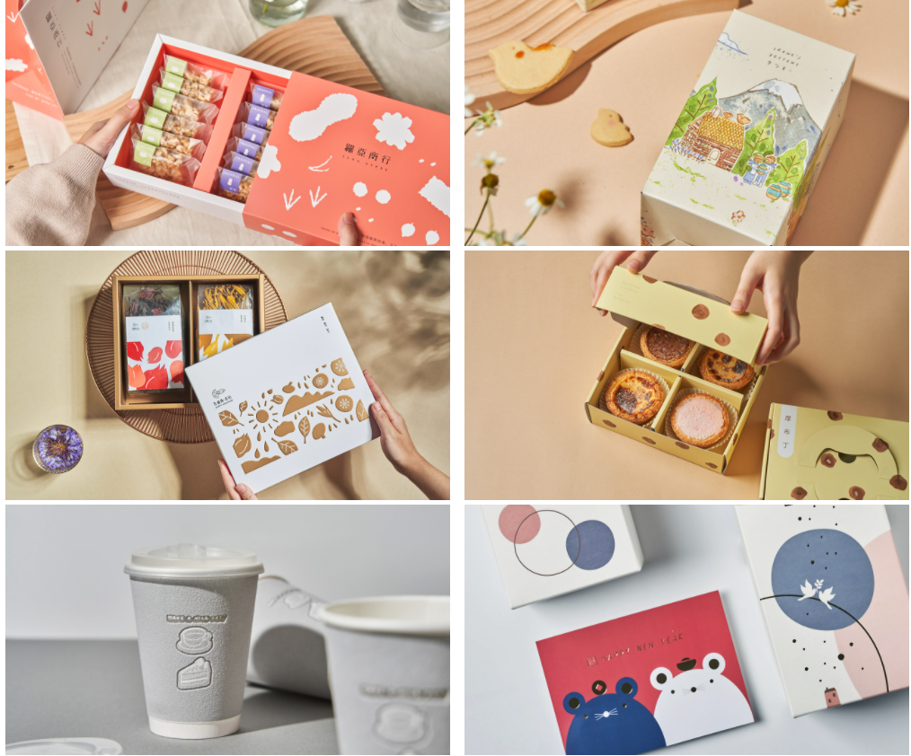
Still in the tea world is the packaging used by this Taiwanese brand. Each box features an illustration of the region where the tea variety was grown.
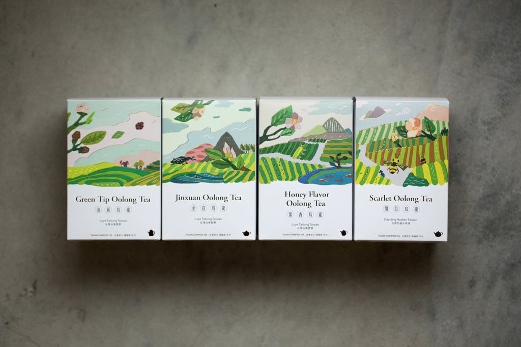
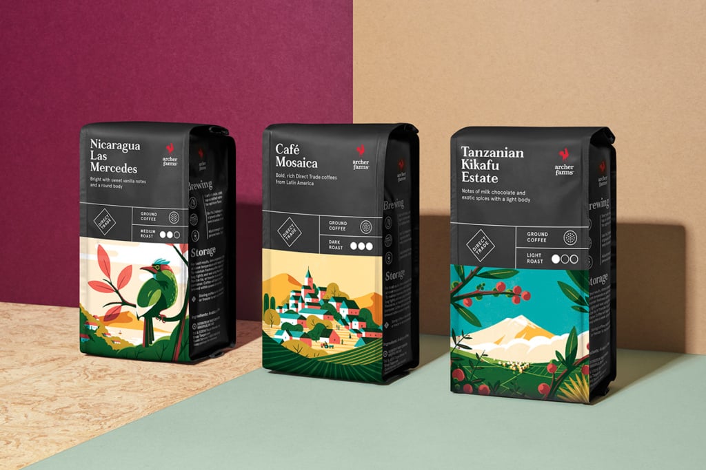
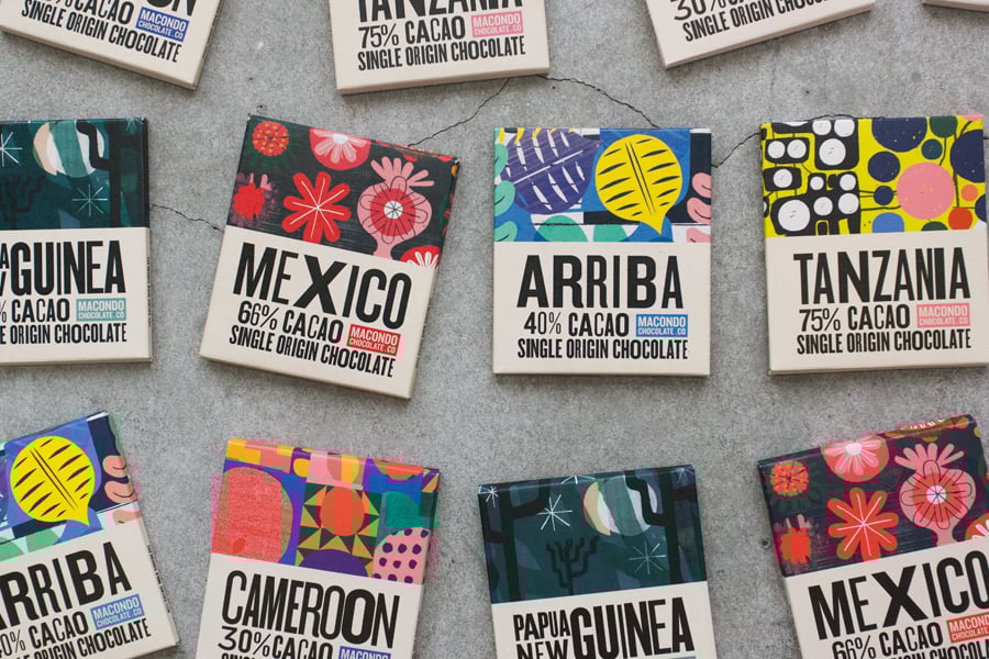
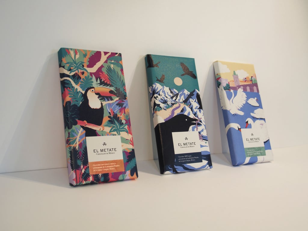
The ploy of showing a product’s place of origin through illustration is widely used, especially for goods that come from exotic or tropical regions, such as coffee, tea and chocolate.
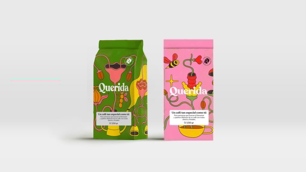
Colombian coffee brand Querida is a project “created by and for women”, and its packaging features illustrations that celebrate femininity.
The market for chocolate bars is perfect for illustration because of the simplicity their wrappers and because the origin of their ingredients determines the flavour profile of the product.
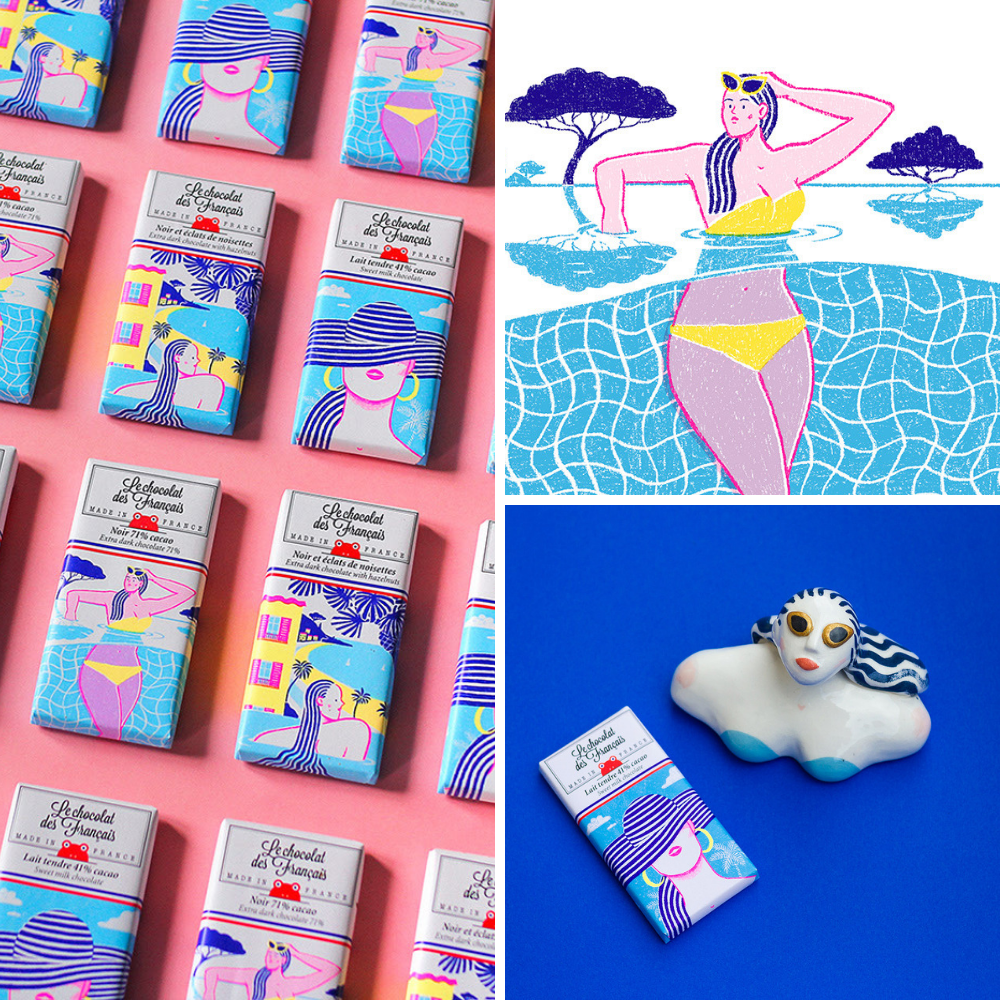
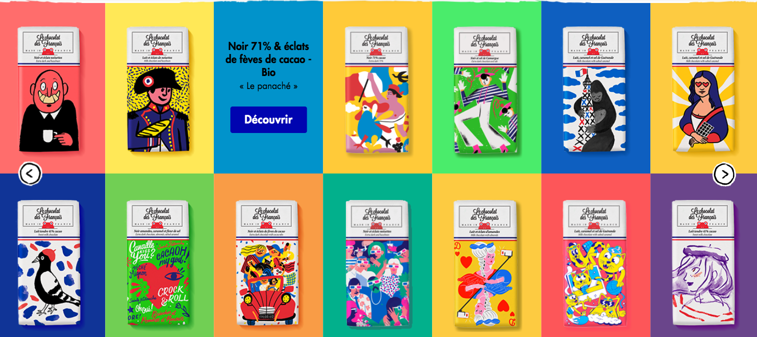
Completely different from the examples above in its use of illustrations is French chocolate company “Les Chocolate des francais”. It uses wrappers with colourful images that give a nod to a younger audience who like collecting images (and having fun!).
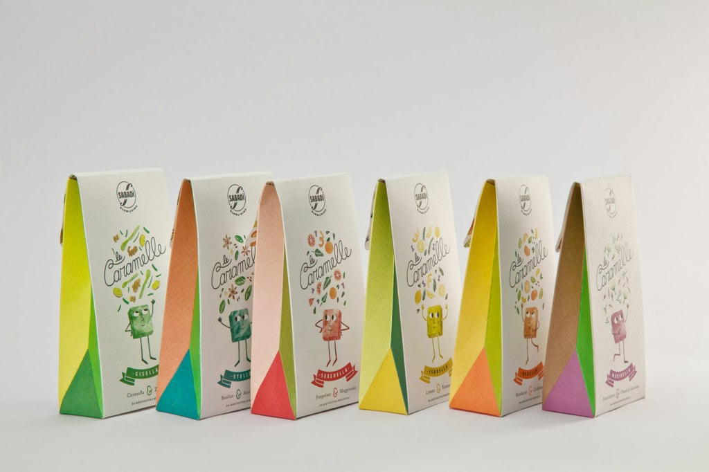
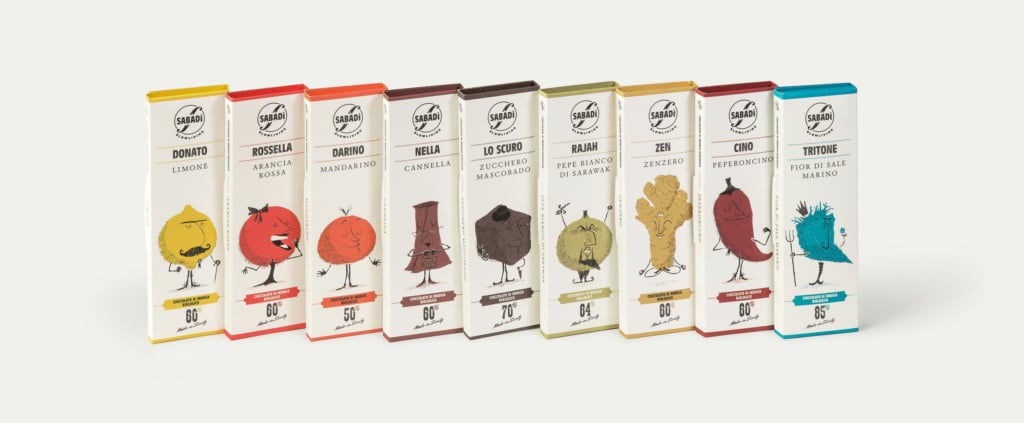
More interesting work from the continent includes the designs created by Verona-based Happycentro for Sabadì’s Modica chocolate and sweets.
In the Far East, it’s common to use entertaining images to package products.
A case in point is the work of Taiwanese designer and illustrator Jieni Kao.
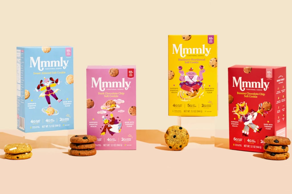
Returning to Europe, where the visual language used for adults and children is quite distinct, let’s take a look at two designers who have created designs for biscuit packaging.
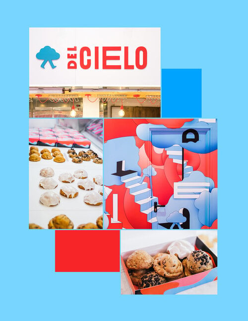
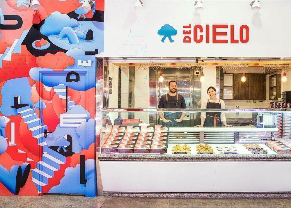
Óscar Bastidas used abstract illustrations and a limited palette in his branding design for the “Del Cielo” artisan biscuit shop in Madrid, scattering drawings and patterns on anything and everything, including the biscuit boxes.
And Berlin-based artist Elena Resko has produced fun and playful illustrations for various products, including chocolate biscuits.
Drinking and laughing
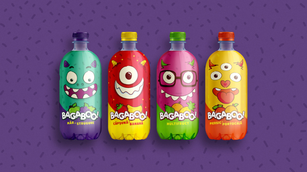
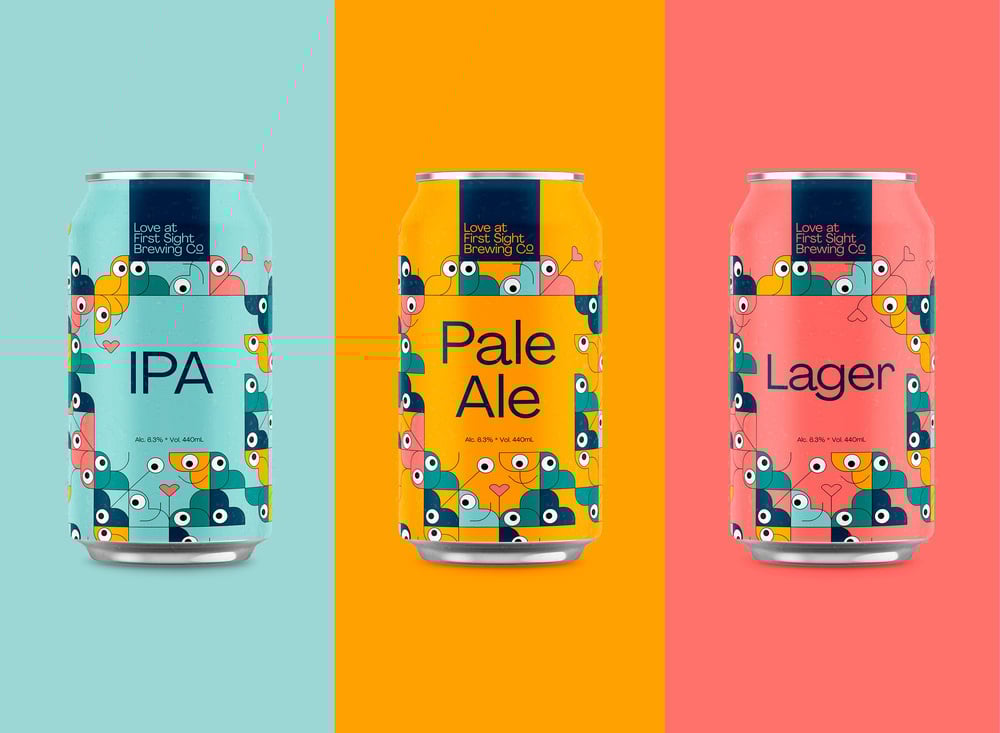
Another area where illustrations can be effective is the drinks sector. Beer and fruit juices in particular need to stand out in a crowded market place where there’s often little difference between products in terms of taste, name and price.
Brewers of craft beer have been quick to understand how illustration can build a relationship of trust with loyal customers, who identify with a brand’s style.
This is an example of a wacky bottle created by designer Victor Stavila for the Bagaboo fruit juice brand.
The beer cans illustrated by Jack Forrest for Australian brewery Love at First Sight use a suggestive design.
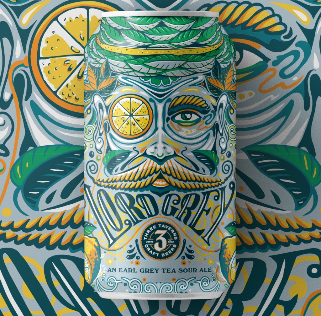
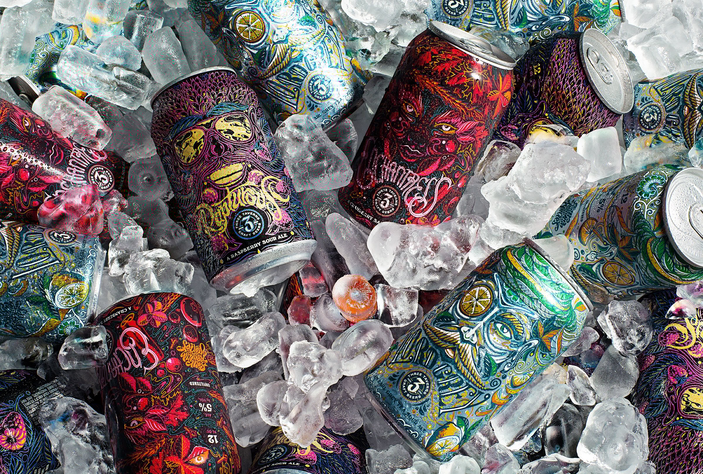
Another example from the beer world are these elaborately illustrated cans for the Three Taverns Brewery (Georgia, USA), created by Metaleap Creative.
Brands and artists who love illustrated packs
For some firms, adopting illustrated packaging is not simply a case of following market trends, but a deliberate choice.
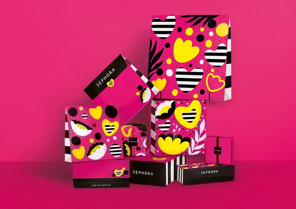
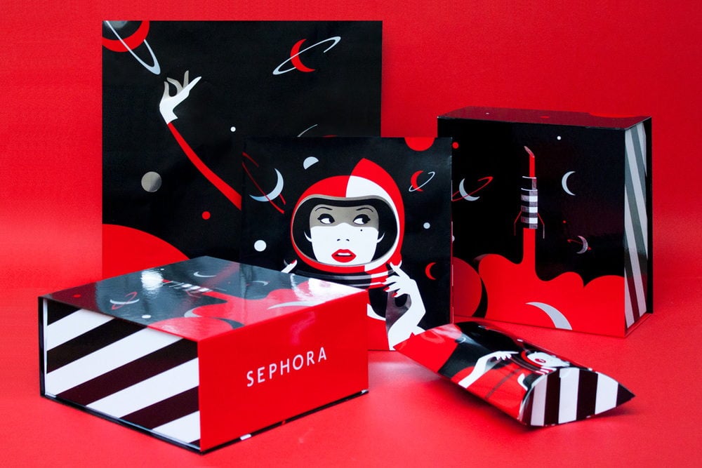
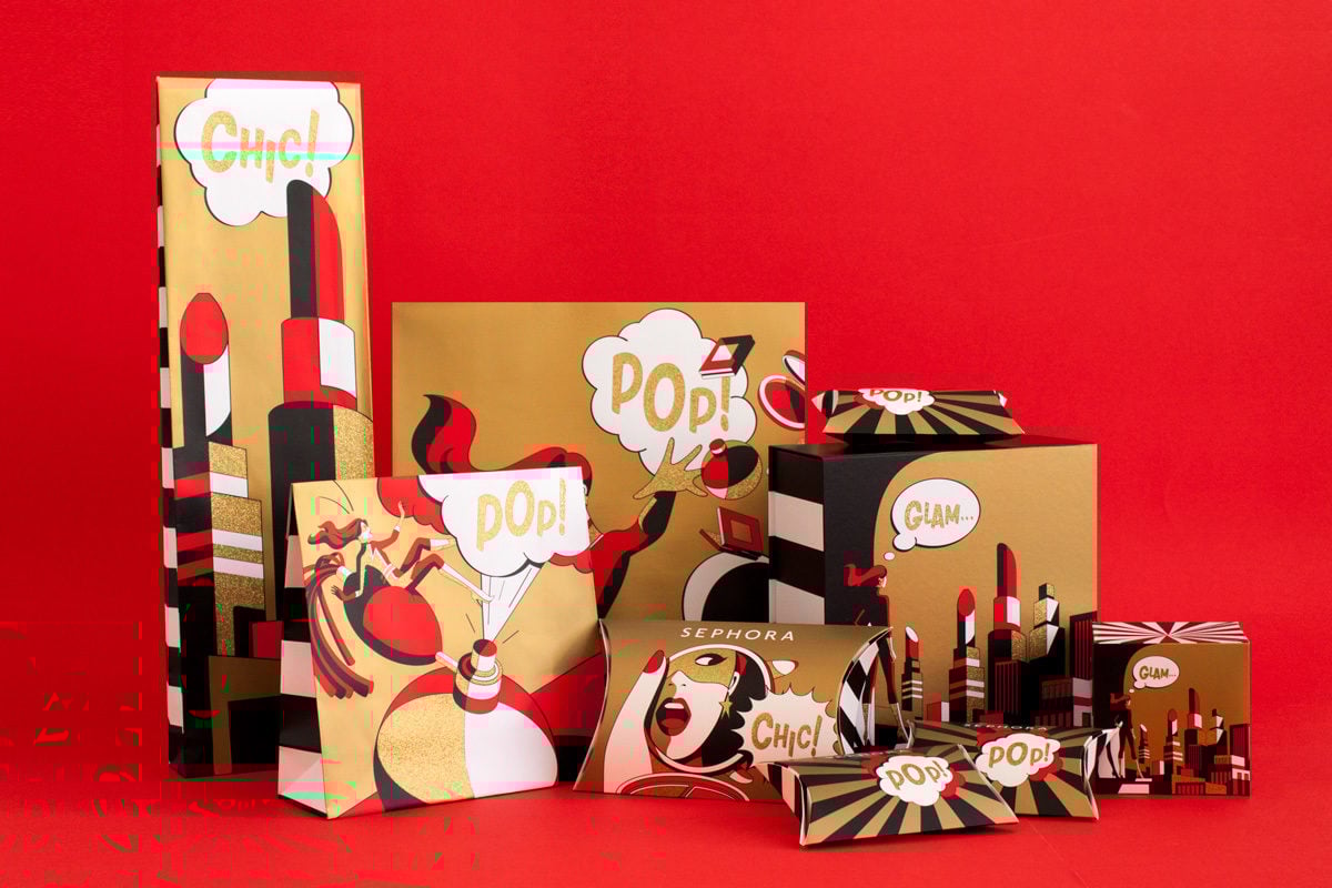
Major brands like Sephora use a lot of illustration to make products like their Christmas gift packs unique, commissioning artists like multi-award-winning Malika Favre, a global illustration superstar.
To wrap up this brief overview, let’s take a look at a couple of illustrators who use drawing as their main technique.
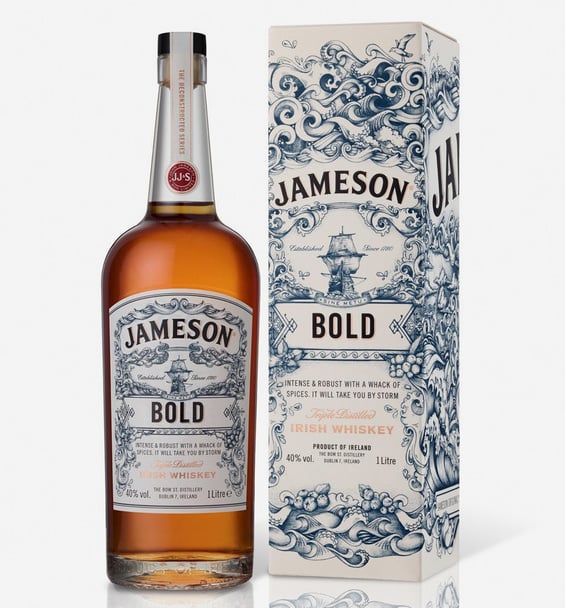
The first is sophisticated designer Greg Coulton who has done work for Jameson Whiskey, Longtooth Gin, Samuel Adams beer and many other brands, always giving them a mature and masculine look.
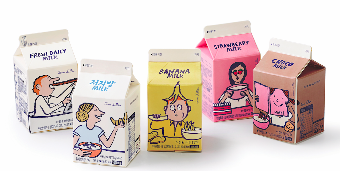
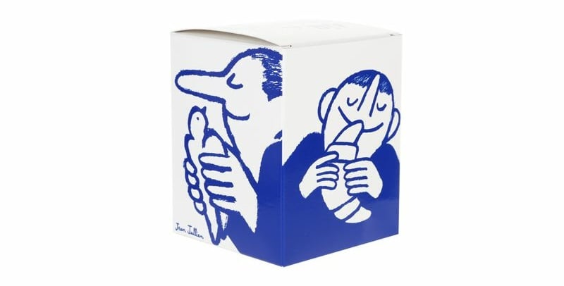
The second is French artist Jean Jullien, whose simple packaging designs are witty, irreverent and unique: check out his designs for the Colette fashion label, Blume beverages and Paris Baguette milk.
Dare to stand out
Using illustration to increase a product’s appeal is now an established trend across the world. There has been an explosion of packaging that’s sophisticated, colourful, entertaining, suggestive, irreverent and fanciful. And shopping is all the more fun for it.
To produce this type of packaging, you need a graphic designer specialising in this type of work, and an illustrator to create the images; then simply choose from the formats offered by and print your own exclusive series of product packaging.