

Table of Contents
Pantone colours: what they are and how to use them
A person with normal vision can distinguish between 150 different shades of colour. Each shade — as we saw in another article in this blog — can take on different characteristics depending on brightness and saturation. So, the number of colours that we’re able to see is about 7.5 million[1], but not all of these colours have a name. Indeed, some colours have gone for centuries without a name. Before Portuguese traders started importing oranges from India in the 15th century, the colour orange existed, but there was not word for it.
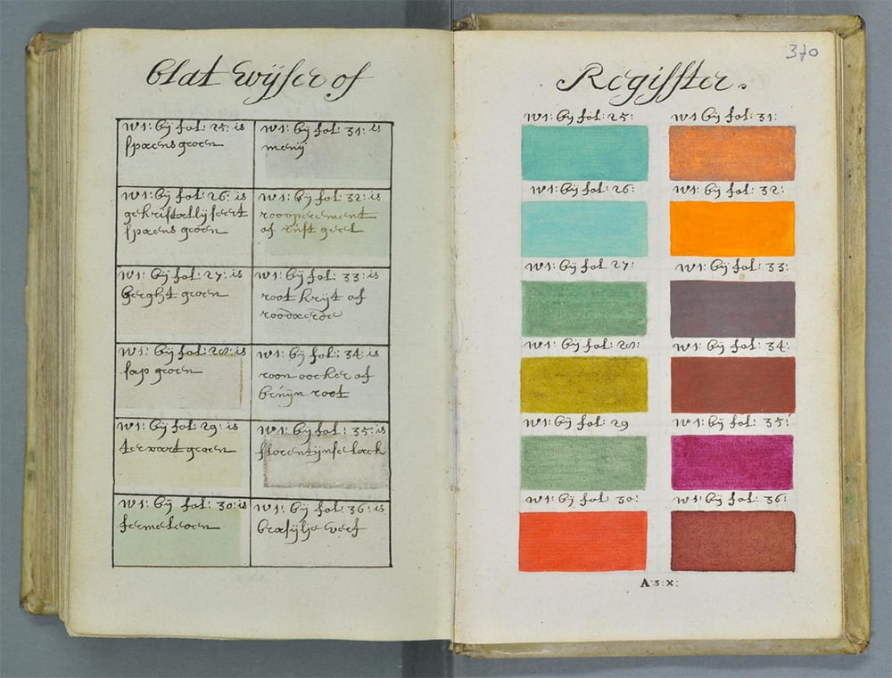
In 1692, an unknown artist, A. Boogert, wrote a book on the use of colour in painting. A guide in which we find the first attempt to organise and name colours. Looking at Boogert’s book today, it’s hard not to immediately think of a Pantone colour guide.
The Pantone Color System is a collection of colours identified by a code. It was first release in 1963 with the aim of creating a “universal language of colour that enables colour-critical decisions through every stage of the workflow for brands and manufacturers.”[2]
Without reaching the extreme of that famous photo of the blue and black dress — which many see as white and gold —, we’ve all bought something thinking it was one colour, only to discover that other people see it as a different one.
Colour perception depends on a range of factors, including the medium (paper, fabric or something else) and the environment (lighting, weather, time of day etc).
The universal language of Pantone colour
At the start of the 1960s, Pantone was a printing company in New Jersey that specialised in colour cards for the cosmetics, fashion and medical industries[3]. Lawrence Herbert, a chemist who worked for the firm, realised how difficult it was for designers, advertising agencies and printers to understand one another when they were talking about colour. In 1962, Herbert bought company and, the following year, in 1963, create the first Pantone Guide with 10 colours, specifying the exact formula of the ink for each colour. Over the years, Pantone colours have become the standard in printing. A standard that allows graphic designers, architects and decorators to speak the same language, meaning that when they are talking about red, they know that everyone else is talking about the same red. If they were specifically talking about the red found in the Google brand, that would be Pantone 7619 C. (You can find an extensive collection of colour palettes for famous brands on the site Brand Palettes).
“We’re a technical product and we help designers and the people producing that product link their communication,” says Ron Potesky, Pantone’s senior vice president and general manager in an article in The Atlantic entitled “How Pantone Became a Global Authority on Color”. “So when you pick the right colour, you get the right colour in the end. That’s the core of who we are.”
To date, Pantone has defined 1,867 proprietary colours for print graphics (with 294 colours added in 2019) and 2.310 colours for fashion, home furnishings and interior decoration. The Pantone® Matching System isn’t the first and only attempt to standardise the language of colour, but it’s the best known by far. Others include the Munsell system, adopted by the US Department of Agriculture, and the RAL and HKS colour systems, both of which are German.
On its site, Pantone has created a page that helps you navigate the different systems and tools that it provides.
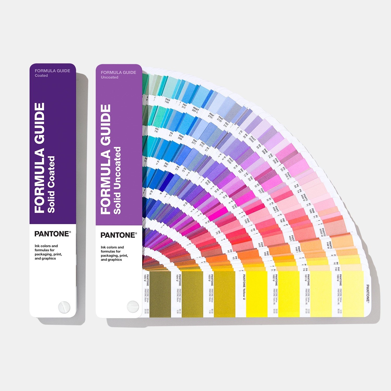
Formula Guide is the basic guide, and the most used and sold. It has two swatches, with colours for coated paper and uncoated paper, and is aimed at those working in the world of graphics and printing.
Also available are guides to colours for metallic inks (Pantone Metallics), pastel colours (Pantone Pastels & Neons), as well as the CMYK and Bridge guides, which show how Pantone Spot colours can be reproduced using CMYK printing. The CMYK guide, unlike the Bridge guide, is not strictly linked to the Pantone Matching System.
For those working in the world of fashion, and textile printing, as well as Pantone Fashion, Home + Interiors, there are also samples printed on cotton. And for product designers (homewares, consumer electronics, toys, etc.), Pantone also produces samples in the form of Plastic Chips as part of the Pantone Matching System.
Pantone Universe: how the brand has branched out
Over the years, Pantone colours have become the benchmark for design professionals, but through Pantone Universe licences, they have also entered popular culture, making Pantone synonymous with colour. The brand can now be found on everything, from mugs, to pencil cups, notepads, smartphone covers, suitcases, towels, lighters, hotels and candles. The list goes on. There are myriad design projects related to or inspired by Pantone, both official and unofficial, licensed and unlicensed.
Pantone smoothies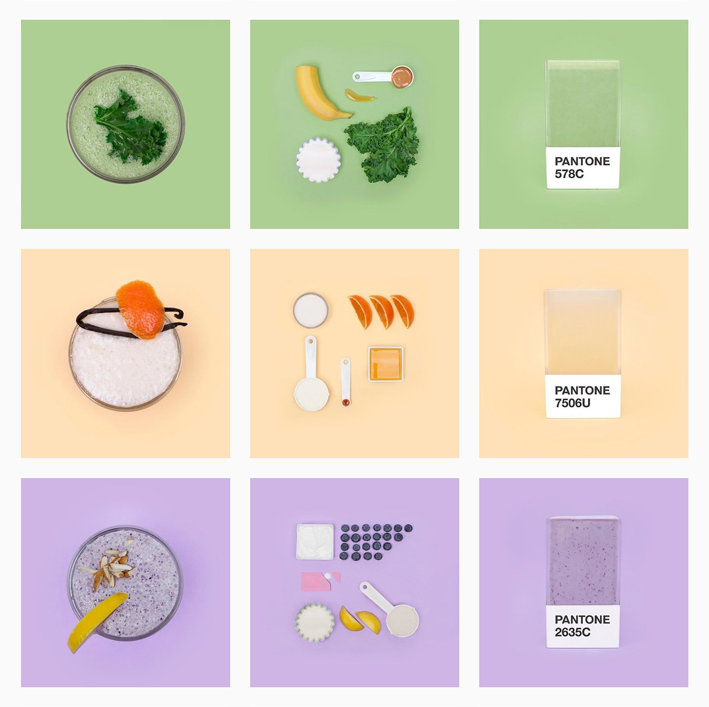
For example, there’s Pantone Smoothies the Instagram account, whose name is self-explanatory name.
Tiny PMS Match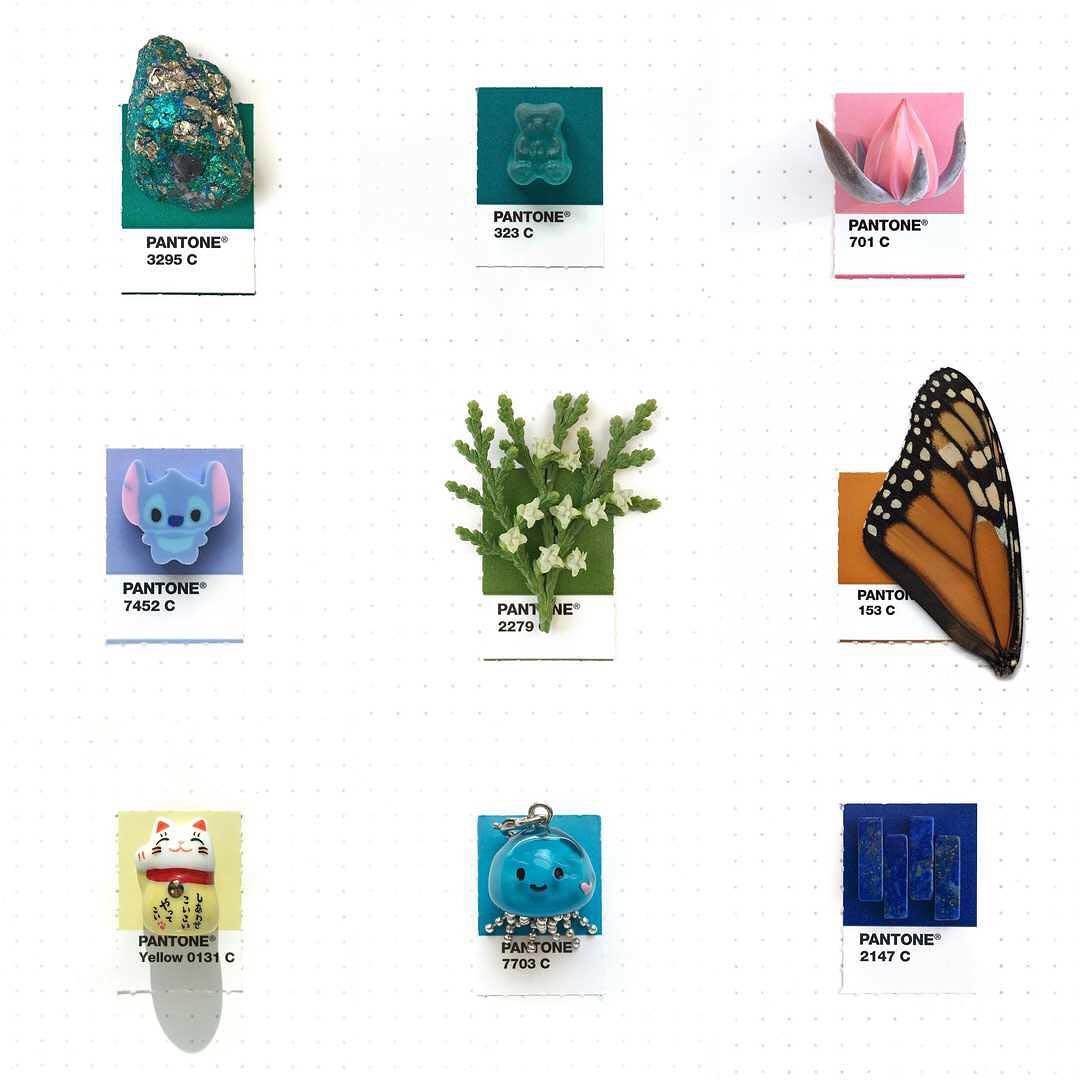
Then there’s the Tiny PMS Match project by designer Inka Mathew, also on Instagram, with images of everyday objects paired with Pantone colours.
Nurses’ uniforms
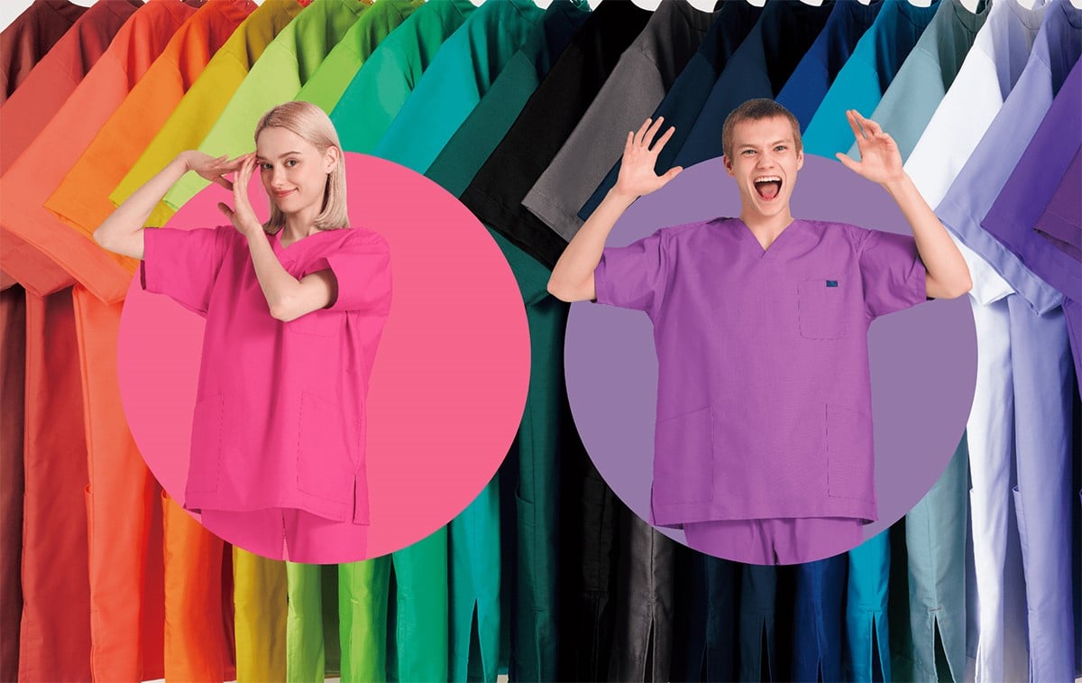
In Japan, you can buy nurses’ scrubs in Pantone colours.
Pantone Hotel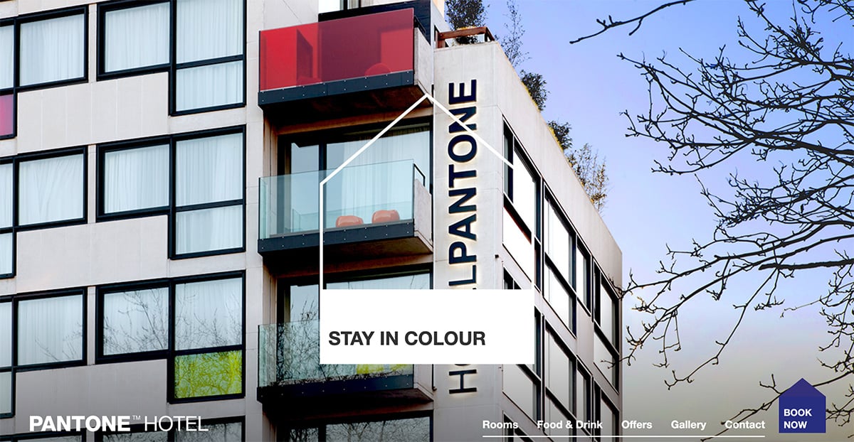
While in Brussels, there’s a Pantone Hotel.
Pantone cafe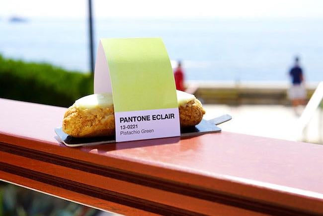
And a few years back, a Pantone cafe even popped up in Monaco.
Skin Tone Guide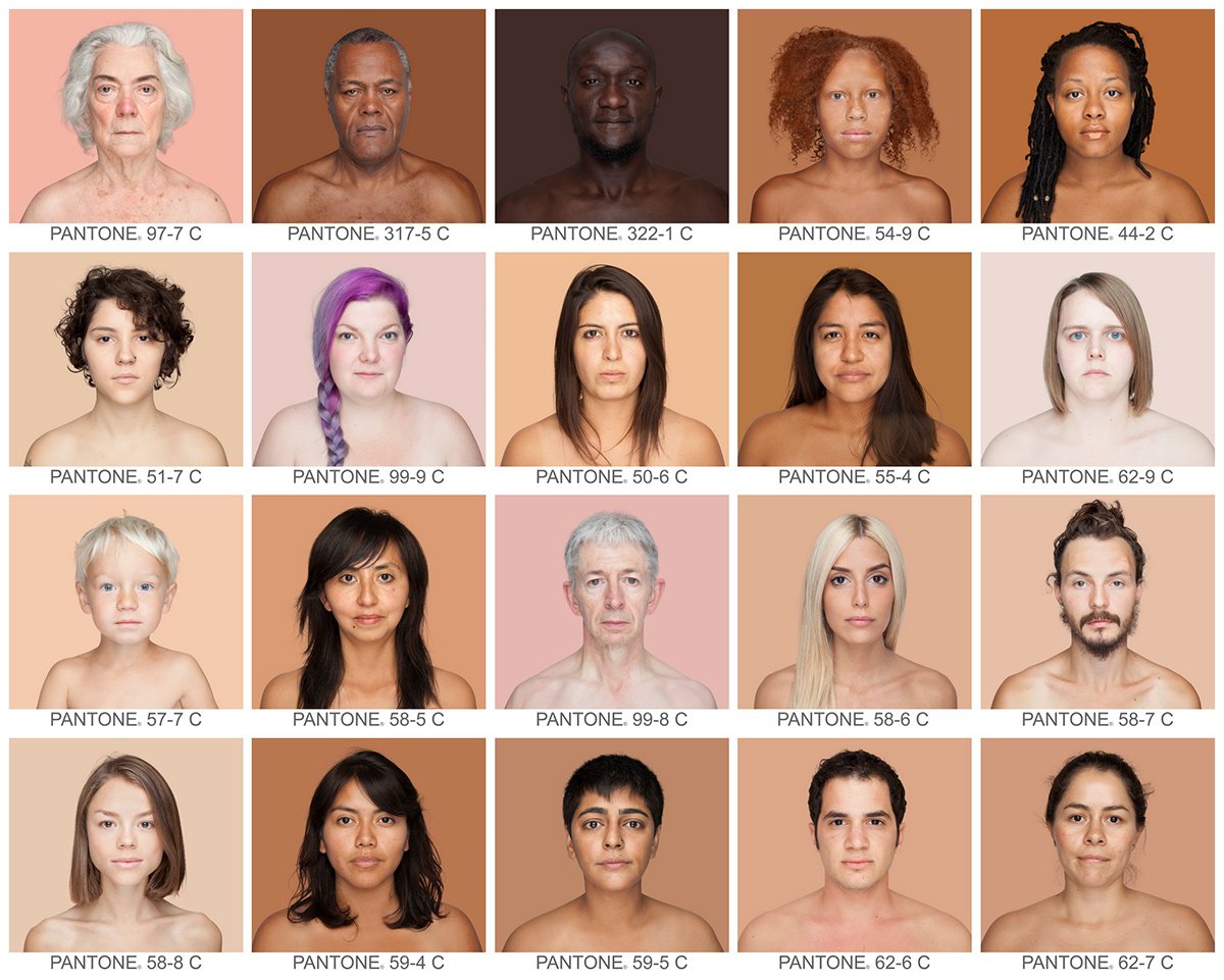
In 2012, Pantone released the Skin Tone Guide. Originally intended for photo editing, it has since been used in collaboration with Sephora to help customers find the right tone of makeup. The guide was also the basis for Angelica Haas’s Humanae Project.
Superbowl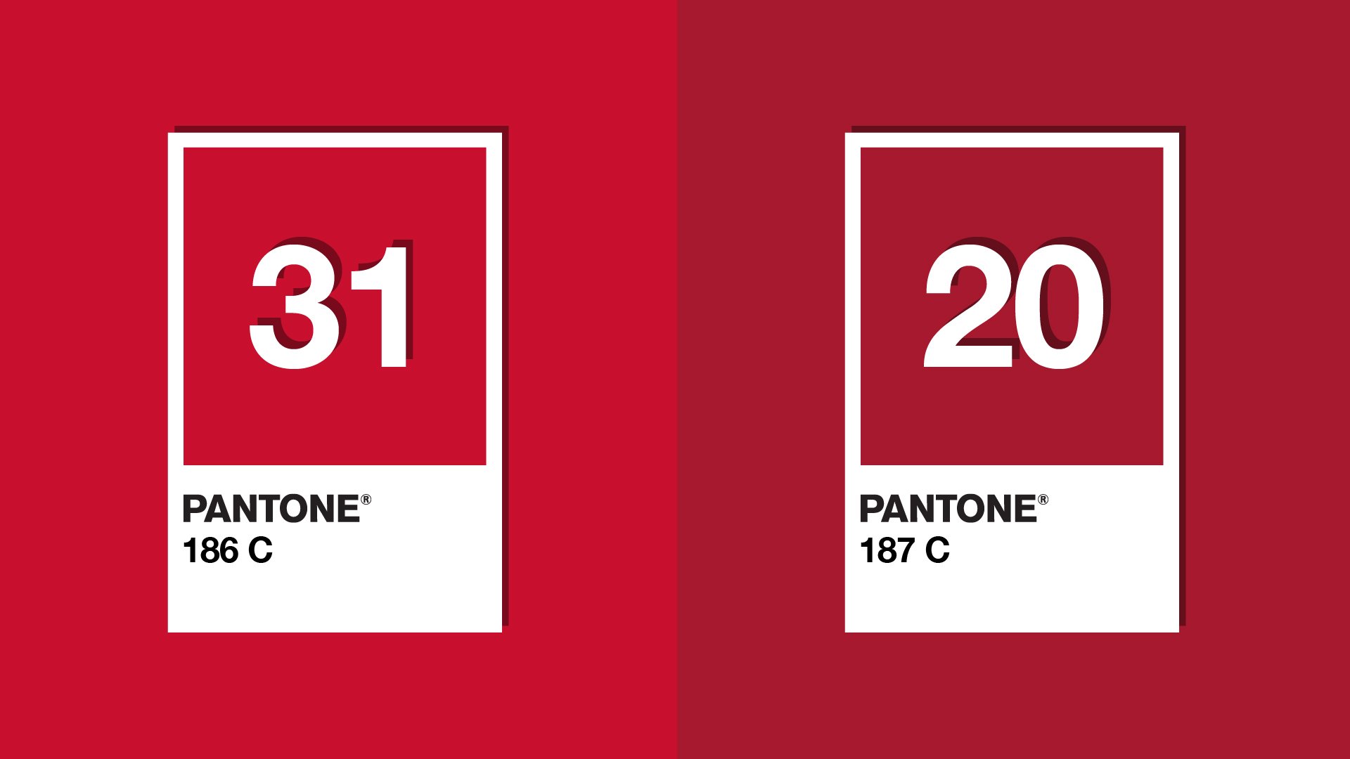
In 2020, Pantone created a social media campaign for the Superbowl in which it commented on the game with colours. It highlighted how the colour of each team was red, but not the same red.
The Pantone Color Institute and colour of the year
The year 1986 saw the founding of the Pantone Color Institute, which offers advice on the use of colour to designers and brands. Today, colour has never been more important for branding, the calling card that instantly conveys what a brand stands for.
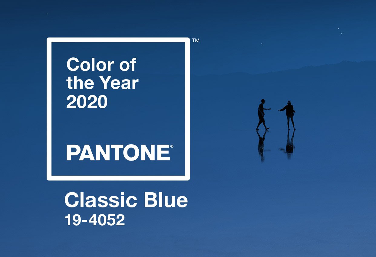
Every year since 2000, Pantone has named a colour of the year[4]. For 2020, it was Pantone 19-4052 Classic Blue. The colour of the year is picked by a group of experts — convened by the Pantone Color Institute — who “comb the world looking for new colour influences.” It is just one of the many marketing campaigns that the American firm has used to great effect in promoting its brand. It’s now an annual tradition keenly awaited and debated across the world; the cherry on the cake for what has become the benchmark in colour for creatives.
[1] Bressan P., Il colore della luna. Come vediamo e perché, Editori Laterza, Bari, 2007
[3] Budds D., How Pantone Became The Definitive Language Of Color, Fast Company, 2015
[4] The website of designer Adam Fuhrer has a useful summary of all the Pantone colours of the year.