
Table of Contents
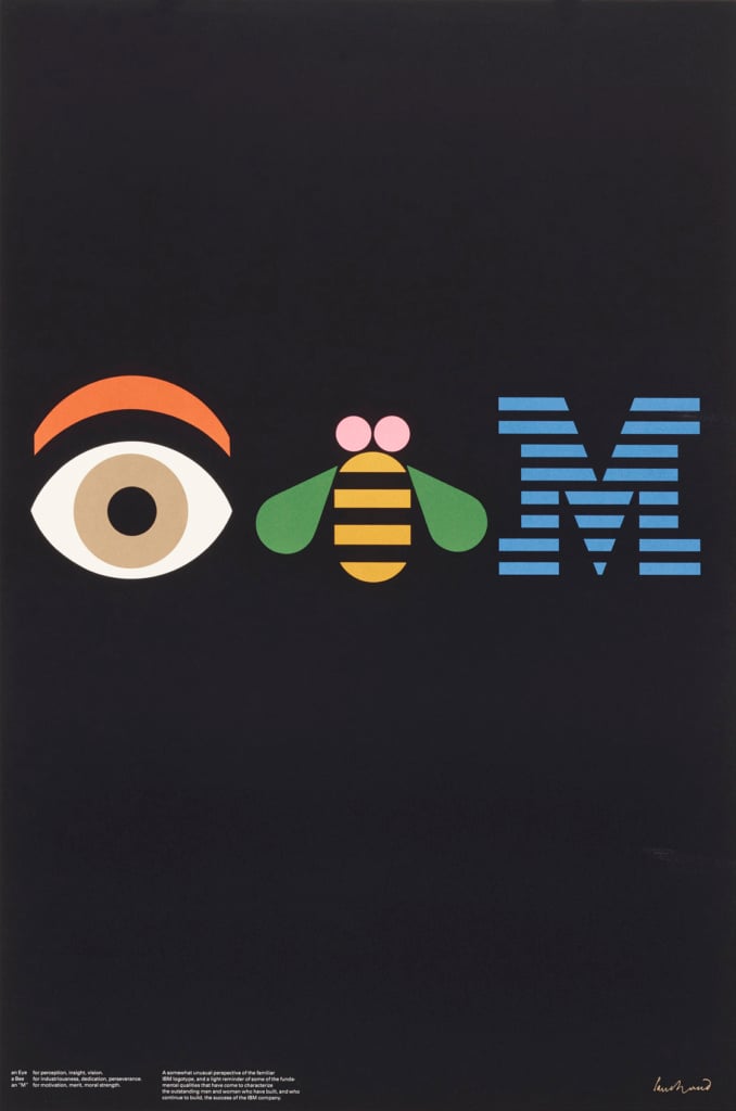
It is difficult to know where to begin when writing an article on Paul Rand. Perhaps the best thing to do is start with something almost everyone knows: the logo he designed for the world-renowned company IBM, which stemmed from an extremely long collaboration dating back to 1956. Rand created an initial logo that year, before making several changes and finalising the eight-bar version in 1972, which is still in use today, aside from a few tweaks here and there. As part of his work with IBM, Rand also created the firm’s graphics standards manual[1] and then in 1981 he designed a poster that essentially became a second logo: the Eye-Bee-M poster.
Thoughts on Design
In 1956, Paul Rand was 42 and a couple of years into a new career in designing brand identities, having recently left advertising behind (we’ll discuss this aspect of his work in more detail later on). A decade earlier, in 1947, at the age of 33, he published Thoughts on Design[2], a small book packed with ideas and reflections on graphic design that are still highly relevant today. In the book, Rand described his concept of graphic design, the “designer’s problem”, and the use of images and typography, particularly in the advertising field. In the preface to the 2014 reprint, Michael Bierut, a partner at Pentagram, described it as the best book on graphic design ever written: “a manifesto, a call to arms and a ringing definition of what makes good design good”. Paul Rand wrote in the book that design is completely worthless if it isn’t relevant:
Graphic design – which fulfils aesthetic needs, complies with the laws of form and exigencies of two-dimensional space; which speaks in semiotics, sans-serifs and geometrics; which abstracts, transforms, translates, rotates, dilates, repeats, mirrors, groups and regroups – is not good design if it is irrelevant.[3]
His work in publishing: collaboration with Esquire, Apparel Arts and Direction
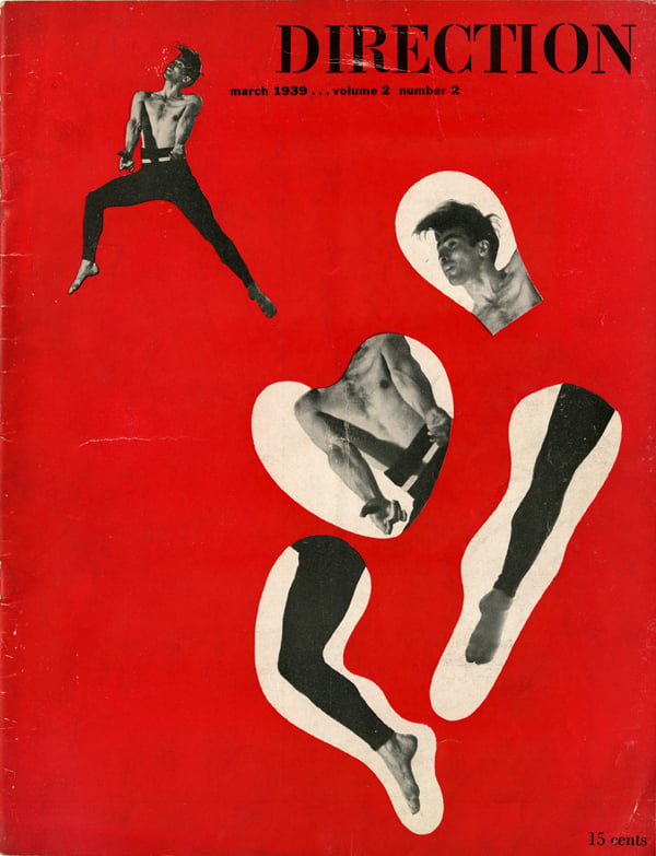
‘Thoughts on Design’ came after ten years of work as a graphic designer, creating both magazines and adverts. At a very young age (just 22) he began to design promotional material on an occasional basis for Esquire magazine. After a short while he was put in charge of Apparel Arts, a quarterly supplement released with Esquire, and he produced a series of wonderful covers for the publication. He also collaborated with another magazine, Direction, and frequently unpaid in exchange for full creative freedom. Before he began his career, Rand attended the Parsons School of Design in his home town of New York, but he never completed the course, and always considered himself to be self-taught. He was one of the first American graphic designers to study European modernism, something he did on his own initiative, and one of the first to experiment with its methods and approaches.
His magazine and advertising layouts wed functional simplicity to abstract complexity. Void of ornament, each detail was planned to attract the eye and convey a message. Yet nothing was formulaic.[4]
His work in advertising
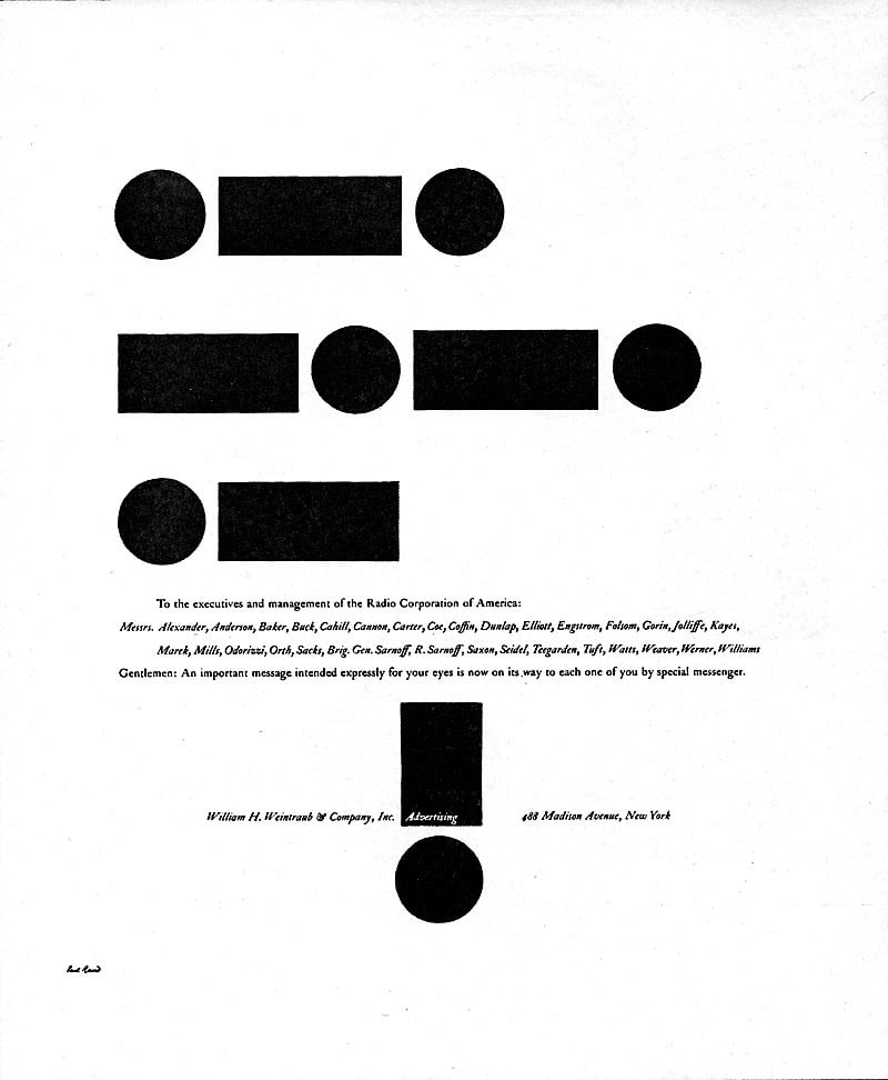
At the age of 27, in the 1940s, Paul Rand became creative director of the agency William H. Weintraub & Co., and made an immediate impression on the Mad Men-style world of advertising, introducing clarity and a modernist style.
Visual communications of any kind, whether persuasive or informative, from billboards to birth announcements, should be seen as the embodiment of form and function: the integration of the beautiful and the useful.[5]
Bierut writes that in those years, when advertising agencies were looking to hire graphic designers, they often simply specified “like Paul Rand”, without adding anything else: everyone knew what they meant. A young copywriter named Bill Bernbach was also on the books of William H. Weintraub & Co. A few years later he founded Doyle Dane Bernbach (DDB), launching what became known as the creative revolution in advertising. It was a profitable encounter for both parties. Rand compared his meeting Bernbach to Columbus’ discovery of America: “This was my first encounter with a copywriter who understood visual ideas and who didn’t come in with a yellow copy pad and a preconceived notion of what the layout should look like.”[6]
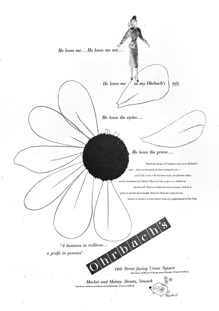
Before founding DDB, Bernbach moved to the Grey agency and continued working with Rand on advertising for Ohrbach’s.
Logo design
Rand left the world of advertising in 1954, the year he won a prestigious Art Directors Club award for an advert for the RCA (Radio Corporation of America), to focus on creating brand identities for companies.
In addition to his oft-cited work for IBM, Rand produced countless logos for major American companies and institutions, including the TV channel ABC, UPS, Yale University and American Express.
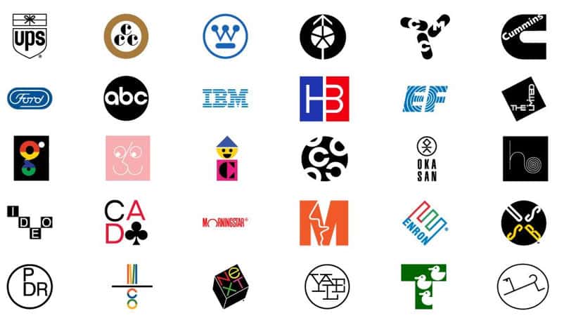
In 1984, Rand was listed amongst the thirty most influential graphic designers of all time in a special edition of Idea Magazine, alongside names like Herbert Bayer, Josef Müller-Brockmann, Giovanni Pintori, Jan Tschichold, Eric Gill, Charles Eames, Max Bill and László Moholy-Nagy.
The NeXT logo
At the age of 72, Rand designed a logo that has outlived the company for which it was created: NeXT, the firm founded by Steve Jobs after being kicked out of Apple, which Apple would later acquire.
Steve Jobs’ biography, written by Walter Isaacson, recounts the time Jobs met Rand. Rand worked for IBM, and Jobs wanted to work with him at all costs. After many attempts, he finally managed to receive permission from IBM. NeXT’s new computer was to be a cube, and Rand liked the shape so much he immediately decided that the logo should be a cube. As Isaacson writes:
When Jobs asked for a number of options to consider, Rand declared that he did not create different options for clients. “I will solve your problem, and you will pay me,” he told Jobs. “You can use what I produce, or not, but I will not do options, and either way you will pay me.” Jobs admired that kind of thinking, so he made what was quite a gamble. The company would pay an astonishing $100,000 flat fee to get one logo. “There was a clarity in our relationship,” Jobs said. “He had a purity as an artist, but he was astute at solving business problems. He had a tough exterior, and had perfected the image of a curmudgeon, but he was a teddy bear inside.” It was one of Jobs’s highest praises: purity as an artist.
In 1996, Rand was invited by John Maeda to give a lecture at MIT, where he talked about graphic design and showed some of his works. When discussing NeXT, he recalled that Steve Jobs’s smile got bigger and bigger as he flicked through the presentation, and at a certain point he asked to give him a hug. Rand told the students: “you know you’ve made a good logo when your client wants to hug you”[7].
From his earliest works, Rand always spent a lot of time on his presentations, which were accompanied by large folders full of sketches, references and research to explain and illustrate the design process. Some of these presentations can be explored on the website – packed full of content – dedicated to Paul Rand, including the one he created for the NeXT logo. There is also a video on YouTube showing Rand’s arrival at NeXT’s offices and the unboxing of the presentation.
A presentation is the musical accompaniment of design. A presentation that lacks an idea cannot hide behind glamorous photos, pizazz, or ballyhoo. If it is full of gibberish, it may fall on deaf ears; if it is too laid back, it may land a prospect in the arms of Morpheus.
Sixty years of making history in graphic design
In his book dedicated to Paul Rand, Steven Heller stressed the impact he had on the world of graphic design. When he died at the age of 82, in 1996, he had lived through sixty years of graphic design history, and left his mark in everything he did. “In the late 1930s he began to transform commercial art from craft to profession. By the early 1940s he influenced the look of advertising, book and magazine cover design. By the late 1940s he proffered a graphic design vocabulary based on pure form where once only style and technique prevailed. By the mid-1950s he altered the ways in which major corporations used graphic identity. And by the mid-1960s he had created some of the world’s most enduring corporate logos, including IBM, UPS, ABC and Westinghouse.”[8]
In a 1941 article for PM Magazine, László Moholy-Nagy, a professor at the Bauhaus and one of its leading exponents, described Rand as “an idealist and a realist, using the language of the poet and business man. He thinks in terms of need and function.”[9]
Rand considered graphic design to be a service, not an art form, despite the aesthetic and artistic part of the profession playing a crucial role. He believed communication should be useful and functional, but also well presented. His influences were European modernism and advertising posters by artists like Cassandre, and he detested stereotyped or cliched marketing. He would always start by studying and analysing the ‘problem’, as he believed that was the only way of coming up with the idea that produces a design.
**********
The auction of Rand’s works in 2018
In 2018, the Wright auction house put a large proportion of the designs Rand created during his career up for sale. Currently, 99% of the products in the catalogue have sold at more than double the guide price.
You can browse the entire catalogue on the Wright website or download it as a PDF.
The Wright catalogue
[1] The graphic design manual was reprinted in 2018, published by Empire.
[2] http://www.postmediabooks.it/2016/165paulrand/9788874901654.htm
[3] Paul Rand, Thoughts on Design, Chronicle Books, 2014
[4] Steven Heller, Paul Rand: Graphic Impact, Modern Magazine, 2015
[5] Ibid.
[6] Allen Hurlburt, Paul Rand: The man considered by many to be one of the legends of graphic design, Communication Arts
[7] Ciro Esposito, John Maeda e Paul Rand, 2020
[8] Steven Heller, Paul Rand: Graphic Impact, Modern Magazine, 2015
[9] “Paul Rand” by Laszlo Maholy-Nagy, paulrand.design