

Table of Contents
Blue is one of the most fascinating and complex colours across the entire colour spectrum. It is the colour of the sky, the sea, unexplored depths and infinite space. But it is also a cultural, symbolic and psychological colour, capable of telling very different stories depending on the era and context.
In the #Powercolours series, we explore the colours that shape the way we communicate visually. Today, the focus is on blue: a colour that may seem “simple”, but in reality conceals extraordinary richness for those working in design, print and visual communication.
Blue: a universal colour with countless meanings
Blue is the world’s most loved colour according to numerous international studies. This comes as no surprise: blue conveys calm, stability and depth, while at the same time it can become energetic, vibrant, technological or even mystical. Its strength lies in its versatility and in its ability to adapt to different contexts without losing its identity.

The symbolism of blue across cultures
In many cultures, blue is associated with the divine and the sacred. In ancient civilisations it evoked the sky and water, becoming a symbol of protection and transcendence. In the contemporary Western world, it conveys trust, security and rationality — which is why it is so often chosen by institutions, banks and technology brands.
In other cultures, however, blue takes on different meanings: in parts of Africa it represents wisdom and truth; in the Middle East it is seen as a protective colour; in ancient China it was linked to purity and vitality. Blue, then, is never neutral: it carries a cultural heritage that makes it extremely powerful in communication.
The emotions of blue: psychology and perception
Colour psychology has long attributed to blue a role as an emotional stabiliser. Looking at blue reduces anxiety, improves concentration and instils a sense of “breathing space”, much like observing an open sky or a seascape.
This explains why blue is so prevalent in corporate branding and tech products: it reassures, suggests performance and communicates seriousness. At the same time, in its brighter variations — such as electric blue or turquoise — it becomes dynamic, youthful and creative. Blue is a dual colour, capable of adapting to very different identities.
A journey through the history of blue
Before becoming one of the most widely used colours in modern design, blue had a difficult history. For centuries, it was rare, expensive and almost mysterious.

The first pigments: Egyptian blue and lapis lazuli
The Egyptians were among the first to create an artificial blue pigment, known as “Egyptian blue”, obtained by fusing copper, sand and limestone. However, the most precious blue came from lapis lazuli, a semi-precious stone sourced from Afghanistan. In the Middle Ages, ultramarine blue derived from this mineral was worth more than gold.
Sacred blue in the Middle Ages and the Renaissance
Because of its extremely high cost, blue was reserved for the most important figures, especially the Virgin Mary in Christian art. Its use was a symbol of devotion and prestige: more blue meant greater value within the artwork.
The arrival of modern pigments
With the 19th century and the Industrial Revolution, stable and affordable artificial pigments such as Prussian blue and cobalt blue became widespread. From that moment on, blue became accessible to all, entering painting, fashion and graphic design.
Blue in contemporary art
One of the most iconic moments in recent art history is undoubtedly “International Klein Blue”, a shade patented by artist Yves Klein in the 1950s. A deep, vibrant, almost spiritual blue that redefined the relationship between colour and perception — a striking example of how conceptual and emotional blue can be.
Why blue is so powerful in visual communication
Today, blue is one of the most commonly used colours in logos, digital interfaces and visual identities. The interesting question is: why?
Blue in branding
Many tech brands — from social networks to major IT corporations — choose blue to convey trust, innovation and stability. It is perceived as a “professional” colour without feeling cold or distant. In digital services it enhances reliability, while in physical products it communicates quality and durability.
Blue in marketing and advertising
Blue is highly effective in campaigns that require clarity and visual cleanliness. It works particularly well for rational, institutional, technological or wellbeing-related messages. Lighter shades are soothing, while darker tones convey authority.
Blue in web design
In the digital world, blue has a unique advantage: it is one of the most readable and comfortable colours on screens. Hyperlinks are blue not by chance, but due to a long-standing legibility choice that has become a convention. However, highly saturated blues can vary across screens, making testing on multiple devices essential.
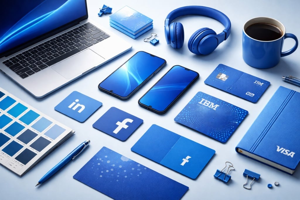
Iconic uses of blue in marketing and branding
It is no coincidence that many of the world’s most recognisable brands have built their identities around blue. Facebook (now Meta) uses it to convey reliability, continuity and connection — essential qualities for a relationship-based platform. IBM has turned blue into a defining element of its identity, earning the nickname “Big Blue” and associating the colour with solidity, expertise and technological innovation.
In the financial sector, brands such as American Express and Visa rely on blue to communicate security, control and trust — key elements when dealing with money and transactions. Even in the food & beverage industry, where blue is less common, brands like Pepsi use bright, energetic shades to stand out and convey dynamism and modernity.
Across Europe, companies such as Decathlon adopt a strong blue to reinforce ideas of accessibility, reliability and performance, while LinkedIn uses a more restrained and professional blue to speak directly to a business-oriented audience. In all these cases, blue is not a random aesthetic choice, but a strategic tool that plays a decisive role in shaping brand perception and trust.
Blue and design: palettes, combinations and harmonies
Blue offers an extraordinary range of shades, each with its own distinct personality. Before creating palettes and combinations, it is useful to understand the main “families” of blue.
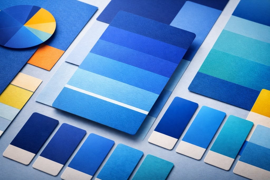
The main shades of blue and their uses
Navy blue is elegant and institutional, ideal for premium or corporate branding.
Electric blue is modern and vibrant, perfect for digital or youth-oriented projects.
Light blue conveys freshness and lightness, often used in wellness or travel sectors.
Petrol blue introduces depth and sophistication, ideal for interior design and refined packaging.
Cyan and turquoise evoke energy and movement, widely used in digital design.
Recommended colour combinations
Blue combinations can create very different atmospheres: paired with orange, it produces a bold complementary contrast; with analogous greens, it creates natural harmony; with yellows, it results in a fresh, luminous effect; with greys, it achieves a sophisticated, professional look. Each combination conveys a different mood and should be chosen according to the intended message.
Common mistakes to avoid when pairing blue
One frequent mistake is using tones that are too similar, resulting in poor readability. Another risk is combining very cool blues with equally cool colours that dull the composition. Finally, dark blue backgrounds can compromise text contrast, especially when using thin or light typefaces.
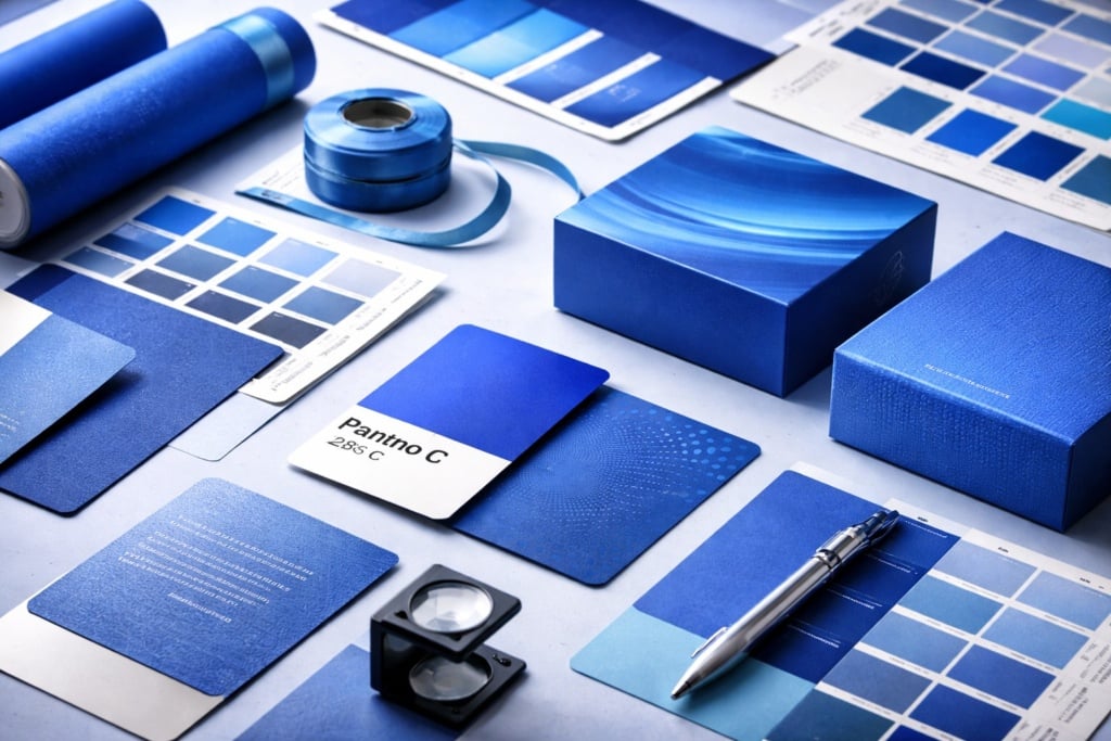
Blue in print: technical and practical advice
Blue is a beautiful colour, but technically challenging in print production. Understanding a few key principles makes all the difference.
Colour management: RGB vs CMYK
Many vibrant blues seen on screen are difficult to reproduce in CMYK, as the print colour space is more limited. To avoid dull results, it is essential to design with colour conversion in mind from the outset. Testing shades and using appropriate CMYK values is crucial.
Pantone blue: when and why to use it
When an intense, uniform or very specific blue is required, Pantone colours ensure accuracy and consistency across different materials. This is a strategic choice for professional branding or premium products. The Pantone Classic Blue is identified by the code Pantone 19-4052 TCX (Classic Blue), selected as Pantone’s Colour of the Year in 2020.
Textures, materials and papers that enhance blue
Blue can take on very different personalities depending on the substrate: on uncoated papers it appears softer and more refined; on coated papers it becomes brighter; on textured materials it gains depth. Varnishes, laminations and foil details can further enhance its impact.
Common printing mistakes to avoid with blue
The most frequent issue is setting a blue that is too dark, which prints almost black. Excessive saturation can also cause loss of detail. Finally, it is important to avoid ink combinations that make the colour unstable or patchy.
Where blue truly shines: examples and inspiration
Blue plays a leading role across many areas of contemporary design. In branding it conveys authority and modernity; in packaging it creates a premium or technological feel; in posters it can become dramatic or poetic; in publishing it adds structure and readability; in web design it is synonymous with clarity and reliability. Its versatility makes it ideal for seasonal campaigns, innovative products and minimalist identities.
How to use blue in your projects with Pixartprinting
Using blue in printed projects requires care, but it can deliver outstanding results. First, it is important to consider the substrate on which the project will be printed: uncoated, coated or recycled materials significantly affect how blue appears. The choice between CMYK and Pantone printing also plays a key role in defining the final character.
On business cards, blue communicates professionalism and reliability; in catalogues it enhances readability; in packaging it conveys quality and attention to detail; in displays it attracts attention without being aggressive. Preparing files correctly, with appropriate colour profiles and balanced contrast, is essential for achieving flawless results.
FAQ about the colour blue
What does the colour blue communicate?
Blue conveys trust, calm, stability and emotional depth. Lighter shades suggest lightness, while darker ones express authority.
Which shades of blue work best in branding?
It depends on positioning: navy feels professional, royal blue is energetic, and light blue feels welcoming and modern.
How can you achieve an intense blue in print?
By designing directly in CMYK using tested values, or by choosing a dedicated Pantone colour for greater accuracy.
Why is blue so widely used in tech logos?
Because it conveys trust, security and innovation — essential qualities for digital services.
Which colours pair best with blue?
Orange, yellow, neutral tones, analogous greens and well-balanced monochromatic palettes.
Conclusion: blue, a multifaceted colour with undeniable impact
Blue is an ancient, symbolic and deeply contemporary colour. For designers and creatives, it represents a versatile and powerful tool, capable of shaping identities, products and campaigns.
In modern communication, blue is not just a colour: it is a language. Learning to use it consciously means unlocking its countless shades to tell new, meaningful stories.