
Table of Contents
Despite being written and published over 200 years ago, Pride and Prejudice remains one of the best-loved and most popular works of English literature. Some people see Jane Austen’s novel as the original love story, a quintessential example of its genre that has enchanted countless generations.
The book – which describes the turbulent relationship between Elizabeth, the daughter of a country gentleman, and Mr Darcy – is undoubtedly one of the bestselling titles of all time, having amassed over 20 million sales. It has also inspired films for the cinema and TV, plays and sequels of various types.
Not bad when you consider that the first edition of Pride and Prejudice had a print run of around 1,500 copies and sold for 18 shillings. Jane Austen published her masterpiece anonymously: at the time, being a writer was not considered a suitable career for women.
Today we’d like to investigate what gives the book its magic, and tell some stories about its publishing adventures, particularly through its most famous and unexpected covers!
The most famous cover of Jane Austen’s Pride and Prejudice
As we’ve noted a few times in the past, publishers typically only started paying attention to design of their covers in the early twentieth century, aiming solely to entice different audiences each time, and so sell more copies.
However, Pride and Prejudice is a notable exception. As early as 1894, an edition was released that is still today considered one of the most beautiful and valuable ever made. We’re talking, of course, about the legendary ‘peacock edition’.
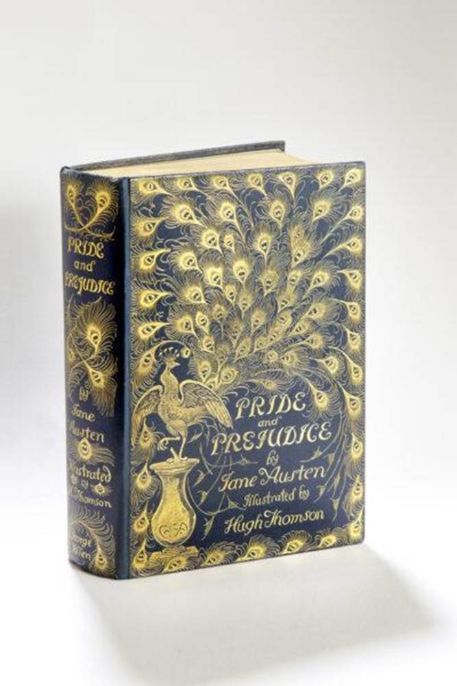
This edition – highly sought-after by collectors – contains 160 illustrations by the artist Hugh Thomson, one of the Victorian era’s most famous and acclaimed illustrators. Having so many drawings depicting all the key moments from the novel was very rare at the time: back then, even illustrated books typically only contained a few images.
The edition is further enhanced by an extravagant cover depicting a sumptuous peacock in gold against a green background, with the book’s title nestled within its open tail. An absolute gem!
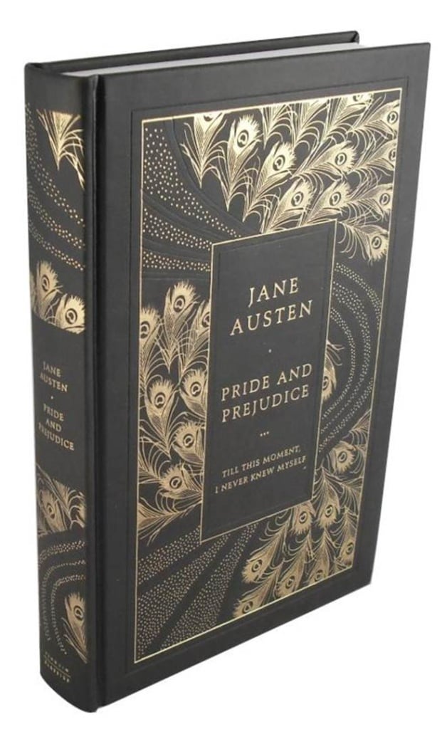
The peacock motif returned in various ways on several subsequent covers of the novel. For example, in 2017 the British illustrator and book designer Coralie Bickford Smith produced a peacock-feather design for the cover of a special Penguin edition of the book.
The cover of the first paperback edition from 1938
Pride and Prejudice by Jane Austen is many different things, including an incredible and extremely popular love story. The first paperback edition of the novel played a significant role in cementing this reputation. Here is its cover.
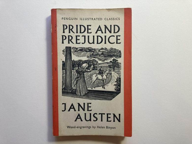
The advent of cheaper paperback editions was a genuine revolution in the publishing world. While in the nineteenth century books had mostly been seen as a pastime for the wealthier classes and intellectuals, cheap editions brought the brilliance of the best novels within everyone’s reach, rich or poor.
The first cheaper editions were produced in the 1910s, but the paperback was really invented in the UK in 1935 when a new publishing house – Penguin – saw the incredible potential of this new market.
Pride and Prejudice was one of the first books Penguin published in paperback. It came out in 1938, as part of a new series dedicated to illustrated classics. The cover featured an illustration and the characteristic orange stripes, the colour the publisher assigned to works of fiction.
Covers of Pride and Prejudice designed specifically for women
By the 1950s and 1960s, society was changing. Women were starting to attend university and to fight for their rights. And they also became heavy consumers of the culture industry’s top products: books.
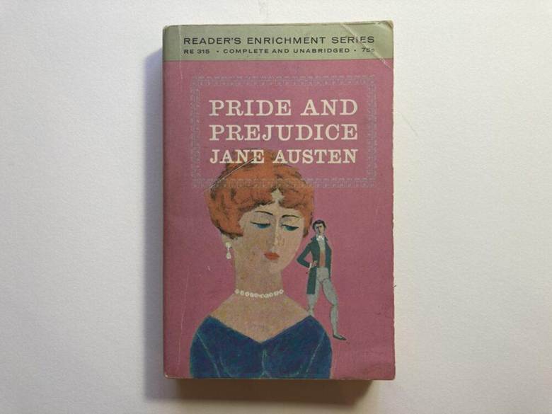
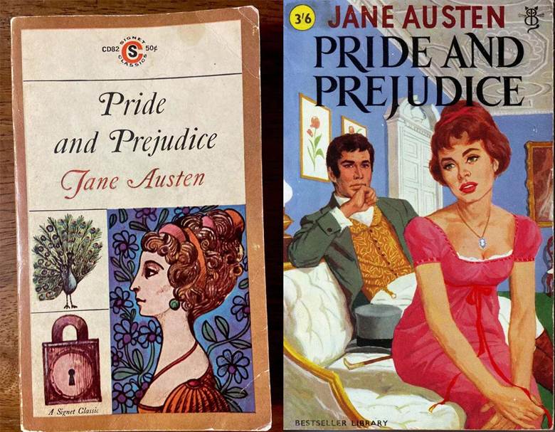
In response, publishers started to produce books dedicated predominantly to female readers, including Pride and Prejudice. Publishers like Washington Square Press in New York and Pan Books in London published editions of Pride and Prejudice with pink covers, or at least with a nod to female lifestyles.
This yielded controversial results: while initially Pride and Prejudice was read by everyone, nowadays the novel is erroneously seen as ‘women’s literature’, in the most stereotypical sense of the phrase.
The most beautiful covers of Pride and Prejudice, from vintage designs to modern alternatives
Pride and Prejudice, first published in 1813, remains an incredibly enjoyable and modern book. One of Jane Austen’s main talents was her ability to provide an innovative psychological characterisation of her characters that has undoubtedly stood the test of time.
Like any self-respecting classic, the novel has managed to capture the imagination of the various generations it has entertained! Here’s a handful of some of the most interesting covers that have appeared through the decades, covering everything from vintage to modern designs.
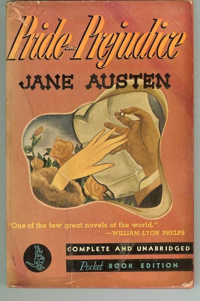
Let’s begin with a decidedly romantic cover from the 1940s!
Here are two very different 1960s covers. One more literary, from the publisher Signet; the other more mass-market oriented, a paperback edition printed by Paul Elek.
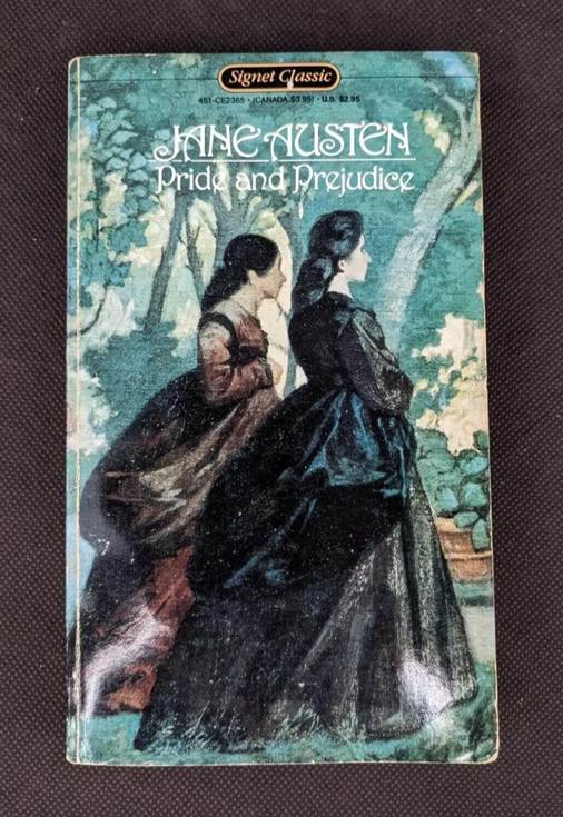
Here’s the type of cover you might have found in bookshops if you’d gone to buy Pride and Prejudice in the 1980s…
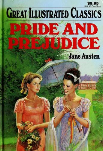
Next we have the cover of a 1997 illustrated edition of Pride and Prejudice.
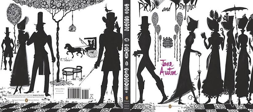
In 2009, Penguin asked Cuban-born designer and artist Ruben Toledo to produce the cover for a deluxe edition of the book. His design was inspired by silhouettes from the world of fashion. Some people have criticised the cover’s overly gothic style, saying it does not match Austen’s writing style. What do you think of the result?
In 2013, a different publisher, Pulp! The Classics, took an entirely different approach, creating an unabashedly ‘pop’ cover of Pride and Prejudice. Unusually, it features Mr Darcy – as the designer later admitted, he bears a striking resemblance to Colin Firth, the actor who played Darcy in an old, well-known BBC adaptation of the book.
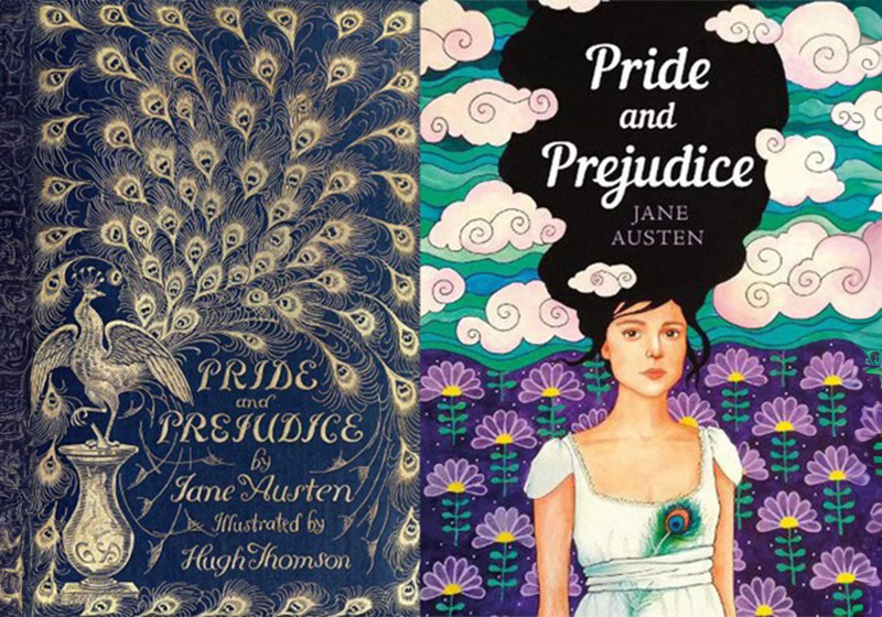
Here, meanwhile, is a truly modern cover of Pride and Prejudice from 2019. The colours are bright, and Elizabeth is depicted as a contemporary woman.
However, one small detail does link the character to her 200-year history: the peacock feather tied to her waist!
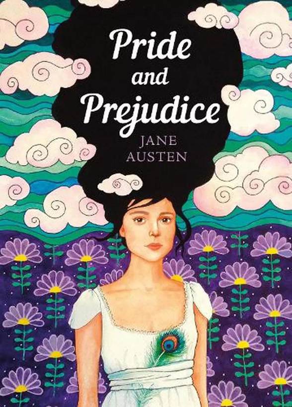
Image: ebay.co.uk
What do you think the next covers of a timeless classic like Pride and Prejudice will look like?