
In graphic design, printing is usually the final stage of a project, a process carried out when the job is done, reproducing the images and text in as faithful and accurate a way as possible. However, there are designers who see printing and production as an integral part of the project, and in these cases the printing requires just as much experimentation and planning as coming up with the concept and developing the layout.
In this article, we describe seven graphic design projects that are all very different, but with one thing in common: the printing (be it analogue, digital or, as often happens, hybrid) played an active and fundamental role in the design. In these examples, printing is not an afterthought, but an integral part of the creative process, combining materials, developments and variables to create innovative solutions that go beyond the limits imposed by software and predefined standards.
1. Alexis Rom Estudio – Atelier Vostok, Get up printing kit, 2007. Spain/Italy
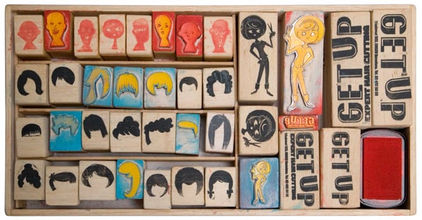
Alexis Rom Estudio – Atelier Vostok is a hub for creative ideas, experimental graphic design and visual communication based in Barcelona and Milan. The studio has the feel of a creative workshop, bringing together a range of different languages, techniques and graphic design processes, and the Get Up Printing Kit project is a perfect example of this process. In this corporate identity job for a hairdresser’s salon, the studio provided the client with a device to produce their own designs – a kit comprising a series of interchangeable stamps of haircuts and faces, which can be combined to create a large number of different solutions. The kit was handmade by the designers using an old photopolymer processor, with the result mounted onto balsa wood, leaving the client free to develop their own customised corporate image. Although it may look like a game, the result is 100% effective.
2. Raw Color, Keukenconfessies, 2010. Netherlands
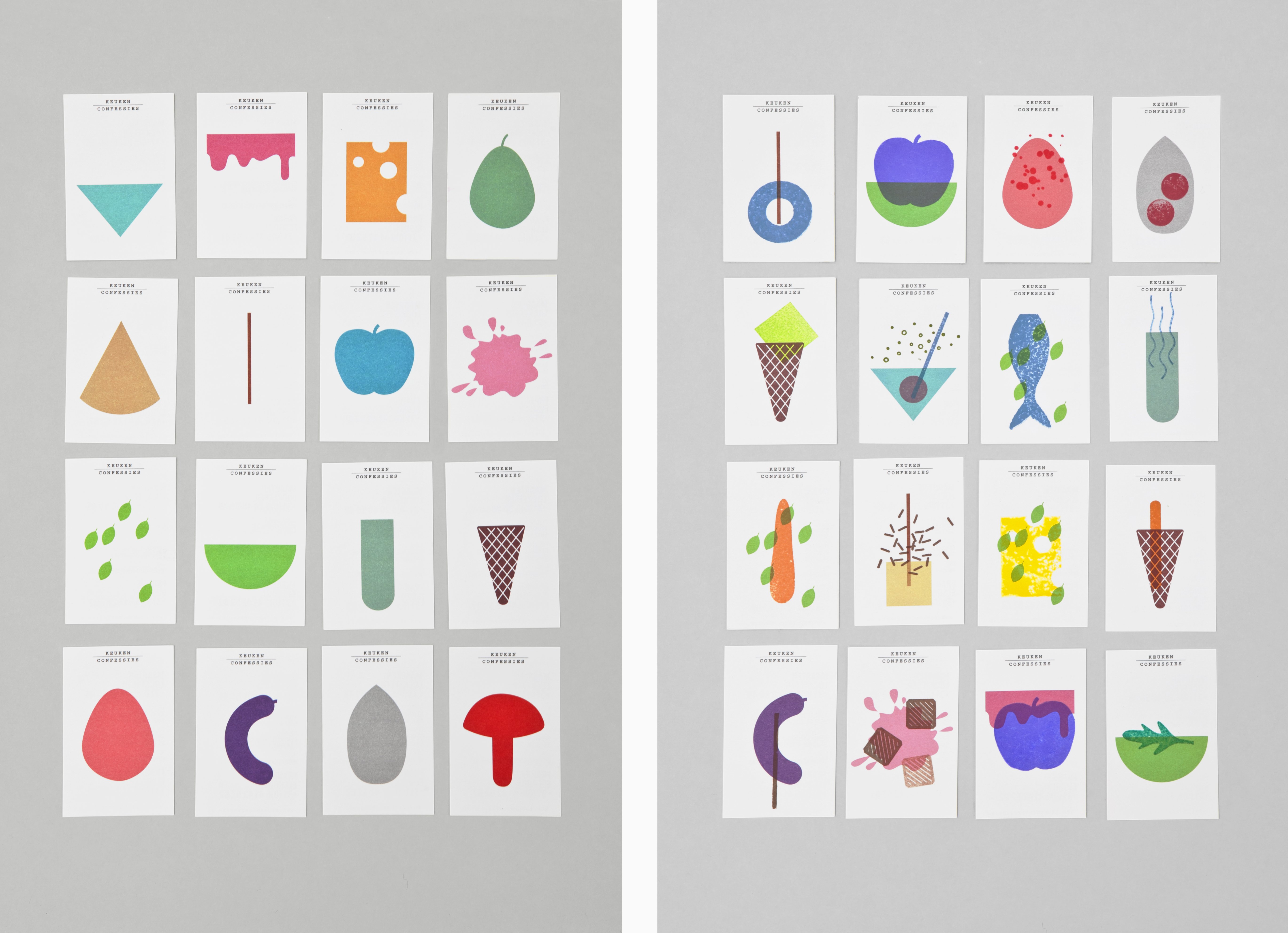
The Dutch graphic design studio Raw Color created a corporate identity based on the same principle as the Get Up Printing Kit for the Dutch food designers Keukenconfessies, a catering company that cares about the environment and the presentation of its products. The design involves a large number of icons inspired by food and cooking utensils, which can be mixed and matched in a practically infinite number of combinations. While the bottom layer of each item was printed using offset printing, for the top layers, specially designed stamps were created for the client, allowing them to add their own personal touch to each item. These combinations recall the mix of colours and flavours found in cooking.
3. Onlab, Galerie C, 2011–2014. Switzerland
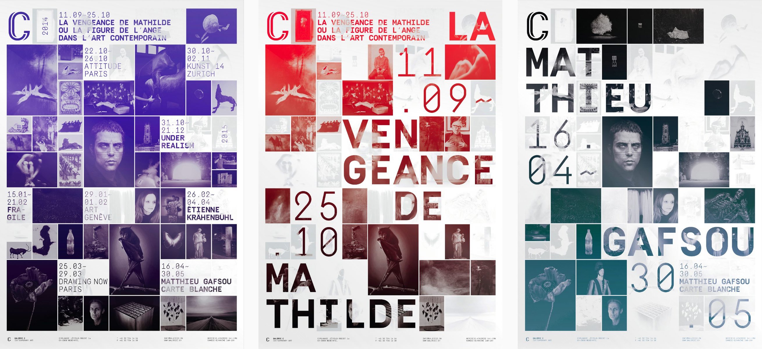
Between 2011 and 2014, to advertise the exhibitions in the Galerie C art gallery, the Swiss design studio Onlab designed posters that made the most of the fact that in screen printing multiple layers can be printed on top of each other. Each season’s programme, complete with all the information about the various exhibitions, was printed on a poster, and then for each show the poster was overprinted, leaving only the current exhibition visible. For each new version, the designers varied the colours, layout and print techniques, but stayed true to the concept.
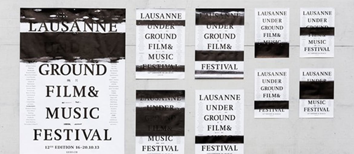
4. Automatico Studio, Lausanne Underground Film & Music Festival (LUFF), 2013. Switzerland
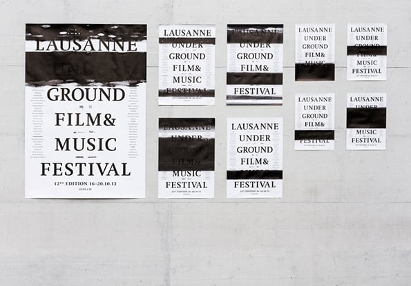
In 2013, Automatico Studio, Swiss study founded by Demian Conrad created the advertising for the Lausanne Underground Film & Music Festival (LUFF), an event that celebrates originality and eccentricity in music and cinema, using a printing technique devised especially for the project. In line with the theme of the event, ‘accident’, the communication for the festival was altered using a visual effect created by manipulating the printing process, which randomly hid and revealed the information displayed, creating something that resembled a mix of printing error and censorship. The technique, which the designer named WROP (water random offset printing), involved intervening directly with the offset printing progress, using water to generate random and unique marks. This analogue technique interacted with the machine’s mechanism, altering its standard hydrochromic parameters.
5. Music Agency, The Event Sculpture, 2014. United Kingdom
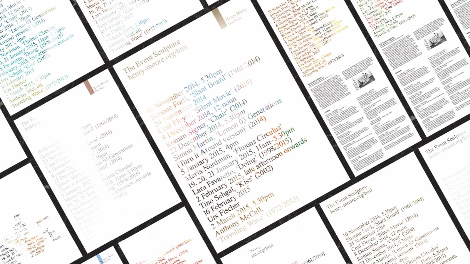
For an exhibition entitled The Event Sculpture organised by the Henry Moore Foundation, which featured nine performances from nine different artists, the Music Agency studio designed an identity where no two publicity items created were the same. The graphics were printed in negative, in white, on scrap posters found at the printing press, meaning each poster and brochure had unique colours and materials. This process reflected the nature of the exhibition itself, which comprised a series of momentary and unique events, where each user enjoyed a different experience.
6. A2-Type, Chalk Studios & New North Press, A23D, 2014. United Kingdom
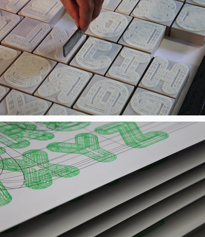
A23D is a 3D-printed letterpress font commissioned by Richard Ardagh, a graphic designer and partner in New North Press, a London-based studio that specialises in letterpress printing. The font, designed by the A2-Type studio and made physically by the prototyping specialists at Chalk Studios, stemmed from Ardagh’s interest in bringing together traditional and innovative printing techniques. There were various complications to overcome, including the thickness of the design, the printing process and the materials to use: the material had to be able to resist the high pressure exerted by the press, but also to print in great detail. After various attempts, the definitive font was printed using polyjet, which makes use of liquid photopolymers.
7. Irma Boom, Chanel No. 5, 2007. Netherlands
When Chanel commissioned Irma Boom, a top book designer renowned for her unexpected solutions and the attention she pays to her materials, to design a publication dedicated to the historic Chanel N°5 perfume, she produced a book that was decidedly out of the ordinary. The entire volume was ‘printed’ without a trace of ink; each page was first stamped on a sheet of aluminium, and then impressed onto paper using an old letterpress machine. The aim was to represent the invisible yet simultaneously intense nature of the fragrance.