
Table of Contents
Although distinct from the world of graphic design, printing has always fascinated many designers, who have tried to understand this technology and use it for their own creative ends. The power of printing doesn’t just lie in achieving the most sophisticated and precise reproduction possible. Even those defects that mean the printing process falls short of formal perfection can become a rich vein to tap for experimentation, as the examples we’re going to show you illustrate.
We learn from our mistakes, and it’s thanks to what have traditionally been considered printing errors that we have been able to explore new graphic features and offer solutions that go beyond existing technical standards. Through errors like these, designers ventured into and redefined the technical domain of printing.
Some traditional printing “defects” have been reinterpreted as conscious creative choices that reveal the underlying process.
Halftone screen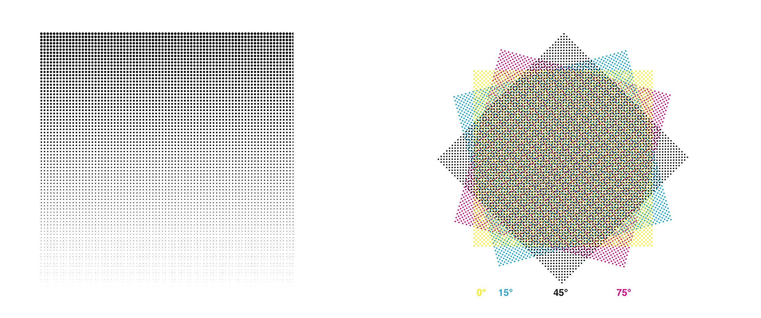
Halftone screening is a method for preparing photographs for printing. It uses dots of differing sizes and spacing to reproduce colour gradients.
This technique is based on an optical illusion: the screen’s tiny dots blend together to create solid hues and gradients discernible by the human eye. Colour is then produced by printing several screens overlapping at different angles (typically four in the CMYK model).
For the optical illusion to work, the dots have to be small enough not to be perceived individually. In the past, a halftone screen visible to the naked eye was often a sign of poor-quality printing produced cheaply.
As early as the 1920s, Herbert Bayer started exploring the possibilities of halftone screens by overlaying them to create moiré effects, or enlarging them. However, it was the advent of photomechanical printing that made serious experimentation with screens possible. One master graphic designer to try his hand at this was Wolfgang Weingart. Fascinated by offset lithographic printing, every aspect of which he wanted to control, Weingart defined the “dot of a photomechanical screen” as the “invisible, yet essential, building block of an entire process.” The use of photomechanical films allowed him to manipulate text and images, further distorting and altering them by enlarging and overlaying screens. The resulting works were extremely innovative and blazed new trails in the world of graphic design.
Another interesting example of halftone screens can be found in the magazine Retromundo, designed in 1986 by Álvaro Sotillo.
Overprinting
Generally speaking, in printing, if two different coloured elements overlap, the part of the bottom element overlaid by the top element is “knocked out”, in other words, not printed. The elements are then reproduced on plates and printed sequentially so that their shared margins touch but the inks do not overlap. Overprinting occurs instead when the shape of the overlapping elements is maintained, and one element is printed on top of the other, thereby creating a third colour. Unlike oil colours in painting, printing inks are generally very transparent and it’s immediately obvious when they overlap.
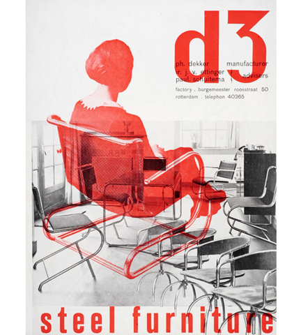
From the early days, overprinting was considered a technical error, as it revealed the underlying printing process, thus “polluting” the message of the artwork. From the mid-twentieth century, however, some designers began to see interesting implications in this specific effect. Early pioneers in the 1920s and 1930s were Dutchmen Piet Zwart and Paul Schuitema who would revolutionise typography with their formal clarity and keenness for experimentation, especially when it came to techniques. In their work, images and blocks of colour often overlapped, creating multiple layers.
From the 1950s onwards, due in no small part to the work of Max Huber, in which photographs, colours, symbols and typography often overlap, overprinting became a device widely used in advertising art.
Out of register
When an image or graphic is printed in more than one colour, each colour has to be printed separately in successive phases and then registration has to be performed, which means checking that each colour has been printed in exactly the right position. If there’s a deviation of even half a millimetre, the image will be out of register, the resulting misalignment immediately obvious to the naked eye: the colours will mix at the edges to create a dark margin, or there will be a gap between them, leaving a white margin.
The precise registration of images and text has long been a major concern of printers and print technicians. Although today’s software and printing technologies make it much easier to obtain perfectly registered colours, it is still common to see out of register colours in mass-produced items.
A sign of low-quality, cheap printing, poor registration was seen by some designers as a creative trick. In the 1960s, Muriel Cooper, a designer who spent most of her career working at MIT, was heavily involved in using new design technologies and in experimenting with printing. In various projects, she intentionally used out of register images to convey a sense of movement and greater expressiveness, like the cover of Bauhaus (1969). Another famous example is the poster Your Turn, My Turn by April Greiman (1983), which uses an out of register image to create a 3D effect.
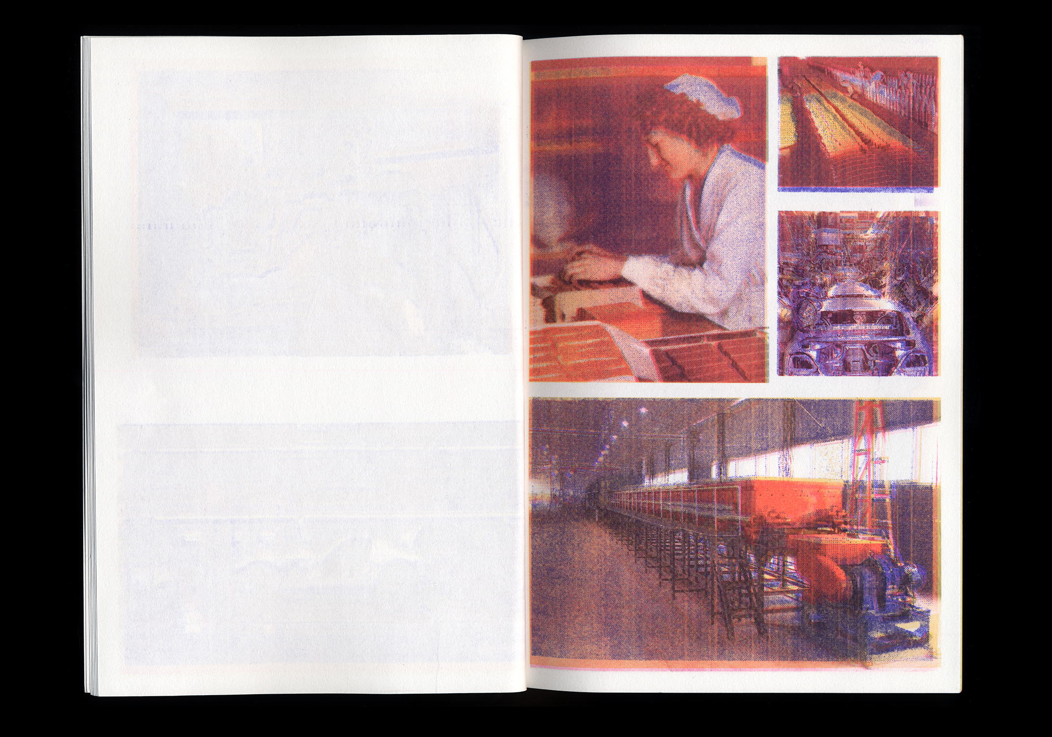
More recently, in the piece Just in Time, Xavier Antin created a book printed using four printing machines– one for each colour – which dated from 1880 to 1976. The end result, with its peculiar out-of-sync and colour movement effect, was achieved by a production process that combined different eras, technologies and techniques.
Printer’s marks
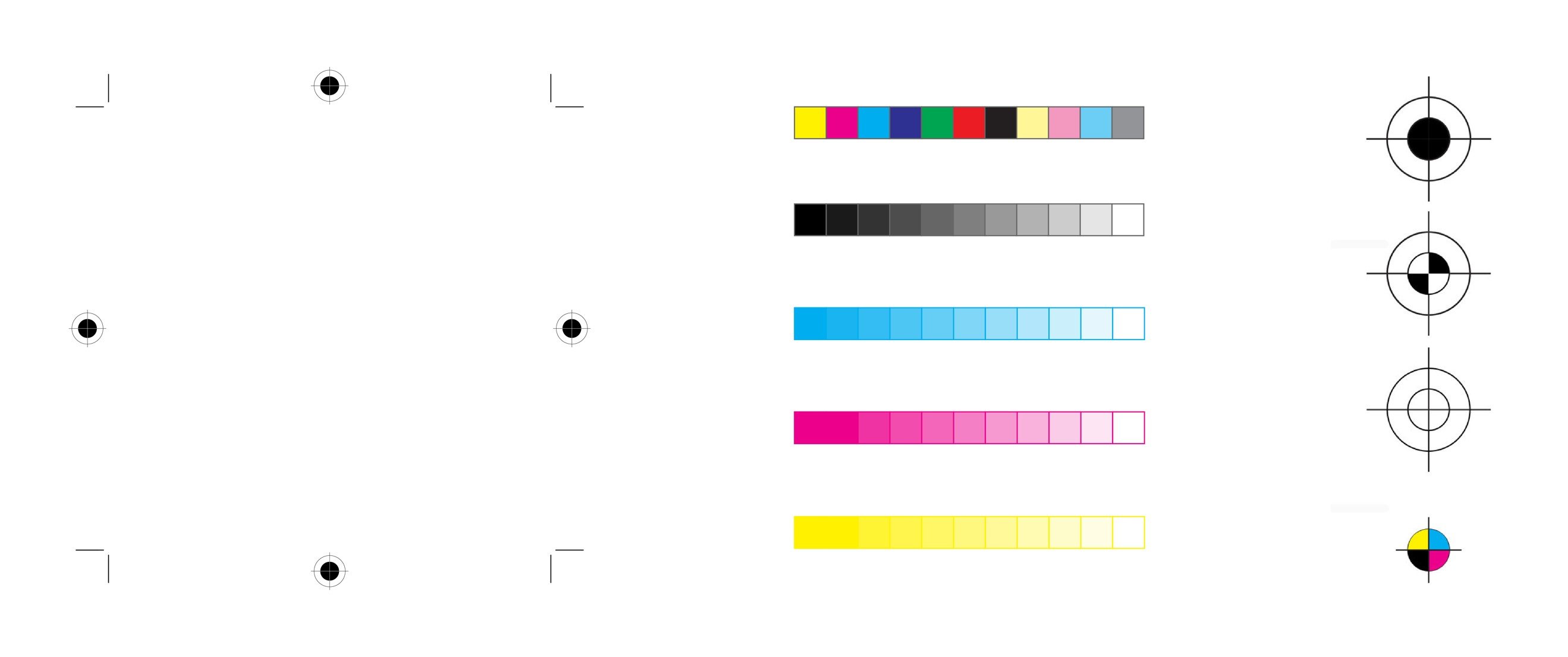
In letterpress printing, various different marks are conventionally positioned in the margins of the print area to check that the image has been correctly reproduced. The most common of these marks are those that indicate where to trim the sheet (crop marks) and those that ensure the correct alignment of contents (registration marks). In addition to these, you will often see bands of colours, which are used to check ink density. Other marks conveying various pieces of information may appear in the margins, only to disappear from the finished product at the end of the printing process.
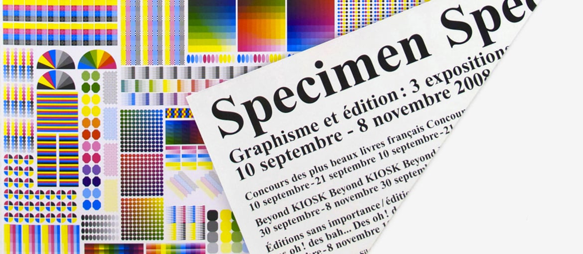
The everyday language of printers, these symbols have fascinated many designers, who have repurposed them in new contexts. A prime example is Fanette Mellier, whose Specimen poster can be read as a brilliant tribute to the iconography of printing. Created to promote an exhibition on editorial design in Chaumont, France, the poster is entirely covered in technical symbols and colours in a self-reflexive statement about its own production process. A fold reveals the text printed on the back.
A further example of the obsession of graphic designers with printer’s marks was the Extended Registration Marks workshop given at ECAL by NORM (Dimitri Bruni and Manuel Krebs), which encouraged students to explore and extend registration marks as a design language using a combination of symbols and colours.
