
Table of Contents
In the mid-1930s, Harper’s Bazaar art director Alexei Brodovitsch, a US-American design icon of Russian heritage, fundamentally redesigned the women’s magazine. He not only revolutionised the publication’s design, but also played a significant role in implementing modern graphic design in the United States. His work made the magazine one of the first major publications to pair dynamic layouts with sanserif fonts. He worked with contrasting film-style photographs and broke the mould, as well as the rules, of the modernist editorial design of his time. He did this by combining fashion photography with abstract text silhouettes. However, his fame extended beyond the world of printing: the 1950s Hollywood classic Funny Face paid homage to the editorial designer by basing the character of Dovitsch on him.
Recent decades have seen a change not only in the readership of women’s magazines, but also in their contents, design, and publishing models. Today there are new ways to publish independently. This represents a breath of fresh air for editorial design and encourages new perspectives on traditional topics.
Following the print-design revolutions of the last century, there are now more magazines by and for women than ever before. It could almost be said that printing is experiencing a boom as a direct result of digitisation. Indeed, blogs use crowdfunding to minimise the cost of their first print publications – and social media to access new audiences. Thanks to their often very small print runs, these print magazines may rely on advertising far less than the older, more renowned publications.
By employing digital structures, independent women’s magazines can reinvent themselves with greater freedom – and celebrate it with radical minimalism, anti-design, and a new aesthetic in graphic design. Just as the design pioneer Brodovitsch left his mark on 1950s graphic design, the design of many current publications is influencing the publishing industry. Thanks to the publishing of women’s magazines, print is not dead, but is rather becoming a form of protest; the following magazines break with convention and act as new voices in a market that is far from oversaturated.
The Gentlewoman
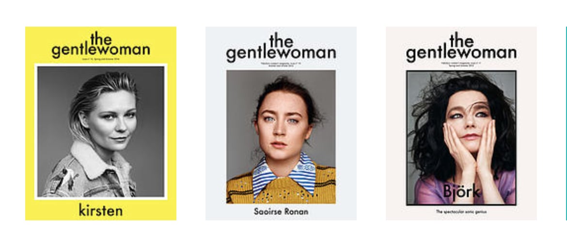
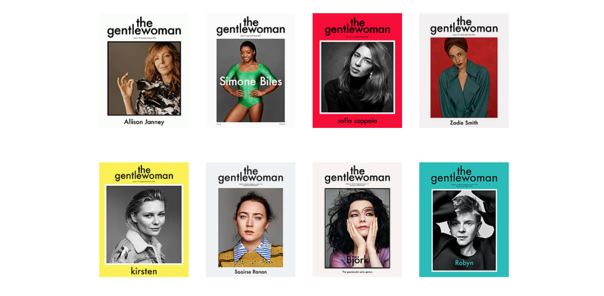
The Gentlewoman represents somewhat of a trailblazer for independent women’s magazines. It owes its title to an illustrated women’s magazine from the 19th century, and like its namesake, is known for interesting articles and a unique interview style. A team led by creative director Jop van Bennekom and art director Veronica Ditting is responsible for the design. The publication’s cover stands in stark contrast to those of the glossy magazines from the big publishers; the articles are very long and focus on representing women from the worlds of business, politics, and sport. The lavish photo spreads are shorter and contain less product placement. The layout of the front cover is always the same, but each issue sets itself apart with a different colour. Only the title and the name of the featured personality adorn the cover, and the background colour frames the portrait, which sits in the centre. Very little colour is used inside the magazine, however, and the sections are clearly distinguished using different kinds of paper: strong, beige-coloured paper in the middle and glossy paper for other sections. The publication has achieved cult status thanks to its modest design.
Riposte
The hallmark of Riposte – the smart magazine for women is a text-based cover adorned only with the title and the name of the featured interviewee. The UK magazine, like The Gentlewoman, relies more on text than on images, and is notable for its use of different kinds of paper. Since the release of the sixth issue, there have been two cover designs for each instalment: the classic, purely text-based, Riposte style and a photo cover. Riposte‘s design reflects current trends and is nonetheless timeless; it dispenses with advertising. Creative Director Shaz Madani is responsible for the magazine’s design, which has earned several nominations and prizes – the Designs of the Year Award and European Design Award, for example.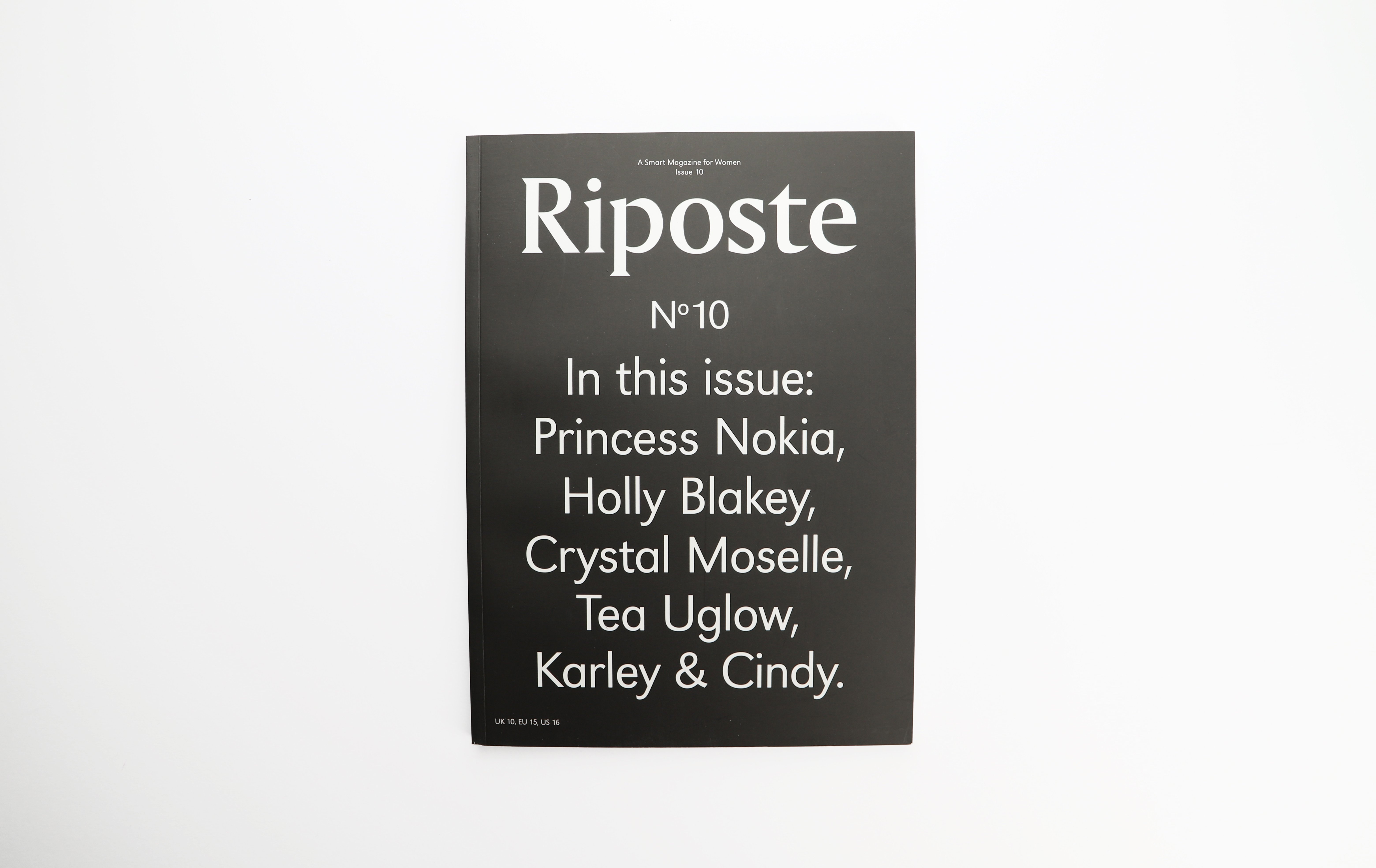
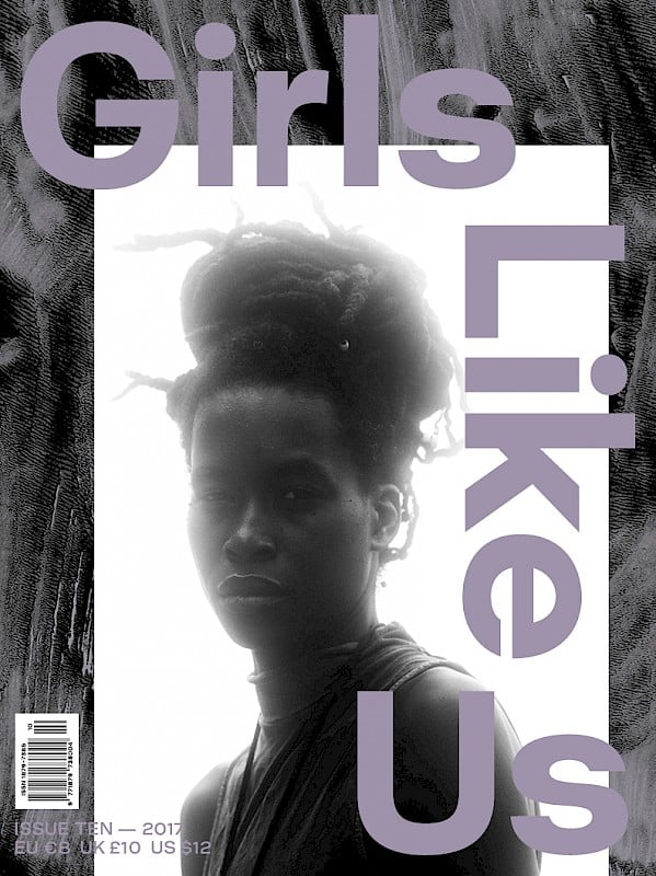
Girls Like Us
Anyone who enjoys strict layouts and understated graphic design will likely feel out of place with Girls Like Us due to the magazine’s heavy use of offbeat typography and anti-design. The radical cover design is reimagined for each issue and every topic of focus, and yet remains recognisable because of its distinct character. In terms of content, the minds behind the publication opt for progressive opinions over commercial femininity. Girls Like Us, like many new magazines today, is published online, but as of three issues ago it is now also available in print.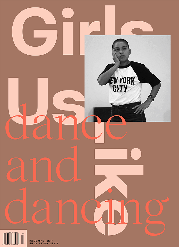
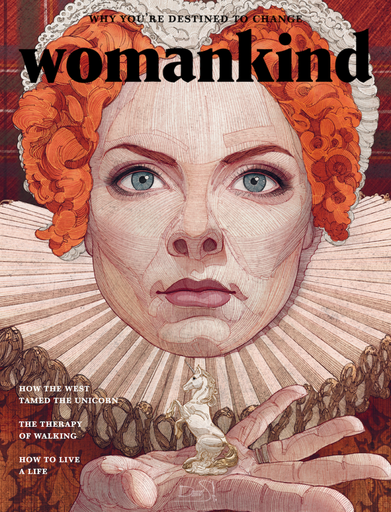
Womankind
Womankind contradicts the notion that ‘print is dead’ and operates completely without advertising. In this way, the publishers have more space for illustrations, which has earned the magazine a nomination for the Stack Award. The cover and contents are filled with sketches and illustrations of the featured women. What’s more, the magazine is increasingly focused on photography and now runs its own Photographers’ Award. The depth of content of the articles, the carefully planned layout, and the quality of the visual presentation have made the publication one of Australia’s most popular women’s magazines. 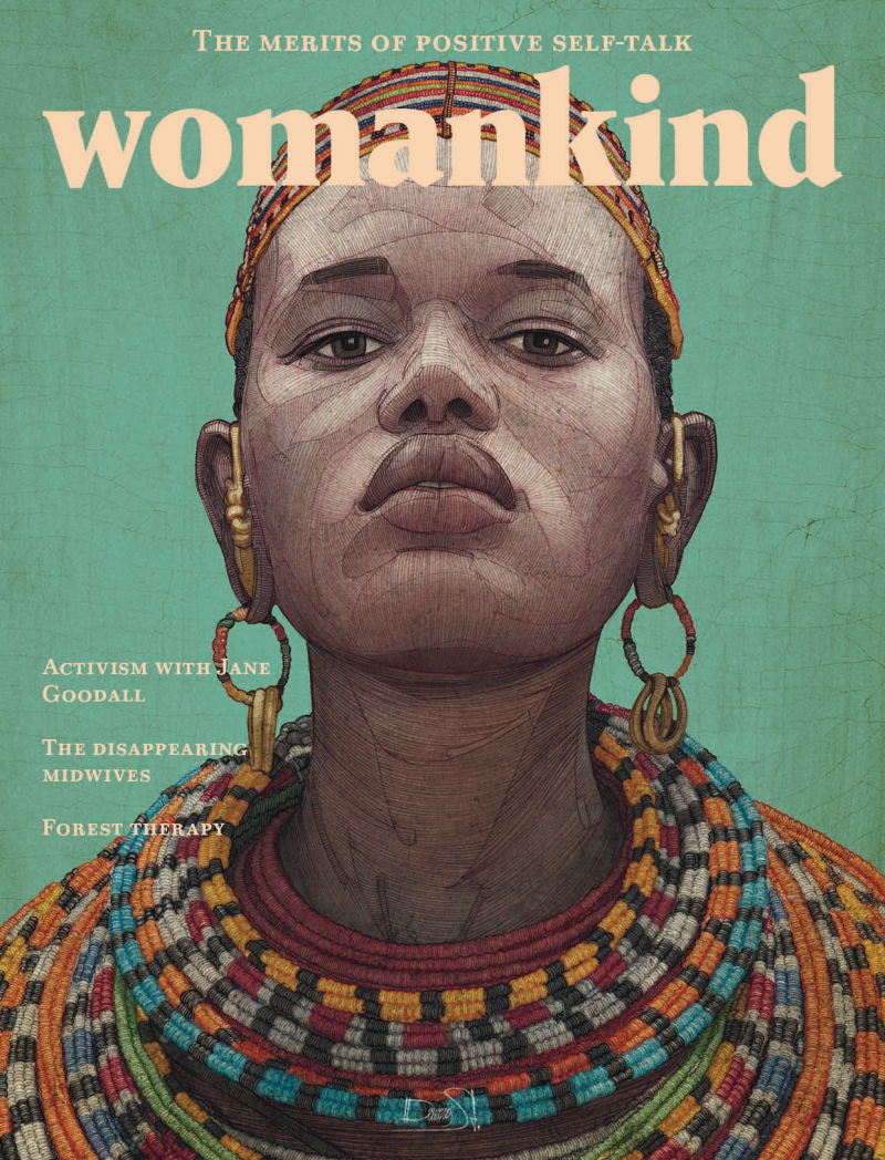
Got a Girl Crush
So far, seven issues of Got a Girl Crush have been released. This, too, is a magazine that owes much of its success to the Internet. In fact, it began life as a blog, and this gives its publishers the licence to be creative and innovative. Every six months, the magazine’s creative director, Amanda Stosz, draws attention to topics such as politics, social injustice, and independence.