Table of Contents
Poster design has a distinguished history in Europe and America, and posters, with their fast, forceful impact upon a wide audience, occupy a special place in the hearts of most graphic designers. The rest of us love posters as part of the daily visual richness and variety of our streets and environment. Protest posters have their own back story. Their design—often the result of a do-it-yourself effort to get the word out quickly—tends to have a sense of immediacy that lends an irresistible urgency to the message.
Design serves as a vehicle of protest by informing the populace of injustice, urging them to support a cause, and creating solidarity. It gives a voice to the general citizenry, attracts attention, encapsulates a burning issue, exhorts, inspires, and reaffirms. Protest posters have never been an exclusively or even primarily professional design activity—anyone can get scissors and paper and take up a brush for a cause. In the past, protest posters were most often created this low-fi, analog way. Today, digital media used in design gives protest messages two distribution channels, by generating printed material to be seen out in the real world along with digital products intended to be shared online.
A quick hopscotch through a timeline of protest posters of the 20th and early 21st century shows that at heart, many of the issues distill down to a few (apparently unsolvable) topics no matter what the era. The struggle of rich vs. poor, war vs. peace, conservative vs. liberal ideologies, to name a few, remain common denominators, with only the names and other specific details shifting with the times.
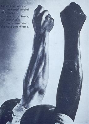
1931
John Heartfield is justly famous for his satiric protest posters created during the Weimar and WWII eras in Germany. The text reads, “Whether black or white, in battle we know only one race, we all know only one enemy: the exploiting class.” Without even showing faces, Heartfield uses the two strong raised arms and fists—one dark-skinned, one light—to make his decisive point.
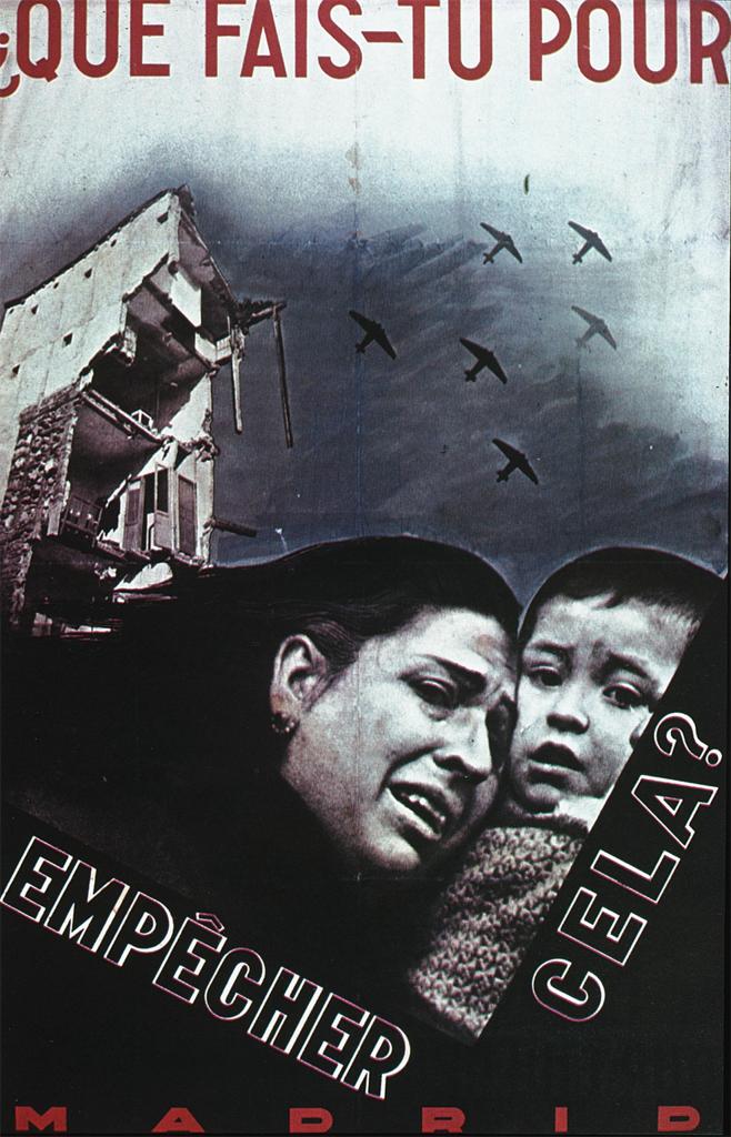
1936–39
This Spanish Civil War protest poster by an uncredited artist reads, in French, “What are You Doing to Stop This?” It was issued by the Madrid Ministry of Propaganda as a call for foreign assistance in fighting off General Francisco Franco’s Nationalist revolution. The composition echoes Russian Constructivism but the message is not Constructivist idealism and the promise of a better future, but a stirring cry for help, now.
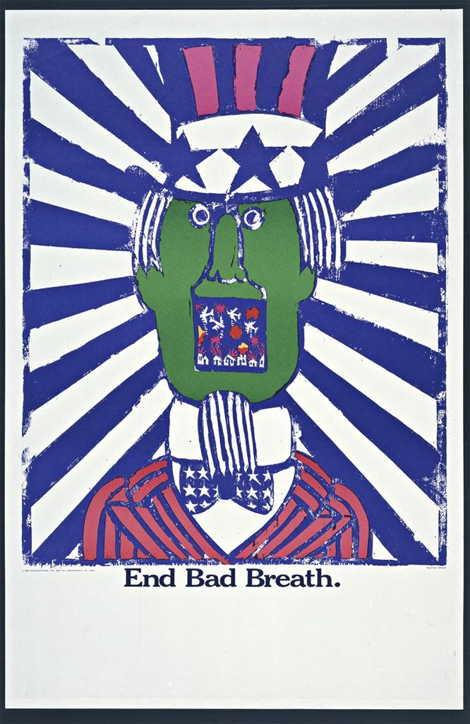
1967
Pushpin Studios founder Seymour Chwast created this devastating poster to protest America’s involvement in the Vietnam War. Uncle Sam, so familiar to us from James Montgomery Flagg’s WWI recruiting posters, takes on a sinister air through blunt imagery (a seething mouthful of planes) and a lurid color palette.
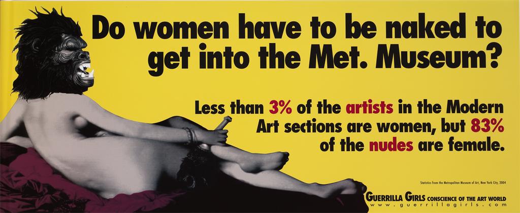
1985
The Guerrilla Girls expose sexism, racism and corruption in politics, art, film and pop culture through a deft combination of facts, humor, and outrageous visuals. This combination of Jean-Auguste-Dominique Ingres’ painting La Grande Odalisque of 1814 and the Guerrilla Girl’s jokey, ugly gorilla mask neatly hammers at the problem: women (who are vastly underrepresented in museum collections) are artists, not just artist’s subjects.
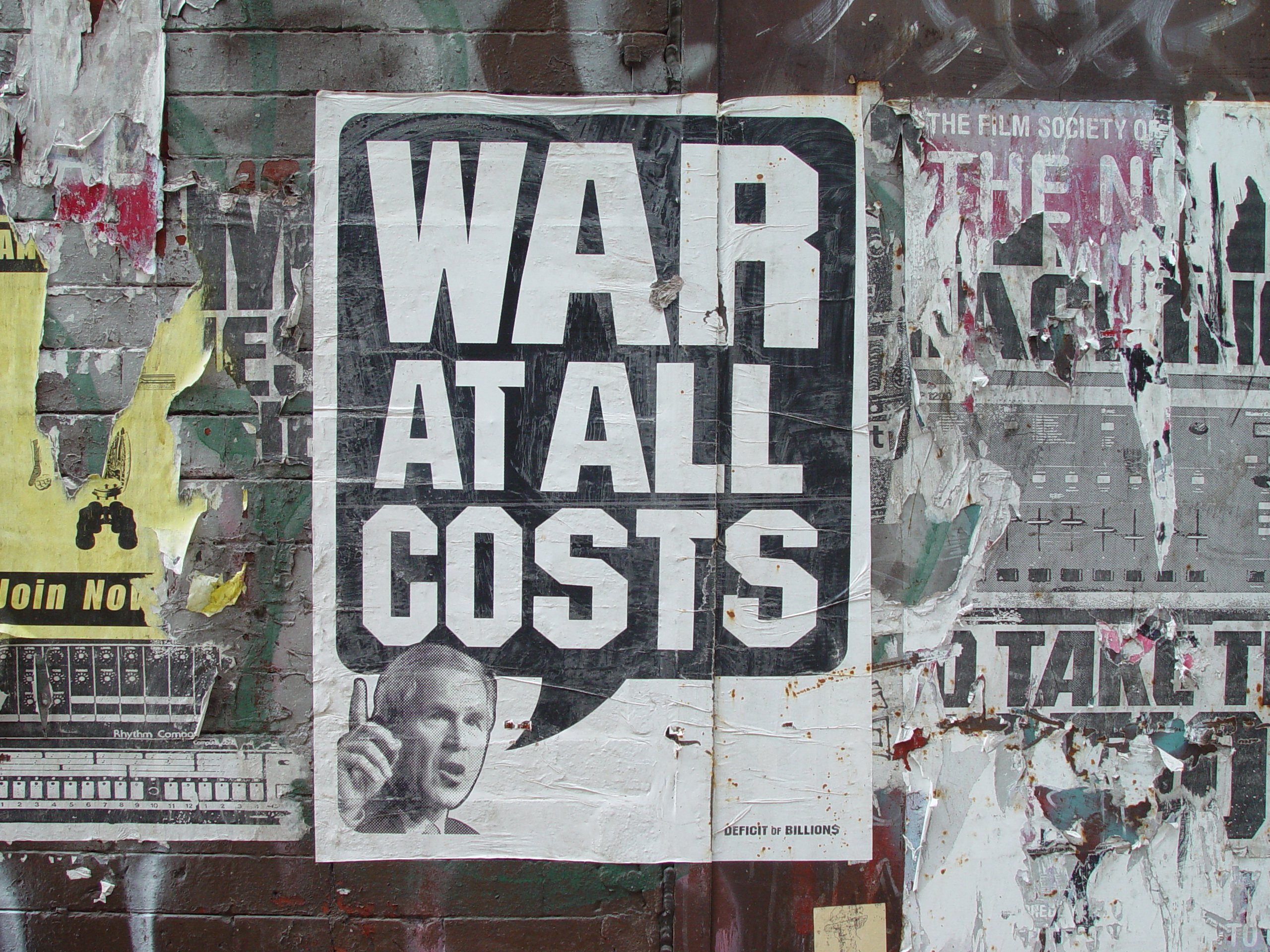
2004
When the Republican Party held its 2004 national convention in New York City, protesters embarked on a series of marches, rallies, performances, demonstrations, exhibits, and acts of civil disobedience to protest President George W. Bush’s nomination as the party’s candidate for president. This poster uses a crude cartoon word bubble to shout out one of the main issues: the human costs of war along with the expense in a time of financial deficit.
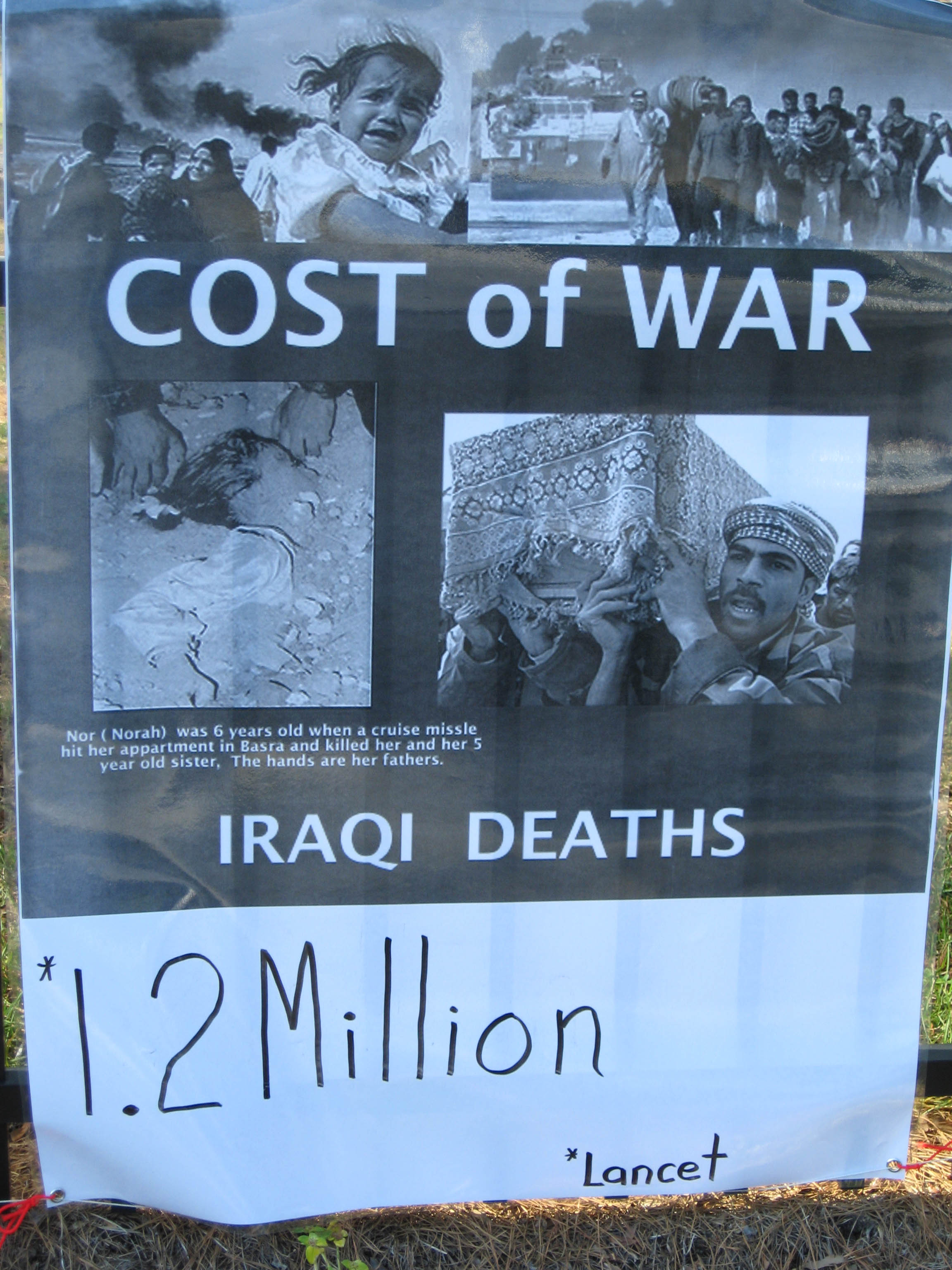
2008
This homespun and very smart poster protesting the Iraq War uses a couple of unique approaches: designing in the blank space at the bottom for handwritten information that can be updated on fresh copies of the poster (reminiscent of lottery posters where the jackpot amount needs constant revisions) and the citation of a credible source for its information.
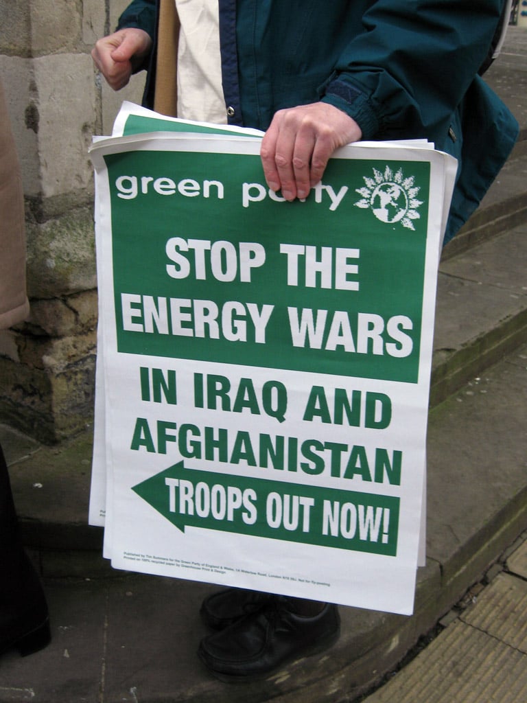
2009
Another point of view is on display on this anti-Iraq War poster, and a completely different design tactic as well; in fact, there is almost no attempt at actual design here. The hierarchy puts the Green Party’s name at top, so a viewer instantly knows who the protest is coming from, and by calling the conflict “Energy Wars” it’s plain what their objection is. Simple but effective.
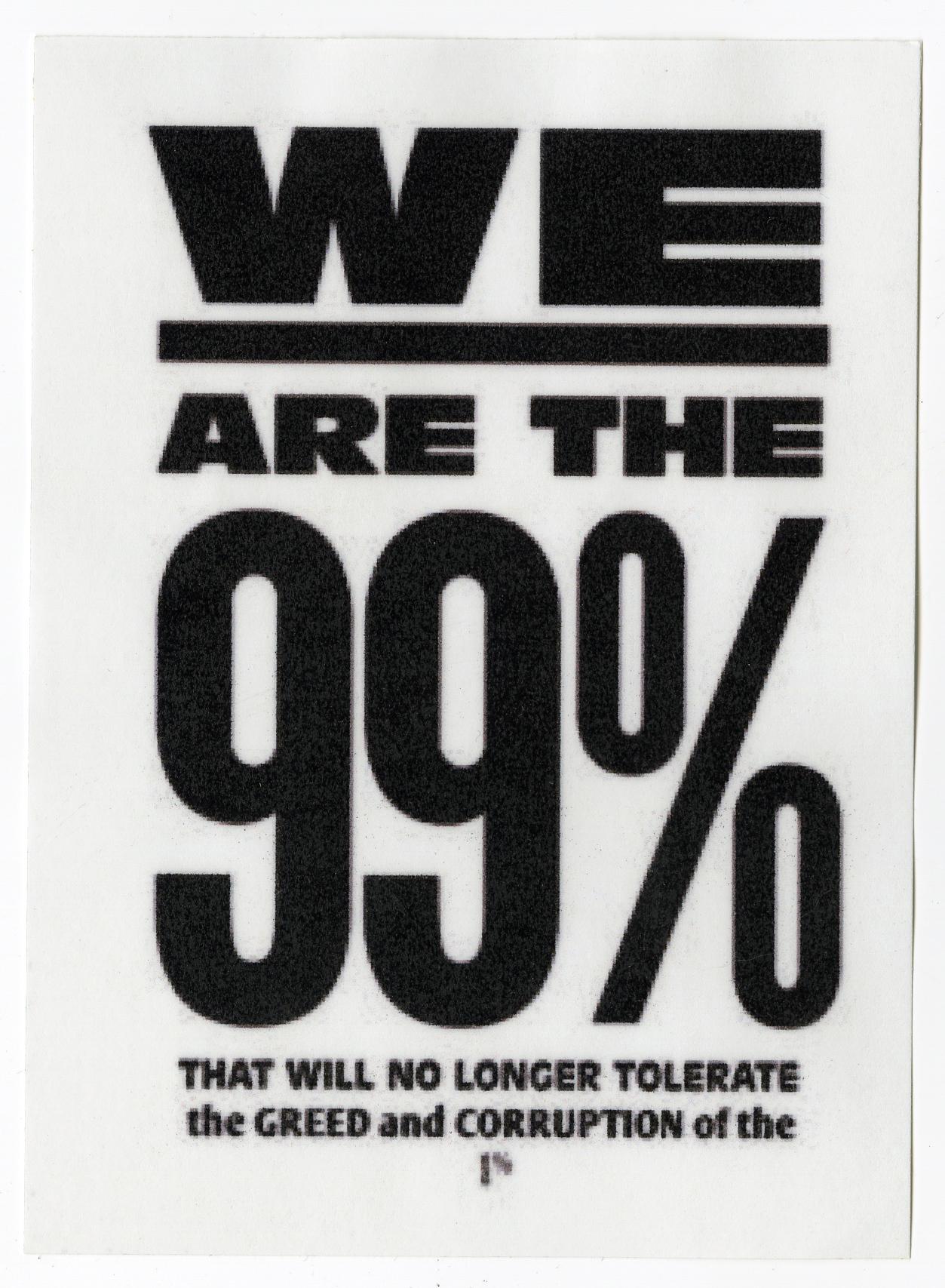
2011
Anyone familiar with page layout software could bang out this poster in perhaps ten minutes, allowing the message to be distributed within the half hour. As with much of the Occupy Wall Street output however, though the wording is super-direct, the message is muddled and the desired outcome unclear. Who are the opponents and why are they in opposition? What does the 99% want to happen? Without identifying these basic underlying facts and outcome, and clarifying them for the intended audience, nothing will happen. Communication, that most basic responsibility of a poster, is absent.
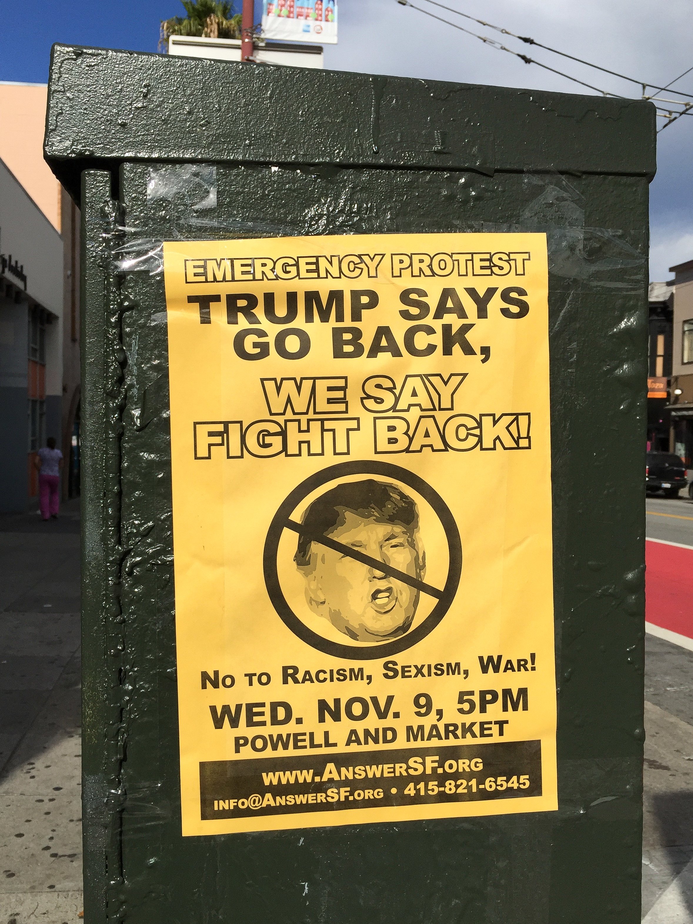
2017
Here’s a classic DIY attempt slapped onto the side of a signal box that checks all the boxes for a protest poster. Its basic design printed on goldenrod copy paper uses bold sans-serif type and the classic circle with a slash through it, the universal symbol for NO (whatever is under here) superimposed over Donald Trump’s face. Its plea for citizens to attend an emergency protest gains credibility because the goal is clearly stated. Adding the organizer’s URL, email address, and contact phone number increases a viewer’s perception of the seriousness and validity of the effort. Hat tip!