Table of Contents
Rai is Italy’s leading TV network and Europe’s fifth biggest. Originally founded in 1924 as the “Unione radiofonica italiana”, it wasn’t until 1954 that it became “Radiotelevisione Italiana” – or “Rai” for short. In today’s #BrandVolution, we’ll be looking at how Rai’s logo has evolved over the years.
1954: the Erberto Carboni logo
On the morning of 3 January 1954, the television announcer Fulvia Colombo opened the TV schedule with the announcement that “today, Rai will be beginning its regular schedule of television broadcasts”.
On the screens of the (few) Italians who could afford a television at the time the company’s first logo appeared, designed by architect and painter Erberto Carboni, one of Italy’s great advertising graphic designers. He was also behind the graphics for the Rai test card, which was shown before programmes began.

It’s an imposing logo comprising thick, squared letters that form a single block. The typeface used is an Egyptian – a squat, blocky font that’s perfect for titles and logos.
The seventies and Alberto Ribera’s logo
At the start of the seventies, Rai began its first colour television broadcasts. In a decade of profound change, Rai’s in-house graphic designer Alberto Ribera designed at new logo for the company.
LOGO 70 RIBERA Crédits: https://www.rai.it/dl/docs/1426244578970Storia_del_logo_Rai.pdf
The typeface is thick, soft and round. The letter “r” seems to blend into the “a”, as if it were a single character. A variation in the colours of the Italian flag was also created to celebrate the advent of colour TV.
And, at the end the seventies, a lowercase version of Erberto Carboni’s logo was produced. Neither were ever adopted as official logos, however.

The eighties: the Ara logo
At the start of the eighties, Rai’s three TV channels (then known as Rete 1, Rete 2 and Rete 3) became RaiUno, RaiDue and RaiTre. The logo was given another makeover, this time by an outside design agency: Ara.

The uppercase lettering is rounded and joined up at the bottom of each character to form a single block. The font used is Handel Gothic, a popular choice in the eighties (you’ll see it in the old American Airlines logo, for example). The logos for each TV channel were distinguished by different colours and geometric elements: a blue sphere for Raiuno, a red cube for Raidue and a green tetrahedron for Raitre.

1988: Giorgio Macchi’s redesign
In 1988, designer Giorgio Macchi redesigned the logo once more: out went cursive script and in came sharp corners where one letters were joined up.Some versions even featured a small Italian flag inside the letter “A”.

The Rai butterfly takes flight
In 2000, the Rai logo underwent a radical overhaul. Designed by renowned brand designer Antonio Romano, the new logo included a butterfly in whose wings could also be seen the profiles of two faces looking at each other. The colours and other elements were carefully chosen: blue was a reference to the world of technology, the butterfly creativity and the two faces interactivity. The font used was Paul Renner’s Futura.

The latest redesign
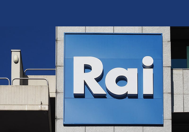
In 2009, Rai began the switch to digital terrestrial TV, initially with the free channel Rai Storia. The following year, the company embarked on a major rebranding exercise: the centrepiece was a set of new logos for its channels created by Frame by Frame.The butterfly gave way to a square-shaped logo that was modern and minimalist. The only thing that remained unchanged was the colour blue.

We’ve reached the Rai logo that we’re familiar with today. These changes in visual identity are retraced in this 34-second video. And if you want to read more fascinating stories from the world of design, continue exploring our blog.

