Table of Contents
We often talk about fonts in our blog: what was once a subject which only used to excite industry insiders, today interests many, especially those who, even if simply as a hobby or passion, are involved in printing and publishing.
Which fonts are the most widely used for printing books? What about brands and signs? Is there a font that is cheaper than others for printing documents? Today we bring you some fascinating facts on the most important fonts in the world of publishing and printing.
The cheapest fonts for printing
We can’t tell you for certain which font is the cheapest in the world, but there are definitely fonts that consume much more ink than others and end up being much costlier to use as a result.
One of these is Arial, a relative of Helvetica, which has been featured in the Windows operating system since 1992. According to some studies, Arial consumes 27% more ink than Times New Roman. More economical than Arial are fonts like Calibri, which has been the default font for Microsoft Office since 2007.
A font specifically designed to save ink is Ecofont, a typeface developed in the Netherlands that has little holes in the letters and saves up to 15% more ink. While it may not be the most aesthetically pleasing of fonts, Ecofont won the 2010 European Environmental Design Award, despite some researchers from the University of Wisconsin criticising its effectiveness in some cases.
The font most widely used in logos and brand names

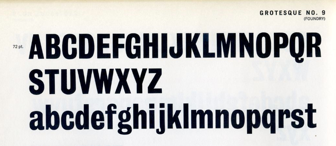
One of the most frequently used and famous fonts in the world is undoubtedly Helvetica. For example: can you picture the NASA space shuttle? Well, the “United States” lettering on its side is written in Helvetica.
Created in 1957 by Swiss designer Max Miedinger in collaboration with Eduard Hoffmann (and initially baptised Haas Grotesk), Helvetica has a decidedly neutral design. And this explains its success: from the 1970s onwards it has been used in countless logos: Italian designer Massimo Vignelli chose it for the New York Subway signage and, in 1984, Steve Jobs made Helvetica the default font for the Macintosh, ensuring its popularity with the general public (it would remain the default font for Apple operating systems until 2015).
Today there are dozens of major brands that use Helvetica including Jeep, American Airlines, Lufthansa, Skype, American Apparel, Behance, Motorola, Panasonic and Tupperware.
Fans will be delighted to know that there’s even a documentary devoted to the font, the eponymously titled “Helvetica” directed by Gary Hustwit and released in 2017. Here’s the trailer.
The most widely used font in publishing

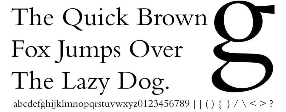
One of the most widely used fonts in publishing worldwide is Garamond. This French typeface – created in the 16th century by Claude Garamond – is extensively used in its different variants in French, Italian and Anglo-Saxon publishing. In Italy, for example, almost all books are printed in Simoncini Garamond, a reworked version of the font created by Bolognese type designer Francesco Simoncini in the 1950s.
Other fonts commonly used in Italian publishing include Palatino (by Mondadori for fiction) and Baskerville (by Adelphi). Anglo-Saxon publishers also often use Minion, Caslon, Bembo and Janson.
The oldest font still in print today

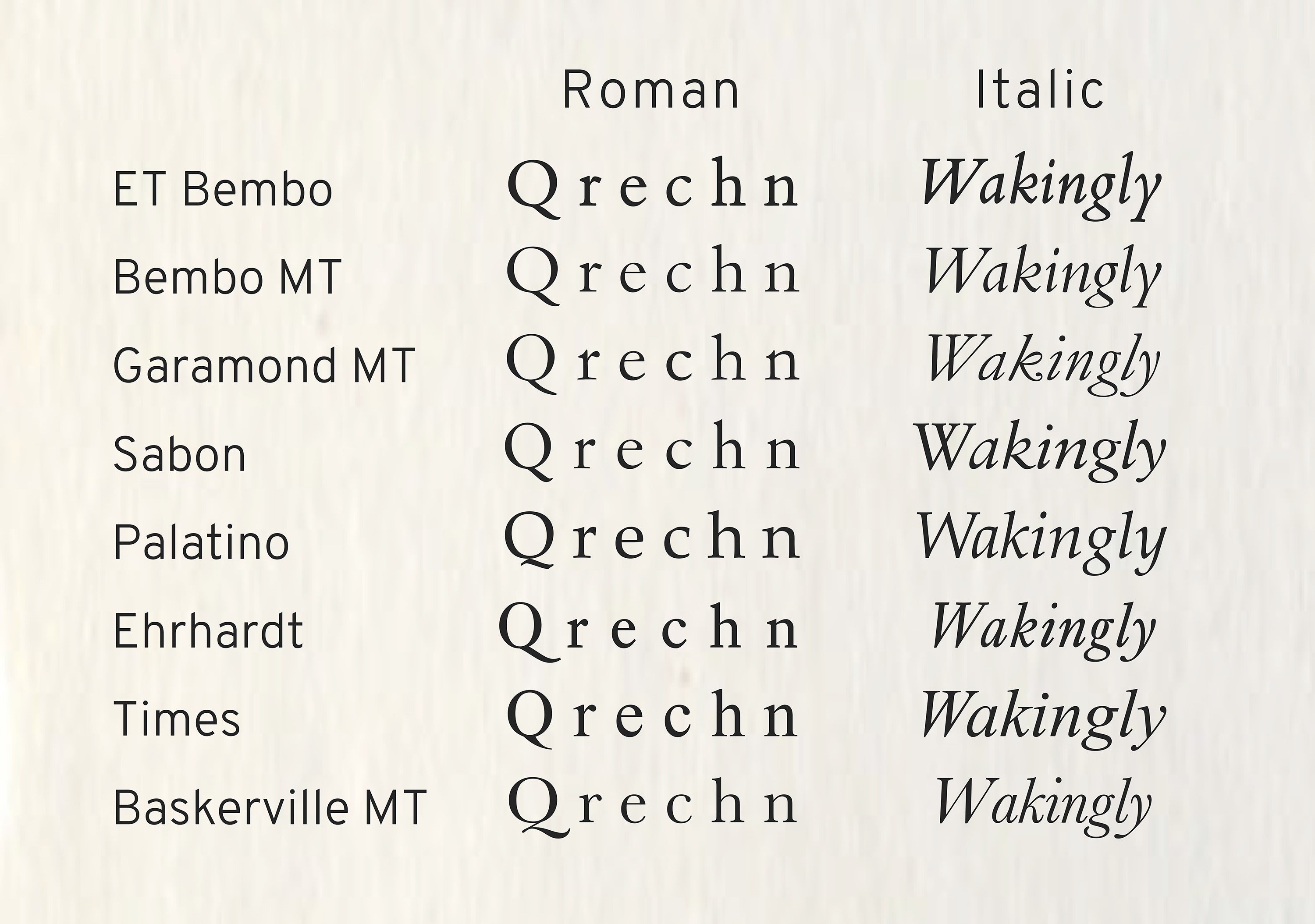
How long are fonts used for? A very long time… in some cases, over 500 years! That’s the case for Bembo, a font created around 1495 and still used today by British publishers. Cambridge University Press, for example, has used it extensively.
The font was created in Venice by printer Francesco Griffo, who studied under Aldus Manutius, and used it to print books by Venetian cardinal and poet Pietro Bembo. In 1929, the typeface was recreated by Stanley Morison for the Monotype Corporation. The font has an elegant, classical design, which is probably why it’s still used today!

