
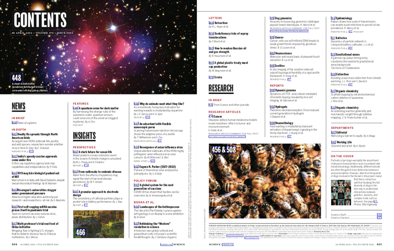
Table of Contents
Science, one of the world’s most famous and prestigious scientific journals and a leading platform for both scientific research and its wider dissemination, was founded in New York in 1880. For over a century, it has been an authoritative voice in the field, and boasts one of the highest Impact Factors, making it highly sought after among researchers. At the same time, it also contains news and articles designed for a wider public – albeit educated readers with a certain level of scientific knowledge – and provides a reliable source for the science sections of newspapers and magazines all over the world.
Since 1900, the journal has been the official publication of the AAAS, the American Association for the Advancement of Science. The AAAS is the largest scientific organisation in the world, and works to promote scientific progress by
fostering international cooperation between scientists and communicating the results of their research to the public (and to politicians), while fiercely defending their independence.
While this may not seem like an essential piece of information for an article about graphic design, over the years the AAAS has not only defined Science‘s editorial identity, but also its visual evolution, prioritising high-quality, clear and transparent communication.
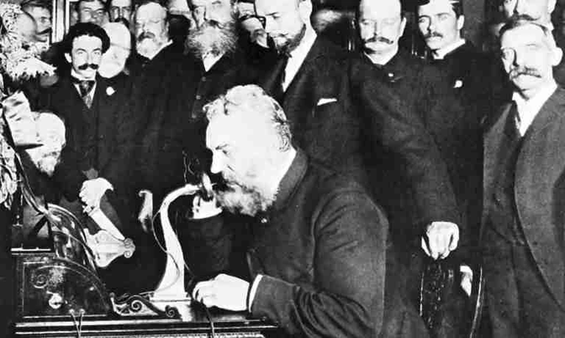
The publication’s history is intertwined with the lives of some of the greatest scientists ever to have lived. Thomas Edison was one of its first major financial backers, co-founding Science with the journalist John Michels, but the venture was a flop: the concept of publishing the world’s leading scientific research was seemingly met with indifference by the public. It was only the intervention of the AAAS and Alexander Graham Bell, the inventor of the telephone, that saved the journal and turned it into what it is today, with over 100,000 subscribers worldwide and a hugely popular website that attracts over 8 million hits a month (!)*
Inside the ultimate science magazine
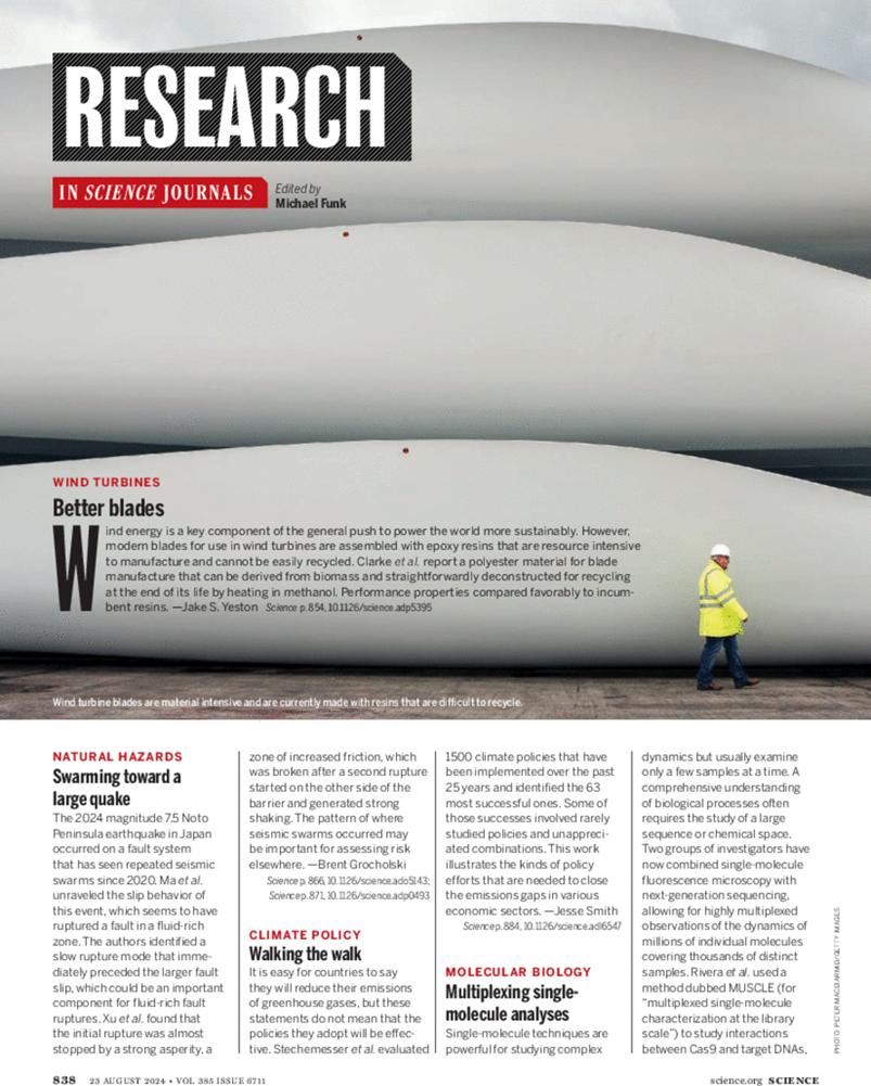
Science is a well-designed journal, reflecting the serious nature of its contents. The weekly publication is slightly smaller than tabloid format, measuring in at a very compact and easy-to-handle 177 x 254 cm. This is ideal both for reading and carrying around, and ensures the magazine lasts a long time despite its substantial number of pages. Scientific journals are designed to be durable: they need to be read by various people and browsed in libraries and universities, and so cannot have the flimsy design of a news magazine, which a week later is already out of date and ready for dropping into the recycling.
The three-column layout is well organised and aims for clarity: it has predominantly white pages for easy reading, lines separating the columns, and images and graphics when required.
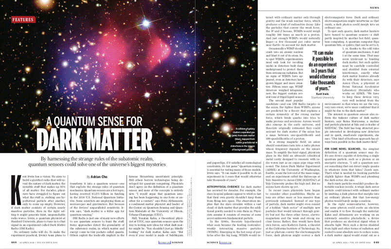
While scientific journals can have striking and impactful covers, inside they must maintain a balance between scientific rigour – research papers, containing at most a few graphical abstracts – and popular articles, which include more photographs and illustrations, but still use them sparingly.

Science‘s logo has changed slightly over the years, but it has mostly been based on a stylish sans-serif font, with the notable exception of a period from the late 1950s to the 1980s, when a slightly overstretched Egyptian font was used instead.
There is no definitive information available on the fonts used, but at a glance, the current logo looks very similar to a Garamond or Century.
The attention paid to every last detail of the magazine’s design can be seen from an editorial in 1986 announcing a major redesign:
‘The familiar format – the old type and logo, the recognized order of features, the friendly layout, and the clean white spaces – can be deserted only by what seems an act of treachery’.
And later:
‘A design touch, the dot over the capital I, may elicit comment. To some it will represent the height of modernism, a sign that “Science” is becoming avant-garde and moving with the new era. To others, it will be the triumph of the typographical error over the forces of scholarship.’

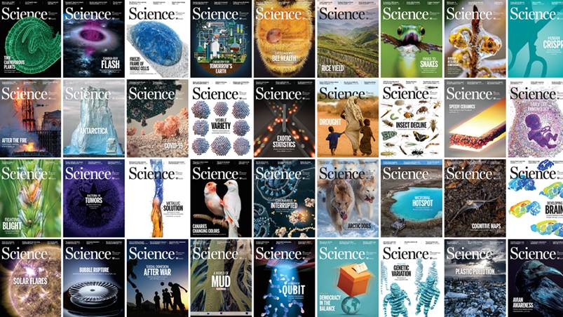
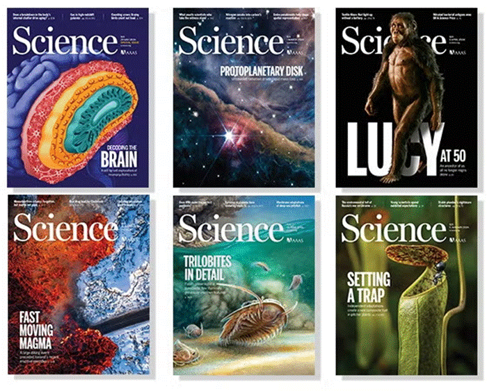
Memorable covers for revolutionary discoveries
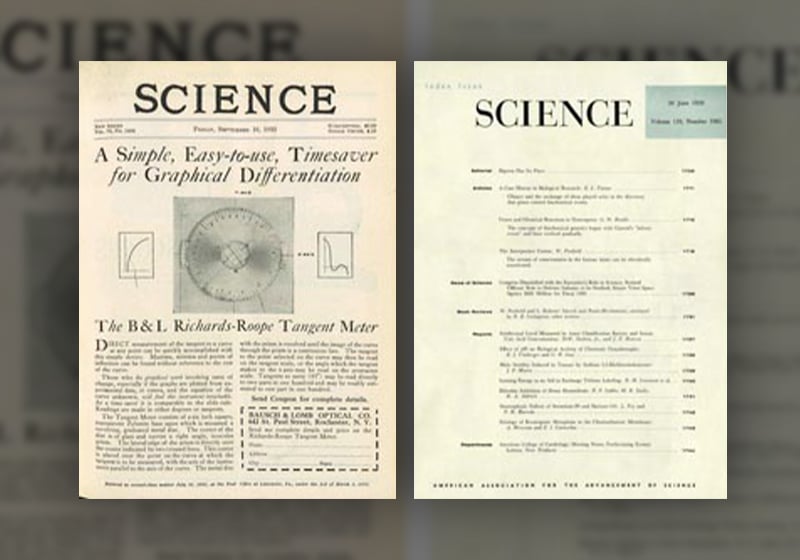
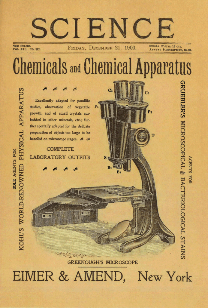
It was only in the 1960s that Science started to add images to its covers – until then the cover was simply a dry contents list with a rather austere layout. It was probably a combination of improving printing techniques and competition from Scientific American that prompted the AAAS to bring their journal up to date and attempt to grab readers’ attention with memorable images. Scientific American‘s colour photographs were striking both for the way they were produced and for their subjects, and this created a new trend in the science journals market, which until then had been focused on written content accompanied by graphs, diagrams and technical photos.
The evolution of the journal’s graphic design is clear to see from the way its covers have changed over the decades.
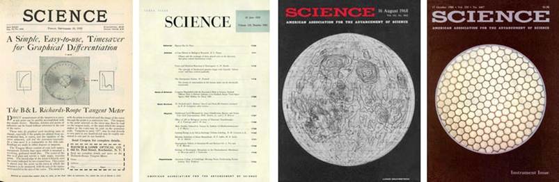
The first redesign came in 1959, when an Egyptian font was adopted for the logo and a photo appeared on the cover for the first time: a black and white ‘electron micrograph of a fractured quartz crystal’.
The first proper colour cover came in late 1975. The use of black and white was not solely an editorial decision: many images from scientific research were not available in colour, since they were produced by microscopes, x-ray equipment, mechanical writing systems, and so on. As the years progressed, things like microscopic images and pictures of space were increasingly coloured artificially. Over time, the journal’s cover graphics remained in step with international developments in graphic design, giving ever more space to images and incorporating greater levels of creativity.
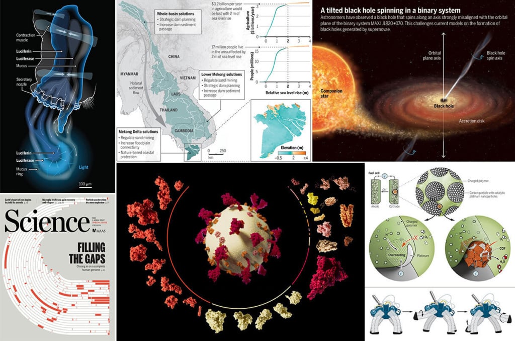
Illustrations, infographics and diagrams: visual science at its best
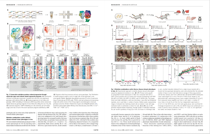
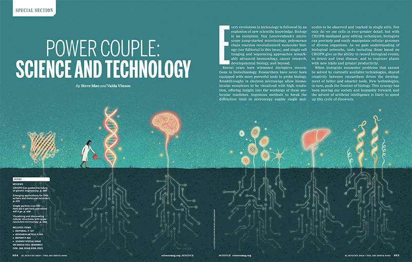
As we alluded to above, the journal contains a variety of photographs, diagrams, infographics and illustrations, chosen depending on the type of article.
Every year, Science selects the top examples of graphic design that have appeared in the journal that year in a column named The Best of Science Graphics, following in the footsteps of other American publications like the New York Times. This demonstrates just how adept Science‘s in-house graphic designers are at finding effective and consistently high-quality ways of visualising information in a range of styles.
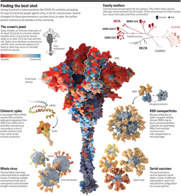
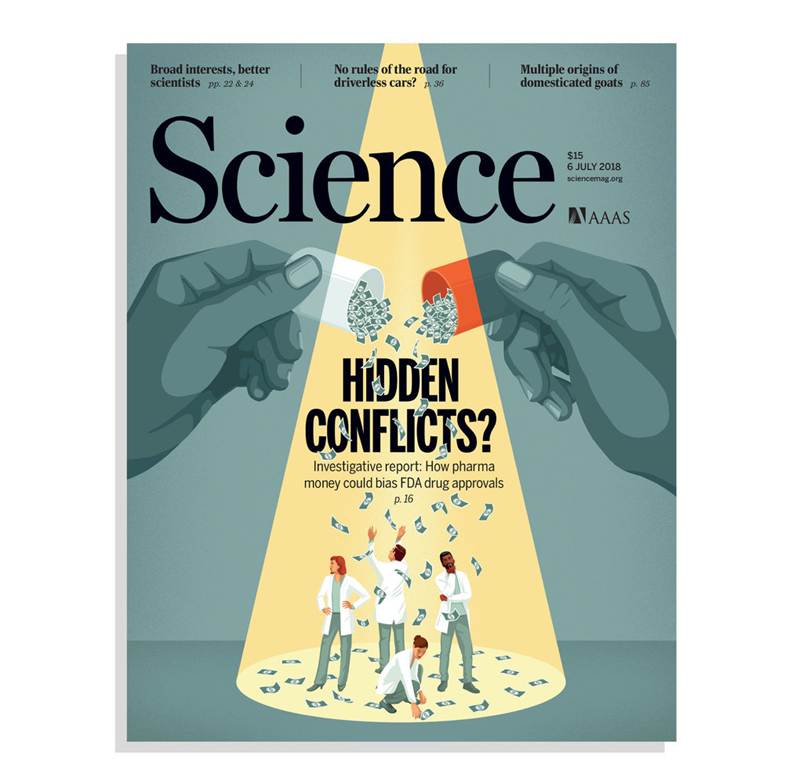
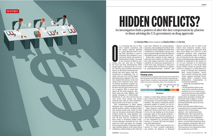
Illustrations are sometimes commissioned for important articles that will feature on the cover, particularly stories related to philosophical, ethical or theoretical topics. In these cases, the illustrator is asked to produce both a cover image and one or more images to accompany the article itself.

Conclusion: a meticulous journal with simple graphics
Science has established a reputation as one of the world’s best and most authoritative scientific journals (with an Impact Factor in the top 25 globally) over the course of more than a century. The quality of the research it publishes is reflected in its standard-setting simple, austere graphic design. It follows the latest trends in scientific image production, increasing the standard required every year and encouraging research centres and universities to pay more attention to this important aspect of scientific dissemination.
Science seems well placed to withstand future challenges, with a healthy balance of print and digital subscribers. Its website is one of the most popular science sites on the internet, overflowing with news and comprehensive archives.
Science is therefore one of the best publications in the very competitive world of scientific journals, where authoritativeness and effective graphic design go hand in hand.
Data taken from Science‘s Media Kit, available to download at: https://advertising.science.org/wp-content/uploads/2025/04/2025_Science_MediaKit_final_links.pdf
** Quotation taken from the editorial ‘A New Look’ from 3 January 1986, vol. 231
https://www.science.org/doi/pdf/10.1126/science.231.4733.9