
Table of Contents
The color winery represents a deep, elegant hue that sits between red and purple. It is a rich, warm, and sophisticated color that immediately evokes feelings of passion, refinement, and mystery. In this article, we will delve into every aspect of winery: from its origin and symbolism to its chromatic characteristics and the areas where it is commonly used, with a special focus on design, marketing, and branding.
Origin and History of the Color Winery
The term “winery” derives from the Latin word vīnācia, relating to wine or the residues left after pressing grapes. This color takes its name from the characteristic shade of ripe grape skins, especially those used for producing prestigious wines like Barolo or Nebbiolo.
Throughout history, winery has played an important role in culture and art, often associated with:
- Wealth and nobility: In the past, rich, dark hues like winery were difficult to obtain and therefore reserved for aristocratic and royal garments.
- Tradition and roots: The color connects deeply with the land and winemaking traditions common in Mediterranean and European cultures.
- Passion and spirituality: Its deep, enveloping shade also symbolizes intense emotion and introspection.
Meaning and Symbolism of Winery
Winery is a color rich with psychological and symbolic meaning, which is why it is carefully chosen in various fields, from design to advertising. Key symbolic associations include:
- Elegance and prestige: Winery is synonymous with class and sophistication, ideal for communicating a refined, high-end image.
- Deep passion: A red with violet undertones, it evokes strong, intimate emotions, perfect for romantic or creative contexts.
- Mystery and spirituality: Its darker shades suggest depth, introspection, and inner wisdom.
- Stability and authority: Compared to brighter reds, winery appears more sober and mature, conveying security and reliability.
This blend of meanings makes winery highly versatile: it can create warm, welcoming atmospheres as well as convey seriousness and luxury.
Technical and Chromatic Characteristics of Winery
Technically, winery is positioned within the range of hues that mix red and purple, with a strong dominance of magenta. Its main characteristics include:
- Hue: Ranges from deep red to intense purple, depending on the pigment mix.
- Saturation: Medium to high, lending depth and vibrancy.
- Brightness: Generally low, providing an elegant, subdued appearance, less bold than pure red.
- Versatility: Its rich chromatic range allows it to pair well with many colors, creating strong contrasts or delicate harmonies.
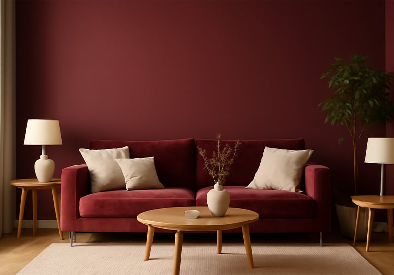
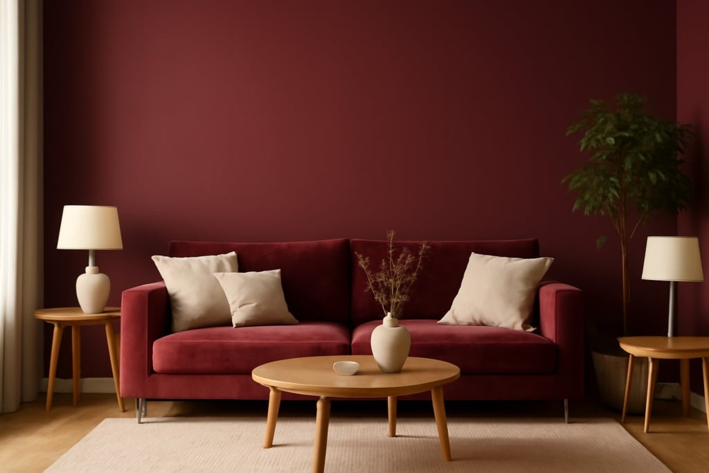
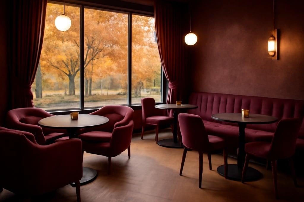
Winery in Interior Design: Warm and Refined Spaces
In interior design, winery is prized for its ability to make spaces elegant and inviting. Common uses include:
- Walls: Painting a wall winery creates a focal point with character, ideal for living rooms, studies, or bedrooms. Its depth adds warmth without overwhelming.
- Furniture: Sofas, armchairs, curtains, and rugs in winery become statement pieces that enhance a room with discreet luxury.
- Accents and details: Cushions, artwork, vases, or lamps in winery allow subtle color integration that enriches the overall atmosphere.
- Color combinations: Winery pairs well with neutrals like beige, cream, or light gray, and with natural materials like light wood or white marble, creating balanced and sophisticated contrasts.
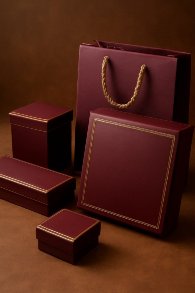
Winery in Graphic Design and Professional Printing
In graphic design and printing, winery is a refined choice that communicates authority and quality. Typical applications include:
- Logos: Using winery in a logo gives a brand a solid, elegant, and memorable identity, ideal for luxury, fashion, or gourmet sectors.
- Promotional materials: Brochures, catalogs, business cards, and flyers in winery attract attention without being aggressive, fostering a classy image.
- Packaging: Boxes, cases, and labels in winery suggest premium products, enhancing perceived value and attention to detail.
- Web design: Winery is used on websites for navigation elements, buttons, or backgrounds that add warmth and professionalism.
Its use requires careful calibration to avoid colors that are too dark or saturated, which can hinder readability or overwhelm visual communication.
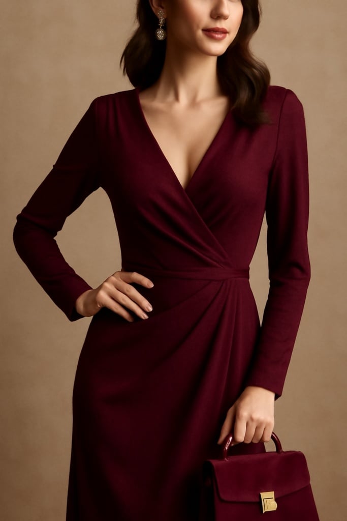
Winery in Fashion: A Timeless Color
In fashion, winery is an evergreen hue, particularly valued for its ability to flatter many skin tones and to be elegant without being banal. Key uses include:
- Autumn/Winter clothing: Coats, evening dresses, sweaters, and skirts in winery are popular seasonal staples for their warmth and intensity.
- Accessories: Bags, scarves, gloves, and shoes in winery complete outfits with a sophisticated pop of color.
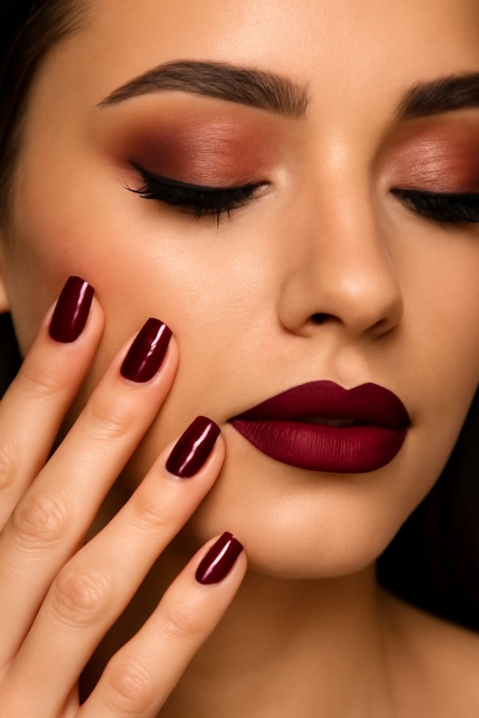
- Makeup: Lipsticks, nail polish, and eyeshadows in winery are classic essentials, enhancing femininity with a refined touch.
- Formal wear: Winery is often chosen for formal occasions, combining the solemnity of red with the mystery of purple for striking visual effects.
Winery in Marketing and Branding: Conveying Luxury and Passion
From a marketing perspective, winery is a strategic color for positioning a brand in a premium segment or communicating values of quality, passion, and authenticity. Benefits include:
- Emotional appeal: Winery stimulates warmth and desire, encouraging emotional engagement from the audience.
- Visual impact: It stands out without aggression, ideal for refined attention-grabbing.
- Brand consistency: Perfect for sectors like wine, fashion, cosmetics, art, and design where elegance and authenticity are essential.
- Communicative flexibility: Winery can be combined with other colors to create cohesive palettes—from classic black and white to vibrant modern looks.
How to Pair Winery: Ideas and Tips
To maximize winery’s potential, it’s useful to know effective color pairings:
- With neutrals: White, cream, beige, light gray—for an elegant, luminous effect.
- With metallics: Gold, copper, bronze—for added luxury and refinement.
- With dark greens: Forest or olive green—for a natural, sophisticated look.
- With other reds and purples: To create dynamic, interesting color gradients.
Conclusion
The color winery is much more than just a shade; it is a powerful visual communication tool capable of evoking deep emotions and strengthening a brand’s or environment’s identity. Its versatility and timeless charm make it an ideal choice for those seeking to blend elegance, passion, and personality in any project—from interior design and fashion to marketing and professional printing.
If you want to enhance your brand with a color that speaks of quality and sophistication, winery might be the perfect solution. For personalized advice on how to incorporate it into your next communication or printing project, don’t hesitate to contact us.