
Table of Contents
Colour theory is a series of concepts – some scientific, some more artistic in nature – regarding colours and how they are used. It provides designers, artists, decorators and photographers with various tips and tricks to find the perfect combination of colours and to experiment with vibrant, innovative pairings.
In general, a good design tends to require smart use of colour theory. But how do colour combinations work, and how can you start experimenting with them? Today we’d like to answer these questions by introducing the main tool underpinning colour theory: the colour wheel.

What is a colour wheel?
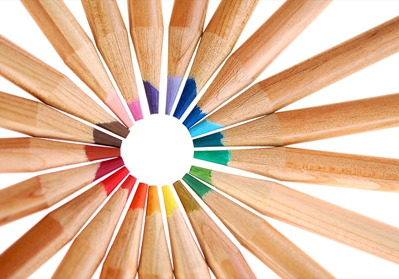
A colour wheel, also known as a colour circle, is the main tool used in colour theory. It is an abstract way of organising colours: they are all laid out in a circle, which highlights the relationships between them, and allows anyone looking at the wheel to work out possible colour pairings.

The colour circle was invented in 1666 by Isaac Newton, who redefined the theory of light and was the first scientist to work out – through his famous prism experiment – that the light spectrum was split into seven colours. However, while Newton was the first person to put the colours into a circle, the colour wheel we use today is a direct descendent of a slightly different design: Itten’s colour wheel.
Johannes Itten – a painter and teacher associated with the Bauhaus school – was the first to place twelve colours in a circle: the primary colours red, yellow and blue, along with the secondary colours and tertiary colours. Itten suggested that the circle could be used to construct harmonious colours, a selection of colours that are pleasing to the eye when paired together.

What can you do with the colour wheel?
A colour wheel is an essential tool for finding harmonious colours, i.e. colours that go well together. As we’ll see, by following various harmony rules you can create palettes of colours that can be used together effectively in any sort of graphic design project!
A colour wheel also orders colours according to their temperature: warm colours like red, yellow or purple evoke completely different sensations to those of cool colours like blue or green. Knowing colours’ temperature is therefore vital if you want to use them judiciously in your work.
Finally, it is worth bearing in mind that there are different types of colour wheel, each referring to a different colour model and different primary colours. In the printing world, for example, the standard model is CMYK, and you have to use the corresponding colour wheel. The standard for producing colour images for screens is RGB, while in schools and in the art sector it is common to use the RYB model, where the primary colours are red, yellow and blue.
Colour harmony rules: colour combinations
There are various colour combination rules that help you find harmonious colours – colours that go together nicely and are pleasing to the eye – from the colour wheel. Let’s have a look at some of the most effective pairings.
Complementary colours
These are the colours that are exactly opposite one another on the colour wheel. When you pair two complementary colours, you get a strong impact: each colours reinforces the other’s brightness.

Split complementary colours
Here the palette comprises three colours: one colour and the two colours that are immediately to the right and left of its complementary colour.

Analogous colours
Analogous colours are three (or more) colours that all next to each other in the colour wheel. This creates a very harmonious composition, but runs the risk of the colours all merging together. The advice here is to choose one main colour for the graphic design and use the others only as supporting colours.

Monochromatic pairing
This is where you take a base colour and change only the hue, tone and shade. It is a very conservative choice that produces harmonious colour palettes.

Triad or triadic harmony
These are three equidistant colours on the colour wheel. This rule creates a highly contrasting palette that is not as strong (or risky) as using complementary colours in your composition.

Square pairing or tetradic harmony
This involves choosing four equidistant colours in the colour wheel, or, to put it more simply, two pairs of complementary colours. In a colour palette, generally the more colours there are, the more difficult it is to get them to balance. The advice if using this colour scheme is therefore to choose one dominant colour and use the others as supporting colours.

Online colour wheels
If you look online, you can find several RGB colour wheels to use for creating images for screens. These are invaluable if you want to create a colour palette and start experimenting in a practical way with colour theory.
Here are some of the colour circles available on the web:
- Adobe colour wheel. Adobe’s online tool allows you to find perfectly harmonious colours and create your own palette using a colour wheel. You can apply various harmony rules to the colours (such as searching for complementary colours or triadic or tetradic harmony) and extract the main colours from an image. Go to the Adobe colour wheel.
- Canva colour wheel. Canva’s colour wheel is a simple and intuitive way to work out which colours go well together. Simply choose a starting colour and get your desired colour combination by choosing one of five rules (complementary, monochromatic, analogous, triadic or tetradic).Go to the Canva colour wheel.
- Paletton colour wheel. Paletton‘s interface is a little more complex than the previous options, but you get precise control over your choice of colours and various ways of previewing your palette.
- Session College colour wheel. This is the only one of the main online colour wheels that allows you to choose between an RGB model (for screen-based images) and an RYB model (mostly used in painting). The platform is mostly intended as an educational tool. Give it a go: you’re sure to learn a lot!
- Rapid Tables online colour circle. This is definitely the least professional and least detailed of all the online colour wheels, but it is a very simple, quick and intuitive tool. Enter the base colour or select it from the colour wheel and find all the colours that pair harmoniously with it.
Are you ready to play around, experiment and create harmony with a colour wheel?