
Table of Contents
Originally, the word ‘tabloid’ was just a paper size. But it has come to be associated with a specific genre of newspaper, all thanks to one very popular British paper with an unforgettable name and logo: The Sun.
The Sun first appeared in newsagents in 1964; the successor to another paper, the Daily Herald. It was initially in broadsheet format, but it switched to tabloid after media mogul Rupert Murdoch bought it in 1969. The publishers completely rejigged the graphic design at the same time, and its popularity began to grow, eventually becoming the biggest-selling UK newspaper, a status it held for decades.
The paper’s editorial line has always stood out for its sensationalist and exaggerated headlines (often creative in their use of language, and frequently acquiring iconic status) and its almost morbid interest in gossip and crime news. It has an intentionally markedly populist approach to politics that always sparks heated debate. Nevertheless, this sometimes explosive mix of content has allowed the newspaper to build its own unique identity, which has influenced British social and political debate and even its language and popular culture.
Particularly under the editorship of Kelvin MacKenzie (1981–1994), the newspaper held considerable sway over public opinion, and it was widely criticised for its strong nationalism, casual use of divisive topics that today would be considered to go far beyond ‘controversial’, and harsh opinions on public figures’ private lives.
One well-known feature that contributed to the paper’s success was the intentionally provocative ‘Page 3’ featuring photos of often topless female models. This approach to visual design and content soon spread across Europe, with other papers imitating The Sun’s crass formula, chaotic and crowded page layout and voyeuristic and caricatured use of photography. Gossip and scandal already had a place in the publishing landscape, of course, but The Sun raised the bar (or lowered it, depending on your viewpoint), pushing provocation at any cost, enjoying challenging the established rules of decency, and arguably prioritising potential new scandals over ensuring the accuracy of all its sources.
A masthead and brand combined
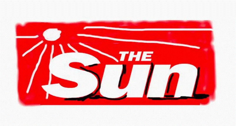
The Sun’s logo is one of the global press’s most recognisable mastheads: a red rectangle containing the name ‘The Sun’ in a Heavy Italic variant of Franklin Gothic. The font has remained unchanged since Murdoch first took charge in 1969.
The red recalls the aggressive, urgent tone the newspaper uses to talk to its readers, while the white lettering offers the maximum possible contrast.
The newspaper’s simple name and even simpler graphics are designed to be so basic they are impossible to forget.

A few adjustments have been made to the logo over the years, but the aim has always been to keep it as recognisable as possible. One interesting exception came in 2017, when David Hockney, the greatest living British painter, redesigned the masthead for a one-off edition.
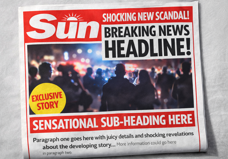
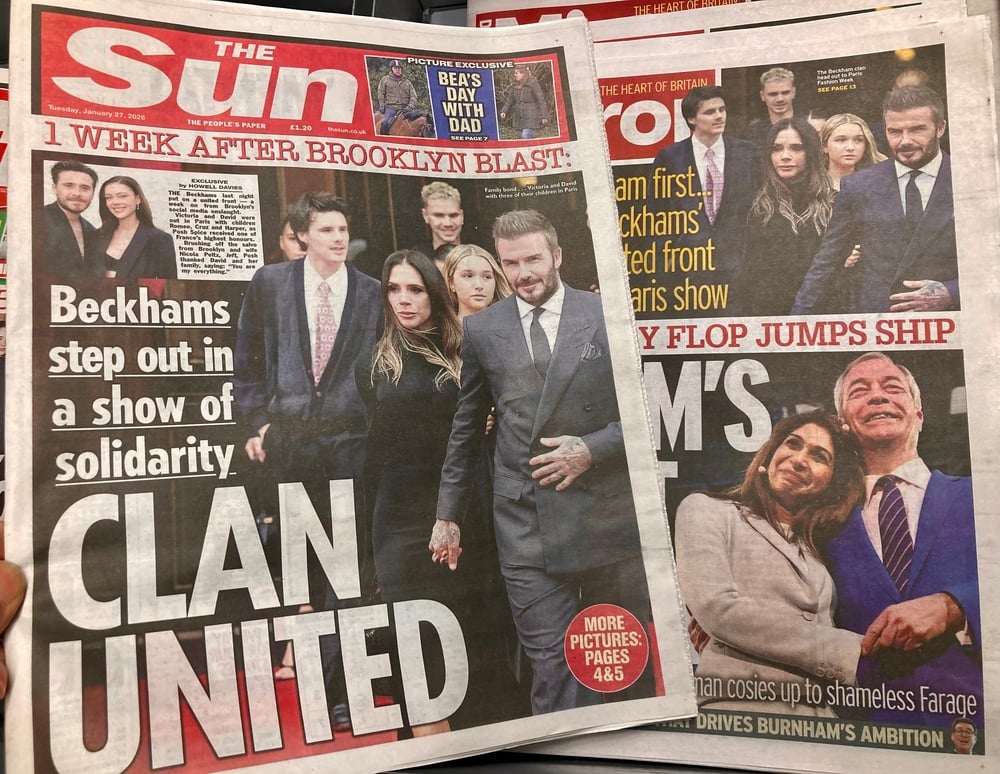
The red masthead, with its short and simple title, provides the starting point for an extremely crowded front page, where the various headlines seem to be competing to grab the reader’s attention.
Front page and general look
The Sun’s graphic identity plays a fundamental role in simplifying and sensationalising the news.
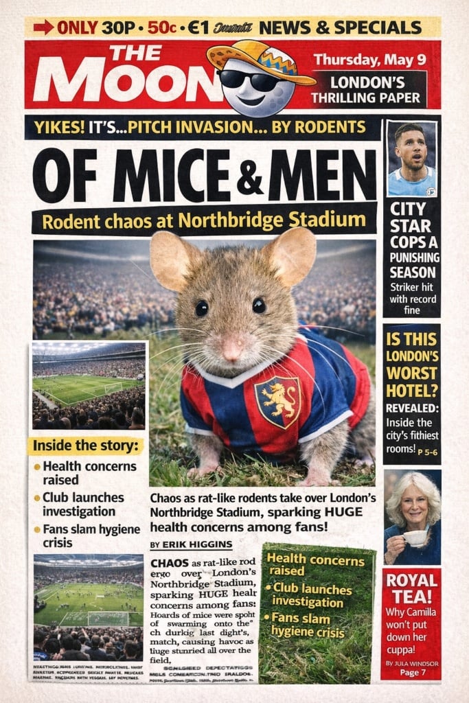
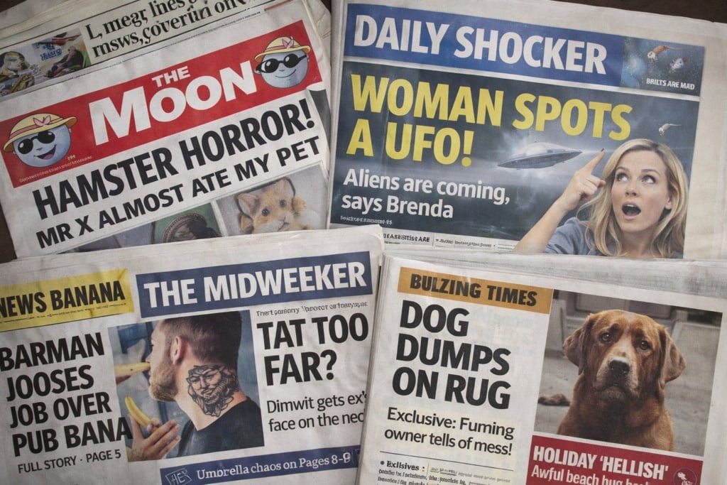
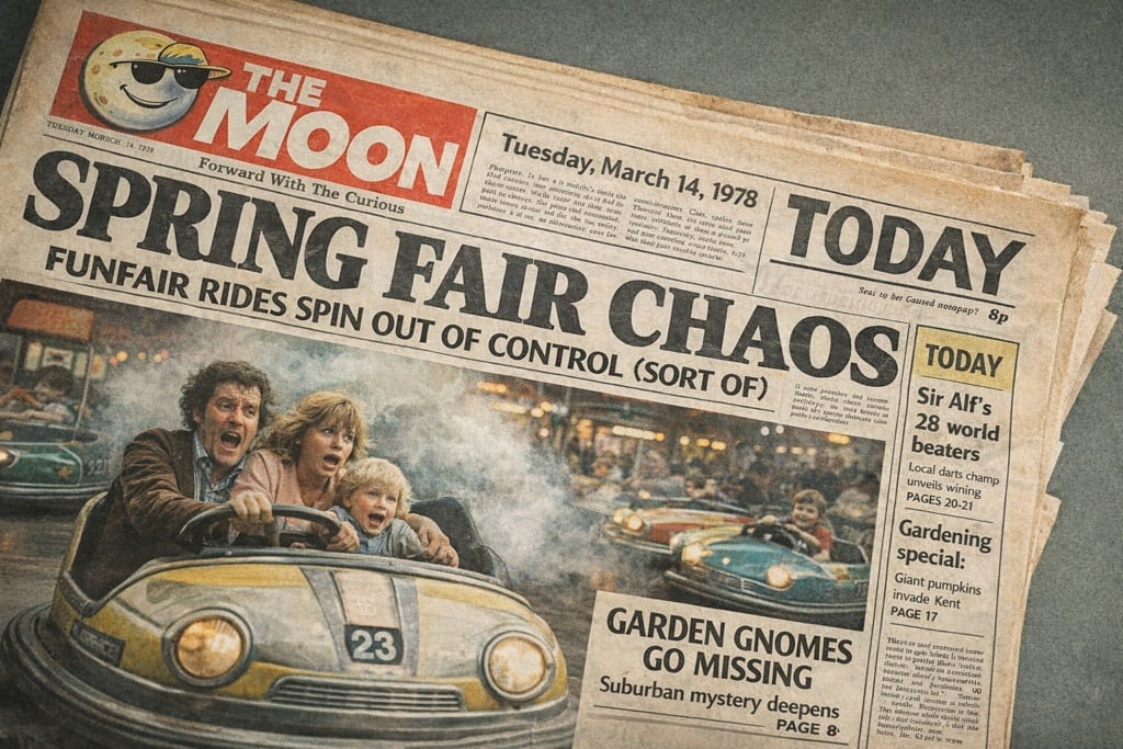
The tabloid’s front pages present a hodgepodge of news, all clamouring for attention: different font sizes, photos, and bold and underlined text are all thrown together, with little regard for stylistic elegance. In the 1980s, the paper began trialling what is sometimes called a ‘manifesto’ front page – a full-page photograph depicting a celebrity or the main protagonists in that edition’s lead story, with an enormous headline over the top, often white on a black background, sometimes known as the main splash. The bigger the news or the more famous the person, the more space on the front page they receive, and the more visibility they get in the UK’s bestselling newspaper, whether they like it or not!
Other editions continue to use the crowded front page with numerous headlines, a design that looks more like an advertising poster than a traditional news source.
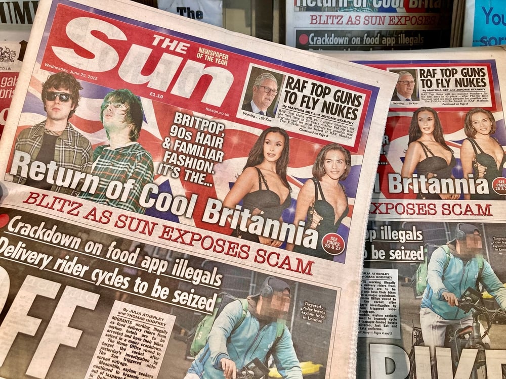
The composition takes hierarchy to extremes: the lead story dominates, while more minor stories and news are squeezed into boxes, strips and side panels. The result is a very dense yet readable page, where the most important aspects are clear at a glance, while the rest acts as a ‘secondary level’ for those wishing to read in a bit more detail.
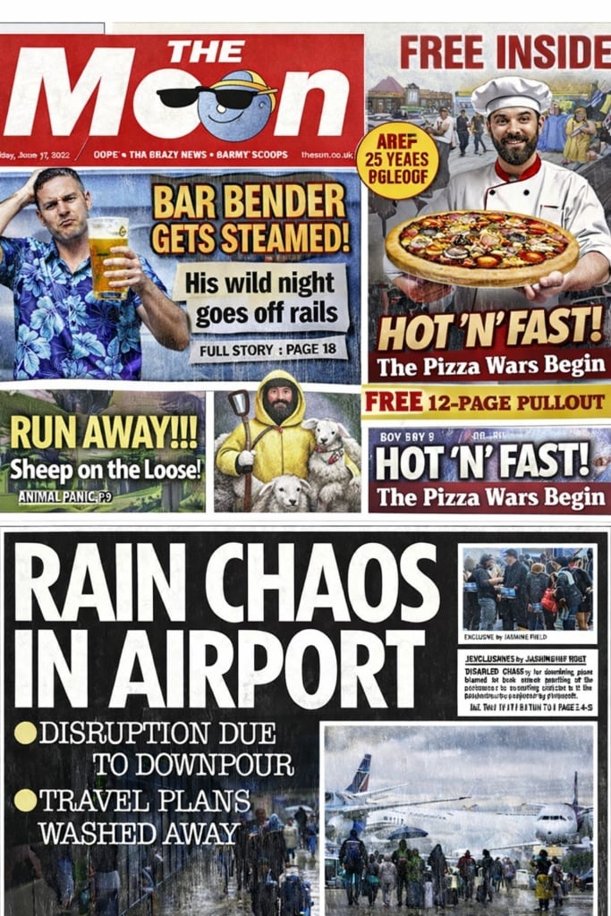
The colour palette is dominated by red, yellow, black and white – simple colours that create a strong contrast. The photo backgrounds are often cropped entirely, creating silhouettes and cut-outs that punctuate the page, increasing the sense of overcrowding.
The faces of the people depicted in the cover photos – often the main protagonists of the latest news, gossip or crime stories – play a vital role, creating an instant emotional reaction in readers.
Overall, the front page is designed to shout from newsagents’ shelves and grab readers’ attention; it will do anything to achieve this, sacrificing restraint and sobriety to achieve the maximum visibility. This approach was later copied by many European tabloids, which borrowed the big splash concept (large, uppercase title + dominant image + simple colours) and made it the standard design for tabloid journalism.
A simple and easy-to-read layout
Inside, the page layout is based on relatively simple grids, often with three or four columns, but continuously broken up by headlines that cut across horizontally (like a printed representation of a town square, where everyone is shouting to be heard), framed boxes, coloured backgrounds and graphic insets.
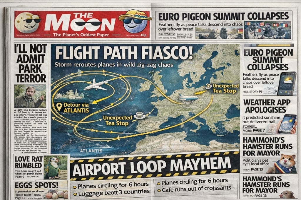
The Sun’s typography follows the paper’s ethos of keeping things simple: the articles are written in a serif font for quick reading and printed on low-quality paper, while the headlines and subheads use highly visible bold or underlined sans-serif fonts. The main headlines often have reduced letter spacing to increase the sensation of density and urgency.
Over the years, despite various redesigns to adapt to new printing technology and the needs of the digital age, the paper has retained its no-frills, rough-around-the-edges graphic appearance.
In general, robust, legible and impactful fonts take precedence over typographical elegance or sophistication. This produces a ‘noisy’ effect, as if the text is trying to make itself heard over the plethora of content and images. This consistency between the typographical style and editorial tone is one reason that The Sun makes such an interesting case study for people involved in information graphics.
People, personalities and celebrities
The Sun has historically always been centred on photographs. It doesn’t aim to document the news objectively, and it certainly doesn’t conduct investigative journalism; instead it seeks to create scandal, amazement and discussion. And to do that it has to exaggerate its tone, be provocative, make insinuations, and play on emotions, conflicts and stereotypes, sparing no one.

The newspaper always focuses on people, putting them at the centre of every news, politics or gossip story. Photos are therefore its favourite medium, typically taken candidly rather than posed, and almost always portraits (faces, busts or full length). Both celebrities and regular people getting their Warholian 15 minutes of fame are captured on camera, and all are moulded to fit the newspaper’s narrative.
The paper’s use of photos is sensationalist, voyeuristic and focused on storytelling, closer to a paparazzi approach than rigorous photojournalism.
Illustrations are also used to describe the people under discussion, mostly cartoons and caricatures that reinforce the article’s ironic or sarcastic tone. These drawings provide a visual counterpoint to the text, emphasising the paper’s penchant for entertainment and for disrespectful and satirical commentary on the news and mirroring the gossip or comments people tend to make among themselves.
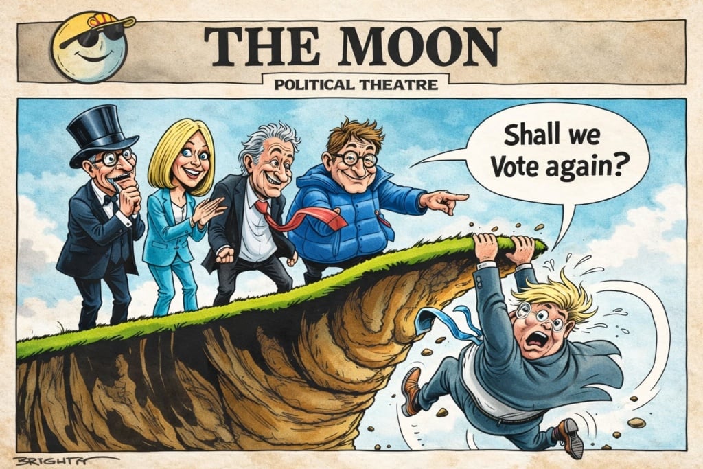
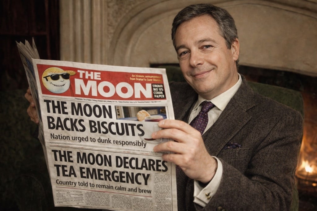
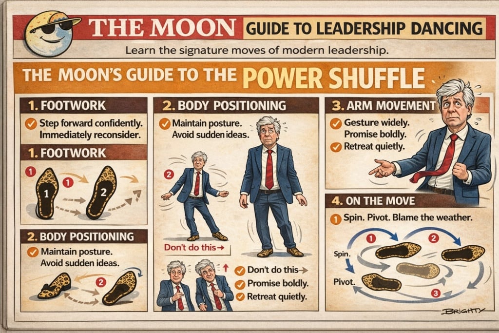
Infographics and tables are particularly common in the sports pages, but they are also used in more innovative, tongue-in-cheek ways, creating a new graphical standard for cartoons. As you can see in this example, simple graphics providing information are used in a meme-like way to comment sarcastically on famous people and their characteristics.
How studying tabloids can help us understand the society we live in
From a graphic design perspective, The Sun is a perfect example of how a newspaper’s visual identity can become a powerful journalistic and cultural tool in its own right. The red masthead, the cover with its enormous shouty headlines and the voyeuristic and narrative use of photographs are visual tools used to support a specific form of mass-market, emotion-driven and assertive information.
Over the decades, as well as influencing how news is delivered, the paper has also influenced the design of many European tabloids, consolidating the use of graphical language dominated by extreme hierarchy, bold colours and storytelling through images.
In recent years – marked by a widespread crisis in the newspaper and magazine industry – The Sun has stopped publishing official sales data for its paper edition, but it is probably hovering around 750,000 copies, a far cry from its circulation of 4 million in the 1980s. (Source: The Conversation)
However, it still holds a unique position in the global publishing world, capable of inventing narratives and scandalising and amusing its readers. Its journalistic style receives a lot of criticism for being crass and unrefined, designed for light reading and certainly not based on thoughtful, in-depth analysis. However, understanding its language offers insight into how a certain approach to mass-market journalism has shaped the visual universe of millions of readers, both within and outside the UK.
The Sun website: https://www.thesun.co.uk/
Editorial note:
Some images in this article are artificially generated illustrations that simulate the layout of real newspapers or magazines for purely illustrative purposes. They do not represent authentic covers. To view real examples of the publications mentioned, you can conduct your own online search or refer to the external links provided in the image captions (links to independent websites not affiliated with ours).