
Table of Contents
Where simplicity goes hand in hand with authoritativeness
We’re continuing our journey exploring the stories and graphical anatomy of the world’s leading magazines. In this article, we’ll investigate one that has genuinely made history, and even managed to shape global events: Time.
Founded almost exactly a century ago, in 1923, Time is a weekly magazine that, as its simple and highly symbolic name suggests, seeks to provide a snapshot of the times we live in.
It is also the world’s most-read news magazine, with over 26 million readers, 20 million of whom are in the United States. The paper version has a circulation of over 3 million copies: by no means the largest, but certainly the most-read and widest-spread authoritative political publication.
Globally, the magazine is best known for its person of the year, who is immortalised on the front cover of the December edition. A certain section of the Western establishment considers this accolade to be a sort of official title and sign of public recognition conferred on the person in question.
Becoming Time’s Person of the Year means achieving a level of global fame that is difficult to quantify. This year, the title went to the singer Taylor Swift, but over the course of its 100-year history the accolade has gone to people with a major social impact like Martin Luther King and Mikhail Gorbachev, presidents, prime ministers, popes and personalities from the world of showbusiness, not to mention objects, concepts and groups of people.
(You can find a complete list on Wikipedia)


Now let’s take our usual dive inside the magazine to explore how it is put together.
SIMPLE COVER, UNDOUBTEDLY ICONIC
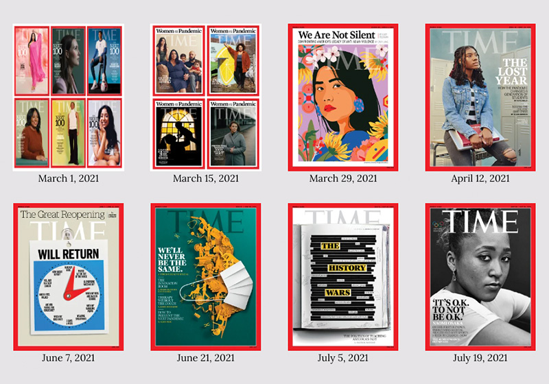
One of the key objectives of any magazine is to acquire iconic status both among its readers and the public at large. As we have seen on this journey of discovery, many publications manage it, while some others fall short. Time, however, is perhaps the clearest example of how strikingly communicative a cover can be.
Time’s secret is that it has always used portraits on its cover, presented to readers as if they were framed pictures on a wall. The photograph or drawing of the person is set within a simple red box, as if to show that the magazine gets its message across loud and clear. The header does not overpower the photo, although sometimes they overlap, or a transparent effect is used.
In recent years, Time has followed the example of other top news magazines by returning to using illustration, albeit sporadically, including on the front cover.


GRAPHICS THAT NEVER DISTRACT THE READER
Inside, Time’s layout is exactly as you would expect from the cover: simple and stripped-back.
A careful balance is always struck between serif and sans-serif fonts, like on the cover, where the historic Proforma font is used for the header, paired with an impactful sans-serif typeface like Franklin Gothic, often uppercase and in signal yellow. This pairing reaffirms the magazine’s authoritative status, since the classic serif font in the header has a sort of academic feel, while the sans-serif font emphasises the news in a bold and clear style.
The inside pages feature a very orderly grid, which never changes or plays around with the graphics. The first and final pages are divided into multiple columns, while the in-depth articles have wider columns. Full-page photos are only ever inserted at the start of an article. This classic setup is common to all news periodicals, although some have made tweaks to it over time.


SIMPLE BUT EFFECTIVE
Time’s success undoubtedly stems in part from its lean and minimalist style – a neutral and linear framework that enhances the photographic and textual content.
The use of photographs and realistic illustrations on the cover reinforces the concept that Time not only relays the news, but also does an excellent job of describing the reality of the moment. The stark simplicity of its visual template has rubbed off on other publications too, providing inspiration for all the top news magazines across the world. Another of the magazine’s strong points is its use of red, which symbolises power and is easy to pair with the colours of the cover images, particularly when they are black and white.
TAKEAWAYS
Time magazine is one of the most influential news magazines in the global publishing landscape.
The simplicity of its graphic design underlines its authoritativeness, while its use of images on the cover makes it one of the most powerful and politically impactful media.
But the main lesson Time teaches us is that keeping things clear and simple is the key to success.
Image sources:
https://www.theguardian.com/media/gallery/2018/sep/22/time-magazine-historic-iconic-covers
https://www.cbsnews.com/pictures/time-person-of-the-year/
https://www.currentaffairs.org/2018/11/the-pleasures-of-graphic-design