
Table of Contents
In the mid-nineties, someone decided to react to the unstoppable march of digital by furiously gathering together unwanted matrices, type pieces, stamps and printing machines from printers all over Italy. They decided to collect them in a museum, giving them a new life and a new home. This is the story behind Tipoteca Italiana, a unique museum dedicated in its entirety to printing and typography.
We’re in Cornuda, a town in the Veneto region of Italy, in the province of Treviso, a stone’s throw from the river Piave, which marks the border between the plain and the mountains. The story begins with the Antiga family, owners of a graphic design company based in the buildings of an ancient hemp mill, now home to Tipoteca. They were the ones who had the important intuition to prevent the disappearance of the world of letterpress printing, a world made up of inventions and technical advancement, design ideas, incredible businessmen and ingenious designers.
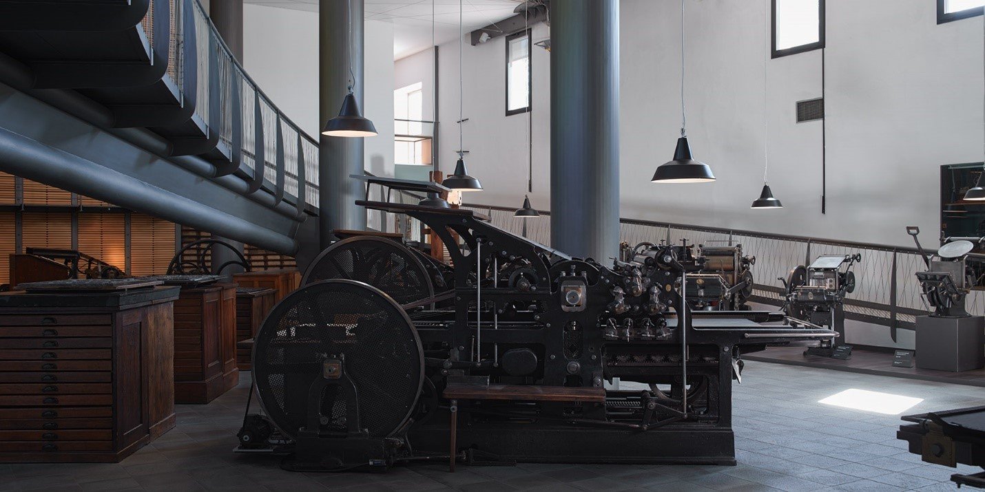
But the result is far from a nostalgia trip: the machinery museum is all in perfect working order, used to print art books and other products (available to buy at the museum’s shop), while designers from all over the world visit Tipoteca to relearn the art of letterpress printing through workshops, seminars and training courses. “It seems that there is an actual physical need to return in some way to the manual nature of graphic design”, Sandro Berra, an expert in the history of letterpress and Tipoteca’s coordinator said. “The need to pit oneself against something tangible and sensory. Printing and typography have therefore taken on a new meaning for today’s graphic design professionals: it is a world still full of ideas which can be reused in new projects, as well as providing a workout for the eye and the gaze of a designer”.
Every year, some 10,000 visitors rediscover the world of typography at Tipoteca: they include students, graphic designers and history buffs, as well as the merely curious.
With the help of Sandro Berra, we’ve put together a selection of the thousands of stories preserved and told by Tipoteca in its various guises: museum, archive, library, printing press, gallery and auditorium. So here are the stories of a typeface (Triennale), a technology (the Optima flatbed cylinder press) and a firm (the Nebiolo foundry).
A typeface: Triennale, “very tall and thin”
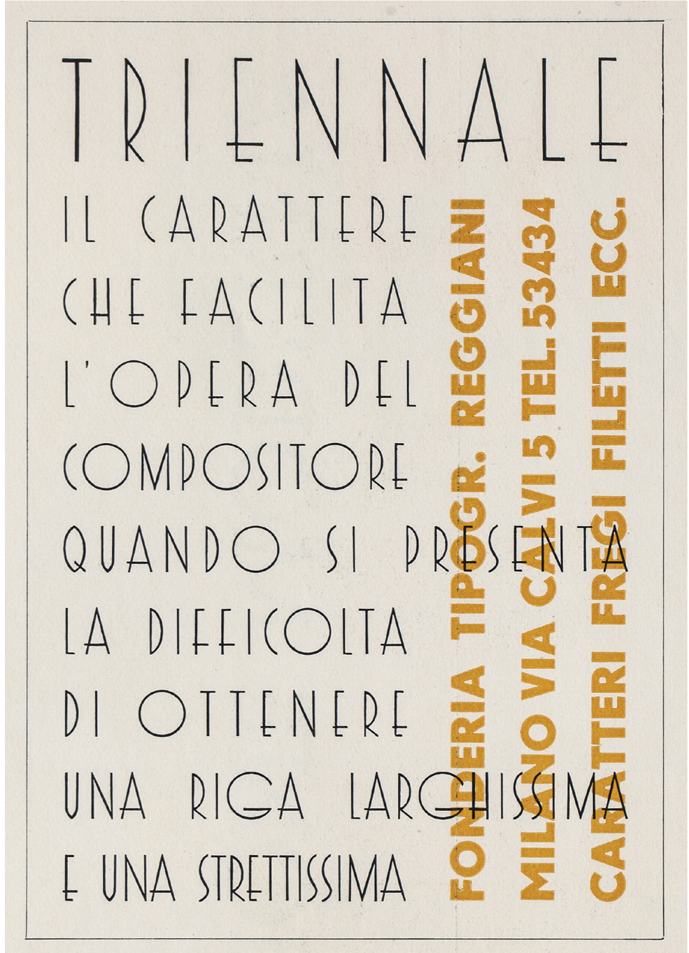
Triennale is a modernist typeface designed by Guido Modiano (1899–1943) for the Reggiani foundry in 1933. It pays homage to the fifth Triennale, the inaugural exhibition at Milan’s Palazzo dell’Arte, a building that would become a temple to Italian architecture and design. Cast in various point sizes (12, 18, 24, 36, 48 and 60), and later in bold face too, Triennale was used mainly in advertising, but was also employed for wall lettering.
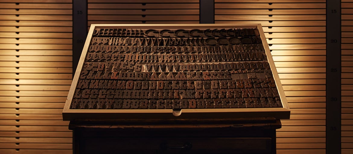
A few point sizes of Triennale are preserved in Tipoteca’s typeface archive, which contains both lead and wood typefaces. There’s a little preview on the museum’s website.
A technology: Optima, the robust and precise flatbed cylinder press
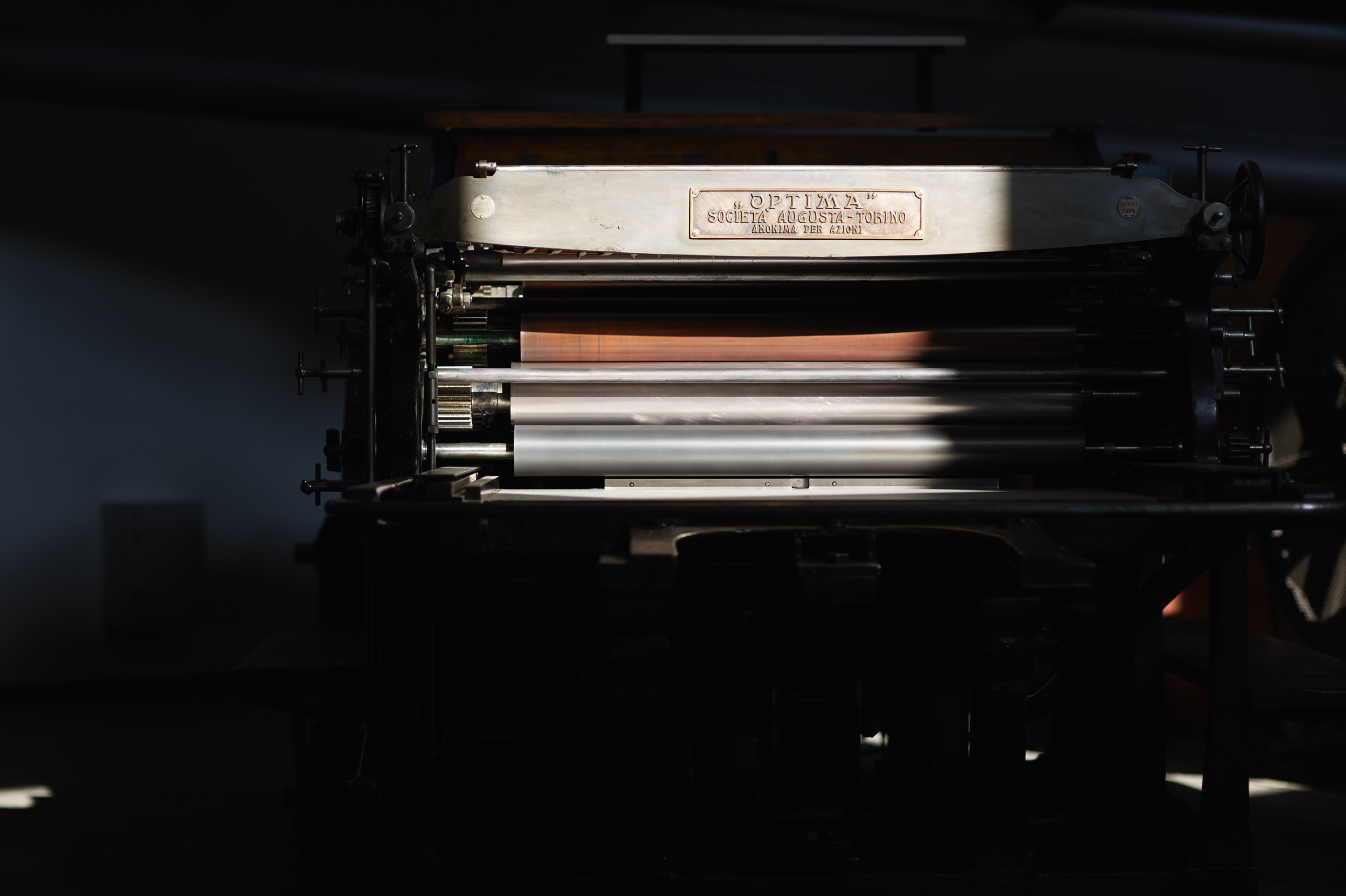
Optima is the brand name of a flatbed cylinder press launched in 1908 by Italy’s leading type foundry of the 20th century, Nebiolo. The Optima was robust, precise and offered high print quality. It churned out around 1,500 copies an hour and allowed a wide range of paper types and sizes to be used, depending on the demands of the format. This meant it could easily (but only manually) be fed sheets measuring 50 x 70 cm, 70 x 100 cm, 80 x 115 cm, and 90 x 130 cm.
Tipoteca is home to an Optima built in Turin in 1914 and once owned by the historic Tipografia Ghibaudo in Cuneo. Housed in the museum’s main hall, the press – like all of those preserved at Tipoteca – is still used to print art books.
A firm: the glorious Nebiolo of Turin
Among the stories told at Tipoteca, one of the most important is undoubtedly that of the historic Nebiolo type foundry of Turin.
In 1878, Giovanni Nebiolo took over a small type foundry and so began the story of Italy’s most important type foundry and press manufacturer. Nebiolo & Comp. di Torino was officially born two years later in 1880. In 1888, with the arrival of new partners, the firm expanded: it would no longer produce just typefaces, but also printing presses. The first machines to leave Nebiolo were designed to satisfy the needs of the small printers found all over Italy at the time. Then, in the early 1900s, Nebiolo shifted towards designing larger presses for the growing newspaper industry. Even Italy’s newspaper of record, Corriere della Sera, would use Nebiolo presses.
This and other stories from the fascinating world of Italian typography are told by the machines, documents and books preserved at Tipoteca, a place we strongly advise you visit!